| |
|

|
Thanks for taking the time to read my thoughts about Visual Business
Intelligence. This blog provides me (and others on occasion) with a venue for ideas and opinions
that are either too urgent to wait for a full-blown article or too
limited in length, scope, or development to require the larger venue.
For a selection of articles, white papers, and books, please visit
my library.

|
| |
February 22nd, 2021
On April 15, 2021, my book Now You See It (2009) will become available in its second edition with the revised subtitle An Introduction to Visual Data Sensemaking.
Now You See It: An Introduction to Visual Data Sensemaking
This is more than a mere update. Essentially, this new edition combines the contents of the first edition with the contents of my book Signal: Understanding What Matters in a World of Noise. I wrote Signal in 2015 to complement Now You See It by covering more advanced data sensemaking techniques, including Statistical Process Control. And, in case you’re concerned that this new edition will be huge and heavy enough to serve as a doorstop, you’ll be pleased to hear that I’ve combined and refined the best of the two books into a single publication that is roughly the same size as the original version of Now You See It. This new edition will make the process of learning visual data sensemaking skills more fluid, efficient, and comprehensive.
Before you can present information to others, you must first make sense of it. Now You See It teaches the concepts, principles, and practices of visual data sensemaking. The skills taught in this book rely primarily on something that most of us possess—vision—interactively using graphs to find and examine the meaningful patterns and relationships that reside in quantitative data.
Although some questions about quantitative data can only be answered using sophisticated statistical techniques, most can be answered using relatively simple visual data sensemaking skills. No other book teaches these basic skills as comprehensively and in a way that is accessible to a broad audience. Even though these skills can be developed by anyone with eyes to see, they are not intuitive—they must be learned. Without these skills, even the best data visualization tools are of little use, and data will remain nothing but noise.
August 7th, 2020
We’re in the midst of a worldwide COVID-19 pandemic. Our understanding of this novel pandemic and our efforts to combat it are determined in large part by the information that we consider. It’s critically important that information in news stories is presented clearly and accurately. Unfortunately, sources that we rely on for the news, including ordinarily reliable sources, sometimes present COVID-19 data in misleading ways. This is sometimes done by omitting relevant data. Even one of my favorite new sources, NPR, was recently guilty of this. The charts that were included in an NPR article titled “Charts: How the U.S. Ranks On COVID-19 Deaths Per Capita – And By Case Count” on August 5, 2010 by Jessica Craig illustrate this.
The article is a response to the recent Axios interview with Donald Trump by Jonathan Swan, which aired on August 3, 2020 on HBO. In particular, the article addresses the exchange that occurred during that interview about COVID-19 deaths in the United States. Trump suggested that we were doing better than any other country, which is not the case by any measure of COVID-19-related mortality. When Swan countered that we’re doing much worse than many countries, Trump handed him a chart that apparently referred to “case fatality ratio,” which is the ratio of deaths per infections. Swan then explained that he was referring to deaths in proportion to the population (i.e., deaths per capita), to which Trump responded, “You can’t do that.” You certainly can do that. There are several ways in which COVID-19 deaths per country can be compared, and per capita deaths is one of the most useful. Case fatality rate is useful as well. Both measures contribute to our understanding when they’re presented clearly.
My primary concern with the NPR article has to do with the two charts that appeared in it: one regarding deaths per capita and one regarding case fatality ratios, both of which compared the U.S. to other countries with “50,000 or more reported cases.” Let’s begin with the chart that shows per capita deaths:
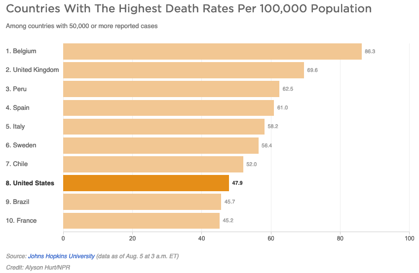 It appears that only two countries—Brazil and France—are doing better than the U.S., but this is hardly the case. As of August 5th, 45 countries reported more than 50,000 COVID-19 cases to date. In other words, 37 out of 44 other countries with 50,000 or more cases are doing better than the U.S., and this doesn’t even count the much larger number of countries with fewer than 50,000 cases. The chart suffers from the “curse of the top 10.” There’s nothing magical, or in this case relevant, about the number 10. Arbitrarily limiting this chart to 10 countries presents a misleading message. At a minimum, this chart should show all 45 countries with more than 50,000 cases. We should be grateful, I suppose, that the designer of this chart did not limit it to 8 countries rather than 10, which would have made the U.S. appear best of all. Now that’s a chart Trump could love. In fact, I wouldn’t be surprised if his staff prepares that exact chart for his next interview.
As an aside, I’ll respond to one more point that was made in the article about deaths per capita:
The per capita death rate is primarily an indication of the overall disease burden in a country, according to Justin Lessler, an associate professor of epidemiology at Johns Hopkins University. (Disease burden is the term used to describe the impact of a particular disease in terms of years of life lost and years lived with disability.)
Both sentences above exhibit problems. The first suggests that the per capita death rate is primarily an indication of the “overall disease burden in a country.” That’s not entirely accurate. It indicates the proportional rather than the overall disease burden. The overall disease burden is better represented by the total case count. The second sentence, which provides a technical definition of “disease burden,” is entirely irrelevant. When defined as the “impact of a particular disease in terms of years of life and years lived with disability,” the disease burden cannot be determined by the per capita death rate.
Let’s move on to the second chart:
Wow, the U.S. is looking particular great in this chart, isn’t it? We’re at the bottom of the chart, which is ordinarily a good place to be when countries are ranked from worse to best, but once again, the story isn’t clearly told without showing all 45 countries. In truth, we’re in the middle of the pack, not the best.
The article did go on to provide useful information by identifying some of the other factors that influence COVID-19 mortality measures when comparing countries, such as age (with COVID-19, because it causes deaths more frequently among older folks, the median age of a country is a factor) and “access to ventilators and ICU care if needed.” Unfortunately, however, it also went on to give Trump some credit for his positive spin on mortality statistics, largely ignoring the fact that Trump’s fundamental claim was a bald-faced lie. By no COVID-19 mortality measure is the U.S. doing better than all other countries, which is what Trump has been saying all along and clearly suggested in the Axios interview.
I suspect that NPR was trying to differentiate itself from most other news outlets by designing charts and including statements that appeared more even handed in its assessment of Trump’s performance. Whatever the motivation, NPR, ordinarily a reliable news source, failed to tell this story clearly.
July 12th, 2020
The principles and practices of data visualization do not vary from one domain to another. They are the same. Data visualization applied to business differs only from data visualization applied to education (or healthcare, or government, or various branches of science, or any other domain you can imagine) in that each domain has its own data that must be understood before it can be visualized effectively. How the data is visualized, however, does not vary from one domain to another. All domains pull from the same repository of visual representations and, to work effectively, follow the same design principles and practices. While it is certainly true that some data domains might routinely rely more heavily on particular charts than other domains, that difference does not constitute a separate branch of data visualization. If you’ve developed expertise in data visualization while working in finance and you suddenly take a job working in healthcare, you will need to learn about healthcare, but not anything new about data visualization that is unique to that domain.
Over the years, as a data visualization practitioner, author, consultant, and teacher, I’ve applied my skills to many domains. To do this effectively, I had to learn enough about those domains to make sense of the data, but what I then did to visualize the data didn’t vary from one domain to another. From time to time, people who worked in a specific domain asked if I would write a book or teach a course about data visualization for their domain in particular. Would it make sense for me to write a new version of my book Show Me the Numbers that is specific to the needs of education, healthcare, or marketing organizations? The lessons that the book teaches about chart selection and design for communicating quantitative data effectively are illustrated throughout with examples drawn from multiple domains; examples that can be easily understood by everyone. A separate version of the book for each domain isn’t needed. You could certainly argue that marketing professionals might prefer to only see data visualizations that are based on marketing data when learning the skills, but would that provide them with any real benefit compared to familiar examples from multiple domains? I don’t think it would. In fact, using examples from multiple domains reinforces the fact that data visualization applies to all domains equally and in the same manner—the skills are transferable—which is a useful reminder. During the early stages of the learning process, focusing on the concepts and skills of data visualization rather than on the data domain is appropriate, even if you only plan to apply the skills to a single domain.
The first edition of my book Show Me the Numbers almost exclusively featured business examples. I chose to do this initially because the business examples that I created (e.g., graphs that featured revenues or expenses) were easy for any reader to understand. As a consequence, however, every once in a while someone would describe Show Me the Numbers as “data visualization for business,” which drove me nuts, because it artificially and unnecessarily limited the book’s audience. For this reason, when I wrote the second edition, I was careful to mix in examples drawn from multiple domains.
As a data visualization professional, it is perfectly reasonable for you to focus on a particular data domain if you wish because increasing your expertise in that domain will make you a better visualizer of its data. Just bear in mind that your visualization skills in particular, as opposed to your data domain expertise, are entirely transferable. When I first started teaching public data visualization workshops many years ago, I quickly observed that classrooms filled with people from various domains, rather than workshops that I taught privately for individual organizations, offered a real advantage to my students. Sharing experiences, discussing the material, working together in exercises, and even commiserating about the challenges that they faced when visualizing data, was richer in diverse groups drawn from various domains.
Data visualization is data visualization is data visualization. If you learn the skills well, you can apply them broadly.
April 13th, 2020
As COVID-19 spreads its deadly effects around the world, many data analysts are struggling to track these effects in useful ways. Some attempts work better than others, however. Comparing these effects among various countries is particularly challenging. Some attempts that I’ve seen are confusing and difficult to read, even for statisticians. Here’s an example that was brought to my attention recently by a statistician who found it less than ideal:
I believe that the objectives of displays like this can be achieved in simpler, more accessible ways.
Before proposing an approach that works better, let’s acknowledge that country comparisons of deaths from COVID-19 are fraught with data problems that will never be remedied by any form of display. Even here in the United States, many deaths due to COVID-19 are never recorded. If someone with COVID-19 suffers from pneumonia as a result and then dies, what gets recorded as the cause on the death certificate: COVID-19 or pneumonia? Clear procedures aren’t currently in place. Medical personnel are focused on saving lives more than recording data in a particular way, which is understandable. This problem is no doubt occurring in every country. The integrity of the data from country to country differs to a significant degree and does so for many reasons. It’s important to recognize whenever we display this data that country comparisons will never be entirely reliable. Nevertheless, working with the best data that’s available, we must do what we can to make sense of it.
If we want to compare the number of deaths due to COVID-19 per country, both in terms of magnitudes and patterns of change over time, the following design choices seem appropriate:
- Assuming that we want to understand the proportional impact on countries, use a ratio such as the number of deaths per 1 million people rather than the raw number of deaths, to adjust for population differences.
- Aggregate the data to weekly values to eliminate the noise of day-to-day variation.
- Use rolling time (i.e., week 1 consists of days 1 through 7, week 2 consists of days 8 through 14, etc.) rather than calendar time, beginning with the date on which the first death occurred in each country.
The following line graph exhibits these design choices. To keep things simple for the purpose of illustrating this approach, I’ve included four countries only: the U.S., China, Italy, and Canada. Also, for the sake of convenience, I’ve relied on the most readily available data that I could find, which comes from www.ourworldindata.org.
 Most people in the general public could make sense of this graph with only a little explanation. It’s important to recognize, however, that no single graph can represent the data in all the ways that are needed to make sense of the situation. Perhaps the biggest problem with this graph is the fact that the number of weekly deaths per 1 million people per country varies so much in magnitude, ranging from over 90 at the high end in Italy to less than 1 at its peak in China, the blue line representing China appears almost flat as it hugs the bottom of the graph, which makes its pattern of change unreadable. Assuming that the number of deaths in China is accurate (not a valid assumption for any country), this tells us that COVID-19 has had relatively little effect on China overall. The immensity of China in both population and geographical space is reflected in this low mortality rate. The picture would look much different if we considered Wuhan Province alone.
Obviously, if we want to compare the patterns of change among these countries more easily, regardless of magnitude, we must solve this scaling problem. Some data analysts attempt to do this by using a logarithmic scale, but this isn’t appropriate for the general public because few people understand logarithmic scales and their effects on data. Another approach is to complement the graph above with a series of separate graphs, one per country, that have been independently scaled to more clearly feature the patterns of change. Here’s the same graph above, complemented in this manner:
 With this combination of graphs, there is now more that we can see. For instance, the pattern of change in China is now clearly represented. Notice how similar the patterns in China and Italy are. From weeks 1 through 7, which is all that’s reflected in Italy so far, the patterns are almost identical. Will their trajectories continue to match as time goes on? Time will tell. Notice also the subtle differences in the patterns of change in the U.S. versus Canada. In the beginning, mortality increased in Canada at a faster rate but started to decrease from the fourth to fifth week while the pattern in the U.S. does not yet exhibit a decrease as of the sixth week. Will mortality in the U.S. exhibit a decline by week 7 similar to China and Italy? When another complete week’s worth of data is added to the U.S. graph, we’ll be able to tell.
Clearly, there are many valid and useful ways to display this data. I propose this simple set of graphs as one of them.
April 9th, 2020
Statistics are playing a major role during the COVID-19 pandemic. The ways that we collect, analyze, and report them, greatly influences the degree to which they inform a meaningful response. An article in the Investor’s Business Daily titled “Dow Jones Futures Jump As Virus Cases Slow; Why This Stock Market Rally Is More Dangerous Than The Coronavirus Market Crash” (April 6, 2020, by Ed Carson) brought this concern to mind when I read the following table of numbers and the accompanying commentary:
U.S. coronavirus cases jumped 25,316 on Sunday [April 5th] to 336,673, with new cases declining from Saturday’s record 34,196. It was the first drop since March 21.
The purpose of the Investor’s Business Daily article was to examine how the pandemic was affecting the stock market. After the decline in the number of reported new COVID-19 cases on Sunday, April 5th, on Monday, April 6, 2020, the stock market surged (Dow Jones gained 1,627.46 points, or 7.73%). This was perhaps a response to hope that the pandemic was easing. This brings a question to mind. Can we trust this apparent decline as a sign that the pandemic has turned the corner in the United States? I wish we could, but we dare not, for several reasons. The purpose of this blog post is not to critique the news article and certainly not to point out the inappropriateness of this data’s effects on the stock market, but merely to argue that we should not read too much into the daily ups and downs of newly reported COVID-19 case counts.
How accurate should we consider daily new case counts based on the date when those counts are recorded? Not at all accurate and of limited relevance. I’ll explain, but first let me show you the data displayed graphically. Because the article did not identify its data source, I chose to base the graph below on official CDC data, so the numbers are a little different. I also chose to begin the period with March 1st rather than 2nd, which seems more natural.
What feature most catches your eye? For most of us, I suspect, it is the steep increase in new cases on April 3rd, followed by a seemingly significant decline on April 4th and 5th.
A seemingly significant rise or fall in new cases on any single day, however, is not a clear sign that something significant has occurred. Most day-to-day volatility in reported new case counts is noise—it’s influenced by several factors other than actual new infections that developed. There is a great deal of difference between the actual number of new infections and the number of new infections that were reported as well as a significant difference between the date on which infections began and the date on which they were reported. We currently have no means to count the number of infections that occurred, and even if we tested everyone for the virus’s antibodies at some point, we would still have no way of knowing the date on which those infections began. Reported new COVID-19 cases is a proxy for the measure that concerns us.
Given the fact that reported new cases is probably the best proxy that’s currently available to us, we could remove much of the noise related to the specific date on which infections began by expressing new case counts as a moving average. A moving average would provide us with a better overview of the pandemic’s trajectory. Here’s the same data as above, this time expressed as a 5-day moving average. With a 5-day moving average the new case count for any particular day is averaged along with the four preceding days (i.e., five-days-worth of new case counts are averaged together), which smooths away most of the daily volatility.
While it still looks as if the new case count is beginning to increase at a lesser rate near the end of this period, this trend no longer appears as dramatic.
Daily volatility in reported new case counts is caused by many factors. We know that the number of new cases that are reported on any particular day do not accurately reflect the number of new infections. It’s likely that most people who have been infected have never been tested. Two prominent reasons for this are 1) the fact that most cases are mild to moderate and therefore never involve the medical intervention, and 2) the fact that many people who would like to be tested cannot because tests are still not readily available. Of those who are tested and found to have the virus, not all of those cases are recorded or, if recorded, are forwarded to an official national database. And finally, of those new cases that are recorded and do make it into an official national data base, the dates on which they are recorded are not the dates on which the infections actually occurred. Several factors determine the specific day on which cases are recorded, including the following:
- When the patient chooses or is able to visit a medical facility.
- The availability of medical staff to collect the sample. Staff might not be available on particular days.
- The availability of lab staff to perform the test. The sample might sit in a queue for days.
- The speed at which the test can be completed. Some tests can be completed in a single day and some take several days.
- When medical staff has the time to record the case.
- When medical staff gets around to forwarding the new case record to an official national database.
There’s a lot that must come together for a new case to be counted and to be counted on a particular day. As the pandemic continues, this challenge will likely increase because, as medical professionals become increasingly overtaxed, both delays in testing and errors in reporting the results will no doubt increase to a corresponding degree.
Now, back to my warning that we shouldn’t read too much into daily case counts as events are unfolding. Here’s the same daily values as before with one additional day, April 6th, included at the end.
Now what catches your eye. It’s different, isn’t it? As it turns out, by waiting one day we can see that reported new cases did not peek on April 3rd followed by a clear turnaround. New cases are still on the rise. Here’s the same data expressed as a 5-day moving average:
The trajectory is still heading upwards at the end of this period. We can all hope that expert projections that the curve will flatten out in the next few days will come to pass, but we should not draw that conclusion from the newly reported case count for any particular day. The statistical models that we’re using are just educated guesses based on approximate data. The true trajectory of this pandemic will only be known in retrospect, if ever, not in advance. Patience in interpreting the data will be rewarded with greater understanding, and ultimately, that will serve our needs better than hasty conclusions.
|


