Ambient Orb — For those who don’t have time for a dashboard
A couple of years ago I had an email conversation with a fellow who worked for a dashboard software company about one of his customers. He said that this customer, a CEO, requested a dashboard that consisted of nothing but a single red traffic light if something was wrong, and was otherwise blank. After taking a moment to digest the idea, I responded that I was sure glad I didn’t work for that company. Any CEO who only wants information when something is wrong is missing much of what he needs to know about what’s going on.
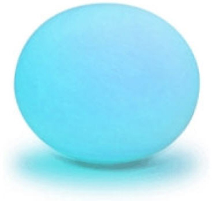
I was reminded of this conversation when I ran across an ad for the “Ambient Orb” this week. It is a large sphere that changes colors based on data input, such as the state of the Dow Jones Industrial Average. Here’s what it looks like when it is dressed in radiant blue:
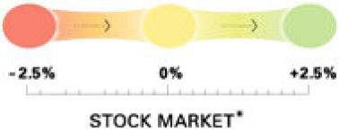
For those of you who prefer the ever popular traffic light colors of red, yellow, and green, it can be programmed to shine in this manner as well, as illustrated by this diverging range of colors for displaying the state of the stock market:
According to the New York Times, “This is ‘ambient information’ — the newest concept in how to monitor everyday data. We’ve been cramming stock tips, horoscopes and news items onto our computers and cellphones — forcing us to peer constantly at little screens. What if we’ve been precisely wrong?” I guess the gist of this statement is that we should be looking at bigger displays, rather than squinting at those tiny screens. “People want information, but they don’t want to invest a lot of time in getting it,” says Ambient president David Rose. “This makes getting information a ‘glanceable’ thing.” And what a wealth of information it is that we can derive from a single color!
I suppose that if you want some ever-present object in your office to alert you to a particular single piece of ultimately summarized information, the ambient orb could do the job. For those who don’t have a moment to spare, you could use it to tell you if its worth your while to actually look at your dashboard today. (In case you don’t know me well enough to know for sure, be assured that I am dripping with sarcasm right now.) Just as the dashboard can serve as a high-level front-end to a richer, more detailed fount of data, so can the ambient orb serve as the single-value front-end to your dashboard. Think of it as a mood ring on steroids.
Why not place one next to your bed and let it tell you whether its worth getting up in the morning, perhaps based on the weather forecast? I suppose that this is one way to deal with information overload, but are we really so busy and overwhelmed that we would choose to reduce information to this level? I’m planning to save my money ($150, plus shipping) for now, but if someone ever comes up with a lava lamp version, I might be tempted to buy.
Take care,

7 Comments on “Ambient Orb — For those who don’t have time for a dashboard”
Reminds me of the “the weatherball”
http://www.mnhs.org/exhibits/weather/weatherball.htm
Well, this is the ultimate “overview” so,
according to Ben Shneiderman’s mantra (“overview first, zoom and filter, then details-on-demand”) it must be right.
The on/off idea is even better.
There are really two kinds of people in the corporate world; those that would love this and those that would hate this concept. This product reinforces my tasty idea, that people want are drawn to something that looks “cool” versus what is effective and breeds thought and analysis.
I’m not sure what the split is but I would say it has to be around 50/50. That’s why products like Xcelsius are successful.
Steve – if you rotate the stock market jpeg above and make it a little wider, you would have a lava lamp version. You may be onto something here…
This makes me want to build a dashboard entirely by arranging several orbs on a bookshelf (think of it as “large multiples”). Instead of 2D screens that show lots of information in a small space, lets use 3D objects that take up lots of space but show only one piece of information. Forget data:ink ratio, it’s all about the data:mass ratio.
I am shocked, SHOCKED! That you would show satire and sarcasm on a blog toward a potential customer who obviously has a big ego that could be damaged.
It reminds me of the TSA security threat levels communicated in airports: “Today’s security threat level is Orange”. What can I do with that information? I’ve forgotten the scale (is orange good or bad?).
Yet I’m glad that Rose has done this. He is sort of the Donald Judd of Information Design (DJ is a minimalist sculptor famous for pieces like large, unadorned steel boxes.) He’s taken simplification to the limit.
While at a conference this week I set my blackberry to “stun” (i.e., to vibrate) and this also unknowingly triggered a setting to vibrate when I received an email. I thus had a subtle, unobtrusive….”ambient” signal of email activity and, thus, activity in my areas of interest. Although at first I thought they were phone calls, it was not bad.
-John
I guess if automobile dashboards went from gauges to a “check engine” light, it’s only natural that information dashboards should also follow this same natural progression of design simplification.
And since the Check Engine light in a car is nicknamed the “Idiot Light”, I’ll let you draw your own inferences about ambient orbs… ;)