When Are 100% Stacked Bar Graphs Useful?
I’ll begin this blog article by answering the question that appears in the title. I’ve found that 100% bar graphs, designed in the conventional way, are only useful for a limited set of circumstances. Unlike normal stacked bars, the lengths of 100% stacked bars never vary, for they always add up to 100%. Consequently, when multiple 100% stacked bars appear in a graph, they only provide information about the parts of some whole, never about the wholes and how they differ. Therefore, they would never be appropriate when information about totals and the parts of which they are made are both of interest, though normal stacked bars often work well in this scenario. I’ve found that 100% stacked bar graphs are only useful in three specific situations, which I’ll describe in a moment.
I was prompted to write about this when I recently read the book titled “Storytelling with Data” by Cole Nussbaumer Knafic. Cole likes 100% stacked bars. Several appear in her book. When Cole and I met for lunch last week, shortly before departing I asked if she would be interested in discussing matters on which we apparently disagree and suggested 100% stacked bar graphs as our opening topic. She graciously welcomed the opportunity, so I began the discussion via email later in the week. Our discussion focused primarily on the following graph that appears in her book as an exemplar of graphical communication.

This graph displays a part-to-whole relationship between projects for which the goals were missed, met, or exceeded by quarter. A 100% stacked bar graph never serves as the best solution for a time series. Stacked segments of bars do not display patterns of change through time as clearly as lines. In this particular example, only the bottom bar segments, representing missed goals, do a decent job of showing the quarterly pattern of change. The top segments, representing exceeded goals, invert the pattern of change (i.e., the lower the segment extends, the higher the value is that it represents), which is confusing. The middle segments, representing met goals, encode the quarterly values as the heights of the segments, not their tops, which makes the pattern of change impossible to see.
The following line graph displays the data more effectively in every respect.

Despite the perceptual problems that I identified in Cole’s 100% stacked bar graph, she feels that it is superior to the line graph above. Her preference is rooted in the fact that the stacked bar graph intuitively indicates the part-to-whole nature of the relationship between missed, met, and exceeded goals. While it is true that a line graph does not by itself state, “these are parts of a whole,” this can be easily made clear in the title, as I did above. For Cole, the stacked bar graph’s ability to declare the parts of a whole nature of the relationship without having to clarify this in the title overcomes its perceptual problems.
Let’s move on to the three occasions when I believe 100% stacked bars are useful:
- When the bars consist of only two segments (e.g., male and female)
- When we need to compare the sum of multiple parts among multiple bars
- When we need to compare the percentages of responses to Likert scales
Here’s an example of the first situation:

Because the bars are divided into two segments only (i.e., women and men), it is easy to read the values of each segment and to compare a specific segment through the entire set of bars. This comparison can be easily made because each segment is aligned through the entire set of bars (women to the left and men to the right). If a third segment were added, however, the segment in the middle would not be aligned to the left or right, which would make comparisons difficult.
I can illustrate the other occasion when 100% stacked bars are useful with the following example from Cole’s book:

The primary purpose of this graph is to compare the sum of customer segments 3, 4 and 5 in the “US Population” versus the sum of the same three customer segments in among “Our Customers.” Assuming that no other comparisons are important, the two 100% stacked bars do the job effectively. If I were creating this graph myself, however, I would be tempted to make a few minor adjustments. Assuming that the customer segments have actual names rather than numbers, which is usually the case, and that the specific order in which the segments appear above is not necessary, I would place the highlighted segments at the bottom of the stacked bars, as I’ve done below.

This gives the featured segments a common baseline, which makes the comparison of their heights easier. Although it isn’t necessary, I also placed the segment names next to both bars because the vertical positions of the segments are not aligned, which makes it easier to identify the segments on the right.
The final occasion involves the comparison of Likert scale responses (e.g., Very Dissatisfied, Dissatisfied, Neutral, Satisfied, Very Satisfied). Cole feels that a conventional 100% stacked bar handles this well, illustrated by the following example from her book:

This particular design does work well for the following purposes:
- Comparing Strongly Disagree percentages
- Comparing the combination of Strong Disagree and Disagree percentages
- Comparing Strongly Agree percentages
- Comparing the combination of Agree and Strongly Agree percentages
- Reading the percentage values for Strongly Disagree
- Reading the percentage values for the sum of Strongly Disagree and Disagree
However, it does not work well for the following purposes:
- Comparing Disagree percentages
- Comparing Neutral percentages
- Comparing Agree percentages
- Reading percentage values of the individual segments Disagree, Neutral, Agree, or Strongly Agree, because mental math is required
- Reading the percentage values for the sum of Agree and Strongly Agree, because mental math is required
Given these particular strengths and weaknesses, a 100% stacked bar graph of this design would work well to the degree that the audience only needs to access its strengths.
Variations on the design of 100% stacked bar graphs usually work better. Most of these variations display negative results (e.g., Strongly Disagree and Disagree) as negative values running left from zero and positive results (e.g., Agree and Strongly Agree) as positive values running right from zero. Here’s an example:
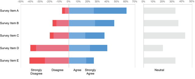
Designed in this way, differences between positive and negative results now stand out a bit more, the sum of Agree and Strongly Agree are easier to read, and the Neutral values are both easier to read and compare.
For some purposes, the Neutral results may be eliminated altogether, and for some it may be appropriate to split the Neutral results down the middle, displaying half of them as negative and half as positive, as follows:

In cases when it’s important to compare each individual segment from bar to bar rather than the sum of negative results (Disagree and Strongly Disagree) or positive results (Agree and Strongly Agree), a separate column of bars for each item on the Likert scale would work best, illustrated below.

Other than these few occasions when 100% stacked bar graphs are effective, I’m not aware of any other appropriate uses of them. If you’re aware of other good uses, please post and describe your examples in my discussion forum.
Take care,

91 Comments on “When Are 100% Stacked Bar Graphs Useful?”
Hi Steve,
Great post and summary of our discussion. I do still prefer the stacked 100% bars over lines in the first example. I like the intrinsic visual cue of the part-to-whole relationship and in this case think the trade-offs are worth it. In general, I don’t think there is a single “right” or “best” answer when it comes to visualizing data, rather different scenarios will call for different approaches and different individuals will make different design choices. For me, it’s about making those choices intentionally when considering how you want your audience to use the graph.
I like your first makeover of the Likert scale data in the final example. However, I find neutral-centering with data of this sort problematic if there’s variance in the amount of neutral across categories; this is illustrated in your second makeover in the final example. Upon initial glance, Survey Item C appears more positive than Survey Item D (because the former extends further into the positive space), when really it is not more positive but rather more neutral. The other views (including the original) avoid this issue.
Thanks for writing this and I look forward to our future debates!
Hi Cole,
Thanks for responding. Your comments give me an opportunity to address another apparent disagreement that came up in our email discussion. You wrote: “In general, I don’t think there is a single ‘right’ or ‘best’ answer when it comes to visualizing data, rather different scenarios will call for different approaches…” While it is definitely true that “different scenarios…call for different approaches,” are you saying that in a specific situation there is no single best solution? If so, I definitely disagree. We develop expertise in data visualization to become increasingly better at determining the best possible solution in each specific situation. Do you disagree?
I do (disagree). I’m pretty sure based on our previous exchange that you won’t like this, but my view is that data visualization sits at the intersection between art and science. There is absolutely some science to it: best practices and guidelines to follow. But I believe there is also an artistic component. This means two different people may attack the same data visualization challenge totally differently. There is room for diversity of approach. Paramount for me is that people use their creative license to make the information easier for their audience to get at, not more difficult. This applies to all design choices – graph type, yes (in which case there are arguably more best practices to follow than perhaps with some of the other areas I’ll list), but also things like use of color, the decision to include or remove specific chart elements, whether/how to annotate, and the use of story, to name a few.
Cole,
In your opinion, are some data visualization solutions better than others in a given situation or are they all equal in merit? If the former, on what basis can we judge one to be better than another? You mentioned that data visualization designers should “make the information easier for their audience to get at, not more difficult.”? This suggests that we can judge the merits of a data visualization by its ability to make the information as easy to understand as possible. Choices of graph type, colors, etc., are made to present the information as clearly and accurately as possible. If one data visualization does this better than another, it is the better solution–correct? If this is true, does it make sense to say that there is no “best” solution in a given situation among a set of proposed solutions?
I’m with Cole here, for the purpose the first chart works much better as 100% stacked bar serie.
Hi Cole,
without getting too much into your argument concerning the 100% bar charts, I would like to address your concern about the likert representation with the positive and negative going to either side of a fixed 0-axis.
You say answer C seems more positive than D although it really is more “neutral”. Usually with this kind of layout, the items are ordered by average answer score, which means that C actually IS more positive than D (you can also see that by comparing the size of the blue part to the size of the red red part). What seems to be more the case is that D is more controvers since there are as many positive as negative answers, while the majority of answers for C are positive.
It is a general problem with a likert scale with an odd number of possible answers. People tend to choose the neutral middle in order not to take a decision. That is in my opinion a poor question design, since it doesn’t give any insight in whether something is good or bad.
Theoretically you could ignore these answers completely and it wouldn’t neither really change the result you see (you still see whether it is rather positive or rather negative), neither would it influence the average, ie. the order of the items.
However including it DOES give an impression how “neutral” people think this item is, it might show that they just don’t care or maybe don’t know enough about the subject in question.
Stephen, I work in the education sphere and use 100% stacked bar graphs for comparing attainment rates as Cole does (though this is the only circumstance in which I do).
However, I invert the graph so that the equivalent of “Exceed” is at the bottom and “Miss” at the top. This works because the combination of “Exceed” and “Met” (i.e. all those who have “Passed”) is more useful than the combination of “Met” and “Miss”. If you imagine the results as layers of coloured sand being poured into a glass tube, highest results first, then “Miss” is the empty space at the top.
Stephen and Cole,
I think I’m with Stephen with respect to avoiding the 100% stacked bar chart for expressing sentiment with Likert-scale or NPS-like questions. To me the 100% stacked bar chart looks like cubist pie chart.
The chart type that has resonated very well with my clients — and that Stephen cites — is the divergent stacked bar chart, combined with the ability to superimpose NPS, a top two box percent, or an average Likert score (I reside mostly in the interactive dashboard world.)
Stephen, your line chart example works great here, but there are only three levels of performance. I run into problems if I need to show five levels of performance / sentiment and will again usually go to the divergent stacked bar with a line superimposed to help see a trend based on NPS, average Likert score, and so on.
Cole, you also mentioned that an over-abundance of centered neutrals may cause a problem in that the positive bars (which may be quite small) will be pushed farther to the right suggesting there are more positives than there really are. Do realize that the neutral bar also pushes the negative bars further to the left. That said, I have found that when you have a lot of respondents that have not committed one way or another, the wide, centered neutral bar really pops out. I can share you some real world examples and I think you’ll agree the centered neutrals make the comparison easier to see.
In cases where I fear that the neutrals might obfuscate the comparison I will add a checkbox that allows people to show / hide the neutrals (again, living in the interactive dashboard world.)
Hi,
I intuitively “like” Cole’s versions better – this is the first time I do not agree with Stephen (I generally love both blogs, btw.). So I wonder how much priming goes on in my brain: I already knew and liked Cole’s examples as well as her general style, so that may influence me (maybe irrationally).
One thing I can articulate: in both the project goals and agreement scores, I might care more about extrema than averages. If I want to see both ends in one glance, I don’t need to accurately compare the middle bar parts to each other. I will still notice that the “neutral” proportion is large for item C.
Also, as Steve Wexler pointed out, the project goal graphic can easily turn into a spaghetty graph.
Hi Steve,
In response to your opening paragraph in which you talk about 100% bars providing information “about parts of some whole, never about the wholes and how they differ”, my solution to this is to include a simple supplemental bar chart that shows the totals. I believe this provides important context as 50% of 1,000 is quite a bit different than 50% of 2. In my mind, using the 100% stacked bar approach alone fails to give that context.
Here’s an example of this approach that I use quite regularly – http://imgur.com/uy0Ywx1
Harley
While I agree with the overall message and point of this post, as far as the first example is concerned, I completely agree with Cole.
It seems clear to me that the goal of the first chart is to specifically highlight the percentage of missed goals, in the context of the whole.
To that end, I find the stacked chart much more clear.
While I agree that there are cases where the three separate lines are the right way to go – when the change of each set over time is the key message – in this case I find it more confusing to reach the same understanding that I get from the stacked bars.
One change I might make, given the purpose of the chart, is to make both the “met” and “exceeded” segments the same light grey color, to further push the emphasis on the “missed” segment.
On the next issue – I have always been annoyed by displays of likert scale data that lump “agree” and “strongly agree” etc., together. I think that with the average survey, there is a lot of important information to be learned from the difference between “this is kinda good/bad” and “this is really good/bad”.
I like the treatment of removing the neutral responses to a separate plot, as in the first example, and agree with Cole that using the neutral response as a central segment is a bit confusing.
Those of you who have expressed preference for the 100% stacked bar graph that displays goal attainment by quarter haven’t provided reasons for this preference other than impressions. Unfortunately, impressions are often misleading.
jlbriggs — You said that the 100% stacked bar graph makes “much more clear” the percentage of missed goals, in the context of the whole.” That actually isn’t the case. This fact is shown more clearly in the line graph. I know you to be thoughtful, so I’m taking your impression seriously, but finding that it doesn’t pass the “ask questions about the data” test. In other words, any specific question that I can think of that someone might ask about the data in this chart can be answered as easily or better using the line graph. If you disagree, please propose one or more specific questions that the 100% stacked bar graph can answer better than the line graph. I think what you like about the 100% stacked bar graph in this case is what Cole likes about it: it says “parts of a whole” without having to state this in the title. Beyond that, however, it suffers in almost every respect.
The potential problem that Steve Wexler mentioned–that fact that a line graph with more lines might turn into a mess of spaghetti–is definitely something to keep in mind. Depending on the nature of the data, more than about five lines would usually look cluttered because of overlapping. While it is true that there is no overlapping in a 100% stacked bar graph, more than a few segments would make the graph perceptually overwhelming in addition to the fact that only the bottom segment could be read with ease.
If I could make one change to Stephen’s line chart, I’d extend the Y-axis to 100%. I know normally line charts only need to cover the values of the data on the Y-axis (unlike bars, for example, which must be shown to extend from zero). But in this case since we’re trying to visualize these values as parts of a whole, even with them stated as percentages I think there’s value in showing the whole range, 0% to 100%.
Andrew,
In understand your intention, but disagree for two reasons: 1) extending the scale to 100% would, in many cases, force most of the lines into the bottom portion of the graph, thereby reducing the differences between them and flattening the lines; 2) it simply isn’t necessary, because we don’t interpret the values in a line graph by seeing how far up the scale the extend (e.g., 33% up the scale) but by noting the values along the scale that correspond to positions along the line.
Stephen –
” I think what you like about the 100% stacked bar graph in this case is what Cole likes about it: it says “parts of a whole” without having to state this in the title. ”
I think the main issue for me is not that it “says” part to whole… it “shows me” part to whole.
I can leave the line chart with the understanding that the data represents a part of the whole.
I can look at the bar chart and immediately understand that relationship, and see it demonstrated visually in front of me.
If I want to look at a given point in time on the bar chart, and understand the relationship between the three numbers, I find that easier in the bar chart.
If I want to understand the different patterns of change over time, I find it much easier in the line chart, of course, but if my primary interest is the missed goals, I can see that change over time pretty clearly in the bar chart.
Perhaps I am imagining the circumstances for which I would be using this chart differently than you are, or differently than intended?
I do certainly agree that the line chart’s axis should not extend to 100%. I have always argued against this method of showing the part-to-whole aspect.
@Stephen
I understand and generally agree with you. However, in this example I feel that
1) extending the scale to 100% for a chart with only 3 lines that must always total to 100% – and especially when one goes as high as 75% – doesn’t flatten them out so much (at least not to the point that they are difficult to follow), and
2) while it isn’t necessary, and while we don’t normally interpret values in line graphs that way, I do notice in myself (and suspect in other users) that there is a tendency to misinterpret the vertical position of points in the line as part of the whole height of the chart (this may, of course, be due to also examining the same data in the 100% stacked bar for too long).
For example: Let’s focus on projects that met their goals. Following the line, 2014 Q1 is obviously very close to the top. Yes, I can plainly see (much better than in the 100% stacked bar) that it is near 75%, but following the line, I do notice a tendency to assume it as near 100% – I have to remember to stop and look at the values to the left.
This tendency to misinterpret the vertical position of the lines might be why some people are finding the 100% stacked bars easier to comprehend.
jlbriggs,
Put this to the test. At any point along any line you can easily interpret the percentage that’s represented with no difficulty and much greater precision than you can with the 100% stacked bar graph. What you’re saying is that with a 100% stacked bar graph, without referring the quantitative scale you can get a rough sense of the percentage of a particular part at a particular point in time, which is true, but this is inferior to our ability to interpret the same value along a line. The fact that we must relate the position along the line to the corresponding position on the quantitative scale is not a problem–it is how a line graph works. In the same amount of time one can roughly interpret the percentage height of a segment in a stacked bar one can interpret the same value along a line with greater precision.
The point that I’m making is that the part-to-whole impression that one gets from a 100% stacked bar graph is of less value than the ability to actually interpret and compare the values, which a line graph supports more effectively. The information and eventual understanding that we get from a graph is more important than any impression that it provides unless that impression is all that matters.
I want to elaborate on a point that I made above. Assessments of the merits of data visualizations should not be based on mere opinions and impressions, which are often wrong, but on scientific tests and observation. We can argue forever based on opinions and impressions without reaching conclusions, but if we test the effectiveness of visualizations, we can make informed judgments.
The scientific revolution displaced the erroneous and harmful rule of mere opinions and impressions. As a result, we now know a great deal more about the world and how it works. We now live a great deal longer because we understand the nature of disease. When Cole promotes the role of “creative license” in data visualization to explain why there is no “best” way to visualize data in specific situations, I fear that she invites us back to a world of mere opinion and impression. I clawed my way out of fundamentalist religion and embraced science because my religious foundation, based solely on beliefs (a.k.a., opinions and impressions), was ignorant and in many ways destructive. Science offers us the best way that we’ve found so far to make sense of the world and to make it better. I’m not willing to step backwards into a world of belief.
When the best approach to visualizing data in a particular situation isn’t clear, we do the best we can based on the knowledge that we’ve developed over time, but we don’t leave it there. If we can, we test various approaches to determine what actually works the best. Is there a best solution in a given situation? You bet there is. Is it possible that we might discover at some point down the road that there is an even better solution. Absolutely. Science never declares a final answer. It is self-correcting. This lack of ultimate certainty isn’t a deficiency.
When we debate the merits of various approaches to data visualization, we should do so based on reliable evidence, not on some undefined notion of art’s role in the process. When the evidence isn’t clear, we do our best to debate the issues rationally and work to gather more evidence. We don’t slip back into the position that creative license negates the possibility of informed judgment. When you rely on data visualization as a means to make sense of the world and enable better decisions, you strive for excellence.
Stephen –
“At any point along any line you can easily interpret the percentage that’s represented with no difficulty and much greater precision than you can with the 100% stacked bar graph.”
I guess that, again, it comes down to my thinking of the stacked chart in terms of seeing the single element that is highlighted, with the other elements existing primarily for context.
Regarding the other two series, I agree fully with your point. If I want to know anything specific about the “met” data, the stacked chart is not very effective at all, and only slightly better for the “exceeded” data.
But I can’t see how the line makes it easier to accurately interpret the value of the “missed” data series at a given point in time. I can just as easily look at any quarter on the stacked chart and determine the % of the “missed” data, and at the same time get a general impression of the other two data elements for that point in time.
And provided that I am primarily interested in the “missed” data element (the assumption I made in the beginning), that impression of the additional data does suffice for the purpose at hand.
I’m enjoying the continued debate!
Steve, when it comes to the question of a single right or best answer, I’ve just published a post summarizing some of our conversation on this topic, which you can view here: http://www.storytellingwithdata.com/blog/2016/1/12/is-there-a-single-right-answer
I welcome others to lend their viewpoints through comments!
jlbriggs,
Let me correct something that I didn’t mean to say. It is true that for any particular quarter of time you can interpret the value of the bottom segment in a 100% stacked bar graph as well as you could interpret that value in a line graph, and in precisely that same way (i.e., in relation to the corresponding value on the quantitative scale). For this one purpose, a 100% stacked bar graph and a line graph work equally well. For all other purposes, however, the line graph is superior for a time series.
Cole,
I’ll repeat here what I posted as a comment in your blog.
How do you define “art” and “artistic license” in this context? As I wrote in my blog recently, people often speak about the “art and science of data visualization,” as you have, but rarely define what they mean by art in this context. This is what you have done here. We can’t discuss the merits of art in data visualization without defining the term.
You are missing the fact that your logic is internally inconsistent. If some solutions are better than others (i.e., more effective than others) in communicating data for a specific purpose to a specific audience, then by process of elimination we can compare all of the solutions to one another to determine which is best in that particular situation.
I would hesitate to claim that there is a single “right” answer, because this implies a moral judgment. I do not hesitate, however, to claim that there is a single “best” solution in any given situation among the many solutions that are available. If we agree that the goal is to present information in the way that is most understandable, then we can test each possible solution to determine which is best. The process is called “science.”
Hi Stephen,
This is a very interesting conversation. I find myself sitting firmly on both sides of the fence (which can be very uncomfortable depending on the height of the fence!). ;-)
You say, “Is there a best solution in a given situation? You bet there is.”, and this may, theoretically be the case. However, in reality, no such “best” has been scientifically proven and agreed upon for all possible “given” situations.
To me, this argument feels like two sides of the same coin. You are arguing that if there is a scientifically-proven “best” way to do things, then use it. But the other side of the coin is that if there is no scientifically-proven “best” way of doing things then you have to rely on something else to make your decision. That something else is what, I think, people are calling “art” or “creative license”, at least in the context of this conversation. You might say that that should be experience, not “art”. Yes, experience has a role, but that is true for everything, including artistic or creative license, so simply saying that something is based on experience does not inherently make it less artistic and more scientific.
Beyond that, there are the subtleties of science. Science is not always as clear-cut as you would seem to imply here. Often you have competing theories, each partially explaining observed behavior, none explaining all such behavior in every circumstance. Just as often we find theories that are found to be very strong, but only for very specific circumstances. Beyond those assumed circumstances, the theory may not always hold, or may never hold.
My point isn’t that we should not rely on science. When we have the science we should. If we don’t have it, we should certainly, over time, strive to fill in the gaps in our understanding. The operative phrase there, though, is “over time”. Between now and then there will be situations where the science is either not available, not definitive, or in dispute. But information still has to be communicated. So shouldn’t people be able to rely on their own “creative license” in order to organize and prioritize the internal knowledge they have gained through experience? Shouldn’t they be able to make a “gut” call?
I don’t see this as a step back into a world of belief. I see it as an acknowledgement that the world of scientific knowledge and understanding is, by definition, forever incomplete. Sometimes you have to make a call in the absence of definitive science (or maybe even sometimes in its presence ;-). Call it gut, or art, or creative license, but sometimes the science will not be there to be the final judge of what is “best” and something has to take its place in order for a decision to be made.
[Gratuitous sports reference…. Even in the world of Moneyball, managers still go with their gut on occasion, and the best ones are right more than they’re wrong. ;-) ]
Regards,
Brian
Hi Steve,
I think in this case, I’d define art as personal choice when it comes to the design aspects of the data visualization.
I don’t believe my logic is internally inconsistent. I think there is a point when the difference in effectiveness between two data visualizations might become insignificant for a given situation. A simple bar chart might be do a much better job of getting across information than a 3D pie chart (for example). In this case, yes, one is better than the other. But I can imagine other situations where two different visuals (whether different chart types or other different design choices, as I’ve discussed in my post) don’t yield significantly different results when it comes to getting the information across clearly. Neither of these are the single “best” answer. Rather, either could meet the needs of the scenario. That’s where the personal choice (or artistic license) comes in.
Totally get your point on “right” vs. “best.” Though your last comment brings up one point we touched upon in our live conversation – the fact that many of the studies informing this “science” are fundamentally flawed. How does that play in here do you think?
I’m enjoying this; I hope you are too!
Brian,
I appreciate your thoughts on the matter. Let me point out how our thinking is alike and how it differs. Scientific knowledge is indeed limited. Science has not and never will provide all of the answers. The shore of knowledge will never expand until it reaches the horizon. This does not mean, however, that when we encounter a situation for which science has not provided a clear answer, we abandon science and enter the world of art. Instead, we expand the boundaries of science. In these situations, creativity is needed. This creativity has nothing to do with art, however—at least not as I understand the term. The process that we use to discover the best solution in a given situation when the answer isn’t obvious has nothing to do with “artistic license;” it involves expanding what we know through experimentation and observation. Artistic license, as Cole is using the term, suggests that the process isn’t rational or empirical (i.e., scientific). Is it magic? Intuitions (gut feelings) play a role in the process, but good intuitions are the result of a great deal of good experience, not whispers from the muses.
Steve and Cole,
I think science might be able to tell us which is the “best” visual, but couldn’t it also inform us that two different visualizations of the same data set score so closely that for practical purposes it doesn’t matter?
What I think may lack from Stephen’s argument that the line graph is best – is a clear explanation of the science behind the argument. It seems like one may need to do several things here, such as:
1) Define which questions the visualization should answer
2) Weight those questions in some way
3) Have a random sample of the population answer the questions about each graph, and record whether the respondents a) got the answer correct and b) how long it took them to answer
4) Figure out a way to score the test and then analyze the results
I’m not trying to say the test above is the exact way to go about doing this, but I would expect to see some kind of scientific test performed that can better eliminate potential bias.
Cole,
Art means personal choice? If this is what you mean by art, wouldn’t it make more sense to say “personal choice” rather than “art” if you want to communicate clearly. We always make choices when we visualize data. This is a given. What matters is the basis on which we make those choices. Are they made based on an understanding of effective practices or on personal whim?
It is absolutely true that two solutions to a particular situation might be equal in merit, although this isn’t common. The critical point is that we should not determine this based on “artistic license,” but on a rational and empirical evaluation of the solutions (i.e., science). This is how we differ. There is never a point when we should stop trying to figure out what works best based on a rational and empirical process and give in to personal whim.
The fact that many scientific research studies are flawed is not a criticism of science. The studies that I criticize are flawed because the researchers failed to follow the methods of science. It is true, of course, that scientific findings can and often will be displaced by better findings later. These are not failures of science, however, but are due to limitations in our knowledge and technologies. It is due to the self-correcting mechanism of science that we are able to continually, step by step, overcome these limitations.
Matt,
Tests similar to those that you have proposed have been done, dating back to the early 20th century. I haven’t bothered to repeat the science-based explanations in this blog article only because I have covered them many times in the past. Cole is familiar with this science as well.
Cole,
In your own blog, you made the following comments in response to me:
Your clarification narrows things down in a useful way. As I understand it now, you are saying that, only when we encounter a situation for which we lack full guidance from science, must we make some personal choices, relying on our intuitions. I accept this as a given. This appears to be different, however, from your original position, which seemed to place art (what you have since defined as “personal choice”) on equal footing with science as the basis on which we make data visualization design choices. Are you now saying that, in situations when we have full guidance from science, we can choose the best among available solutions? If so, shouldn’t we focus our efforts on learning the science of data visualization, leaving as few choices as necessary to “artistic license?”
That’s an interesting question. I think we’re getting somewhere here! I never meant to imply art and science are on equal footing—I do agree that science gets us a good deal of the way there. But it isn’t the entire equation. Yes, I think certainly personal choice and intuition must be relied on in cases where we don’t have hard science pointing us one way over the other. I concede this is more often the case in finer design choices, for instance use of one color over another, and less common when it comes to graph types, which I think is what many of your points (especially early on) refer to. However, I also believe that there is a point at which two different visuals aren’t different enough when it comes to their ability to get information across for one to be clearly better than the other. This is another place where creative license or personal choice can come into play.
I keep coming back to the initial example of the 100% stacked bars in my original vs. the line graph that you recommend. You say science dictates that the lines are better. But I understand the science and accept that there are tradeoffs in the design process and believe the benefit I get with stacked bars in this case (implicit understanding of part of a whole) outweighs the cons of that choice (that it’s difficult to compare segments within a given bar; that isn’t my goal). You’ve claimed that isn’t rational, but I think being informed of tradeoffs and making a decision in light of that information is the definition of a logical and rational approach. And it is one that two different people might make differently. Is there a flaw in my logic here?
I prefer Cole’s design for (1) and use it extensively for the same application (though also for binned variables such as the ages of employees within a population). My reasoning is simple: it explicitly communicates that the user is looking at parts of a whole whereas for the line chart the user has to read the labeling, especially the title. It therefore passes my ‘one second rule’ i.e. Can the user see what’s going on in the first second?
The divergent line charts are interesting. Stephen, the time you & I met 6 years ago when we both presented at the London Tableau User Group I was invited because something I had written about (recommending) divergent bar charts for Likert data. Since that time we’ve done a lot of user experience testing of dashboards which included divergent bar charts and they are almost always a source of confusion for users. A couple of years ago we dropped them for the the stacked charts you recommend which score much higher in user testing. Our house style is to use 2 gradients of blue for the positive, two shades of red for the negative and grey for the neutral.
I have a big problem with splitting the neutral across the central part. A Likert question is really asking a user, who’s view is on a continuum to ‘bin’ their feelings to the nearest of 5, 7, 9 category. When splitting the neutral across the center what you’re saying is that we can treat half of this central group as positive and the other half negative (because you’ve put half one side and half the other side of a central axis). You have no way of knowing that this is true. As analysts we need to constantly question the process of measurement that has created the data.
Of course the other aspect is that I’ve yet to find a case where the user is interested in the neutral and therefore the neutral not sitting on an axis isn’t a concern. To generalize it further stacked bars are useful (a) when the user is interested in the extremes – eg exceptional or under performing staff. (B) when the data is hierarchical – eg Doctorate, Master, Batchelor as part of a ‘university educated’ group.
Understanding that I’m playing with fire my only instance for using pie charts is where there are two categories and that (a) you want to show the split between two parts of the population – usually gender; if you want to place the charts away from a common axis (eg on a map); if you want to code a third variable, eg population size. In many instances we’re not trying to communicate the accurate numbers but instead the split between two groups – is one bigger than another. When a difference is small (eg 45/55) a pie can meet this objective better than a stacked bar).
“The information and eventual understanding that we get from a graph is more important than any impression that it provides unless that impression is all that matters.”
Steve, I agree that if you want to accurately compare every category at every point of time then the lines are the best method. However, why should that be the only purpose of a chart? It’s one you imposed on these charts, but might not be the objective Cole had in mind when designing it.
Maybe Cole’s objective was to highlight the % missed only. The other bar segments are secondary information, not vital to her key objective in making a 100% stacked bar. The “impression” I get from her stacked bar is that Missed Targets have increased to 42%.
That said, if her objective was just to highlight % missed, then why not draw just that line and not the others? I’ve added more detail in the forum.
Andrew,
The least offensive thing I can say about your “One-Second Rule” is that it is just plain silly. It reminds me of Guy Kawasaki’s rule that a presentation should never consist of more than 10 slides (a rule that he himself breaks regularly). We include titles on charts to orient readers with useful information. Indicating in the title that a line graph displays parts of a whole adds no time to the process of reading the chart. What you gain is a chart that is considerably superior to the 100% stacked bar graph.
Regarding the Likert scale graphs, bear in mind that I’m not saying that the examples in this article are the best way to display Likert scale results. Several approaches are available, which serve different purposes, some of which might indeed work better.
Throughout my life I have philosophically approached the “Either / Or” question with the answer of “Both”. And I especially do so when “Both” is indeed the best answer. I find this intellectual tug between “either” stacked bars “or” lines to be drawn too far down the myopically false assumption that data can represented in “either” one chart type “or” the other.
Let us not forget the immense value that interactivity brings to the field of data visualization. With today’s tools, we can visually communicate this data in one, or both, or all three chart types. And we can do so in a single, immersive and interactive medium.
Much like a jeweler looking at a new gem through his loupe, we would be amiss if we failed to look at each data set from multiple angles. If we did not turn it in our hands, observing from more than one perspective, we would fail to fully understand all of the data’s facets.
The same is true with our visual communication of this data to others. To convey a complete and accurate understanding, we are amiss to present the “gem” in a single, static chart.
Rather, we must strive to build interactivity into our presentation: the ability to drill and twist. We must present the same gem through multiple, interactive lenses. Only then can the consumer fully understand the data, and fully surpass the limitations of any one chart type.
Andy,
I’m not imposing any particular meaning on Cole’s 100% stacked bar of time series data. The line graph works better for every purpose. For example, if you want to highlight the percentage of projects that missed their goals and the other categories are only of secondary interest, which was Coles’ stated purpose, the line graph does this better. You are welcome to identify a specific purpose for which the 100% stacked bar version of the graph is superior. So far, no one has. The only argument that has been made in favor of the 100% stacked bar graph for this time-series data is that it indicates the part-to-whole nature of the data without needing to point this out in the title.
Keith,
No one is arguing against the usefulness of interactivity. Having the ability to view data from every possible perspective in many different ways is not only useful, it is necessary for data exploration and analysis. Where I, and perhaps Cole, would disagree with you, however, is in your insistence that all data presentations for all purposes benefit from interactive graphs. The assumption in this particular discussion is that we are presenting a particular story we’ve found in the data. Interactivity is not required to tell this particular story. Not everyone is a data analyst who wishes to explore the data on their own.
Thanks for a fascinating conversation! Steven, I have your first 3 books, recommend them regularly, hand them to new staff, they have been a wonderful resource. Cole, I have your book on order now :-).
I’ll offer this supposition: As many have noted, the audience is a key participant. It is not enough that they cognitively perceive the information accurately and quickly, they must also believe that they understand it. The art, then, of the analyst is to create visuals that are clear, avoid known perceptual & cognitive biases, and that the audience believes in their own understanding.
My hypothesis is that this is due to the audience’s belief in their own understanding. Anecdotally, I have had many a draft dashboard with line-graphs showing part-to-whole asking come back with the question: “can’t you just use some pie-charts?”. Using 100% Stacked-bars have been an acceptable compromise.
In a presentation setting, they may ask questions to prove to themselves (or others) that they get it. If I were presenting Cole’s graph, the design is excellent for my typical audience because:
1) Clear: It has a clear primary message
2) Avoids distortion: Stacked-bars don’t distort the primary message
3) Audience belief: Stacked-bars inspire self-confidence in audience
4) Audience belief: It allows (and answers) typical secondary questions like, is this a meaningful sample size? [Yes, 230-270 projects] Are we exceeding goals on other projects?
It would be interesting if anyone has a study of this element and/or there is another term-of-art for what I’m calling “Audience belief”.
Will,
In what sense is an analyst’s ability to “create visuals that are clear, avoid known perceptual and cognitive biases,” etc. acts of art? These abilities are informed by science.
Any questions that you ask members of a “typical audience” about the line graph, as opposed to the 100% stacked bar graph, will elicit equal or superior answers. Your statement about “audience belief” is conjecture. There is no evidence that 100% stacked bars inspire more “self-confidence.”
Stephen:
“The only argument that has been made in favor of the 100% stacked bar graph for this time-series data is that it indicates the part-to-whole nature of the data without needing to point this out in the title.”
I still feel there is a misunderstanding of this issue.
I don’t have any problem reading the title of the chart, and having a full understanding that the data represented in the line chart represents a percentage of the total (and I fully agree that a “1 second rule” is silly, and without useful purpose).
The difference is between knowing this information, and seeing it’s relationship directly illustrated visually. Sometimes that’s not the goal, sometimes it is.
We appear to agree on more of this issue than we disagree.
Your clarification that the understanding your red line vs understanding the original red column are not significantly different, to me, settled it.
If my primary goal is to accurately understand the values and trend of the “missed” data series, and a secondary goal is to understand that in terms of its part-to-whole relationship, I can see that very well in the first chart.
This is the specific use case that I am asserting, that I have gone back and forth between these two charts dozens of times looking for, and I continue to see the original chart as the more useful in that case.
I think we all unanimously agree that if the purpose is to understand the changes over time of all three series equally well, the line chart is a clear winner.
In regard to the “artistic license” part of the discussion – it seems to me, from reading back and forth between your comments and Cole’s, that you are referring to the same part of the process where you use your intuition, experience, and personal preferences to fill in the gaps where the science does not fully inform us (or where we are ignorant of such information).
It seems to my observation and experience that Artistic License is a pretty common way to describe, among other things, this personal interpretation of how to fill in the gaps, and of how to implement what the science does inform us of.
I agree that it’s good to be clear on terminology, and it’s good to follow what the science tells us.
But there will always be a limit to what the science tells us – collectively – and how much of that science we can know and understand – individually.
And whatever you want to call it, what Cole is terming artistic license will always be the way that we handle the gaps.
Cole,
Let me being my response to your most recent comments by summarizing our positions as I now understand them. We both believe that science should inform data visualization design decisions whenever the science exists. We both believe that personal judgments must be relied on whenever guidance from science does not exist. Something that I haven’t already stated, but definitely believe along with you, is that some design choices are made from many potentially effective alternatives. For example, when choosing colors for a chart, many potential combinations of colors could work equally well. The same is true of font choices. Where we might differ is that I believe that these choices that are made from many potentially effective alternatives are few in number. The two that come to mind immediately are those that I’ve already mentioned: colors and fonts. I’m sure there are others, but I believe that there are relatively few. In other words, I believe that the appropriate realm for personal choice is limited and minor compared to the realm of choices that are guided by science. I further believe that when guidance from science isn’t available, we should seek to remedy through observations and testing, to determine objective guidelines. And finally, like you, I believe that the best practices that have emerged from science are not rigid rules that we should follow blindly. As we develop expertise in data visualization, we learn how things work to the level that enables us to bend and break the rules at times to make data visualizations as effective as possible.
Now, let me respond to a specific question that you asked in your most recent comments about your 100% stacked bar graph versus my line graph of the time-series data. You continue to believe that your graph is the better solution for this particular situation and I believe that my line graph is more effective. I think that your position fails to consider the weight of the evidence in favor of the line graph’s effectiveness over the 100% stacked bar graph in this situation. Here are the pertinent differences, as I understand them:
1. It is perceptually easier to follow the pattern of change through time along a line than to do so by connecting the tops of bar segments.
2. A line presents the pattern of change in a way that requires the processing of less visual content than bar segments.
3. Patterns of change are presented simply and clearly along the lines that represent Net and Exceeded goals, but they are presented in a way that is difficult to perceive for the Exceeded segments of bars and impossible to see for the Met segments of bars.
4. A line makes it easier to compare the patterns of change among Missed, Met, and Exceeded Goals, but the stacked bars make it difficult to compare the patterns of Missed and Exceeded goals and impossible to compare the pattern of Met goals to either of the other categories.
5. A line makes it easy to read all of the values, while the stacked bars only make it easy to read the values for Missed goals.
6. A line makes it easy to compare values from among categories for any particular quarter, but this is more difficult using the stacked bars.
7. The 100% stacked bar graph inherently indicates the parts-of-a-whole nature of the data, but the line graph indicates this in the title, which must be read anyway, and therefore does not cost anything in time or effort.
Given these facts, I consider your preference for the 100% stacked bar graph a case of bias rather than an unbiased consideration of comparative benefits.
jlbriggs,
Please consider the comparative benefits of the two charts that I listed above in my comments to Cole. While it may be true that, if all you care about is the fact that Missed goals increased and care little for anything else, this can be seen in the 100% stacked bar graph, this can also be seen just as clearly in the line graph. Plus, the line graph provides a great of additional useful information. Given this fact, why would you ever choose the 100% stacked bar graph.
Let me share a basic rule of thumb that I follow in my work: When choosing between multiple forms of display that communicate the primary point with equal merit, if one does a better job of presenting the other information that also appears in the display more effectively, choose that one.
jlbriggs,
Regarding what Cole is now calling “personal choice,” which avoids the confusion that was caused by the term “art,” I agree that personal choice gets involved when science provides no guidance. How could I not agree with this? This agreement, however, is the result of a long discussion that began with “art” (without definition) seeming to play an equal role with science, according to Cole, in data visualization. This position concerned me for obvious reasons. Some context will put this into perspective. Cole promotes the work of David McCandless. Knowing this, I had good reason to be concerned about her understanding of the role of art in data visualization.
Stephen, on “art”, I think the difference may be largely semantic. I see the process of science as uncovering underlying principles. The “art” of X is the verb, the actions and thousands of micro-decisions that principles don’t cover. Actions can be take with knowledge without knowledge of the principles. For example, “the art of pottery” could be performed before the principles could be described. Science uncovered principles about the clay-mixture, oven-temperatures, glaze-properties etc. Knowledge of the principles allows for more consistent and reproducible results.
I would agree with you that each element will provide more consistent, reproducible results if based on sound principles, uncovered or informed by science. The act of creating the each graph is, in my terms, the “art”.
I also agree that the “self-confidence concept” is conjecture, based on my own set of observations. In the hierarchy of evidence, ‘anecdote’ is the least authoritative, but it is not equal to zero nor constitute a counter-example. I recall reading your newsletter some time ago on the subject of people inability to let go of pie-charts in which it was suggested that people really like circles. Might it be equally well explained by a theory that people *believe* they can interpret them, thus treat them preferentially?
Perhaps someone will point us to (or conduct) a randomized controlled study on user confidence of graphical interpretation and provide us with principles to inform future work.
Respectfully, Will
P.S. so many comments I missed jlbriggs who said much the same as me on “art” but rather more succinctly :-)
“And whatever you want to call it, what Cole is terming artistic license will always be the way that we handle the gaps.”
This is regarding the differences in approach for the first example only.
While some may find Cole’s example more aesthetically pleasing, Stephen’s line graph does communicate the information more effectively.
1. The line graph demonstrates the general trend of each category more effectively.
2. The line graph makes it easier and faster to estimate approximate values for each time period. This is especially true of the category falling in the middle section (i.e. Met).
Don’t be fooled. It may not look like it, but it sure smells like pie.
Will,
I asked Cole what she meant by “the art and science of data visualization” because her initial position suggested a broader definition of “art” than her current substitution of “artistic license” with “personal choice.” As I mentioned above in my comment to jlbriggs, my concern was based in part on the fact that Cole promotes the work of David MaCandless who uses artistic license as an excuse for ineffective design.
Regarding pie charts, I doubt that people often indicate a preference for them over bar graphs of the same data because they believe they understand pie charts better. Do you have any reason to believe that people think they understand pie charts better than bar graphs? I don’t. Since you brought up pie charts, I’ll use this as an opportunity to point out that Cole states quite frankly in her book that “pie charts are evil.” Why? Because they are perceptually difficult to read. Like me, she suggests that people use a bar graph to display a part-to-whole relationship, even though this requires that something extra be done to point out that the bars add up to the whole of something (i.e., 100%). However, Cole does not recommend the use of line graphs for parts of a whole that change through time over 100% stacked bar graphs. With pie charts, Cole feels that the immediate understanding that the pie chart is showing parts of a whole is trumped by the perceptual superiority of a bar graph, but in the case of parts of a whole that are changing through time, she feels that the immediate understanding that the 100% stacked bar graph is showing parts of a whole is not trumped by the perceptual superiority of a line graph. I find this puzzling.
Stephen,
Could you please direct me to the studies you refer to?
Googling has only led me to this article…
https://www.perceptualedge.com/articles/visual_business_intelligence/displays_for_combining_time-series_and_part-to-whole.pdf
…which provides the same response you articulate in this blog post, but does not reference specific studies.
And thanks for hosting this conversation! It has has triggered a small debate at my workplace. We generate a client report that uses a stacked bar chart similar to the one that started this conversation, and based upon available data, we may swap it for lines.
thanks much,
Josh
To elaborate on my comparison of the stacked bar (as used in the first example) to a pie chart is that while I do find stacked bars marginally easier to interpret than pie charts when dealing more with multiple categories, I am still forced to work pretty hard to approximate length/area (much akin to the pie chart). In this way, I find the stacked bar to pretty much be a pie chart that’s axis has been straightened; an improvement (yes) but still not the best option.
To me, the argument for value in immediate implied understanding of parts of a whole falls short in the greater communication of the data.
Stephen,
I don’t know David MaCandless’s work, so I can’t add much there. It seems, from comments here and in her blog, that you may hold more similar views than initially believed.
I do not have reason to think people strongly prefer pie charts to 100% stack-bar-charts and have had success at replacing pie charts with stacked bar charts. Where I run into difficulty is in introducing line-charts as in your example at the top. From my experience, Cole’s recommendation of stacked-bars for part-to-whole over time is more acceptable to users than line-chart part-to-whole, as measured by positive vs negative comments from my users.
So what then: I understand and concur with the arguments to why the line chart is more perceptually effective and should be preferred. Yet I get push-back. If it is truly more effective *for the viewer* then I would get pleased acquiesce. Lacking that, I must conclude that there is another principle at work that I do not have clarity around. My working hypothesis is my conjecture of “user confidence of interpretation”, which I would suggest is very similar, perhaps a precursor, to Cole’s “immediate understanding”.
Josh,
For research findings regarding the use of lines for displaying time series and other data across interval scales, you’ll need to review several sources. I would begin with the work of the Gestalt School of Psychology. Other useful sources would be the work of Jacques Bertin and William Cleveland. Bertin studied various attributes of visual perception (positions, lengths, colors, sizes, etc.) to determine which worked best for various purposes. Cleveland did research to determine the best visual attributes for displaying quantitative information, finding that differences in 2-D position (e.g., positions of data points along a line in a line graph) worked best. For the best collection of research in visual perception and cognition studies related to data visualization, you should read Colin Ware’s book, Information Visualization: Perception for Design. For a introduction to these principles, rather than a deep dive, you can read my book Show Me the Numbers.
Will,
Good for you that you aren’t familiar with David McCandless’ work. I recommend that you maintain this unfamiliarity.
You wrote: “If it [a line graph for parts of a whole changing over time] is truly more effective *for the viewer* then I would get pleased acquiesce [sic]. Lacking that, I must conclude that there is another principle at work…” Actually, this is not a necessary conclusion. People’s perceptions are not always accurate. What they think is happening is often quite different from what is actually happening. This fact is well established by cognitive science. The charts that people prefer are often not the charts that work best. As designers, we are responsible for giving people what actually works–what serves their interests best–not necessarily what they want. I’ll be speaking to a large group of designers in Vancouver on Friday evening. I’m planning to emphasize this important truth in my talk. Henry Ford once said, “If I had asked people what they wanted, they would have said faster horses.” It is our job as designers to push back when people ask for things that we know aren’t best for them, otherwise, we’re not doing our job. We are responsible for what we put in the world. We ought to be designing visualizations that work as well as possible.
This conversation is continuing faster than I can keep up with!
Steve – one clarification – you say that I promote the work of David McCandless. I highlighted a single example of his in my book that I think is particularly effective (an annotated line graph showing breakups using Facebook data over the course of calendar year). Please don’t mistake this as a full endorsement of every visualization he’s ever created. I will often applaud or critique the work of someone else. This isn’t meant to be a statement that everything that person or news outlet creates is good or bad. That’s just silly!
In response to your numerated comment/question above – I’d love to bring up the article Andy Cotgreave posted in response to the debate (here: http://gravyanecdote.com/visual-analytics/dataviz-criticism-know-the-authors-intentions-first/?es_p=1169521). He separately asked me about my intention for the data viz in question. I’ll repeat my response here:
___
My intention was to draw focus to the increasing proportion of missed goals, while still preserving the context of the other categories. I saw your [Andy’s] redesign in the line graph and agree that if that’s the single thing we want the audience to take away, that could work. But in doing so, I’d anticipate that one of the first questions from an audience would be: ok, missed went up, but does that mean meet met down or exceed went down, or did both go down? By preserving this context, we already have answers to these secondary questions. [Note: Steve, your lines allow for these secondary questions to be answered, too, so same point doesn’t apply] And by making them grey and pushing them to the background, I can do so without adding much clutter. It also allows me to have the built-in visual cue that the segments we’re focusing on are part of a whole. [Steve, this is the part I don’t get with your graph.]
These were all intentional choices. Steve keeps going back to his line graph, but for me, something is missing there that isn’t with the stacked bars. As you say, there is always compromise involved.
___
So, Steve, my reason for choosing 100% bars over the lines you recommend is mainly about making this part-to-whole quickly visually obvious (and not making the audience read to get it). You don’t seem to accept this as a valid reason and I’m honestly not sure how to respond to that!
Cole,
Regarding David McCandless, you actually refer to two of his visualizations in your book, one of which is notoriously bad (cultural color semantics). I am encouraged to hear that you don’t broadly endorse his work, but I’m disappointed that you feature examples of his work without warning about the bad practices that he promotes.
It is helpful to get a clear statement of your reason for using a 100% stacked bar graph for the time series example in your book rather than a line graph. I understand that you chose it because it immediately indicated “parts-of-a-whole” without having to clarify this in the title, despite the fact that it exhibits many perceptual problems. You are correct that I do not accept this as a good choice. As I indicated when we first began this discussion, I’m puzzled by the fact that you chose the 100% stacked bar graph when the line graph is superior in every way except for the fact that the part-to-whole nature of the categories “Missed,” “Met,” and “Exceeded” must be clarified in the title, which adds no complication or time to the viewing process. Given the principles and practices that you teach in your book and courses, I would expect you to choose the chart that provides greater clarity, understanding, and the least amount of effort.
Despite the many ways in which you and I are aligned, this is definitely a difference in our approach to data visualization.
Steve—You say that the title clarification in your line graph doesn’t add more time to the viewing process. But reading does take more time. Visual processing is faster than verbal. With the stacked bar, I am relying on visual processing and eliminating the need for the viewer to read. I think this is a case of trade-offs, not a clear “lines are right, bars are wrong.”
(Also, you’re right, I totally forgot the second McCandless visual I refer to in the book—the colors in culture wheel. I find this useful for being able to look up the connotations of colors in different cultures. I’m probably opening a huge can of worms here, but what’s your specific issue with this one?)
Cole,
I said that placing the part-to-whole clarification in the title did not add to the time that was required to process the information in the graph. You place titles on all of your charts. I assume that you expect people to read them. If you’re referring to the extra time required to read the additional four words “Percentages Out of 100%,” I’ll grant you that a fraction of a second has been added, but that is easily offset by the perceptual difficulties that we face when reading the 100% stacked bar graph. It is not accurate to reduce my position to “lines are right, bars are wrong.” My positions are never expressed in this naive manner.
(Regarding McCandless’ colors in cultures wheel, rather than taking this discussion down another path, I’ll send you my redesign of this chart directly.)
Stephen and Cole,
If the organization looking at either the 100% stacked bar or line chart cannot easily see that they have a problem, then that organization should not be in business.
That said, I maintain that the divergent stacked bar approach I present below provides the most versatile solution. We can have more levels of attainment and it will remain easy to read and understand.
Se http://www.datarevelations.com/images/DR_GoalAttainment.jpg
Stephen –
“Some context will put this into perspective. Cole promotes the work of David McCandless. Knowing this, I had good reason to be concerned about her understanding of the role of art in data visualization.”
Point taken, and I assumed something along these lines to be behind the issue.
(and agree that using “art” as an excuse to say to hell with rules or whatnot is a terrible thing that is also a real danger)
Stephen / Cole:
Cole said:
“These were all intentional choices. Steve keeps going back to his line graph, but for me, something is missing there that isn’t with the stacked bars. As you say, there is always compromise involved.
___
So, Steve, my reason for choosing 100% bars over the lines you recommend is mainly about making this part-to-whole quickly visually obvious (and not making the audience read to get it). You don’t seem to accept this as a valid reason and I’m honestly not sure how to respond to that!”
Which also still sums up my thoughts.
You seem stuck on the “but they can read that it’s part-to-whole in my title, so it’s the same” – but it’s not the same.
It’s not a matter of understanding, intellectually, that the data represents a part to whole. Yes – we can all read and understand that, and understand what you’ve plotted. There is no disagreement there.
What we’re talking about is seeing it visually displayed. Seeing the relative parts-to-whole of all series visually displayed.
– Not “what are each of the three values”.
– Not “what, precisely, are the two contextual values”
What is my primary data point that I want to see, and what does the overall part-to-whole relationship with the other variables look like?
The main data series is easily decoded, and the other two provide context in way that it does not exist in the line chart.
I don’t know that I can clarify any further than that, but there seems to remain a misunderstanding of what I am actually saying here…
jlbriggs,
I understand what you are saying. Our disagreement is based on a difference in the overall merits that we assign to the two charts. You believe that ability of the 100% stacked bar graph to convey “these are parts or a whole” in a visual manner trumps its deficiencies. You believe that, as long as the “Missed” time series can be read in the 100% stacked bar graph, the fact that the line graph does this just as well (actually, slightly better) and provides many more benefits that the 100% stacked bar graph lacks is of no significance. I disagree. I evaluate the merits of a graph on its ability to efficiently communicate useful information–the more useful information, the better, because the result is greater understanding. The line graph provides much more useful information and it does it in a way that is much easier to access.
I get that you and Cole believe that it is of greater value for a graph to communicate visually than in words. I share this preference, but I don’t allow it to override other concerns that are greater. If, through the addition of four words to a title, I can use a line graph in this case to provide a great deal more useful information, there is no contest.
I hope that everyone who participated in this discussion, either by contributing to it or merely by reading it, has taken something of value from it. I appreciate Cole’s gracious willingness to have some of her work evaluated in this manner. Despite our disagreements, the similarities in our perspectives are much greater than the differences.
This discussion has illustrated the fact that experts can disagree, and when they do, it is useful to do more than simply say, “Let’s agree to disagree,” which should be our last resort, not our initial response. We learn by discussing our disagreements.
This interaction has also shown that disagreements about the merits of particular data visualizations cannot be debated merely by listing their strengths and weaknesses. The calculus is much more complex. It involves differences not just in knowledge and experience, but in values as well. I evaluate the merits of data visualization somewhat differently than Cole does. It’s useful to recognize this and to think deeply about our values–what matters most to us. All of us are probably striving to do good work, but how we measure it differs. Sometimes how we measure it can be improved.
One of the primary concerns that motivated me to launch this discussion was the popular notion that data visualization is as much art as science. I suspected, based on things that Cole had said, that she might be in this camp. This concerned me because I’ve seen a great deal of harm done in the form of ineffective data visualization, all in the name of “artistic license.” I was pleased to discover that by “art,” in the context of data visualization, Cole means “personal choice,” and that she embraces personal choice only in matters that are not clearly addressed by science.
I want to thank Cole and everyone else who participated for helping me think about these important issues more deeply and in new ways.
Steve, thanks very much for starting this discussion in the first place!
I absolutely agree that the intersection of the things you and I agree on when it comes to data visualization is far larger than that which we do not. I welcome further opportunities to explore and discuss the latter—I agree that it’s by doing so that we can all learn from each other and help advance the field.
I echo what many have said in various forms here and over on my blog, which is that it’s great to see so much passion around data visualization. Big thanks to everyone who contributed to and followed the discussion!
It is nice to have a disagreement, starting with a critique of someone’s work, that doesn’t devolve into another “Stephen Few is mean!” debacle :D
I’ve been following Stephen’s work for a few years now, and have learned an immeasurable amount from doing so. I only discovered Cole about 2 months ago, and couldn’t believe I hadn’t read her blog before – I exhausted the ‘Makeovers’ and ‘Tips’ listings in a couple of days, which has been very helpful as well.
One question at the end of this Stephen – are you comfortable with the term “artistic license” to describe that part of the process, or do you still dislike it for it’s potential to be misunderstood or misrepresented?
jlbriggs,
Personally, I wouldn’t use the term “artistic license” in place of “personal choice” to describe the design decisions that we must make when there is no clear guidance from scientifically informed best practices. The term “art” and its derivatives carry too many implications that can be misleading. The term “license” suggests that special permission is being given to do things that are normally inappropriate, as if anything goes. When faced with design decisions that aren’t clearly guided by known best practices, we still do our best to choose what we think will work most effectively; we don’t resort to whim.
After looking at comments from Cole and Stephen; I think I agree with both =) For the purpose of this argument lets say the best solution is the one that transmit the intended idea in the least amount of time possible. Is there a “best” solution? Mot likely (although it could be argued that two visualization transmit the exact same message in the exact amount of time). However; I do not think is attainable to get a single “best” solution. Why? Because visualizations are seen and interpreted differently because each person have different set of eyes, a different brain and a different set of life experiences that affect the perception of the visualization. Even the metrics used to measure the best visualization can become quite complex. Therefore in based of all the “unknown” we can certainly have multiple “best” solutions. Therefore Cole have a point. As “artists” of data visualization, each “artist” will select and tweak (and tweak again and again) their visualization attempting to make things clearer for the receptor which in many cases we barely now.
Stephen,
I very much enjoyed reading and participating in this conversation. I agree, we are so much better off when we can discuss our viewpoints in a reasonable way.
It seems, in the end, that a fair amount of your resistance to Cole’s original thoughts falls at the feet of the words “art” or “artistic”. It seems clear that you consider art to be quite a separate thing from science, seemingly to the point of never the twain shall meet. :-)
However, linguistically (and historically), any such distinction is not as strong as you seem to hold it to be.
For instance, from the Oxford English Dictionary (2nd ed), there appear the following definitions of art, not including phrases and obsolete usages (ordered by appearance in the dictionary):
1. Skill in doing anything as the result of knowledge and practice.
2. Human skill as an agent, human workmanship.
3. The learning of the schools (referencing the Trivium)
4. Skill in applying the principles of a special science; technical or professional skill.
5. The application of skill to subjects of taste, as poetry, music, dancing, the drama, oratory, literary composition, and the like; in modern usage, skill displaying itself in perfection of workmanship.
6. The application of skill to the arts of imitation and design, painting, engraving, sculpture, architecture.
7. Certain branches of learning which are of the nature of intellectual instruments or apparatus for more advanced learning (again, examples being the Trivium and Quadrivium).
8. A practical application of any science; a body or system of rules serving to facilitate the carrying out of certain principles.
9. An industrial pursuit or employment of a skilled nature; a craft, business, profession.
10. A pursuit or occupation in which skill is directed towards the gratification of taste or the production of what is beautiful.
11. [omitted because the use is in the form of phrases, e.g., healing art, industrial art, etc.]
12. An acquired faculty of any kind; a power of doing anything wherein skill is attainable by study and practice.
13. Studied conduct or action, especially such that seeks to attain its ends by artificial, indirect or covert means.
14. An artifice, contrivance, stratagem, wile, trick, cunning device.
I think we can safely ignore 13 and 14 for this conversation (at least I hope we can ;-).
3 and 7 deal with a classical sense of learning that is, again, not related to this particular conversation.
Of the remaining definitions, only 5, 6 and 10 refer to art in the sense of a pursuit of beauty or to subjects that might be considered classic “arts”.
The rest of the definitions, the largest set, deal with art as a skill. They talk about skill developed through practice, skill in applying the principles of a science, or skill in the context of professional capabilities.
The word artistic is defined as “pertaining to art”. In this context, wouldn’t artistic license, then, most reasonably be interpreted as referring to the application of the skills of a science developed through practice of the subject at hand? Based on my reading of Cole’s comments (and others comments) this certainly seems closer to her intent than any definition focused on beauty, for example.
This conversation seems to me to largely be an argument not over the value of science in informing data visualization practices, but over the working definition of the word “art”. When we want to have meaningful discussions we must first agree on the definitions of the things we intend to discuss. Otherwise we talk past each other, each intent on proving our point, but not necessarily discussing the same point at all (a fact you have pointed out numerous times and to excellent effect, for example, in your discussions of “Big Data”).
Again, thanks for providing the forum for such an engaging discussion.
I think one thing that is lost in the art vs. science discussion is the role of context. In the case of the bar graphs vs. the line graphs, I might choose to use bar graphs if the audience has already seen a lot of line graphs, especially if the other line graphs show something much different (e.g. stock prices.)
I suspect that one reason that so many people don’t like the line graphs is that people see so many line graphs so often that there’s a certain amount of line graph fatigue–especially in finance. This makes it that much more likely that people’s eyes will glaze over when they see a line graph, financial or otherwise. Especially if they consider themselves non-experts in finance.
Similarly, when I do web design I avoid large, wide rectangles because they look too much like banner ads. I learned this the hard way. Error messages on a yellow background–the most important information on the page– were going unheeded. In another case my boss showed me a client’s website where they had put the link to our site in a colored background; he asked me where it was in the page–it was dead center– and it took me over a minute before I gave up!
So there may be something similar going on with line graphs: people have been trained to ignore them through unpleasant associations. That wouldn’t show up in a study of pre-attentive attributes, where the participants are shown a graph in isolation and told explicitly to study it. It also depends on the cultural context.
But that’s the sort of thing artists would be more attentive to.
Brian,
From the beginning, I have merely said what you said at the end of your comments: we cannot talk about the “art and science of data visualization” as Cole did without first defining what we mean by art.
David,
I doubt that the audience for Cole’s time-series graph would find line graphs any more familiar, and thus fatiguing, than bar graphs. Even if they did, I wouldn’t choose a less effective form of display merely because it was more familiar, and thus a potential source of greater graph-fatigue. Also, I am not aware of any actual evidence that the problem of “graph-fatigue,” resulting in reduced effectiveness, exists. And finally, I suspect that, if evidence for “graph-fatigue” actually existed, people familiar with the science of data visualization would be every bit as sensitive to the problem as artists–perhaps more so.
rjss,
The degree to which a particular chart varies in its ability to communicate a specific message to different people is only slight. This is because the perceptual and cognitive processes that are involved in chart reading vary little from person to person. Therefore, we can indeed design a solution that will work best for the vast majority of people. The only significant perceptual difference that we must keep in mind concerns color blindness, which affects approximately 10% of males and 0.5% of females. We can easily address this for almost all cases, however, by avoiding the use of both red and green to encode different meanings in a single chart.
It is not clear from the article (or from the comments I have read) what decision the chart is intended to support. Without this, it is difficult to argue in favor of the stacked bars. If the point is to see the percentage of goals that have not been met, I would say the two are about equal, but this indicates the rest of the stacked bars are almost irrelevant to the point of being distracting (the lines are much less distracting), tilting the argument in favor of the line graph.
I have heard the argument before related to wanting to see that the data is part of a whole, but have not heard an explanation for how this helps the chart viewer / decision-maker. Would viewers ever assume they are not seeing all of the data? The best I can assume is that this information helps viewers understand that all columns have the same (normalized) total, but this seems inconsequential at best and harmful / misleading at worst.
If the chart was to help convey the difference between met (+exceeded) vs not met goals, then I would argue a variant on option 3 (split/stacked bars) with failed goals below and met and exceeded goals above the x-axis as the best choice. Otherwise, I cannot develop a use case that would make the stacked bars clearly superior to the line graph.
That being said, I subjectively like the stacked bars more than the line graph. I imagine I am not alone, and this likely confounds the problem for many. This does matter when user experience is being considered, since user adoption and continued usage is in some part dependent on purely subjective – and often irrational – responses to what is presented. It is by no means the only factor to consider (nor should it be a high priority factor), but it can be used to break ties or close calls when deciding between visualizations. In these cases, the designer should know how interpretation of the chart will be impacted and make the design decision intentionally.
Good morning:
I am a big fan of both Stephen Few and Cole Nussbaumer Knaflic. This is a great blog and very helpful discussion on what chart is a good option. I agree with everything and good to know that we have more than one option to show the data and it all depends on;
– what are we presenting
– how does the data look (few dimensions or multiple)
I have used both versions based on the scenarios.
..kk
KK,
I cannot resist pointing out that you cannot “agree with everything” that has been said in this discussion without contradiction. For example, Cole asserts that 100% stacked bar graphs are sometimes useful for time series and I assert that they are not. If you’ve used both versions, you agree with Cole and disagree with me.
This conversation is exciting. Stephen you commented “The degree to which a particular chart varies in its ability to communicate a specific message to different people is only slight. This is because the perceptual and cognitive processes that are involved in chart reading vary little from person to person.” I agree but I guess that was exactly my point (which I did not communicate well) that it will be different (even if slightly). In order to select a best solution we first had to determine what is best. That was my point of defining best as the visualization that transmitted the intended idea in the least amount of time. Comments in the blog went back and forth between the options because there were different criteria for best.
rjss,
In your initial response you said the following:
This is the opinion to which I responded. You seem to be saying something different now. It is absolutely true that we cannot agree on a best solution without first agreeing on criteria for determining the best. I define the best solution as the one that produces the most comprehensive, accurate, and useful understanding of the facts contained in the data in the least amount of time.
I’m a little late to the conversation, but have very much appreciated the dialogue. Thanks to Stephen and Cole for your openness and pursuit of clarity.
I’m curious about the inherent difference between a bar graph’s representation of discrete (stepped) data points and a line chart that introduces a slope between discrete data points, filling in the space between measured data with what might be considered interpolated visual data.
Are there instances where you would consider a bar graph for a time series to be more accurate because it makes the discrete data points more clearly distinct? I understand that connecting data points with lines helps with perception of trends, but are there cases you can think of where connecting the data points with lines would be counterproductive?
And when might smoothed lines be more appropriate than straight lines, if ever?
If you know of studies that examine these differences, I’d be interested to hear about them.
Eric,
I’ll begin by mentioning that “discrete” and “stepped” data points do not mean the same thing. Bars represent discrete values. The term stepped usually refers to values that change over time in a particular manner involving extended periods of the same value interrupted occasionally by a sudden change that stays in effect for awhile (e.g., postage rates).
A line graph does not suggest that values exist between data points along the line. The line simply connects adjacent values along an interval scale, such as time, which represents the pattern of change simply and clearly. For this reason, lines that connect actual values should be straight, not smoothed, to clearly show that nothing exists between the values. Smoothing a line should never be used when displaying actual values.
Stephen,
With due respect, the line chart does not adequately display the sum of the parts nature of the data. I have found that the chart title is often read sometime after the footnotes, so titling it doesn’t really help with this. In the strictest terms, I would argue this should be a 100% area chart, but definitely a line chart would display trend but not contribution. Cole’s chart shows both.
I loved your first rework of the survey data. Inspirational and definitely makes me want to read more. I was a bit turned off by the tone of the piece though. I’m not sure if you intended to “call out” a highly respected member of your profession to prop up your own credentials. Was this intended to be a public debate and did she realize that? Perhaps I have misread. If so, the frame of mind of your readers may be different if you clarify that up front.
Chris,
You are making the same basic argument that has been made by everyone else who prefers Cole’s 100% stacked bar time series graph. You are saying that it is the better solution because it does the better job of saying “These are parts of a whole.” That, however, is not the issue and it isn’t a valid response to the question that I’ve been asking all along: “Which graph is the most effective?” An answer to this question requires an assessment of these graphs’ overall ability to inform, not their ability to make a single point. You are correct, however, in pointing out that a 100% stacked area graph would have been an improvement on Cole’s solution in that it would not only say “These are parts of a whole” but also “These values are changing over time,” and would do so in a way that makes the pattern change for the bottom series of values slightly easier to see. A fundamental problem that all stacked graphs share, however, is their inability to show anything by the bottom segment of values in a manner that is easy to interpret.
You wrote, “I have found that the chart title is often read sometime after the footnotes.” Really? How did you go about finding this? I doubt that you observed this in a manner that we can rely on as empirically established fact. Cole and I both recognize chart titles as useful and encourage our students and readers to make them informative. People who read graphs know that they should begin with the title, and we have no reason to believe that they don’t. A good title is a vital component of a graph.
You wrote that “a line chart would display trend but not contribution.” Actually, you are wrong. Look at my line graph and confirm for yourself that the contribution of any part can be read at any point in time with ease. Further, notice that you can also compare the contributions of each part at any point in time with ease. Next, look at Cole’s 100% stacked bar graph and see if the same is true. It is not. Only the contribution of the bottom stack can be read with ease.
Finally, you suggested that I was calling Cole out to “prop up” my credentials. That’s a provocative claim and one that has no foundation. Cole was not surprised when our debate went public. In fact, we both decided to make it public, and did so independently, at about the same time. Further, I sent Cole a copy of my original blog post so she could review it before I made it public. Neither Cole nor I engage in public debates to boost our credentials. My credentials in the field of data visualization are well established and Cole’s workshops and new book are doing a good job of establishing her credentials. The purpose of our debate was to get people thinking about best practices and to learn something through the process. There are more direct and efficient ways to boost one’s credentials than through time-consuming activities like this.
Stephen,
Thank you for the reply. If I may engage in a friendly debate with you. When I see the first chart, I believe the most important thing to communicate is that over time, we are seeing more project deadlines missed. The problem with showing a line chart is that project deadlines missed might go up, but did they go up because of more projects overall or because more percent of projects missed? The only way to show contribution properly is a percentage of a defined whole, which is either a pie chart or a stacked chart or something similar. Anything else is asking your audience to stop, think and interpret. Now, if you disagree that contribution is important, then I see your argument for a line chart.
Technically, the line chart does communicate contribution, but not until the audience stops, thinks and interprets. As I was reading it, and I’m pretty savvy at reading charts, I had to think about it for a minute. Then I read the title. Then I still had to wrap my brain around the interactions between them. Way too much work. I equate it to showing side by side column charts for distribution. In rare cases it gets around the problem you rightfully call out of not being able to differentiate the middle rows, and really shows comparison. But again, the audience has to stop, think and interpret and it usually defeats the point, and this is why I tell our analysts to avoid it. As an aside, I loved your advice in this respect and look forward to reading more in your books.
As for chart titles, obviously I’m exaggerating a bit, but I also teach our analysts that you should never rely on a title to frame something (as opposed to describe what metrics they’re looking at). If you have to do that then you should consider if you’re displaying it correctly. I think you would probably agree with this advice.
Lastly, thank you for clarification. I apologize for insulting you and did not mean to say that I think you were doing this. Only that the question honestly arose in my mind of whether Cole might have been caught off guard by this post. You might consider editing your post to reflect the collaborative nature of this conversation. Perhaps it’s just me, but I read it the wrong way and wouldn’t want others to get that impression.
Thank you for engaging me. I appreciate the work it must take to keep up with all of these comments, and the spotlight that must be harsh when you have to be very public with your opinions in a field where opinions are many and passionate. I know that you are one of the most respected people in your field and I hope to continue following you.
Chris,
I agree that contribution (i.e., of each part to the whole) is important. The line graph shows this more clearly and accurately than the 100% stacked bar graph. As the line for missed deadlines goes up, the other lines go down overall. The relationship between the three parts can be seen much more clearly in the line graph. Also, something that you suggested is not accurate. The line graph is showing the same percentages of the whole as the 100% stacked bar graph. As such, you clearly know that missed deadlines are not going up because of an increase in the number of projects.
If you are suggesting that readers should never have to stop and think for a moment when reading a graph, then you and I definitely approach data presentation differently. Take a moment to consider the great value that is gained by taking a moment to realize that the lines are presenting parts of a whole. A moment of thought results in a great deal of additional insight. That’s a worthwhile trade-off. The goal is to inform and to do so as well as possible. The goal is not to communicate in a way that requires no thinking.
No, I definitely don’t agree with your advice that one should never rely on a title to frame the information in a graph. In fact, I consider that advice potentially harmful. The entire purpose of a title is to frame the information that is being presented in the graph. Words, numbers, and the visual components of graphs each contribute to the presentation. A well-designed graph always benefits from a thoughtful title.
I appreciate your recognition that presenting one’s thoughts publicly and engaging in lengthy interactions with my readers, as I do, is time-consuming and at times stressful. I do it because it is needed.
Keep in mind I come from the very far end of the spectrum on this issue due to my marketing background, and I recognize that. At the same time, I feel like I’ve earned some credibility on the matter, even if I’m not nationally known. Copywriting and direct mail are humbling experiences that teach you what kinds of people can absorb what types and amounts of information. I continue to see these trends in analytics consulting, as I present to clients two to three times a week, and they just…don’t…get…it. Smart people too. Sometimes execs, sometimes business managers. They might even be nodding their heads too. But if it’s not completely straightforward and broken into properly sized chunks of information, I spend twice as long explaining it verbally. Can a smart, focused person understand context from titles and less straightforward charts. Absolutely, and it might be a better story for it. But in my experience you lose a lot of people along the way.
Smart people will disagree, but as I said, I represent that end of the spectrum.
Chris,
I don’t know you, so I’m not aware of your experience other than what you’ve written above. Having done work of this general nature for over 30 years, I am well aware of the fact that most people have limited experience in reading graphs and are prone to making errors. In fact, my work focuses on this problem more than anyone else that I know.
The line graph that I proposed as a better way to show how parts of a whole change through time was not “less straightforward” than Cole’s 100% stacked bar graph. They are both straightforward, but they vary in their ability to represent the data in ways that work for people’s brains. The line graph excels in every respect except for one: the immediate recognition that it is displaying parts of a whole. That recognition takes one second for anyone who is familiar with a graph like this. If you scratched your head for a moment when you first looked at my line graph, that’s not because it wasn’t straightforward; it’s because you are accustomed to seeing parts of a whole time series represented as stacked bars or areas. Once you’ve seen it done in the way that I’ve illustrated, however, there is no reason why you would ever scratch your head again. None of the ways that we display data graphically are intuitive the first time someone sees them. One must learn to read them. Is it not worth a moment of time to learn a better way of viewing data? This isn’t brain surgery. Everyone who relies on information to do his or her job is capable of reading the graphs that I promote in my work. Everyone who cares about the data is willing to take a moment to learn how to read them if they’re unfamiliar. Those execs and business managers that you referred to are plenty capable of developing these simple skills, but they’re usually confronted with poorly designed graphs that waste their time, so they often don’t bother to try.
Very good points. Thank you for discussing with me. It’s fun to interact with people that are passionate about data visualization and information.
Hi Stephen, hi all
Sorry for being late to the party, as it were, but do you have any comments as to the representation of the data as stacked barcharts as shown in Figure 1.a in both of the following publications?
http://www.ncbi.nlm.nih.gov/pmc/articles/PMC3837510/
http://www.ncbi.nlm.nih.gov/pmc/articles/PMC3918868/
Basically, the author(s) is trying to show the number or percentage of patients with a particular genetic mutation per disease group, but I struggle to compare different disease groups as they are staggered.
I would be interested to know if you felt there was a better way of representing this type of data, as these two papers were the first to graphically represent these type of findings in this way and this has now become an “industry standard” approach for depicting these sort of results.
MattC,
Your links take us to multiple publications with many stacked bar graphs–some 100% stacked bars and some regular stacked bars. Perhaps you can pick a specific example or two and post them in my discussion forum where they can be seen without following links.
(Got to reading this following the wonderful two days I spent in Stephen’s Signal workshop in London – thanks Stephen!)
As I was skimming through the comments I noticed that while a lot of people commented about the visual cue one would get from a 100% stacked bars chart that we are discussing a part-of-whole relationship, no one considered the visual cue Stephen’s line chart solution that we are dealing with a time-series. I believe the two to be on equal grounds – the chart shows the ratio of each category over time. Both these parts are important, and I dare say equally important. Stephen’s version allows for trend comparisons in a way that Cole’s version doesn’t. But more to the point, it doesn’t make sense to say Stephen’s solution lacks a visual cue when Cole’s lacks an equally important visual cue.
After reading through this very long thread, I’ll say this:
From the very beginning, it is not clear (from Stephen’s objections) what the first chart is designed to convey – what aspect of the goal attainment is supposed to be emphasized?
For instance, if the percentage values of missed goals is the most important thing, and met/exceeded are there to provide secondary context to misses, then the stacked chart appears to be perfectly fine. If trend over time is of little or no importance at all in the story, then why a line chart?
There are variations of the line chart that can be considered, again depending on what is to be emphasized most. For example, if a mix of trend and value are important, one could add markers to the line chart, and even emphasize the marker values more than the line, if required. On the other extreme, one might consider markers only (a dot plot), if the values of all series (missed, exceeded, met) are important, but trend over time is not important. The vertical gridlines help facilitate the comparison per each quarter.
Hello All,
I thoroughly enjoyed reading this blog entry as well as the spirited debates on which chart more effectively tells the story.
Personally, I prefer the Stephen Few’s line chart for the simple reason that it effectively shows trend over time for each of applicable segments. Although the stacked column bar chart clearly shows that percent of “Missed” projects have been trending up, it does not provide clear context of the trend other Projects Segments (“Exceed” and Meet).
In contrast, the trend line chart will clearly show that in the latest quarter Q3-2015, both the percentage of “Missed” and “Exceeded” projects rose from the previous quarter while the percentage of Met Project declined. However if we look over time it’s clear that since Q2-2014, the percentage of “Met” Project have been relatively stable, while the percentage of “Missed” and “Exceeded” project have gradually increased and decreased, respectively.
Finally, the one thing I would consider adding is the total # of projects trend over time, thus converting the chart into a combo line/column bar chart. The Left (Primary) axis will remain the same display the Percent of Total Projects broken out by Goal Attainment Status, while the Right (Secondary) axis will be based on the integer count of total projects over time and will be displayed as column bars.
The advantages of integrating this Total Project count metric within the chart is that it would give the user context the total project count the percentage are based on and it will give the user the option to derive the Project count by Status Segments. For example, if the total # of project over time has declined or remained the same, then the increase percentage in “missed” project may indicate quality of work is declining. In contrast, if the # of projects have increased sharply since Q2-2015, it indicates that as the increasing # of projects correlates with an increasing rate of missed projects.
The primary disadvantage of the adding the Total Project Count over time is that it will make the chart busier and dual-axis combo chart are not easy to interpret of the casual user, especially if the axis are not properly/clearly labeled.
On the first set, “projects missing goals”, with the stacked bars colored as they are in this example, [my impression is that] my brain takes in the data and the annotation simultaneously, and recognizes the big jump in the number of missed goals first. Then there’s immediately a second insight, from the data, that the level of missed goals is very high.
In contrast, the the line chart, my immediate first impression looking at the lines is only that they’re not tracking in the same direction. Then the annotation hits. Then I confirm the truth of the annotation.
We’ve been trained to expect that line charts are going to show us trends. In a sense, this violates that expectation, and so the mind does not immediately jump into the correct mode of “what am I seeing here?” The relative mass of the red color line isn’t enough to keep the secondary lines from being given near-equal perceptual value on first intake, so to speak, so they delay recognition of the primary intended message.
So to me, the difference between the two presentations is whether the user experiences immediate personal discovery vs a delayed confirmation of a stated interpretation. I would argue (without evidence) that the former is more powerful.
I also wonder whether, in an automated/mass production environment, where adding a custom annotated insight to every chart might not be possible, whether the users would necessarily “draw the right conclusions” from looking at each type of chart. My feeling is that in this case, the stacked bar presentation is always going to leave the user with the intended message, but the line chart may not.
Great discussion.
I got what you intend, thanks for putting up. Woh I am happy to find this website through google. “Do not be too timid and squeamish about your actions. All life is an experiment.” by Ralph Waldo Emerson.