Averages Aren’t What They Used to Be and Never Were
Todd Rose, director of the “Mind, Brain, and Education” program at the Harvard Graduate School of Education, has written a brilliant and important new book titled The End of Average.

In it he argues that our notion of average, when applied to human beings, is terribly misguided. The belief that variation can be summarized using measures of center is often erroneous, especially when describing people. The “average person” does not exist, but the notion of the “Average Man” is deeply rooted in our culture and social institutions.
Sometimes variation—individuality—is the norm, with no meaningful measure of average. Consider the wonderful advances that have been made in neuroscience over the past 20 years or so. We now know so much more about the average brain and how it functions. Or do we? Some of what we think we know is a fabrication based on averaging the data.
In 2002, Michael Miller, a neuroscientist at UC Santa Barbara, did a study of verbal memory using brain scans. Rose describes this study as follows:
One by one, sixteen participants lay down in an fMRI brain scanner and were shown a set of words. After a rest period, a second series of words was presented and they pressed a button whenever they recognized a word from the first series. As each participant decided whether he had seen a particular word before, the machine scanned his brain and created a digital “map” of his brain’s activity. When Miller finished his experiment, he reported his findings the same way every neuroscientist does: by averaging together all the individual brain maps from his subjects to create a map of the Average Brain. Miller’s expectation was that this average map would reveal the neural circuits involved in verbal memory in the typical human brain…
There would be nothing strange about Miller reporting the findings of his study by publishing a map of the Average Brain. What was strange was the fact that when Miller sat down to analyze his results, something made him decide to look more carefully at the individual maps of his research participants’ brains… “It was pretty startling,” Miller told me. “Maybe if you scrunched up your eyes real tight, a couple of the individual maps looked like the average map. But most didn’t look like the average map at all.”
The following set of brain scans from Miller’s study illustrates the problem:
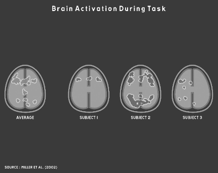
As you can see, averaging variation in cases like this does not accurately or usefully represent the data or the underlying phenomena. Unfortunately, this sort of averaging remains common practice in biology and social sciences. As Rose says, “Every discipline that studies human beings has long relied on the same core method of research: put a group of people into some experimental condition, determine their average response to the condition, then use this average to formulate a general conclusion about all people.”
This problem can be traced back to Belgian astronomer turned social scientist Adolphe Quetelet in the early 19th century. Quetelet (pronounced “kettle-lay”) took the statistical mean down a dark path that has since become a deep and dangerous rut. Sciences that study human beings have fallen into this rut and become trapped ever since. Many of the erroneous findings in these fields of research can be traced this fundamental misunderstanding and misuse of averages. It’s time to build a ladder and climb out of this hole.
When Quetelet began his career as an astronomer in the early 19th century, the telescope had recently revolutionized the science. Astronomers were producing a deluge of measurements about heavenly bodies. It was soon observed, however, that multiple measurements of the same things differed somewhat, which became known as the margin of error. These minor differences in measurements of physical phenomena almost always varied symmetrically around the arithmetic mean. Recognition of the “normal distribution” emerged in large part as a result of these observations. When Quetelet’s ambition to build a world-class observatory in Belgium was dashed because the country became embroiled in revolution, he began to wonder if it might be possible to develop a science for managing society. Could the methods of science that he learned as an astronomer be applied to the study of human behavior? The timing of his speculation was fortunate, for it coincided with the 19th century’s version of so-called “Big Data” as a tsunami of printed numbers. The development of large-scale bureaucracies and militaries led to the publication of huge collections of social data. Quetelet surfed this tsunami with great skill and managed to construct a methodology for social science that was firmly built on the use of averages.
Quetelet thought of the average as the ideal. When he calculated the average chest circumference of Scottish soldiers, he thought of it as the chest size of the “true” soldier and all deviations from that ideal as instances of error. As he extended his work to describe humanity in general, he coined the term the “Average Man.”
This notion of average as ideal, however, was later revised by one of Quetelet’s followers—Sir Francis Galton—into our modern notion of average as mediocre, which he associated with the lower classes. He believed that we should strive to improve on the average. Galton developed a ranking system for human beings consisting of fourteen distinct classes with “Imbeciles” at the bottom and “Eminent” members of society at the top. Further, he believed that the measure of any one human characteristic or ability could serve as a proxy for all other measures. For example, if you were wealthy, you must also be intelligent and morally superior. In 1909 Galton argued, “As statistics have shown, the best qualities are largely correlated.” To provide evidence for his belief, Galton developed statistical methods for measuring correlation, which we still use today.
Out of this work, first by Quetelet and later by Galton, the notion of the Average Man and the appropriateness of comparing people based on rankings became unconscious assumptions on which the industrial age was built. Our schools were reformed to produce people with the standardized set of basic skills that was needed in the industrial workplace. In the beginning of the 20th century, this effort was indeed an educational reform, for only six percent of Americans graduated from high school. Students were given grades to rank them in ability and intelligence. In the workplace, hiring practices and performance evaluations soon became based on a system of rankings as well. The role of “manager” emerged to distinguish above-average workers who were needed to direct the efforts of less capable, average workers.
I could go on, but I don’t want to spoil this marvelous book for you. I’ll let an excerpt from the book’s dust cover suffice to give you a more complete sense of the book’s scope:
In The End of Average, Rose shows that no one is average. Not you. Not your kids. Not your employees or students. This isn’t hollow sloganeering—it’s a mathematical fact with enormous practical consequences. But while we know people learn and develop in distinctive ways, these unique patterns of behaviors are lost in our schools and businesses which have been designed around the mythical “average person.” For more than a century, this average-size-fits-all model has ignored our individuality and failed at recognizing talent. It’s time to change that.
Weaving science, history, and his experience as a high school dropout, Rose brings to life the untold story of how we came to embrace the scientifically flawed idea that averages can be used to understand individuals and offers a powerful alternative.
I heartily recommend this book.
Take care,

8 Comments on “Averages Aren’t What They Used to Be and Never Were”
I love the part about the pilots. There’s an excerpt here:
http://www.thestar.com/news/insight/2016/01/16/when-us-air-force-discovered-the-flaw-of-averages.html
This book looks great: it’s added to my list.
How do you think this will change data visualization? I’m beginning to hear people, especially in healthcare and education, talk about the way they explore data differently. I think it’s happening in these fields because their rows of data represent real people, not widgets.
I see many people frowning on KPIs: how can you condense a Doctor’s patients or a school’s pupils into one measure of performance? “Individualised” care and education are blowing these metrics away and I believe we need to change the field of visualisation accordingly.
I’m seeing bar charts being replaced by boxplots, histograms, scatterplots and the like. Essentially, I’m seeing people draw all the data instead of aggregated data points.
Are you seeing the same? How do you think the field should change?
Interesting… although not surprising. The average almost never (although I can certainly think about a few instances; e.g. uniform distribution) “represent” individual samples from the population. Therefore the postulate from the author (although I have not read the book) does not only apply to “humans”. I think descriptive statistics in studies (e.g., journal articles) are used to “describe” the sample but do not imply a value (e.g., mean, media) is representative of the population in the sense that the author seems to imply. In other words why should we expect individual samples from the population to resemble the average? Determining if we should use the “average” (or median, or 95th percentile) is largely based in the question we are trying to answer.
Andy,
What you’re observing has little to do with data visualization in particular, but with data sensemaking in general. Perhaps we’re finally reaching the point where people have been trying to get value from data sensemaking tools without success long enough to wake up to the fact that data sensemaking requires skills that must be learned. Skilled data analysts have always known that you cannot make sense of data by viewing it at high levels of aggregation alone. Technology vendors are largely to blame for it taking so long to get to this point. Your own employer, Tableau, shares in the blame. How many versions of Tableau were released before box plots were finally provided? Data sensemaking tools, no matter how well designed, are just tools. At best, they extend our reach. They do not magically turn us into skilled data analysts.
We should take advantage of this rising awareness to teach people the skills that are required to derive value from data. Responsible technology vendors should speak up and admit that their tools are useless unless people develop these skills. That would take courage, but it would earn respect.
Part of the fault (a lot, I think) lies with our educational system and its many dysfunctions. In particular, statistics continues to be taught much the way it was taught 40 years ago. Aggregation and summary statistics were necessary for many people due to the lack of affordable alternatives. While good statisticians knew better, the bulk of people teaching these courses were trained using techniques based upon the scarcity of data and lack of tools to analyze it without summarizing it first.
The irony is that many of the problems highlighted in this blog result from the readily available computing “power” that is often misused. Yet it was the lack of this computing “power” that helped make summarizing and aggregating data a necessity. It is time to rethink how we teach people to relate to data.
Dale,
It is definitely time to “rethink how we teach people to relate to data,” but “readily available computing power” does not change data sensemaking in a fundamental way. Statistics, properly understood and applied, in collaboration with data visualization to bring meaningful patterns to light, are powerful tools, but only when placed in the hands of people who have learned to think critically, both deeply and broadly. It is people power, enhanced by computing power, that’s most needed.
On average, Switzerland is flat.
About averages, here’s what Hans Rosling says about the subject as part of his TED lecture 2006:
https://youtu.be/hVimVzgtD6w?t=13m48s
Unfortunately, in Gapminder World http://www.gapminder.org/world/ the “split nation” feature is not available.