Godin’s Silly Rules for Great Graphs
Seth Godin invited a reaction last week when he ventured into unfamiliar territory by publishing a blog post entitled “The three laws of great graphs.”
- One story
- No bar charts
- Motion
He was apparently engaging in a bit of hyperbole—a statement that is intentionally exaggerated for the purpose of making a point—when he listed as one of his rules: “No bar charts.” When Jesus made use of hyperbole to warn that great wealth can lead to corruption—”It is easier for a camel to pass through the eye of a needle than for a rich man to enter into the kingdom of heaven”—I suspect most listeners understood that he was using an exaggerated analogy to make his point. Godin’s spare but sweeping statement, “No bar charts,” however, runs the risk of being taken literally by many who struggle with data presentation, and have an undiscerning appetite for simplistic rules.
In a follow-up blog entry on the following day, Godin responded to the outcry of those he calls “data presentation purists” by explaining what he supposedly really meant: “bar charts are dramatically overrated.” I agree that bar graphs are often used when a different type of graph would do the job much better, but they are not overrated. In fact, for general presentation purposes, bar graphs along with line graphs are the two most valuable graphical tools for telling quantitative stories. Godin got it quite wrong when he wrote: “The correct use of a bar chart is to show how several items change over a period of time.” The story of change over time is actually told much more effectively with a line graph. Bar graphs work better than anything else for simple magnitude comparisons. In regards to this, Godin also veered from good advice when he argued that one should use “a simple pie chart when comparing two or three items at the same scale.” In fact, pie charts do one thing and one thing only—they compare parts of a whole (things that add up to 100% of something). They should never be used for other magnitude comparisons.
The example that Godin used to illustrate the superiority of pie charts actually tells a story that could be better told using a simple bar graph, even though it might indeed display parts of a whole (whether it does or not isn’t clear without context).
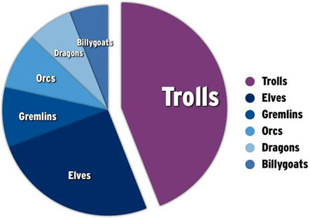
One of the first things that I noticed when I saw this chart is that it includes elements that aren’t needed to tell the story. Notice that the slices are directly labeled in the pie chart itself, which makes it entirely unnecessary to include a legend. Doing so works against Godin’s objective of keeping the story simple, because it draws people’s attention to items that add no meaning to the chart, thus wasting their time.
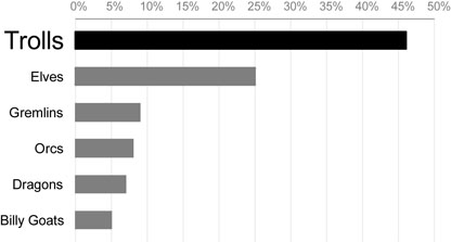
According to Godin, the message of the chart is, “Trolls are where we should focus our energy.” Apparently, however, the other creatures shown in Godin’s pie chart must also be important to the story, or else why not lump them together into a single slice labeled “All Other Creatures”? Based on this assumption, a bar graph would make it much easier to compare the values associated with the various creatures, and could be designed in a way that still clearly emphasized the greater importance of trolls to the story, as illustrated below:
There’s no need to address the other issues raised by Godin’s argument, because Jon Peltier has already done so with great dispatch in his blog. I would like to address Godin’s final rule, “Motion,” which he elaborates by saying, “You should animate your charts.” While there are times when it is useful to animate a chart in some manner, more often than not it adds nothing to and at times even obscures the story. Here are Godin’s specific instructions:
It’s simple: create two slides. The first one shows where the data used to be, the second one, on the same axes, shows where it is or where it’s going. Motion.
Establish the first slide. Make your point about your source and its validity. Then press the advance button. Boom.
Boom? While I appreciate Godin’s intention, there are usually better ways to show change in a presentation. In many instances, it is better to show change in a single line graph, which allows people to see the full course of change from one point in time to the last as a single, simple picture. When the story is better told using a different type of chart, such as a bar graph (or, God forbid, a pie chart), it almost always works better to begin by displaying a single graph that displays the state of things at one point in time and then cause a second graph that displays the state of things at the other point in time to appear beside or below the first. Doing it this way makes it possible for people to compare the two states, such as the past and today, which is almost impossible to do when they can only see one graph at a time.

I’m not trying to pick a fight with Seth Godin. He’s an excellent speaker with areas of expertise that differ from mine. When he gives advice about graphs, however, he wanders into my backyard, and I can’t help but point out the flaws when he gets it wrong. Perhaps I’m just one of those “data presentation purists” who believes that the rules ought to actually work, confirmed by thoughtful research.
Take care,

16 Comments on “Godin’s Silly Rules for Great Graphs”
Thanks for reading, Steve
Your examples are terrific. And in the right hands, I have no doubt that they’re even better.
Unfortunately, you don’t need a license to get a copy of Powerpoint.
I’ve seen thousands (thousands!) of presentations, and I can count on one hand the number with charts as good as the ones you used.
Help save us!
Yes, you are one of those “data presentation purists”, and thank you.
I believe the “data visualization purists” have a new convert in Seth Godin!
Seth,
Thanks for the kind response. I agree that most charts–in PowerPoint and elsewhere–communicate poorly. I’m doing what I can to change this.
Where you and I seem to disagree, however, is that this will be improved by eliminating (or even reducing) the use of bar charts. In the thousands of presentations and reports that I’ve seen, more misinformation and confusion has resulted from the use of pie charts than bar charts.
Also, regarding motion, my alternative for presenting a change in state is as easy for those “without a license” to create as your suggestion involving motion (that is, showing the first graph and then replacing it with the second). Both approaches involve creating two graphs with a common scale. The advantage of mine, I believe, is that it makes a comparison between the two states possible.
I know that we’re both on the same team, working hard to help people communicate better and think smarter. I hope you’ve found my suggestions helpful.
While I agree with most of what you said I disagree with this particular statement:
“Apparently, however, the other creatures shown in Godin’s pie chart must also be important to the story, or else why not lump them together into a single slice labeled “All Other Creatures”? Based on this assumption, a bar graph would make it much easier to compare the values associated with the various creatures”
In fact, by showing all the other creatures individually and not in one large piece (which would be bigger than the troll’s piece) it is obvious that any of these are much smaller than the troll piece. No need to compare them accurately, they really are unimportant, but showing them provides the single information that each of them is relatively unimportant. I think the pie chart does a pretty good job in making this particular point.
Michael,
You make a good point. If my assumption is incorrect, and the other creatures are not important to the story, then the pie chart does an adequate job of displaying the dominance of trolls. In fact, if you wish to discourage your audience from noticing any facts related to creatures other than trolls, a pie chart does this better than a bar chart. Notice that when looking at my bar chart, compared to Godin’s pie chart, you are more inclined to detect the fact that elves have three time the effect of the next creature (Gremlins). In other words, the bar chart does a better job of telling the full story more clearly. This is partly due to the fact that visual perception is much better able to compare differences in the lengths of bars than differences in the areas or angles of pie slices. Because pie charts display differences in magnitude less effectively than bar charts, pie charts can be an appropriate choice when you wish to obscure aspects of the story that you consider unimportant or in conflict with your objective. As such, pie charts are often an appropriate choice for marketing, when an accurate and comprehensive picture of what’s going on isn’t what you wish to convey.
“In other words, the bar chart does a better job of telling the full story more clearly.”
I guess that’s in a way exactly what Seth was trying to say. The full story contains nuances which are hard to explain – or at least take quite some time. Also, you don’t want your audience to dig into a chart when they should listen to what you say. My solution to this is usually to provide a handout with all the facts that tell the full story. But in a presentation such as the ones Seth has in mind it’s more important to get your main message across. If your message has to do with the full story, then use the bar chart and explain it in proper detail. But if the full story is unimportant (just nice to know), then use the pie chart (plus an elaborate handout). Btw, I’m not sure if you meant it in a negative sense, but I don’t think that this approach is necessarily “obscuring” aspects, why not call it “focussing”?
If the entire message that the graph was intended to display was that ‘trolls are the biggest problem’ then you don’t need a graph at all.
Just have a slide that says ‘Trolls are the biggest problem’.
Chris,
that depends on your audience. Showing the graph might add “credibility” to your message. Apart from that, the message of the pie chart is rather “trolls are where we should put our effort. There are several other problems, but each of them is relatively unimportant”. This is more information than your single sentence, but less than the bar chart. Anyway, I agree that there certainly are countless different ways of conveying this information and that you might not need a graph at all.
I think the question of what kind of graph to use should pivot on a couple of key issues. First, what is the message you want to send to the audience, and second, how will the audience process the message. If the audience is homogeneous in how they will understand or read a graph, then you have a much simpler task. If we all hate trolls, then we can see that trolls continue to be a problem. When the audience is heterogeneous, then the challenge is different. Jon may be on the Grow the Gremlin committee, and he is thrilled with the graph. I belong to the group Billy Goats are Bad Guys who Bite Girls (BG3), so I am reading Seth’s data (in your chart) in a completely different way. To me, you are emphasizing something that is lame (Gremlins, ugh!) and ignoring a clear and present danger (BG3 expansion). Seth’s pie chart ignores the temporal issue that the column chart shows. By using a pie chart, his message can be more directed, but it misses a key story for some in the audience.
The story he wants to tell with the data is not what some of us see in it, and by using devices such as motion, bigger fonts, underlining, or careful structuring of data, the chart author can attempt to focus the message. Just be aware that there are multiple interpretations in a heterogeneous audience–even if they are just PowerPoint slides.
I think the sorted bar chart is more effective!
Great post as usual Stephen. I think your choice of side by side bar charts to show change is excellent. It’s probably as true to the data as you can get. All the important facts are laid out nicely without distractions. There is no doubt about what is shown and what’s important. However to be fair to Godin I think that there are situations where gradually revealing the facts is a powerful story telling technique. By using two slides to show change, Godin can make use of surprise as a way to make the story stickier. It’s not always the right thing to do but I think it’s worth considering when using data visualization in live presentations.
Tobias,
Actually, the method that I recommended involves gradually revealing the facts, just as Godin’s approach does, but the end result is a display that supports a comparison of the two points in time. Even though the two graphs are displayed on the same slide, the second graph wouldn’t appear until after the audience has had a chance to view and become familiar with the first. In other words, by using the animation functionality of PowerPoint, the second graph would remain invisible until a click of the mouse reveals it. I use the method constantly in my classes to build concepts one step at a time.
Stephen,
Ahh. Sorry I missed that point. Apparently I did not read what you wrote carefully enough. You combined the best of both worlds. Respect and hats off to you.
While these graphical presentations appear to represent some facts, their relationships are questionable. No one knows what happens between the points of discrimination between elves and billy goats, or that as their numbers are diminished by the trolls, the elf gene pool concentrates upon the fittest while that of the trolls grows nonspecific to aggression. As a result, the specifics of the data become neither quantifiable as absolute nor continuous.
However the data is presented, the fact of variance and the potentiality of discontinuity should not, in this day of quantum mechanics and data clouds, stick with representations the observed data points rather slick graphics?
Maybe I’ve seen too much that did not match the pretty pictures. Why not use the full capacity of our technology to present the facts, warts and all with lipstick.
Harold,
I’m interested in your thoughts, but don’t clearly understand what you’re saying. What do you mean by “stick with representations the observed data points rather slick graphics”? Did you mean to say “stick with representing observed data points rather than slick graphics?” Also, perhaps you could explain what you mean by “Why not use the full capacity of our technology to present the facts, warts and all with lipstick”? Did you mean “without” lipstick?
In what manner would you represent data points other than graphically? By expressing values as text? Both text and graphics are abstractions, each with its own strengths and weaknesses. Many of the truths that live in data cannot be communicated as text.