Statisticians, Remember Your Native Tongue
A common problem among many professions is the inability of expert practitioners to communicate with their clients. Attorneys are often guilty of speaking legalese to the folks that they represent, unaware that it is unfamiliar to them. Medical doctors sometimes struggle in the same way, even though their effectiveness relies on their ability to communicate clearly with their patients. Statisticians struggle with this problem more than most. You can be the most advanced statistician in the world, but if you cannot clearly report your findings to decision makers, your work is wasted. Learning to express statistical findings in ways that non-statisticians can understand should be a fundamental requirement of statistical training. I suspect that this problem is often due, not to inability, but instead, to a lack of awareness. It is indeed difficult to refrain from using statistical speak once you’ve become fluent in it, but I think that most statisticians lose awareness of the fact that others don’t understand it, so they rarely even try to overcome the problem. The solution to this problem begins with awareness. I’ll use an example from the work of a talented statistician, Howard Wainer, to illustrate this problem and its solution.
On the inside cover of Howard Wainer’s newest book, Truth or Truthiness, appear the words, “This wise book is a must-read for anyone who’s ever wanted to challenge the pronouncements of authority figures.” Including “truthiness” in the title—a word that was coined by the comedian Stephen Colbert—further suggests that Wainer’s intended audience is broad; certainly not limited to statisticians. Over the course of a long and productive career, Wainer has contributed a tremendous amount to the fields of statistics and data visualization. I’ve learned a great deal from his books. When reading them, however, I have at times cringed in response to sections that general readers would find confusing or even misleading due to a lack of statistical training. I find this frustrating, because I want the basic concepts of statistics to be more broadly understood. I celebrate those rare statisticians who manage to speak of their craft in accessible ways. Charles Whelan, the author of Naked Statistics, and Nate Silver, the author of The Signal and the Noise, are two statisticians who haven’t lost touch with the world at large.
In Truth or Truthiness, Wainer critiques a graph that appeared in the New York Times and redesigns it in a way that, in his opinion, is more effective. Here’s the original graph:
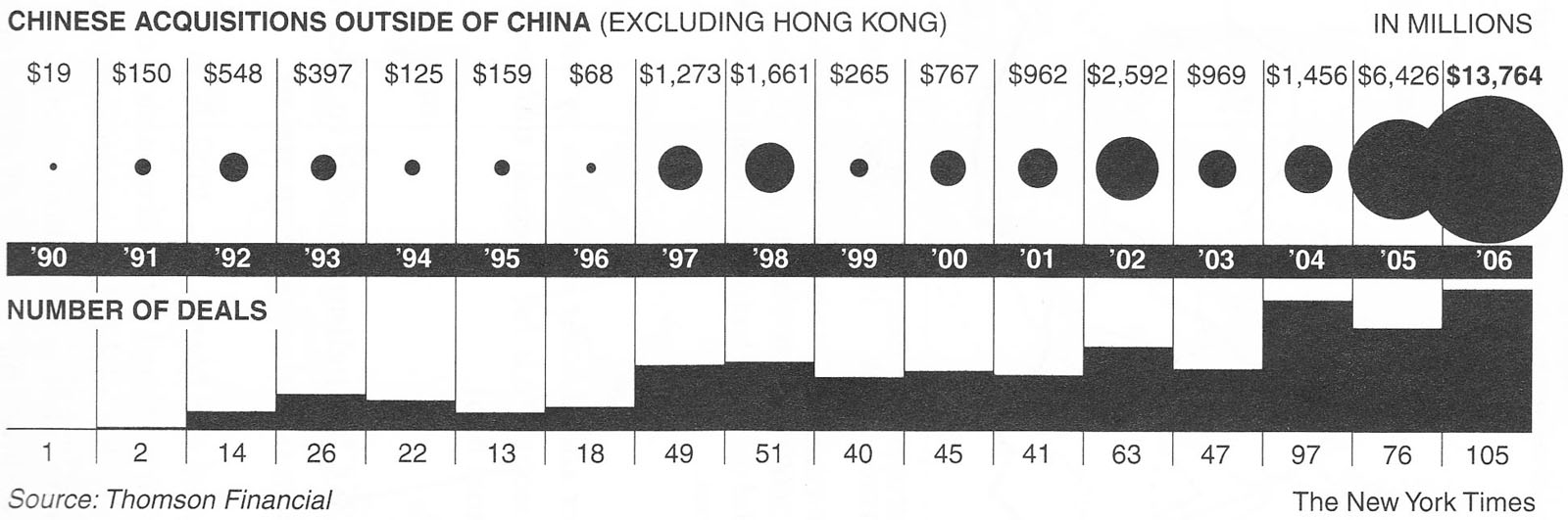
This combination of a bubble plot and a bar graph tells the story of increases in China’s acquisitions outside of the country, both in the number of deals and in the costs of those deals in millions of dollars. Although Wainer believes that this could be displayed more effectively, as do I, he credits it with two positive characteristics.
The New York Times’s plot of China’s increasing acquisitiveness has two things going for it. It contains thirty-four data points, which by mass media standards is data rich, showing vividly the concomitant increases in the two data series over a seventeen-year period…And second, by using Playfair’s circle representation it allows the visibility of expenditures over a wide scale.
(Truth or Truthiness, Howard Wainer, Cambridge University Press, 2016, p. 105)
While it is true that the New York Times does a better job of basing their stories on sufficient data than most news publications, I wouldn’t cite their use of bubbles in the upper chart as a benefit. Bubbles, which encode values based on their areas, require less vertical space to show this wide range of values than bars, but this slight advantage is wiped out by the fact that people cannot judge the relative areas of circles easily or accurately, nor can they easily compare bars to bubbles to clearly see the relationship between these two variables as they change through time. Wainer points out that the use of bubbles was introduced by William Playfair, the great pioneer of graphical communication, but Playfair did not have the benefit of our knowledge of visual perception when he used this technique. Statisticians must learn what works perceptually as part of their training in data visualization. Part of understanding your audience is understanding a few things about how their brains work.
Let’s look now at the alternative display that Wainer proposes.

Before critiquing this ourselves, let’s hear what Wainer has to say.
Might other alternatives perform better? Perhaps. In Figure 9.14 is a two-paneled display in which each panel carries one of the data series. Panel 9.14a [the upper panel] is a straightforward scatter plot showing the linear increases in the number of acquisitions that China has made over the past seventeen years. The slope of the fitted line tells us that over those seventeen years China has, on average, increased its acquisitions by 5.5/year. This crucial detail is missing from the sequence of bars but is obvious from the fitted regression line in the scatter plot. Panel 9.14b [the lower panel] shows the increase in money spent on acquisitions over the same seventeen years. The plot is on a log scale, and its overall trend is well described by a straight line. That line has a slope of 0.12 in the log scale and hence translates to an increase of about 32 percent per year. Thus, the trend established over these seventeen years shows that China has both increased the number of assets acquired each year and also has acquired increasingly expensive assets.
The key advantage of using paired scatter plots with linearizing transformations and fitted straight lines is that they provide a quantitative measure of how China’s acquisitiveness has changed. This distinguishes Figure 9.14 from the New York Times plot, which, although it contained all the quantitative information necessary to do these calculations, had primarily a qualitative message.
(ibid., p. 105)
Wainer’s scatterplots and his explanation of them include several assumptions about his audience’s knowledge that miss the boat. Even if his readers all understand how to read scatterplots, a scatterplot is not a good choice for this information. Clearly, a central theme of this story is how China’s acquisitions changed through time, but this isn’t easy to see in a scatterplot. Merely by connecting the values in each graph with a line, the patterns of change through time and their comparisons would become clearly visible.
About the upper graph, Wainer says,
The slope of the fitted line tells us that over those seventeen years China has, on average, increased its acquisitions by 5.5/year. This crucial detail is missing from the sequence of bars but is obvious from the fitted regression line in the scatter plot.
This is a vivid example of the disconnection from the world at large that plagues many statisticians. Most people do not understand the meaning of the slope of a trend line in a scatterplot other than the fact that, in this case, it is trending upwards. Without the annotation that he included in the chart, the 5.5/year increase in deals per year on average would remain unknown. I also don’t think that pointing this 5.5/year increase out is an appropriate summary of the story, for it suggests greater consistency than we see in the data.
The lower scatterplot introduces a number of problems for typical readers. First of all, most people don’t know how to interpret log scales. In fact, many readers might not even notice that the scale is logarithmic. They certainly wouldn’t know what the slope of the trend line means, nor would they understand that this straight line of best fit with a log scale indicates an exponential rate of increase, which Wainer fails to mention. Most readers would be inclined to compare the trend lines and conclude that the patterns of change are nearly the same. Also, one of Wainer’s statements about the data isn’t entirely correct:
The trend established over these seventeen years shows that China has both increased the number of assets acquired each year and also has acquired increasingly expensive assets.
China did not increase the number of assets or the amount of money spent on those assets each year. There are many examples of years when these values decreased, which to me is an important part of the story.
In the final paragraph of his explanation, Wainer claims:
The key advantage of using paired scatter plots with linearizing transformations and fitted straight lines is that they provide a quantitative measure of how China’s acquisitiveness has changed.
This would only be an advantage if readers knew how to read these “paired scatter plots with linearizing transformations and fitted straight lines.” Unfortunately, most readers would not. In fact, phrases such as “linearizing transformations” might cause them to flee in horror.
The news story that the New York Times was attempting to tell could have covered all of the important facts in ways that were easily understood by a general audience. If the relationship between the number of acquisitions and the costs of those acquisitions was important to the story, a single scatterplot designed in the following way with a bit of text to explain it could have done the job.

I’ve intentionally used linear scales for both axes so that the trend line clearly exhibits the exponential nature of the correlation between the two variables. I wouldn’t rely on the graph alone to tell this part of the story, but would explain in words that when a line curves upwards in this fashion it exhibits an exponential rate of increase: the cost of the acquisitions does not increase in increments that are equal to the number of them, but instead increases by ever greater amounts as the number of acquisitions increases. In addition to the overall nature of the relationship, this graph also clearly exhibits the fact that the relationship varies somewhat, which is especially illustrated by the outlier that strays far from the trend line in the lower right corner, showing that in a particular year the number of acquisitions was not associated with an exponential increase in costs.
It is doubtful that the New York Times was particularly concerned with the nature of the relationship between the two variables, but mostly wanted to show how both variables increased through this period of time. To tell this story, I would suggest a couple of displays, starting with the paired line graphs below.

This would be easy for general readers to understand and it supports the basic message well. What it doesn’t do especially well, however, is clearly show the pattern of change in the value of acquisitions because to scale this graph to include the last two extremely high values, most of the values reside in the bottom 25% of the scale (i.e., from 0 to 4 billion dollars out of a total scale that extends to 16 billion dollars), resulting in a line that is looks a great deal flatter than it would if the graph were scaled to exclude the last two values. If this pattern of change should be displayed more clearly, and if we were assured that our readers understood logarithmic scales, rather than displaying the number of acquisitions on a linear scale and the value of acquisitions on a log scale, the patterns would be more comparable if both were scaled logarithmically, as follows.

Let’s assume, however, that it is best to avoid log scales altogether to prevent confusion, which would be the case with a general audience, even with readers of the New York Times.
One potential improvement would be to place both lines in a single graph, but to do this without creating a confusing and potentially misleading dual-scaled graph. To do this, we must express both sets of values using the same unit of measure and scale. One simple and common way to do this is to express both time series as the percentage difference of each value compared to the initial value (i.e., the value for the year 1990). Another common expression of the values that is perhaps even easier for people to understand involves expressing each year’s value as its percentage of the total for the entire period, as follows:

Now that the two lines appear in the same graph, they are easier to compare. It is clear that the number of acquisitions and their dollar value trended upward during this period, but not always and not always together. In other words, the correlation between the number and dollar amounts of acquisitions is there, but it isn’t particularly strong. Even though we have the scaling problem caused by the extremely high dollar values in 2005 and 2006, patterns of change during 1990 through 2004 are relatively clear and easy to compare. If this were not the case, however, we could address the scaling problem by providing a second line graph that only includes data from 1990 through 2004, as follows:

Now, let’s return to the main point. Those who do the work of data analysis must know how to clearly present their findings to those who rely on that information to make decisions and take action. This is an essential skill. Highly skilled statisticians are incredibly valuable, but only if they can explain their findings in understandable terms. This requires communications skills, both in the use of words and in the use of graphics. Training in these skills is every bit as important as training in statistics.
Take care,

20 Comments on “Statisticians, Remember Your Native Tongue”
To defend the graph from the NY Times, they probably had some constraints due to the medium, e.g.: limited contrast, no colors, limited space…
G,
If the graph appeared in the print version of the paper, you’re certainly correct that there would have been constraints. Of the constraints that you mentioned, however, only limited space would have prevented them from doing what I’ve proposed, which can be produced without compromise with limited contrast and no colors. Also, the single line graph that I proposed could have been displayed with just a little more vertical space than the ineffective graph that they produced.
I get the issue, I think the main constraint for them was probably time. I now I’m producing a lot of sub-par graph just because I have a basic idea go with it and when it doesn’t turn out ideal I just go with what I have.
One of the positive of their graph is that they have the value listed.
Thank you a lot. It looks so obvious, and like you are reading my mind, but of course only after you explained it.
I wonder whether average acquisition size could be also informative?
Maxim
G,
Time is definitely constrained when you’re working on breaking news, but I doubt that this particular story was produced under a tight deadline. Even if it was, the alternatives that I proposed would require no more time to recognize or produce than the display that appeared in the New York Times.
Interesting.
What about the attraction value of a graph like the original? The dollar bubbles don’t show scale as well as line charts, but the graph is different and may be more interesting to look at for some. That has value if readers end up unconsciously giving it a few more seconds than they would to a “normal” line graph (and learning something from it in the process).
Also, the rather unique original graph makes it memorable for me. Perhaps I looked at that graph longer than I would have had I seen it in its original context, but I clearly remember the tiny $19 dot and the big $13,000 bubble.
Sim,
The argument that you’re making is one that is frequently made, especially by infographic designers. I’ve responded to it many times in this blog and in my articles. I won’t reproduce a comprehensive response again here, but I will make a few comments and ask a few questions.
You assert that the “graph is different and may be more interesting to look at for some.” As Wainer pointed out in his book, this graph emulates one of the earliest examples of quantitative displays that were created by William Playfair in the 19th century. Nevertheless, it might appear novel to some readers. Do we actually know that this appearance of novelty combining bubbles and bars actually induces readers to look at the display longer? We don’t. Even if it did, do we know that the extra time looking at a display that is difficult to read produces greater understanding? We definitely don’t. I think it’s a stretch to believe that readers of the New York Times are more interested in novelty than the actual content of the news story. Assuming that they are is rather demeaning.
You say that you “clearly remember the tiny $19 dot and the big $13,000 bubble.” I suspect that you don’t actually “clearly remember” the dollar amounts, but only that the first value was tiny and the last was large. If this alone were the story, then everything else could have been eliminated and this could have been conveyed in an even more dramatic and memorable way. There is more to the story, however. The line graph not only displays this huge difference between the first and last values, and does so in a way that is easy to accurately discern, but it tells a more comprehensive story as well, all of which is accessible to readers.
Assuming that people just want to be entertained by novel or eye-catching forms of display is not a foundation on which good journalism is built. Unfortunately, however, many news organizations have made this assumption about their readers. I assume that readers of the New York Times are primarily interested in the information and want it to be presented in an accurate and accessible way.
Trend lines are great ways to lie about the data… if you want to see what the data was, you just look at the dots! And those dots are not the data, they are aggregates of the data, and one starts to wonder if the data is as clean as it is claimed to be.
Stephen,
1/ in the end, would you recommend reading this book ? It’s subject seems read-worthy, and would fit into your curriculum for critical thinking skills.
2/ I had a look at the table of contents and it mentions “inside out plots” as good graphs to explore multi-dimensional datasets. How would you contrast those with parallel coordinates ? Up until now I had found parallel coordinates to be most effective for multi-dimensional datasets – but I did not know about the former.
Thank you
Edouard,
I always pick up useful information regarding data analysis from Wainer’s books, including this one, but this is not one of his better books. Inside out plots are not a particularly useful way to perform multivariate analysis. In fact, I’m planning to write another blog post to compare them to parallel coordinate plots, which are far superior.
I would argue that Wainer’s version is potentially clearer and more intuitive although I agree that the simple regression (trend) over time is probably not a good approach to modelling the relationship. But, he does show the relationship between cause and effect clearly, his model (linear trend), and the raw data i.e. more purchases over time is associated with increased spend. The trend line displays the increased purchases and spend over time.
I had to take some time thinking about the transformations you applied to the data in order to present both measures as percentages. This transformation would mean that the trend will change as new data comes in. Not a good approach for long term, continued, assessment in my opinion. It is also a derivation of the raw data.
The argument that NYT readers will not understand scatter plots or trend lines may be a fair point, but I think this is also true of data transformations that require some thought to map back to the original goal to data i.e. no. of deals and spend by year.
Although Wainer’s presentation is limited, I’m not sure I buy the claim that the updated presentation is any clearer.
Mark,
Let’s consider the pros and cons.
You acknowledged that readers might not understand a scatterplot or trend line. Independent of the data transformation issue, do you think that any readers might not understand a line graph? I suspect that you would acknowledge a universal understanding of line graphs among NYT readers.
You state that Wainer’s graph “does show the relationship between cause and effect clearly.” Actually, it doesn’t. Think about this for a moment. First of all, there is no need to point out that, the more items you acquire, the more you spend. The fact that this relationship exists is not in doubt. What Wainer fails to understand, in my opinion, is that by using a linear scale in one scatter plot and a log scale in the other, with linear trend lines, will lead all but statistically savvy readers to believe that the relationship is linear, but it is not, it is exponential.
The two line graphs that I proposed, both using linear scales, tell the story in a way that would be easy for all readers to understand. The single line graph with the common annual-percentages-of-the-whole scale, I would ideally use in addition to the paired line graphs to make it easier to compare the two patterns of change. If I were forced to use it alone (e.g., because space was tight), I would provide an explanation for the simple transformation that was done. This particular transformation would be easy, in my experience, for readers of the NYT to understand.
Hi Stephen
I have a question and a suggestion.
1. Wouldn’t two column charts–as per the original design–convey the message clearly? Increase in the number of deals as well as an increase in the value of those deals over time?
2. When representing dollars over time it’s worth remembering one of Edward Tufte’s principles:
“In time-series displays of money, deflated and standardized units of monetary measurement are nearly always better than nominal units.”
Regards,
Hicham
Hicham,
Why do you think that column charts (i.e., vertical bar graphs) would offer advantages over line graphs? Lines trace patterns of change through time more simply and clearly than bars. I use bars for time series only when I want readers to focus on particular points in time (e.g., on one year at a time in this case) and not patterns of change through time.
Regarding Tufte’s recommendation, what do you have in mind in this particular case?
Stephen,
I got the impression that the issue with the NYT graph was the use of 2 dimensional areas (circles) to represent one dimensional data (value of deals)–quoting ET again, a typical way to confuse data variation with design variation–and hence the question about column charts.
As for ET’s principle, the idea is to use real dollars instead of nominal dollars. For example it might be that–after adjusting for inflation–the $1.456 billion spent in 2004 is worth less than the $1.273 billion spent in 1993–hence the possibility of reversing some of the trends shown in the graph.
regards,
One niggling thing with the mention above that that ‘trend’ line “shows cause and effect”. *Something* caused every of those deals, and that something cannot ever be discovered via parametric statistical methods. The only thing these methods may help with is to make a prediction that the next set of deals in the next year will be even larger, but the uncertainty is very high as to what that next deal will be, and the model will (very likely) be wrong.
I cannot recommend this (to be fair, expensive) book enough:
https://www.amazon.com/Uncertainty-Soul-Modeling-Probability-Statistics/dp/3319397559/ref=cm_cr_arp_d_product_top?ie=UTF8
Hicham,
The problem with bubbles (i.e., circles), which encode values as their areas (not height or width, which are always the same) is that we cannot perceive areas easily or accurately. I definitely agree (and teach) that if the value of money has changed significantly during the time period that’s displayed, the values should be adjusted for inflation. It is possible that the New York Times made this adjustment.
One challenge I have with adjusting for inflation is that even though we have some standard definitions of ‘inflation’, the things that make up those standard definitions all fluctuate in value widely.
Inflation was originally defined as an increase in money supply, but our central banks have redefined it to mean price increases (which is one of the consequences of an increasing money supply).
Hi Stephen,
it is an interesting discussion, I agree in principle with your responses, but as I stated previously the Wainer example “shows the data” and his model clearly. The reader can read off the real value of the total acquisitions per year, the number of acquisitions, and a crude approximate of the trend (which I don’t see the need for in this summary). I understand your point about the lay user and log scales, but, there is always the amount (in dollars) to refer to back to.
The example you provide may well explain the trend more clearly but you have transformed the data. There is no reference to the reader back to the real value spend (in dollars). I would prefer to show the data first.
Nate, of course “something” caused each deal. This is a real limitation with this type of summary. The context is missing, deals are averaged arbitrarily by year, currencies fluctuate in value, etc. I’m not entirely sure what you mean by a parametric model though. A graph in general is a statistical model. Averaging is a parametric model. Models can be useful or they can be stupid. Depends what and how you use them.
Mark,
Read my previous response to you more carefully. The pair of line graphs that I proposed as my primary alternative to Wainer’s solution (i.e., the first solution following the scatterplots) does not contain transformed data. One displays a count of acquisitions and the other displays dollars spent on those acquisitions.
Im curious–are you a statistician?