When expensive dashboard software doesn’t work, do it with Excel
One of the most prevalent problems with dashboard software is inflexible layout. Most products force you to divide the dashboard screen into a rigid grid of rectangular panels into which tables, graphs, and other display widgets are placed. It is difficult to produce a well-designed dashboard when working under these constraints. To arrange a large collection of disparate data in a small amount of space in a way that communicates effectively, you need complete flexibility to position display objects wherever necessary, size them however necessary, and to strip them down to their bare essentials. Most products fail to support this level of flexibility.
I was recently introduced to the work of an Excel expert extraordinaire, Charles Kyd, who gets Excel to perform layout tricks that leave most dashboard products in the dust. Kyd’s web site, http://www.exceluser.com/, offers a cornucopia of Excel resources, including an E-Book, Dashboard Reporting with Excel. In it Kyd presents a step-by-step approach to building dashboards in Excel that makes use of some features that I never knew existed, such as the Camera Tool. It is this feature in particular that frees you from the rigid row and column structure of Excel and allows you to place and size display objects, including tables, with complete flexibility.
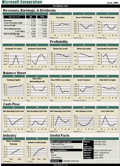
Kyd doesn’t claim to be a data visualization expert, but he manages to avoid most of the common pitfalls of visual dashboard design that most software vendors flaunt, such as those ridiculous dashboard gauges that clutter and eat up the screen with low-density information. His visual designs could be improved somewhat, but they are far better than what you’ll find on the web sites of most dashboard vendors and are definitely on the right track for effective communication. Dashboard Reporting with Excel sells for $24.95, and you can download it immediately from http://www.exceluser.com/. Here’s a sample of one of his dashboards:

Not bad for a dashboard that requires nothing but that spreadsheet software that is already running on your computer. I hope that the inventiveness and good sense of people like Charles Kyd provide the swift kick that dashboard vendors need to focus on functionality that delivers real business solutions, rather than the entertaining but information poor dashboards that currently dominate the market.


4 Comments on “When expensive dashboard software doesn’t work, do it with Excel”
You might be shocked to find out that this is a one-to-one copy of a petroleum dashboard published 2004 on this website: http://robslink.com/SAS/democd18/royal.htm
Actually, Rob copied my Excel dashboard in SAS.
If you check http://robslink.com/SAS/democd18/ you’ll see that he posted the file in May, 2006. That month, two people from SAS purchased my ebook, Dashboard Reporting With Excel. The book includes images like it. I wrote the book in late 2004 and early 2005.
The 2004 date is the date of the fiscal period data, which came from Hoovers.com. I credited Hoovers in my original version of the report. (During 2006 I switched from Hoovers to MoneyCentral and Yahoo, however.)
You can see the same report, but with a different color pattern and for a different company here:
http://www.exceluser.com/dash/sheets/gra.xls
You can open a few more workbooks from the same location: safc.xls, sap.xls, oxy.xls, and pcar.xls. I have nearly 500 such workbooks at this location, so I won’t list them all.
Yes, definitely credit where credit is due – Charley Kyd is the original creator of this dashboard layout, and my SAS/Graph version was an imitation of his original!
I have my samples set up with thumbnail/index pages, and a link under each thumbnail to an ‘info’ document that gives credit to the originals that I’m imitating, etc. (I also put a reference in the comments at the top of the actual SAS code for the example)…
For example, from the following index page:
http://robslink.com/SAS/dashboards/aaaindex.htm
The link below this Royal Dutch dashboard is:
http://robslink.com/SAS/democd18/royal_info.htm
But, since people _could_ go to this dashboard directly, without going through the index page and without seeing the info doc link, I think I will do something a little special in this case and add some text to the black bar at the top of the dashboard to specifically say “SAS/Graph Imitation of Charley Kyd’s ExcelUser Dashboard”, to avoid any confusion!
I’ll plan on making that change this evening…
Oops … I am sorry for getting this wrong. Credit where credit is due;-) I was misslead by the 2004 in the report as Charley explained. Peace out.