Eye-Tracking Nonsense from Tableau
Don’t trust everything you read. Surely you know this already. What you might not know is that you should be especially wary when people call what they’ve written a “research study.” I was prompted to issue this warning by a June 29, 2017 entry in Tableau’s blog titled “Eye-tracking study: 5 key learnings for data designers everywhere”. The “study” was done at Tableau Conference 2016 by the Tableau Research and Design team in “real-time…with conference attendees.” If Tableau wishes to call this research, then I must qualify it as bad research. It produced no reliable or useful findings. Rather than a research study, it would be more appropriate to call this “someone having fun with an eye tracker.” (Note: I’m basing my critique of this study solely on the article that appears in Tableau’s blog. I could not find any other information about it and no contact information was provided in the article. I requested contact information by posting a comment in Tableau’s blog in response to the article, but my request was ignored.)
Research studies have a goal in mind—or at least they should. They attempt to learn something useful. According to the article, the goal of this study was to answer the question, “Can we predict where people look when exposed to a dashboard they’ve never seen before?” Furthermore, “Translated into a customer’s voice: how do I, as a data analyst, design visually compelling dashboards?” What is the point of tracking where people look when looking at so-called dashboards (i.e., in Tableau’s terms, any screen that exhibits multiple charts) that they haven’t seen before and have no actual interest in using? None. This is evidenced by the fact that none of the “5 key learnings” are reliable or useful for designing actual dashboards, unless you define a dashboard as an information display that people who have no obvious interest in the data look at once, for no particular purpose. Only attempts to visually compel people to examine and interact with information in ways that lead to useful understanding—that is, in ways that actually inform—are relevant to information designers. What were participants asked to do with the dashboard? According to the article,
We didn’t give participants a task for this Tableau Labs activity, but that doesn’t mean our participants were not goal-directed. Humans are “meaning-making” animals; we can’t stop ourselves from finding a purpose. Every person looking at one of these dashboards had a task, we just didn’t know what it was. Perhaps it was “look at all the crazy stuff people create with Tableau?!”
Despite the speculations above, we actually have a fairly good idea of the task that participants performed, which was to quickly get familiar with an unknown, never-seen-before display. Where someone’s eyes look when seeing a screen of information for the first time is not where their eyes will look when they looking at that screen to ingest and understand information. This is not how research studies are conducted. I shouldn’t have to say this. This is pseudo-science.
When participants at the conference were asked to look at so-called dashboards for the first time, which were not relevant to them, and to do so for an unknown purpose (or lack thereof), what did eye-tracking discover? Here’s a list of the “5 key learnings”:
- “(BIG) Numbers matter”
- “Repetition fatigue”
- “Humans like humans”
- “Guide by contrast”
- “Form is part of function”
(BIG) Numbers matter
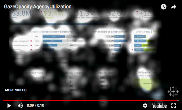
The observations behind the claim that “BIG Numbers matter” was that people tend to look at huge numbers that stand alone on the screen. Actually, people tend to look at anything that is extraordinarily big, not just numbers. In a sea of small numbers, big numbers stand out. What this tells us is actually expressed separately as key learning number 4: “Guide by contrast.” In other words, things that look different from the norm catch our attention. This is not a key learning. This is well known. Here’s the example that appears in the article:

Each “key learning” was illustrated in the article by a video. In all of the videos, sections of the screen that appear light and therefore visible, as opposed to darkened sections, were sections that received the attention—the lighter the section the more attention it received. The big numbers in this example appear at the top, but even though they appear in the most visually prominent portion of the screen, apparently, they did not garner more attention than the bar graphs that appear in the section below the numbers. If the attention-grabbing character of big numbers was revealed in this study, this particular screen does not provide clear evidence to illustrate this finding.
In response to this claim, we should be asking the question, “Is it useful to draw people’s attention to big numbers on a dashboard?” Typically, it is not, because a number by itself without context provides little information, certainly not enough to fulfill any actual tasks that people might use dashboards to perform. Nevertheless, the research team advises, “If you have an important number, make it big.” I would advise, if you have an important piece of information, express it in a way that not only catches your audience’s attention but does so in a way that is informative.
Repetition fatigue
Apparently, when people look at a dashboard that they’ve never seen before that isn’t relevant to them, and do so for no particular purpose, if the same type of chart appears multiple times, they get bored after they’ve examined the first chart. If you’re not actually trying to understand and use the information on the dashboard but merely scanning it for visual appeal, then yes, you probably won’t bother examining multiple charts that look the same. This isn’t how actual dashboards function, however. People look at dashboards, no matter how you define the term, to learn something, not just for visual entertainment. When you have a goal in mind when examining a dashboard, the kind of “repetition fatigue” that the researchers warn against probably does not come into play.
We should always select the form of display that best suits the data and its use. We should never arbitrarily switch to a different type of chart out of concern that people won’t look at more than one chart of a particular type. Doing so would render the dashboard less effective.
Here’s the example that appears in the article to feature this claim:

Even if I cared about this dashboard, I might not bother looking at more than one of these particular charts because, from what I can tell, none of them appear to be informative.
Humans like humans
Yes, people are attracted to people. Faces, in particular, grab our attention. According to the article, “if a human or human-like figure is present, it’ll get attention.” And what is the point of this key learning? Unless the human figure itself communicates data in an effective way, placing one on a dashboard adds no value. Also, if the point is to get someone to look at data when it needs attention, you cannot suddenly place human figures on the dashboard to achieve this effect.
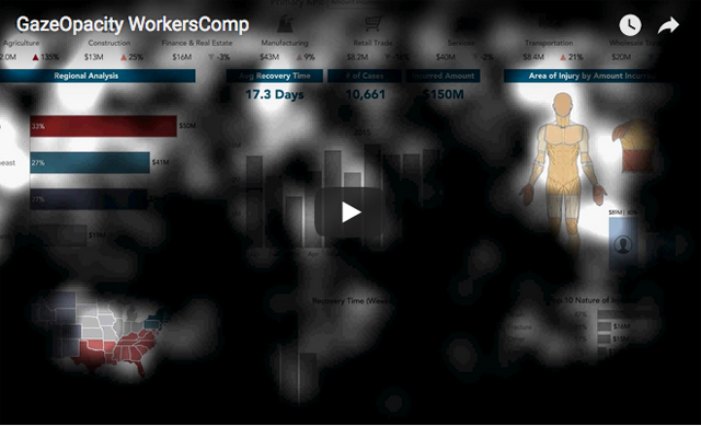
Here’s the example that appears in the article:

This study did not actually demonstrate this claim. It doesn’t indicate that people’s attention is necessarily drawn to human figures in particular. We know that people’s attention is drawn to faces, but this study might not have indicated anything more than the fact that an illustration of any recognizable physical form in the midst of an information display—something that looks quite different from the rest of the dashboard—catches people’s attention.
I’ve seen this particular screen of information before. It presents workers’ compensation information. The human figure functions as a heatmap to show where on the body injuries were occurring. The human figure wasn’t there to attract attention, it was there to convey information. It certainly wasn’t there because “humans like humans.”
Guide by contrast
We’ve known for ages that contrast—either the difference between the background and the foreground or making something appear differently than it usually does—grabs attention, if not overdone. This is not a key learning. Here’s how the finding is described in the article:
Areas of high visual contrast acted as guideposts throughout a dashboard. During the early viewing sequence, the eyes tended to jump from one high contrast element to the next. Almost like a kid’s dot-to-dot drawing, you can use high contrast elements to move visual attention around your dashboard. That being said, it’s notable that high contrast must be used judiciously. If used sparingly, high contrast elements will construct a logical path. Used abundantly, high contrast elements could create a messy and visually overwhelming dashboard.
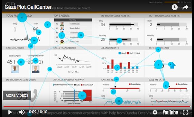
And here’s the example that was shown to illustrate this:

Although it wasn’t explained, I assume that this video displays the sequence of focal points that a single participant exhibited. It certainly does not show the particular sequence of glances that was exhibited by all participants. Even if the researchers explained how to interpret this video, it wouldn’t tell us how to use contrast to lead viewers’ eyes through a dashboard in a particular sequence. Discovering how to do this using contrast would indeed by a key learning.
Form is part of function
The researchers complete their list of learnings with a final bit of information that is well known. Yes, the form that we give an information display contributes to its functionality. Here are the insights that the researchers share with us:
All dashboards have a form (triangular, grid, columnar) and the eyes follow this form. This result was both surprising and not surprising at all. Humans are information seekers: when we look at something for the first time, we want to get information from it. So, we look directly at the information (and don’t look at areas with no information). What’s important to note is the design freedom this gives an author. You don’t need to conform to rules like “put anything important in the upper left hand corner.” Instead, you should be aware of the physical form of your dashboard and use your space accordingly.
Knowing that “form is a part of function” actually tells us the opposite of what the researchers claim. It does not grant us “design freedom” and encourage us to ignore well-known principles and practices of design. Quite the opposite. Understanding how form contributes to function directs us to design information displays in particular ways that are most effective. In other words, it constrains our design choices to those that work. Contrary to the researchers’ statement, placing something that’s always important in the upper left-corner of the dashboard, all else begin equal, is a good practice, for this is where people tend to look first. Ironically, if you review the first four eye-tracking videos that appear in the article, they seem to confirm this. Only the video pictured below is an exception, but this is because nothing whatsoever appears to the left of the centered title.
The example that was provided to illustrate this learning does not clarify it in the least.

The researchers were trying to be provocative, suggesting that we should ignore well-established findings of prior research. After all, how could research done in the past by dedicated scientists compete with this amazing eye-tracking study that was done at a Tableau conference?
The true key learning that we should take from this so-called study is what I led off with: “Don’t trust everything you read.” I know some talented researchers who work for Tableau. This study was not done by them. My guess is that it was done by the marketing department.
Take care,


9 Comments on “Eye-Tracking Nonsense from Tableau”
How long can such companies be (apparently) governed by their marketing B.S.? And how long can talented researchers at such companies tolerate it all?
I fear that the answer to each question is: A very long time.
Great analysis, Stephen.
This, coupled with Tableau’s “Total Cost of Ownership” article (https://www.tableau.com/resource/total-cost-ownership), shows that Tableau is employing all the dirty tricks they can to make people believe they’re the leaders.
(Here’s a Twitter discussion of the above mentioned article: https://twitter.com/SQLbyoBI/status/915209188103610368)
It’s a shame about Tableau. It started off as being a genuinely useful way of presenting quickly relatively simple graphs. I had great hopes that they’d develop the functionality that’d allow me to also present more complex information usefully, in the way that I (still) have to use Excel and R for now. Instead, I got bubble charts. That form of graph only follows the function of influencing gullible procurement departments…
Wonderful critique and well-aimed. It reminds me of the “research” that lies behind the advice that no more than 7 items should be put on a bullet list on a Powerpoint slide. That “research” (which may have been legitimate) examined people’s ability to retain information as a function of the number of unrelated ideas that were put before them. The true key learning should be not to put unrelated ideas on a Powerpoint slide, not to dumb them down to what people can retain when poorly designed information is presented to them.
In the case of both Powerpoint slides and the Tableau “research” the unfortunate common denominator appears to be that analysts should to expect their audience to be interested in their analysis – your job is to entertain and go through the motions, not to inform.
These are truly woeful conclusions.
The primary conclusion that I can pull from the “study” is: If you make stuff stand out on your screen, people will look at it.
The problem is that a large cohort of people who really need to understand how specious these conclusions are, will instead eat them up.
It will be gospel. And those same people will gleefully deride your critique, while congratulating each other about it.
The struggle for me: how to avoid pure cynicism at this point? It seems that every data visualization issue out there goes down this same path time after time…
Great critique, Steve. I came across this “research”, as well, and had some of the same thoughts, though you pointed out some important flaws that I might have missed. Their use of eye-tracking seems to be inspired by how advertisers use it to evaluate ads (i.e., where images that are usually only seen once, viewers have no pre-existing purpose in mind or initial need for the information, and where attention-grabbing is the primary goal), further supporting your hypothesis that this “study” was likely designed and written up by people with a marketing background.
I received an email from Andy Cotgreave of Tableau today. According to Andy, Amy Alberts, who wrote the article on which my review is based, also did the original research study. Although Amy’s role is not identified on Tableau’s website–at least not anywhere that I could find–it is identified on LinkeIn as a User Research Manager. In his email, Andy suggested that I owe Amy an apology for guessing that the author of this so-called study works in Tableau’s marketing department. I responded to Andy that an apology is indeed appropriate, but not from me. An apology from Amy Alberts in particular and Tableau in general would be appropriate for publishing such harmful nonsense. Technology vendors and those who speak for them bear responsbility for the quality of their advice. Isn’t it time that we held them responsible?
I’m attending a BigData conference in London today and this is one of the seminars. I wasn’t going to attend but remembered this blog post so now keen to see what Tableau have to say!
A conference about “Big Data” is a perfect fit for this nonsense.