Big vs. Small BI: Size Really Doesn’t Matter
I’ve often said that most large BI vendors support data analytics poorly—especially data visualization. While it’s true that the big guys find it difficult to change course quickly and that most are mired in an old paradigm (technology focused and engineering oriented, rather than design focused and people oriented), which doesn’t support what’s needed for data sensemaking, this doesn’t mean that a big BI company can’t overcome these obstacles and succeed as an analytics vendor. On the other hand, while it’s true that small BI companies are usually more agile, this doesn’t mean that most of them are doing good work. Agility gets you nowhere if you don’t know what you’re doing or where you’re going; it just gets you nowhere faster.
This has been on my mind today, because in the last week I’ve received product briefings from two small data visualization vendors, and these briefings underscored how important it is to start with the right goals, skills, and perspectives if you hope to get somewhere worthwhile. One vendor took advantage of its agility to build something worthwhile; the other wasted the opportunity because it lacked a clear vision and necessary expertise. The two vendors are iQ4bis and Grapheur. (Since this was published, iQ4bis changed its name to Halo Business Intelligence.)
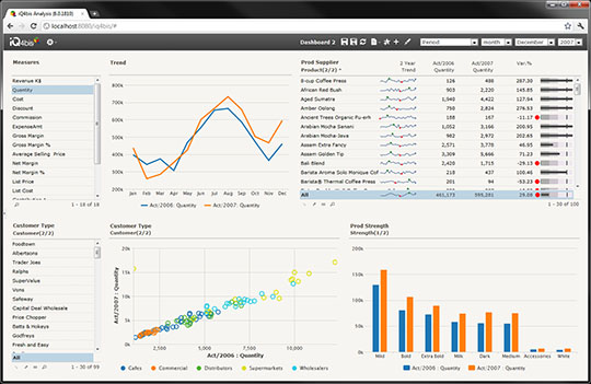
I quickly learned that these two vendors have approached their work from very different perspectives, producing significantly different results. iQ4bis is trying to serve the basic reporting and analysis needs of people whose data is hosted by Microsoft Sharepoint and SQL Server, who are not expert data analysts, and who don’t need to do anything fancy. For this reason, the product is intentionally limited in functionality. Their product is better than most of their competition because they began development with a firm commitment to data visualization best practices. Though fairly basic, what it does it does well. Their commitment to best practices comes through in the design of the charts and user interface (see the sample screen below). Improvements could certainly be made, but fundamentally the product seems quite sound, which cannot be said about many.
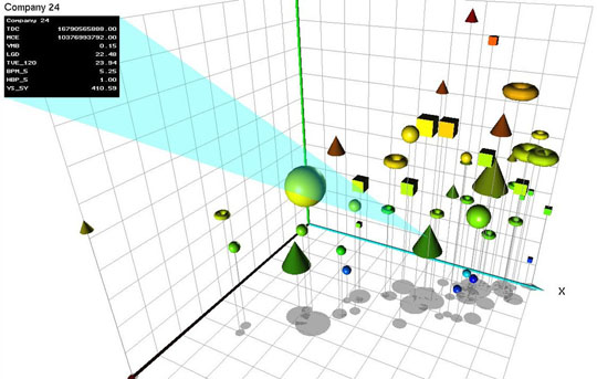
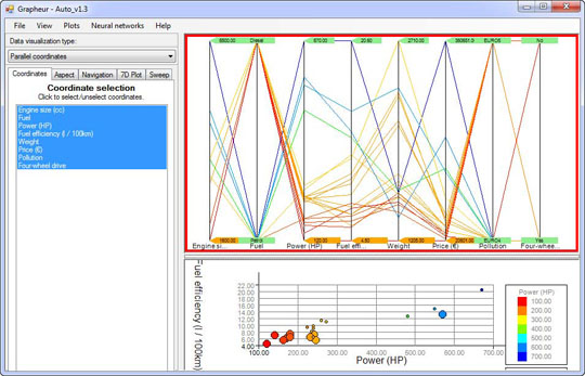
In contrast, Grapheur doesn’t exhibit a clear sense what it’s trying to do or who it’s trying to support. According to the user manual, it’s “intended for business users and decision makers.” During the product briefing, however, when I questioned why the software made it so easy to make bad choices, I was told that only expert analysts would use Grapheur, therefore it wasn’t necessary to prevent people from making mistakes that an expert would know to avoid. Only people who are well trained in visual data analysis would even attempt using this software because it includes several uncommon and complex visualizations, including parallel coordinates, and flirts with statistical functions like K-means clustering. However, even a expert analyst would not be drawn to this software because care wasn’t taken in its design. To illustrate this point, here are two sample screenshots from the product’s website:
3-D bubble charts are exclusively the realm of specialists who are highly trained in the recognition of 3-D patterns, but I doubt that they would find floating donuts all that useful.
To me this looks like something my cat Tuna once spit up, although a bit more colorful. To the uninitiated, some data visualizations can look absurd yet work effectively for those who understand them, but this isn’t the case here. This is meaningless.
The two developers of this software, both computer science professors at the University of Trento in Italy, have also written a book titled Reactive Business Intelligence: From Data to Models to Insight. What is “reactive business intelligence”? They define it as follows:
Reactive Business Intelligence (RBI) is about integrating data mining, modeling and interactive visualization, into an end-to-end discovery and continuous innovation process powered by human and automated learning.
Wow, that sounds impressive. Based on reading the user manual, however, this product doesn’t support true data mining at all and isn’t really designed for statistical modeling. How it enables a “continuous innovation process powered by human and automated learning”, I haven’t a clue.
The brevity of the 59-page user manual suggests that this product is incredibly easy to learn and use. Not so. Let me illustrate. Parallel coordinates are not familiar to most “business users and decision makers.” If you’ve run across them, you know that at first glance they appear intimidating. Using them well requires a great deal of training and experience. You would expect a user manual to take some time to introduce them. Here is the entire parallel coordinates section:
Now select the visualization type parallel coordinates and make sure that the corresponding panel to the right is selected.
In the parallel coordinates visualization, the different columns are represented by equally spaced parallel vertical lines. Each row in the data matrix is represented by a polyline that intersects the vertical line at the specific column values for that row. Each line is color coded according to the cell value in the column that was chosen for color-coding using the global aspect panel.
They don’t even explain what you would use parallel coordinates to do.
One apparent explanation for the misguided nature of this product is the fact that neither of its creators appears to have any experience or training in either business intelligence or information visualization. What is crystal clear is the fact that neither has studied human perception or cognition, which are two prerequisites for the development of useful data visualization software.
Do we need another dysfunctional data visualization product? Hardly. Do we need another confusing industry acronym (RBI)? God forbid.
Some of the best new data visualization products are coming from relatively small, young, and exceedingly agile software vendors that have (1) taken the time to understand what people must do with data to derive value from it, (2) developed a clear set of objectives to address this need, and (3) acquired the design and development skills required to create software that effectively supports these objectives. The fact that a BI vendor is small and agile, however, doesn’t guarantee good data visualization software. Nor does the fact that a BI vendor is huge guarantee bad data visualization software.
Those of us who rely on vendors to provide good tools for data sensemaking don’t care whether they’re big or small; we just want to do our work as well as possible. Vendors that help us do this will gain our trust. Vendors that make hollow claims are already rapidly losing it.
Take care,


5 Comments on “Big vs. Small BI: Size Really Doesn’t Matter”
I think that another positive coming from younger companies is, similar to what you said, the youth contained within their staff. For a long time we lived in a world where it was black-and-white: you either were a data/progamming guy or a design guy (see most web design companies). However, the up-and-coming generation of experts seem to WANT to have their skill sets to have both. I think this benefit will give us tools–in this case BI tools–which will eclipse the current king(s) of the hill. Of course I may be biased as I believe I’m part of the aforementioned generation.
Fesh,
I want to believe that this shift that you’ve observed toward a greater balance between development and design is actually happening, but I haven’t seen any evidence of it. I interact with software developers and development organizations frequently, and haven’t seen any evidence that a greater appreciation for design is actually taking root. In my interactions with universities, I haven’t seen curriculum changing to produce a design-oriented workforce. A greater number of books about design have been written in the last few years, but when I mention them to software developers, they’ve rarely heard of them.
I was chatting with a friend and colleague about this earlier today and she pointed out that our greater ability to connect with one another today via the Web, etc., might give the sense that there are more design-oriented folks out there when in fact it’s just easier to find others of like interest. I suspect that she’s right.
@Stephen
I think many developers would have a greater appreciation for design (visualization) if there was a greater appreciation for requirements in the software industry in general. As important as it is to the development process, “requirement elicitation” is a rarely-discussed topic. Many programmers rush to writing code, and fail to develop any understanding of real requirements. Without this understanding, the result is a really _cool_ product that doesn’t meet the customer’s needs.
The BI industry is a great example. Data-sensemaking has a unique array of requirements, but rather than determine how the customer will see and use the visualization (whether a dashboard, infographic, etc.) to make sense of data, most programmers will dive right into writing code that implements the solution. In the end, what do you get? A really cool product with 3D bells and whistles that wows the customer and mostly fails to meet their needs.
To clarify what I mean by “requirement elicitation”, here’s an example: I develop dashboards, and often customers just give me a wish list with no real objective. Most programmers would take the wish list and get started on the implementation. Instead, I talk to the users and figure out how they operate, what decisions they make, what situations demand attention, etc., and revise the wish list to be a solid list of real requirements. The results are both satisfying to me, and something that the customer can use.
Andrew,
You and I are on the same page. Thanks for stating your position so clearly and thoughtfully.
Hi Stephen,
One other advantage of these smaller, more agile vendors, is that they put pressure on the bigger guys to ‘step up’, and improve their game. If it wasn’t for the success of Tableau and Qliktech, then I’m sure Cognos would not be currently developing their own data visualisation technology (as recently told by Cindi Howson).
Of course, the trouble has been that the larger vendors usually don’t do as well when copying, then when innovating, so the quality of their efforts will be fascinating to see.
But the bigger guys are finally catching on.
Mick