| |
|

|
Thanks for taking the time to read my thoughts about Visual Business
Intelligence. This blog provides me (and others on occasion) with a venue for ideas and opinions
that are either too urgent to wait for a full-blown article or too
limited in length, scope, or development to require the larger venue.
For a selection of articles, white papers, and books, please visit
my library.

|
| |
March 19th, 2020
We love to put things in order. “Which college is best, second best, third best, etc., and how can I get my kid into one near the top of the list?” “I love God, Mom, America, and apple pie, in that order.” “Formal education consists of elementary school, middle school, high school, undergraduate school, and finally graduate school, if you’re lucky.” “Our best salesperson is John, second best is Mary, Sally is third, and poor Harold is at the bottom of the list.” We sometimes forget, however, that when we sequence things, even when that sequence is based on a quantitative measure (e.g., salespeople ranked by sales revenues), the order itself is merely ordinal, not quantitative. The company’s top salesperson, John, might be mediocre at best, and the second-best salesperson, Mary, might sell but a smidgen less than John or perhaps only half as much. A #2 ranking merely reveals that Mary sells less than John, not how much less.
An ordered list that appears along the axis of a graph, such as the ranked list of salespeople below, is called an ordinal scale.
An interval scale, like the one below, is quite different.
An interval scale subdivides a continuous range of quantitative values into equal intervals, in this case a range extending from 0 to 500, subdivided into intervals of 100 each. One of the most common interval scales that we use in quantitative data analysis involves ranges of time (e.g., from years 1950 through 2020) subdivided into equal periods (e.g., the 1950s, 1960s, etc.). Interval scales, by definition, are quantitative in nature; ordinal scales are not. In general, all we can say about ordinal scales is that the items have a meaningful order, nothing more. Along an interval scale, quantitative distances between adjacent items are always equal, but along an ordinal scale, distances between items typically vary.
A Likert scale is an example of an ordinal scale that is often used in social science research and surveys. Likert scales allow people to respond to questions, such as “How often do you drink more than a single serving of an alcoholic beverage in a day?”, by selecting from an ordered list such as the following:
1. Never
2. Seldom
3. Occasionally
4. Frequently
5. Always
Notice that the items have a meaningful order, but the scale itself is not quantitative. The difference in the frequency of occurrence between “Never” and “Seldom” is not necessarily the same as the difference between “Seldom” and “Occasionally.” Item #5 (“Always”) is not five times greater than item #1 (“Never”). Even though items in ordinal scales are often labeled with numbers (e.g., “1 – Never” and “5 – Always”), the numbers only indicate a sequence (item #1, item #2, etc.), not quantities.
Ordinal scales often provide meaningful and useful ways to arrange items in a list. I often arrange the values that appear in a graph in order from low to high or high to low because it is easier to compare values when those that are close to one another in magnitude are near one another in the graph. You can see this by comparing the two graphs below: one ordered by SAT scores from high to low and the other arranged alphabetically by student names.
As I’ve already mentioned, when values are ranked, the ranking itself is not and shouldn’t be treated as quantitative. Shouldn’t, but often is.
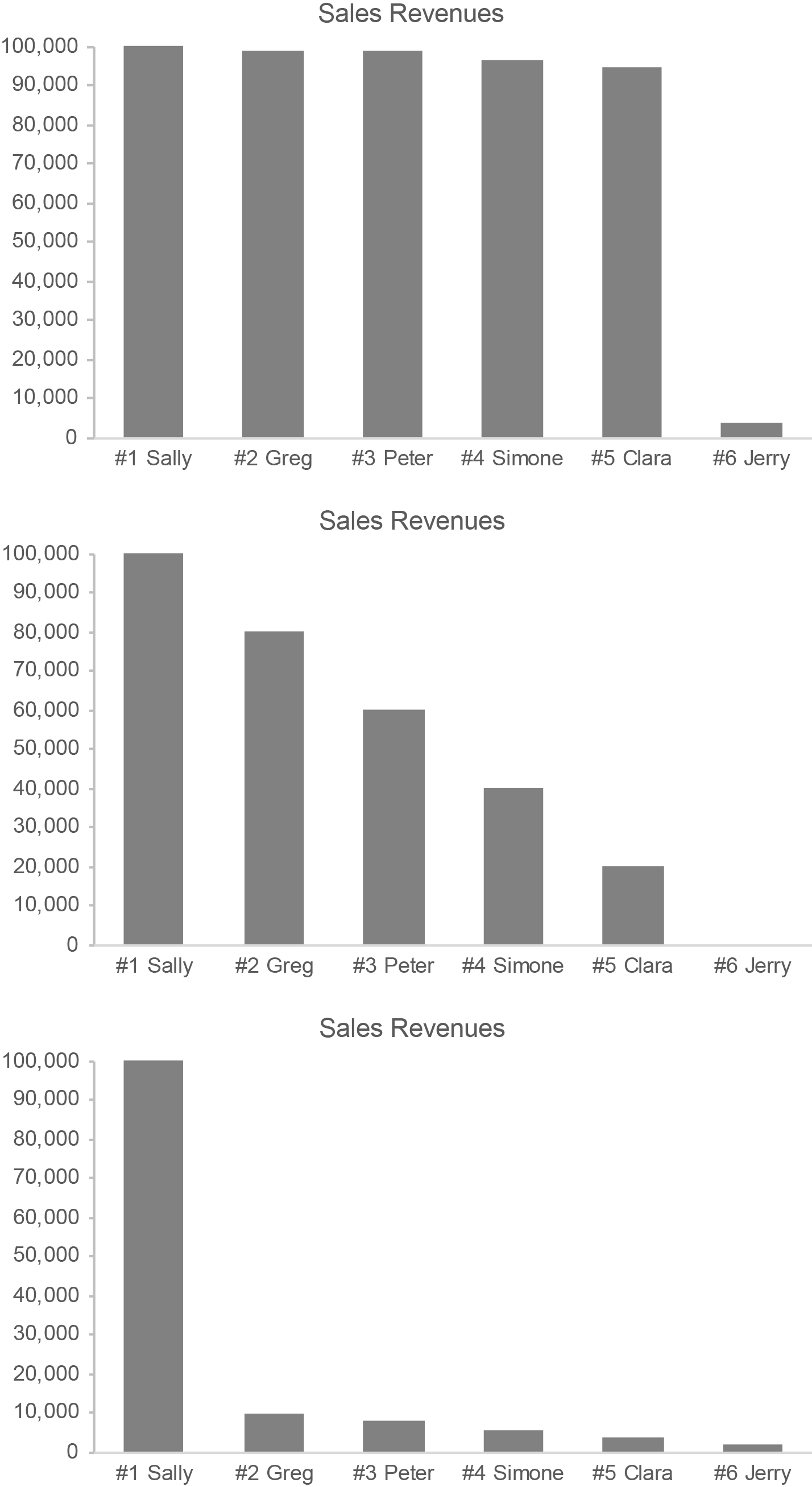
Here are three examples of salespeople ranked by sales revenues, displayed graphically. Notice how differently the salespeople vary in sales performance among these three graphs even though the rankings are the same.
For most purposes, it is the sales revenues themselves in these examples that are important. They deserve far more attention than the rankings.
Let’s get back to Likert scales for a moment. Assigning numeric values to items in a Likert scale is not appropriate, in my opinion, but it is routinely done. For example, social science research that uses a questionnaire to measure depression among a population, based on the following Likert scale, could simply add up the numbers associated with the items to produce an overall 5-point depression score.
1. Never
2. Seldom
3. Occasionally
4. Frequently
5. Always
Measuring people’s depression in this manner, however, does not qualify as truly quantitative.
If ordinal quantification is misleading, why is it done? Mostly, for convenience. It allows people to represent something that is difficult to measure with a simple number, but that number is inherently misleading. Sometimes this is also done for another reason: to lend Likert scales an inflated sense of accuracy, precision, significance, and objectivity when making research claims. A great deal of social science and survey-based performance reporting (e.g., customer satisfaction surveys) is based on quantified Likert scales. In my opinion, this renders any claims that are based on them suspect.
In science and data sensemaking (including data visualization), it is important to understand the difference between interval scales and ordinal scales: the former are quantitative; the latter are not. Both play a role, but their roles should not be conflated.
March 9th, 2020
It galls me when people oversell data visualization. Data visualization combines technologies (visual representations of quantitative data) with specific skills (techniques for creating and interacting with those visual representations) to make sense of and communicate quantitative data. It does not replace the other technologies and skillsets that are also needed to derive value from quantitative data; it complements them. It contributes to solutions; it is not “the solution.”
As an expert in data visualization, I’ve never oversold it. Data visualization is extremely useful and at times essential, but it is only one of many technologies and skillsets that are needed to understand and communicate quantitative data. It enables us to see patterns and relationships in quantitative data that would be difficult or impossible to see in any other way, but it does not stand alone. To understand and present quantitative data effectively, we also need domain knowledge, statistical thinking, critical thinking, scientific thinking, systems thinking, and computer skills.
Marketing has infected us with a propensity for hype. It is no longer enough to truthfully describe what something is and does; we must exaggerate it to the point of absurdity in an effort to sell it. When we create expectations that can never be satisfied, however, we pave the road to confusion, frustration, and failure. When data visualization fails to deliver on hyperbolic promises, in what direction do the fingers of blame point? They point to data visualization rather than to the fools who misrepresent it.
If you value data visualization, you’ll do it no favors by exaggerating its role and worth. An honest assessment is all that’s needed. Data visualization is incredibly useful, but it’s not the “second coming.” Rather than tooting data visualization’s horn with the bombastic grandeur of a Wagnerian opera, demonstrate its worth by doing it well. Combine it with complementary skills and technologies to solve real problems. That’s enough. That will always be enough.
March 5th, 2020
I just finished reading the book about Artificial Intelligence (AI) that I’ve been craving for years: Artificial Intelligence: A Guide for Thinking Humans, by Melanie Mitchell. More than any other book on this hot but largely misunderstood topic, this book describes AI in clear and accessible terms. It cuts through the hype to present a sane assessment with no agenda apart from a desire to inform. Reading this book, you’ll likely discover that AI is quite different from what you imagined.
 Melanie Mitchell qualifies as a second-generation pioneer in the field of AI. Beginning in the mid-1980s she earned her Ph.D. in the field under the supervision of Douglas Hofstadter, the previous generation pioneer whose book Gödel, Escher, Bach: an Eternal Golden Braid inspired many to pursue AI. She continues to do research and development in AI as a professor at Portland State University and at the Santa Fe Institute. I’d wager that few people, if any, understand AI in general better than she does. In this book she explains what AI is, covers its history from inception through today, describes the approaches that have been pursued (symbolic AI, neural networks, machine learning, etc., including explanations for how these approaches work), and presents the strengths and limitations of AI in unvarnished terms. She does all of this with a practical eloquence that is rare among technology writers.
Should we be concerned about AI? You bet, but probably not for the reasons that you imagine. AI has never exhibited anything that qualifies as general intelligence (i.e., thinking as humans do), despite years of diligent effort. Will it ever? Nobody knows. In the meantime, however, we do know that computers can perform “narrow AI” tasks that are quite helpful. We should make sure that AI is only applied in ways that are truly useful and understood. If we can’t understand how AI’s results are produced, we can’t trust those results. We must also make sure that AI applications are designed in ways that are both effective and ethical. Current applications exhibit worrisome flaws. As AI researcher Pedro Domingos has said: “People worry that computers will get too smart and take over the world, but the real problem is that they’re too stupid and they’ve already taken over the world.” I agree. We can and should produce better, more useful AI technologies. Knowing that people like Melanie Mitchell are involved in the effort gives me hope—a glimmer, at least—that we just might head in that direction.
March 1st, 2020
As data sensemakers, we spend a great deal of time examining quantitative relationships. Along with distribution, correlation, and time-series relationships, proportion is the other quantitative relationship that plays a significant role in data sensemaking. A proportion is just a relationship between two quantities. If we compare the number of friends that Sally and John each have, Sally’s 20 friends compared to John’s 10 friends is a proportion. It’s really that simple, but confusion often occurs when we communicate proportions.
Much of the confusion probably stems from the fact that proportions can be expressed in several ways: as ratios, fractions, rates, and percentages. The proportion of Sally’s 20 friends compared to John’s 10 can be written as a ratio in either of the following ways: “20 to 10” or “20:10”. This same proportion can also be expressed as “2 to 1” or “2:1”, for these ratios represent the same proportion in which the first value is double the second. This proportion can also be expressed as the fraction “20/10”. The symbol for division (i.e., /) that appears in the fraction indicates that a proportion can also be expressed as the result of division, which is called the rate. In this case, the rate of Sally’s friends to John’s is 2, because 20 divided by 10 equals 2. A rate of 1, expressed as a percentage, is 100%, so the proportion of Sally’s friends to John’s, expressed as a percentage, is 200% (i.e., the rate of 2 multipled by 100%).
All of these expressions of the proportion reveal that Sally has twice as many friends as John. Expressed as a percentage, we could also say that Sally has 100% more friends than John, for Sally’s 200% minus John’s 100% results in a 100% difference. We should express it this way cautiously, however, for people often find “less than” or “greater than” expressions of proportions confusing. When we express a greater than or less than proportion, we must remember to express only the difference between the two values.
Each expression of the proportion above treats Sally’s friends as the point of reference. To get the rate of 2, we began with Sally’s number of friends and divided that by John’s number of friends (i.e., 20 / 10 = 2). The order matters. If we instead treated John’s number of friends as the point of reference, we could express the proportion of John’s 10 friends to Sally’s 20 in each of the following ways: the ratio 10 to 20, 10:20, 1 to 2, or 1:2; the fraction 10/20 or 1/2; the rate of 0.5; the percentage 50%. We could also say that John has 50% fewer friends than Sally (i.e., John’s 50% minus Sally’s 100% equals -50%).
If John lost 8 of his friends, leaving only 2, while Sally maintained all 20 of her friends, we could say that John has 0.1 or 10% the proportion of friends that Sally has. This is fairly straightforward and clear to anyone who understands the basic concepts of rates and percentages. On the other hand, would could also say that John has 90% fewer friends than Sally (10% minus 100% equals -90%), but, as I warned previously, this isn’t nearly as straightforward and clear for many people.
In the Oxford English Dictionary (OED), the first two definitions of “proportion” are:
1. A portion, a part, a share, especially in relation to a whole; a relative amount or number.
2. A comparative relation or ratio between things in size, quantity, number, etc.
Both of these definitions fit what we’re discussing here. The sixth definition that appears in the OED, however, which is particular to mathematics, can lead to confusion.
6. MATH. A relationship of equivalence between two pairs of quantities, such that the first bears the same relation to the second as the third does to the fourth.
In other words, when comparing the ratio 1:2 to the ratio 10:20, mathematicians would not just say that they are in proportion but that they actually are a proportion. I mention this only to point out that, if you’re talking to a mathematician about proportions, you might be using the term differently, so be careful. I’ve encountered this problem myself a few times.
A few months ago, I ran across an example of a proportion gone wrong. It appeared on the PBS Newshour broadcast on September 23, 2019 in a segment titled “Judges weigh Trump’s family planning finding rule.” Near the end of the broadcast the following text appeared on the screen:
 This is an example of a proportion that has been expressed as the difference between two values (i.e., the average income of Title X patients minus the income that’s defined as the poverty level) rather than more clearly as the relationship between them, but that’s not the only problem here. An income that is 150% below the poverty line makes no sense. An income can’t be more than 100% below the poverty line, for that would produce a negative value and negative income doesn’t make sense in this context. The person who wrote this text must not understand proportions, and apparently the program’s hosts were confused as well, which is all too common. I suspect that they meant to say that 78% of Title X patients have incomes that fall below 150% of the poverty line. In 2019, the U.S. federal poverty level for a family of one was $12,140, so 150% of that is $18,210. It seems reasonable that 78% of people who take advantage of Title X—people who tend to have low incomes and thus are in need of Title X assistance—made less than $18,210 for a family of one, $24,690 for a family of two, $31,170 for a family of three, and so on.
When dealing with proportions, a rate of 1 and a percentage of 100% play an important role. They both express the same equal, one-to-one proportion. In other words, the two values that are being compared are the same. For this reason, we tend to think of proportions as being less than, equal to, or greater than 1 when expressed as a rate or less than, equal to, or greater than 100% when expressed as a percentage. Consistent with the importance of 100%, there is a special type of proportional relationship that is based on 100% of something: the part-to-whole relationship. The whole is 100% of some measure (e.g., total sales revenues) and the parts are lesser percentages into which the whole has been divided (e.g., sales revenues in separate geographical regions, consisting of North, South, East, and West), which add up to 100%. When examining parts of a whole, we spend much of our time comparing the parts to one another. As such, graphical displays of part-to-whole relationships are only effective if they make it easy to compare the parts. Unfortunately, the most popular part-to-whole display—the pie chart—does this job poorly. It is difficult to compare slices of a pie. If you don’t already know why this is so, I recommend that you read my article “Save the Pies for Dessert.” As it turns out, this problem with pie charts is well understood but routinely ignored.
The ways that changes in proportions are expressed are another common source of confusion. Let me illustrate. According to a recent survey, the obesity rate among U.S. adults is now 42%. If we’re told that the obesity rate has increased 40% in the last 20 years, what was the rate in the year 2000? Think about this for a moment. In the year 2000, was the obesity rate 2% (i.e., 2% + 40% = 42%) or was it 30% (i.e., 30% * 140% = 42%)? It depends on how you interpret the words “increased 40%.” People sometimes mistakenly interpret this as a percentage point increase rather than a percentage increase. In this particular case, common sense suggests that the obesity rate must have been 30% in the year 2000, for there’s no way that only 2% of U.S. adults were obese just 20 years ago. Without this context, however, people might be confused.
This increase may be expressed in any of the following ways: “From the year 2000 to the year 2020, the obesity rate among U.S. adults…”
- “…increased from 30% to 42%.”
- “…increased 12 percentage points to 42%.”
- “…increased 40% to 42%.”
Which of the three expressions above would least likely result in confusion? I suspect that the first, “…increased from 30% to 42%”, is the clearest. We could, of course, state the change more thoroughly by saying “…increased 12 percentage points from 30% to 42%” or “increased 40% from 30% to 42%.” When communicating with the general public, extra care in expressing changes in proportions works best.
Communicating proportions isn’t terribly difficult if we’re aware of how people might misinterpret them and take care to express them clearly. If you’re proportionally challenged, I hope this helps.
February 21st, 2020
I often write about topics that I myself have struggled to understand. If I’ve struggled, I assume that many others have struggled as well. Over the years, I’ve found several mathematical concepts confusing, not because I’m mathematically disinclined or disinterested, but because my formal training in mathematics was rather limited and, in some cases, poorly taught. My formal training consisted solely of basic arithmetic in elementary school, basic algebra in middle school, basic geometry in high school, and an introductory statistics course in undergraduate school. When I was in school, I didn’t recognize the value of mathematics—at least not for my life. Later, once I became a data professional, a career that I stumbled into without much planning or preparation, I learned mathematical concepts on my own and on the run whenever the need arose. That wasn’t always easy, and it occasionally led to confusion. Like many mathematical topics, logarithms can be confusing, and they’re rarely explained in clear and accessible terms. How logarithms relate to logarithmic scales and logarithmic growth isn’t at all obvious. In this article, I’ll do my best to cut through the confusion.
Until recently, my understanding (and misunderstanding) of logarithms stemmed from limited encounters with the concept in my work. As a data professional who specialized in data visualization, my knowledge of logarithms consisted primarily of three facts:
- Along logarithmic scales, each labeled value that typically appears along the scale is a consistent multiple of the previous value (e.g., multiples of 10 resulting in a scale such as 1, 10, 100, 1,000, 10,000, etc.).
- Logarithmic scales make it easy to compare rates of change in line graphs because equal slopes represent equal rates of change.
- Logarithmic growth exhibits a pattern that goes up by a constantly decreasing amount.
If you, like me, became involved in data sensemaking (a.k.a., data analysis, business intelligence, analytics, data science, so-called Big Data, etc.) with a meagre foundation in mathematics, your understanding of logarithms might be similar to mine—similarly limited and confused. For example, if you think that the sequence of values 1, 10, 100, 1,000, 10,000, and so on is a sequence of logarithms, you’re mistaken, and should definitely read on.
Before reading on, however, I invite you to take a few minutes to write a definition for each of the following concepts:
- Logarithm
- Logarithmic scale
- Logarithmic growth
In addition to definitions, take some time to describe how these concepts relate to one another. For example, how does a logarithmic scale relate to logarithmic growth? Give it a shot now before reading any further.
…
Regardless of how much you struggle to define these concepts and their relationships to one another, it’s useful to prime your brain for the topic. Now that you have, let’s dive in.
Logarithms
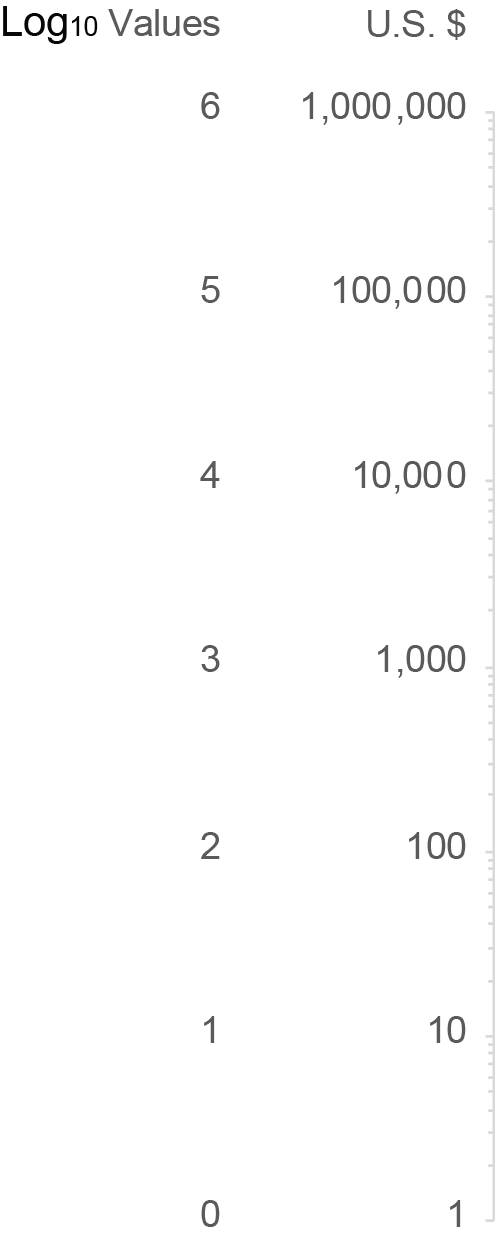
The logarithm (a.k.a., log) of a number is the power that the log’s base must be raised to equal that number. I realize this definition might not seem clear but hang in here with me. I promise that greater clarity will emerge. Logarithms always have a base (i.e., a number on which it is based). The most common base is 10, expressed as log10, but any number may serve as the base. To determine the log10 value of the number 100, we must determine the power of 10 that equals 100. What this means will become clear in a moment through an example, but before getting to that, let’s review what raising the power of a number means in mathematics.
Raising a number to a power involves multiplying the number by itself a specific number of times. The power indicates how many instances of the number are multiplied. For example, 10 to the power of 3, written as 103 (the 3 in this case is called the exponent), involves multiplying 10 * 10 * 10, which equals 1,000. Raising a number to the power of 1 involves only one instance of that number—there is nothing to multiply—so the number remains unchanged. For example, 101 remains 10. Raising a number to the power of 2 involves multiplying two instances of that number, so 102 is 10 * 10, which equals 100. In these examples so far, the only time multiplication wasn’t involved was with the power of 1. Multiplication is also not involved whenever the exponent is zero or negative. In those cases, raising the power of a number involves division. For example, with the power of 0, rather than multiplying instances of the number by itself, we divide the number by itself, so 100 is equal to 1, for 10 / 10 = 1. Here’s a list of values that result from raising the number 10 to the powers of 0 through 6:
 Now that we’ve reviewed what it means to raise a number to a particular power, we can get back to logarithms. Remember that the log of a number is the power that the log’s base must be raised to equal that number. So, to find the log2 value of the number 8, we must determine the power of 2 (the log’s base) that is equal to 8. In other words, we must determine how many times 2 must be multiplied by itself to equal 8. Since 21 = 2 and 22 = 4 (i.e., 2 * 2 = 4) and 23 = 8 (i.e., 2 * 2 * 2 = 8), we know that log2 of 8 is 3. Given this procedure, what is the log10 value of 100? It is 2, for 10 must be raised to the power of 2 (i.e., 10 * 10) to equal 100. What’s the log2 of 64? It is 6, for 2 must be raised to the power of 6 (i.e., 2 * 2 * 2 * 2 * 2 * 2) to equal 64.
So far, we’ve only dealt with logs that result in nice, round numbers, but that isn’t always the case. For example, what is the log2 of 100? The log2 of 64 is 6 and the log2 of 128 is 7, so the log2 of 100 is somewhere between 6 and 7. When expressed to eight decimal places, the log2 of 100 is precisely 6.64385619. What is the log10 of 5? It must be less than 1, because 5 is less than 10. The precise answer is 0.698970004.
Have you ever examined a list of the logarithms associated with an incremental sequence of numbers? Doing this is revealing. Here’s a list of the log2 values for the numbers 1 through 32, with an additional column that shows the proportional relationship between log2 values and the numbers on which they’re based:
Notice that, other than the log2 value of the number 3 (i.e., 1.584963, which is 52.832% of 3), as we read down the list, each log is a decreasing percentage of the number on which it is based. Keep this fact in mind. It will come in handy as we examine logarithmic scales and logarithmic growth.
Logarithmic Scales
A logarithmic scale (a.k.a., log scale) is one in which equal distances along the scale correspond to equal logarithmic distances. Because of the nature of logarithms, each number that typically appears along the scale is a consistent multiple of the previous number. The example below includes a log10 scale along the Y axis.
 Along a log10 scale, because the base is 10, each number is 10 times the previous number. The example above begins at 1, but it could begin at any number. For example, a log10 scale could begin at 40 and continue with 400, 4,000, 40,000, and so on, each ten times the previous. A log2 scale that begins with 1 would continue with 2, 4, 8, 16, and so on, each two times the previous. Unlike a linear scale in which the intervals from one number to the next are always equal in value, such as 0, 10, 20, 30, 40, etc., along a log scale the intervals (i.e., the quantitative distances between the labeled values) consistently increase in value, each time multiplied by the base.
The numbers 1, 10, 100, 1,000, 10,000, 100,000, and 1,000,000 in the graph above correspond to logarithms with a base of 10, but those numbers are not themselves logarithms. Instead, they are the numbers from which the logarithms were derived. Here’s the scale that appears along the Y axis of the graph above, this time with the actual log10 values 0 through 6 labeled in addition to the numbers 1 through 1,000,000 from which those logarithms were derived.
We usually label the log scales with the numbers from which the logarithms were derived rather than the logarithms themselves because the former are typically more familiar and useful.
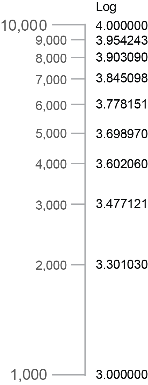
Another characteristic of a log scale that reinforces its nature bears mentioning, which I’ll illustrate below by featuring a single interval only along the Y axis of the graph shown previously.
Notice that the minor tick marks between 1,000 and 10,000 get closer and closer together from bottom to top. This is easier to see if the scale is enlarged and the minor tick marks are labeled, as I’ve done below.
Each interval from one tick mark to the next (1,000 to 2,000, 2,000 to 3,000, etc.) consistently covers a numeric range of 1,000, but the spaces between the marks get smaller and smaller because the differences in the logarithms corresponding to those numbers get smaller and smaller. To illustrate this, I included a column of the log10 values that correspond to each tick mark in the example above. The decreasing distances between the tick marks correspond precisely to the decreasing differences between the log values.
Logarithmic Growth
Because the numbers that typically appear as labels on a log scale are each a consistent multiple of the previous number, if you didn’t already understand logarithms, you might assume that logarithmic growth involves a series of values that are each a consistent multiple of the previous value. Here’s an example of how that might look as a series of values:
 In this example, each daily value doubles the previous value. This, however, is not an example of logarithmic growth. It is instead an example of exponential growth (a.k.a., compound growth). With exponential growth, the amount of increase from one value to the next is always greater. Compound interest earned on money in a savings account is an example of exponential growth. As the balance grows, even though the rate of interest remains constant, the amount of growth in dollars consistently increases because of the growing balance. For example, 10% interest on $100 (i.e., $10) would increase the balance to $110 during the first period, and then during the next period, it would be based on $110 resulting in $11 of interest, a dollar more. Even though the interest rate remains constant, because the balance grows from one period to the next, the amount of increase grows as well.
Contrary to exponential growth, logarithmic growth (a.k.a., log growth) exhibits a constant decrease in the amount of growth from one value to the next. In other words, it always grows but it does so to a decreasing degree over time. A simple example is the distance that a bullet travels when you shoot it straight up into the air from the moment it leaves the gun until it reaches its apex, before beginning its descent. The height of the bullet starts off by increasing quickly but those increases constantly decrease in amount from one interval of time to the next due to the pull of gravity.
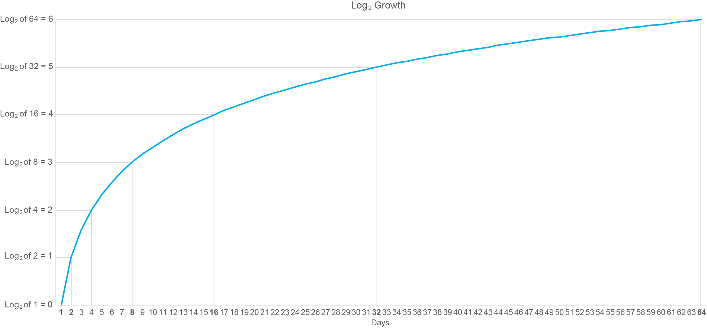
So, how does log growth relate to log scales? It’s not at all obvious, is it? Good luck finding an explanation on the web that’s understandable if you’re not fluent in mathematics. Here’s a graphical example of log growth, based on the log2 values for the numbers 1 through 64:
I’ve annotated this graph with lines connected to points in time when the logarithm has increased by a whole unit (i.e., from 0 to 1, 1 to 2, etc.). Starting on day 1 the log value is zero and whole-unit increases are subsequently reached on days 2, 4, 8, 16, 32, and 64. Do you recognize this pattern of days along the X axis? It matches the numbers that would appear along a log2 scale that begins with 1. In other words, the intervals between the days on which the logarithms increased by a whole unit consistently grew by a multiple of 2.
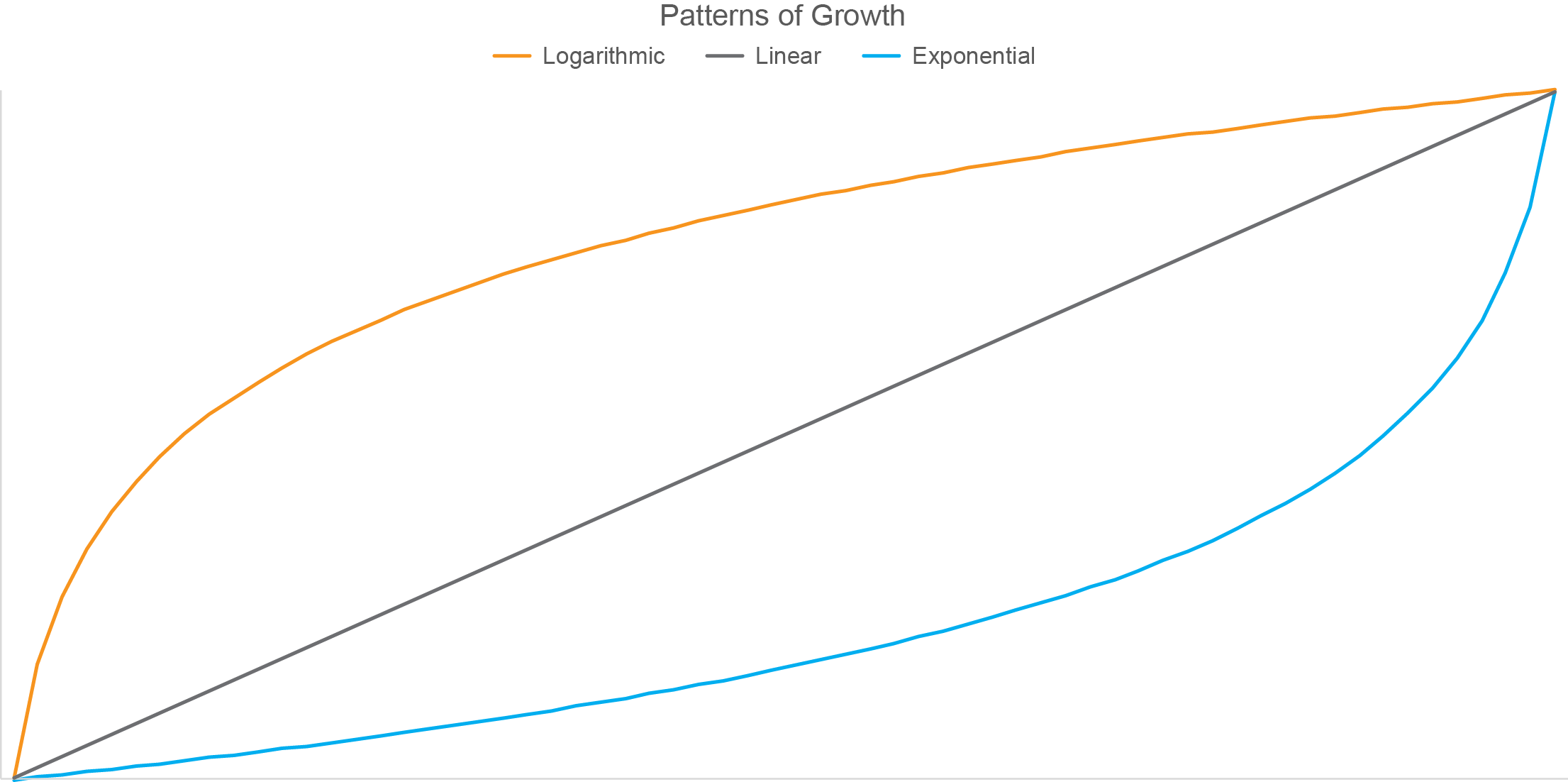
Have you noticed that the pattern formed by log growth is the inverse (i.e., flipped top to bottom and left to right version) of the pattern formed by exponential growth? To illustrate this, the graph below displays three different patterns of growth: logarithmic, linear, and exponential.
This inverted relationship between patterns of logarithmic and exponential growth visually confirms the inverted relationship that exists between logarithms and the exponential powers that are used to produce them.
Given the nature of logarithms, what do you think would happen to the shape of the blue exponential line above if I changed the scale along the Y axis from linear to logarithmic? If your answer is that the blue line would now take on the shape of logarithmic growth similar to the orange line above, you’re thinking in the right direction, but you went too far. The nature of logarithms to progressively decrease in the amount that they grow from one to the next would cancel out the nature of exponents to progressively increase in amount that they grow from one to the next, resulting in a linear pattern similar to the gray line in the graph above.
…
I hope you agree that these concepts actually make sense when they’re explained with clear words and examples. You still might not have much use for logarithms unless your work involves advanced mathematics, but now you’re less likely to embarrass yourself by saying something dumb about them, as I’ve done on occasion.
|