A Design Problem
I found this graph in Business Objects' user documentation. It served as an example of 3-D bar graphs. Business Objects is a leading business intelligence software vendor. Take a moment and try to interpret the data.
[Scroll down to see our solution to this graph's design problems.]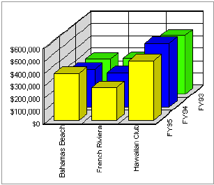
Our Analysis
Notice the following problems in the example above:
- The 3-D bars are impossible to read.
- The heavy grid lines offer nothing but distraction.
- The vertically-oriented labels (i.e., the resort names and years) are difficult to read.
- The years run from back to front, which is counter-intuitive.
A Solution
It took me 15 minutes to do my best to guess the dollar amounts of the bars, then five minutes to create the following alternative:
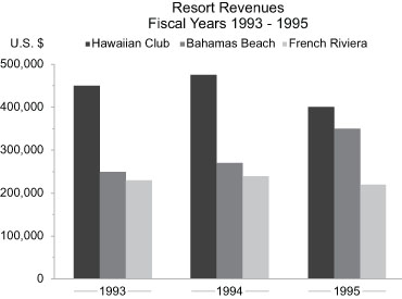
This graph eliminates the use of 3-D altogether, which almost never works in business graphs. Also notice the other following improvements:
- The bright bar colors have been replaced with variations in gray-scale, thereby guaranteeing that this graph will still work if it is photocopied or printed on a black-and-white printer.
- The three resorts have been arranged in order of rank, based on revenue, to highlight their comparative performance.
- The years have been arranged from left to right, which is intuitive.
- The legend has been placed above the bars, in the same sequence as the bars, to ease the process of matching them up.
The bar graph solution is ideal if people primarily want to focus on the magnitudes of a particular bar or if they want to compare the revenue of all three resorts in a given year. However, if we're more interested in seeing how revenue has changed through time, then the following line graph solution, suggested by Daniel Ferry, would work better.
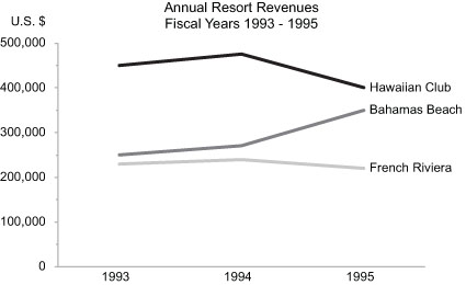
This design makes it easy to see how revenue has changed from year to year at each of these resorts. I've preserved the gray-scale color scheme that was used in the bar graph, so this graph will also work well if printed in black-and-white. Additionally, because I was able to label each of the lines directly, I was able to remove the legend.