A Design Problem
I found this graph on the web site of Visual Mining, Inc. It served as an example of a radar graph used to report the ratings of three candidates for employment. Pretty, isn't it, especially where colors overlap to form new colors, but can you make sense of it?
[Scroll down to see our solution to this graph's design problems.]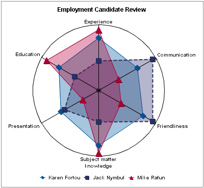
My Analysis
The fundamental problem with this display is that radar graphs are rarely useful for business reporting, and certainly not for this purpose. They can obscure an otherwise simple message.
A Solution
Assuming that the graph was based on a five-point rating scale, it took me 15 minutes to estimate the ratings of each employment candidate based on the radar graph, and then five minutes to create the following alternative:

Because the purpose is to make a fine comparison of the three candidates' fitness for the job, a table provides the needed precision. It's very simple to read, and requires no instruction whatsoever, unlike the radar graph. It also provides the summary measures of the candidates' overall average ratings, which are very useful in light of the objective.
Upon reviewing our solution, Kevin Eaves, an insightful Director at World Savings Bank, suggested that a series of related bar graphs would also work. Although I prefer a table for displaying the small collection of ratings for the three employment candidates, I agree that a series of bar graphs would work well for a larger number of candidates, so I've now also prepared a graphical solution.