A Design Problem
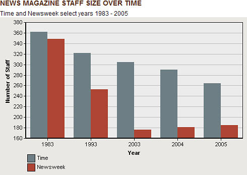
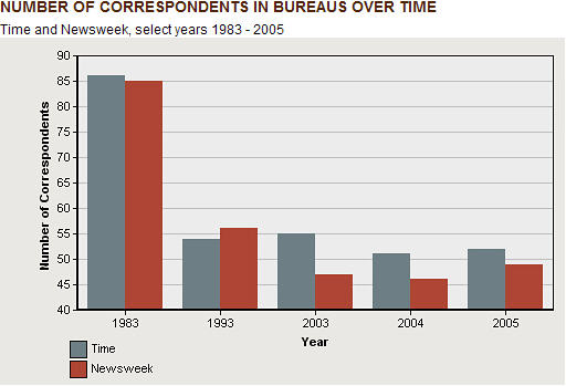
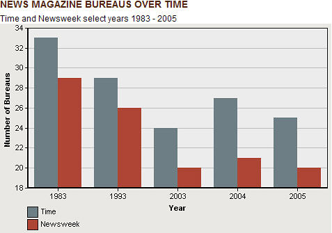
The following set of three bar graphs was taken from Journalism.org. Their purpose is to show how Time magazine and Newsweek magazine have had to downsize between 1983 and 2005.
[Scroll down to see our solution to this graph's design problems.]


My Analysis
At first blush, these graphs don’t seem all that bad. They suffer from a few obvious but minor visual problems, such as the vertically oriented title on the y-axis, but they are certainly easier to read than most of the other examples of poor graph design that you’ll find on this site. The primary problem with these graphs is that they visually misrepresent the truth. They mislead the viewer by manipulating the data in two different ways.
The first way involves the use of a non-zero baseline. If you look at the vertical axes on all of these bar graphs, you’ll notice that none of them start at zero. This would be fine if lines or dots were used to encode the values, but because the length of a bar encodes its value, rather than just the position of it endpoint in relation to the quantitative scale, the use of a non-zero baseline doesn’t work. By starting the quantitative scale above zero, the relative differences in the values represented by the bars have been exaggerated. For instance, if one bar represents a value of 10 and another 9, when the bars start at zero we can see that this is a relatively minor difference. However, if the bars start at 8, then the one that represents 10 would appear to be twice as high as the one that represents 9. In my experience, most people who use non-zero baselines in their bar graphs are not intentionally trying to lie. Common software products like Excel make it too easy to set the baseline to a value other than zero. Most people use non-zero baselines in bar graphs without even realizing that this misrepresents the values. You no longer need be one of them.
The second problem with these graphs is that they don’t depict a continuous range of time. Although the intervals between the bars are of equal size, because some of the bars are 10 years apart and others are only one year apart, the overall trend is misrepresented. For instance, in general there is a much larger difference between the first three bars (1983, 1993, and 2003) than there is between the last three bars (2003, 2004, and 2005). However, as we’ll see by comparing the original graphs to my redesign below, by only selecting certain years at unequal intervals, the graphs exaggerate the rate of the decline.
A Solution
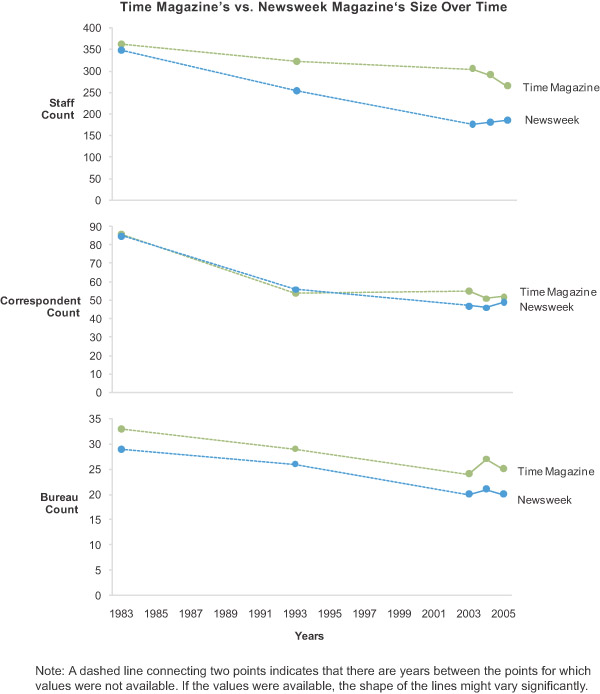
Here is my redesign:

From this display, we can quickly see that, while there appears to be a general downward trend in all of the graphs, it is much more gradual than the original graph suggests, especially the decrease in news bureaus. The truth is far less sensational than the original graphs would have you believe.
Notice that the general trend between 1983 and 2003 is “interpolated,” that is, the shape of the line is based on only a few data points separated by many years, instead of every year (because many years were not included in the original graph). I’ve used a dashed line and included an explanatory note to inform the viewer of this fact. Ideally, it would be best to have data for all of the years so that we could present a more accurate picture of the shape of change through time. After all, values tend to fluctuate from year to year, in spite of the general trend. If any of these values vary significantly (either positive or negative) from the overall trend, then the picture would look quite different from the one above. Unfortunately, due to missing data, we cannot know for sure.
