A Design Problem
I found this graph in the Sept 2003 issue DM Review. It is based on research conducted by Giga Research, a subsidiary of Forrester Research, Inc. What do you think of it?
[Scroll down to see our solution to this graph's design problems.]
My Analysis
The data is great but the display is a jumbled mess.
A Solution
Here's the same data displayed simply and clearly:
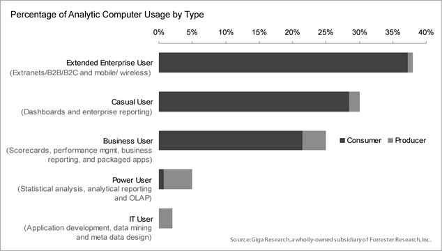
I could have used colors but, frankly, this graph doesn't need them. Limiting it to black and white allows you to photocopy this useful information and pass it on without any loss of quality. Can you imagine what the original pie chart would look like if you photocopied it in black and white?