Beauty at the Cost of Insight
This entry was written by Bryan Pierce of Perceptual Edge.
Recently, I found a glowing press release from a business intelligence vendor named Blink Logic, which announced that their software is now being used by a large financial services company. After reading the press release, I went to their website where I found the following image:
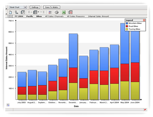
This is a stacked bar graph that is being used to display how Internet Sales have changed from month to month. Each stacked bar combines sales for Mountain Bikes, Road Bikes, and Touring Bikes. Although this might not be the best graph for the job (notice how difficult it is to compare the heights of the red or blue bars), depending on what their client needs to focus on, this graph type might be sufficient.
What bothered me and prompted me to write about this graph appears in the legend in the upper right corner.

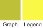
In the graph, the colors of the three bar segments are blue, red, and green. In the legend, they’re blue, red, and yellow. Here are swatches of the two colors side by side.
In looking around their website, I found a few other examples of the same problem.
If you look at the original bars closely you can see that the fill color in each of the bars varies slightly. In conjunction with the shadow on the right side of each bar, it’s probably safe to assume that Blink Logic is trying to simulate lighting effects on the bars and as a side effect, the yellow color, which was selected to represent Touring Bikes, is being rendered as green (that is, yellow supposedly darkened by shadows).
Problems of this sort are fairly common by-products of lighting effects. Because of the gratuitous use of lighting effects, for example, I’ve seen pie charts that looked like they contained more slices than they actually did and line graphs where the colors of two or more of the lines were indistinguishable. Even when lighting effects don’t distort the image, they can still slow us down, because they complicate the display, making our eyes try to find and compare gradients of color instead of uniform patches.
The essential point I’m attempting to make is not just about lighting effects, but about all of the glitzy effects and cool features that vendors incorporate into their products and promote to the world. Before a new effect or feature is added, a vendor needs to weigh its true costs versus its benefits. Is it detrimental to the whole? If you add another variable to a bar graph, you complicate it, making it harder to focus on the other data. Often, this is okay, because the benefit of the additional data outweighs the cost of the additional complexity. But what benefit do visual frills add? When you add a color gradient, shadows, or a 3-D effect to your bar graph, you might make it “prettier,” but is it really worth sacrificing understanding in the process?
-Bryan Pierce
12 Comments on “Beauty at the Cost of Insight”
Another issue is that the legend obscures some of the data points. Labels should be used on the last point of each series (or spanning the last couple of points), and the legend should be removed.
Bryan – Nice post!
I’m an avid anti-stacked bar chart promoter. Once you get beyond the first data set, the baselines are not the same. A simple line graph with labels would have been a much better choice.
On the color/lighting point; to me it wasn’t a big issue becuase it’s intuitive with only 3 different options (colors are vastly different). I can see how it could become an issue as you add more series.
To Jon’s point, the legend should not overlay any data sets. In this example, the legend should have been in the upper left if not removed. Needing a legend is another reason I’m not a big fan of stacked bars.
Bryan, when you say “notice how difficult it is to compare the heights of the red or blue bars” what you don’t understand that by simply mousing over each bar, the exact value, data source and other useful information are displayed in a mash-up. A user can also click on any bar and easily drill down to the next layer of data.
As to Jon’s and Tony’s comments, with one click the legend can be moved anywhere on the dashboard, or closed. With one click, an end user can change the chart type to one of a dozen others (including line graph), or view as a table, all with the same mouse-over, mash-up and data drill down capabilities.
Joe,
I just mentioned the problem with stacked-bar graphs in passing, and did so, not as a criticism of your software, but of stacked-bar graphs in general. I realize that they do have some uses, and the ability to easily access exact values when necessary—in this case, by hovering the mouse over the bar segments—helps to counteract one of their fundamental problems. You must provide this extra level of assistance with a stacked bar graph, however, because the visual representation of the data cannot be relied on alone to do the job. The best graphs don’t require actual values to be displayed to present data.
The point of my post was to address the prevalence of counter-productive “features” in data visualization software. In this case, as Tony mentioned, we can figure out what bar segments the yellow legend item is associated with fairly easily, through deduction. However, there are cases when this might not be possible (such as when there more bar segments), and really, we shouldn’t have to deduce this at all. Vendors should not allow “features” with these kinds of side-effects into their software.
-Bryan
Regarding Joe’s comments: any time a visualization requires the reader to take an action in order to reveal, clarify, or improve the communication of the information being presented the visualization falls short of effective analytic information design.
In this example, perhaps the user “can” mouse over the bar segments to see their precise values, move the legend out of the way so as not to obscure the data, and perform similar actions.
The real point, however, is that the user should NOT be obliged to to these things to see information that a well designed visualization would convey prefectly well.
After all, isn’t the whole point to present meaningful information that imposes as little burden on the reader as possible?
I see here a different problem not mentioned so far. The X axis presents dates between July 2003 and June 2004, but most of the labels are unreadable. Should the software wrap month&year into two lines? Or even better should the labels “2003” and “2004” be displayed only once under month names?
For your information, here’s my best practices how to use dates in X axis:
http://jpbi.blogspot.com/2007/04/monitoring-changes-over-time-my-best.html
-Janne
PS. I think stacked bar is ok, if it’s not the only display format. Stacked bar allows you to focus on the sum, if that’s your first priority. If not, then choose line or column.
Hey Bryan– you mention:
“Although this might not be the best graph for the job (notice how difficult it is to compare the heights of the red or blue bars), depending on what their client needs to focus on, this graph type might be sufficient.”
What would be the best graph for the job, do you think? Without knowing more, do you think a multi-series column would be an improvement?
Tony,
Without knowing more about its intended use, I can’t say for sure, but most likely the best solution would be a line graph with one line for each type of bike and a second line graph beneath it to show their combined total. This would probably work better than the stacked-bar graph for two reasons: First, this is time-series data, and lines work better for displaying the shape of change through time than bars do. Second, unlike the stacked-bar graph, which forces us to compare the heights of bar segments that are on top of one another rather than side-by-side, all of the lines would share a common baseline, so magnitude comparisons would be easier.
-Bryan
Excellent point Bryan. Thank you for bringing up this issue, though I doubt any vendors will pay attention because they know their customer base is focused on visual over value instead of the other way around.
So the world turns… ;-)
Following the comments regarding the problem of comparing different values shown on a stacked bar chart, you might like to see our solution from some 10 years ago. It was in an AVI paper where myself and Alan Dix advocated the addition of interactivity to improve static visualisation. Go to:
http://www.meandeviation.com/dancing-histograms/hist.html
where you will find a demo of our ‘interactive stacked histogram’. As from the paper title, it’s surprising how little things can sometimes greatly improve the value of visualisations. I hope that the ‘avid anti-stacked bar chart promoter’ might even be persuaded! :-)
I wonder if this problem is an inherent weakness in the fancy new graphics software (such as Flash), and is likely to happen frequently because of the fancy shadowing/lighting features?
Here is a Flash example I found in an unemployment map on our local newspaper’s website:
http://www.wral.com/news/state/page/4879060/
Look very closely at the legend, and notice that the very darkest green (almost black) is 15-17.99% unemployment. Now, try to find that darkest green anywhere in the map … I bet you can’t! I’ve checked this with a color editor and verified it – the dark green in the legend is rgb color #003300, and the counties that should be that color are #345c34 (quite a bit lighter!) This could quite likely compromise the user’s perception and therefore “data integrity” of the graph, imho.
I am certainly liking coming back again and again to your website and it has certainly been a long time since you have had this going. I simply envy the way you are able to mix and match so many facets of life and business all into your posts and lead the reader up a path that is bound to get them what they are looking for.