HOPs, Skips, and Jumps to Silly Visualizations
A few days ago, I received an email from a professor who teaches information visualization about a recent research study titled “Hypothetical Outcome Plots Outperform Error Bars and Violin Plots for Inferences About Reliability of Variable Ordering.” The study, done by Jessica Hullman, Paul Resnick, and Eytan Adar, was published by the journal PLOS ONE on November 15, 2015. The professor asked if I was familiar with it, and, if so, what I thought of it. I wasn’t aware of it, but that soon changed. This study is nonsense—another representation of dysfunction within the infovis research community. Like many infovis researchers, the authors appear to be naive about the ways that people use information visualization in the real world and what actually works for the human brain. In this blog post I’ll highlight the study’s problems and describe the conditions that, I suspect, gave rise to them.
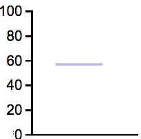
Hypothetical Outcome Plots (HOPs) were created by the authors of this study to display one or more sets of quantitative values so that people can see how those values are distributed and, when multiple sets are displayed, compare the distributions. HOPs do this, not as a static display, such as a histogram or box plot, but as an animated series of values that appear sequentially, 400ms per frame. The following example shows a single HOPs frame (i.e., one of many values).
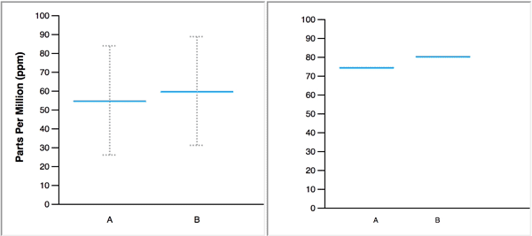
When animated, the blue line, which represents a single value, changes position to display several values in a data set, one at a time. In the figure below, the animated HOPs on the right represents the same two normal distributions that are displayed on the left with blue lines to mark the means and error bars to represent 95% confidence intervals.
The authors make the following claim about the merits of their study: “Our primary contribution is to provide empirical evidence that untrained users can interpret and benefit from animated HOPs.” When I came across this claim early in the paper, I could not imagine how HOPs could ever serve as a viable substitute for graphs that summarize distributions, or, how untrained users would find them more informative than a simple descriptive sentence. What was I missing that allowed the authors to make this claim? Upon further review, I discovered that the authors devised experiments that 1) restricted the usefulness of the static distribution graphs that they pitted against HOPs, and 2) asked subjects to perform useless tasks that were customized to match the abilities of HOPs. Simply put, the authors stacked the deck in favor of HOPs, yet were still unable to back their claims.
Before diving into the study, let’s remind ourselves of what data visualization is. Here’s a definition that I’ve been presenting recently in lectures:
Data visualization is technology-augmented visual thinking and communication about quantitative data.
Data visualization involves human-computer collaboration. We use visual perception and cognition to do what they do well and we allow computers to assist us by performing tasks that they can do better than we can. Not every task is performed by the human visual system. Only those tasks that the visual system can handle better than cognition or a computer are performed in this way. Skilled data visualizers distribute the work of data sensemaking appropriately between perception, cognition, and the computer in ways that leverage the strengths and avoid the weaknesses of each.
Now, back to the study. The authors were inspired by the fact that people think about proportions more naturally in terms of frequencies (counts) rather than percentages. For example, those who have not learned to think comfortably in terms of percentages often find it easier to understand the expression “57 out of 100 people” than the equivalent expression “57% of the people.” With this in mind, it apparently occurred to the authors that, if they represented distributions as a randomly selected set of 100 values and presented those values one at a time as an animation, people could potentially engage in counting to examine and compare distributions.
Let’s think about the characteristics that describe distributions and therefore typically need to be represented by distribution displays. In general, we describe the nature of a distribution in terms of the following three characteristics:
- Spread (the range across which the values are distributed)
- Central Tendency (a measure of the distribution’s center)
- Shape (the pattern that is formed by the set of values when arranged from lowest to highest)
Each of these characteristics answers specific questions that we typically ask about distributions. For example, the central tendency answers such questions as, “What value is most typical?” and “What single value is most representative of the set as a whole?” The shape answers questions such as, “Where are most of the values located?” and “Is the distribution normal, skewed, uniform, bimodal, etc.?” Several graphs have been developed to display these characteristics of distributions, including histograms, frequency polygons, strip plots, quantile plots, violin plots, box plots, and Q-Q plots. They vary in the characteristics that they feature and therefore in the purposes for which they are used. None of the displays that have been developed for this purpose rely on counting. Anyone who needs to examine and compare distributions can easily learn to use these graphs. I know this, because I teach people to use them.
But what about those occasions when we need to explain something about one or more distributions to a lay audience? If that information is best described visually, we use a simple distribution graph and explain how to read it. If that information can be communicated just as well in words and numbers, we take that approach. For a lay audience, anything that HOPs could possibly display could be more clearly presented in a simple sentence. Counting values as they watch an animated display is never a viable solution.
In this study, only one of the tasks that subjects were asked to perform was typical of the questions that we ask when examining distributions. The others were contrived to rely on counting to suggest a use of HOPs. Even if counting could answer some questions that we might ask about distributions, should that lead us to invent a form of data visualization to support the task of counting? Think about it. Is it humans or computers that excel at counting? Clearly, it isn’t humans. We count slowly and are prone to error, but counting is a task that computers were specifically designed to do at great speed and accuracy. What I’m pointing out is that HOPs are an attempt to use the human visual and cognitive systems to do something that is handled far better by a computer. The authors’ attempt to create a counting visualization was fundamentally misguided.
Let’s review the study to see how the authors fallaciously ascribed benefits to an ineffective form of display.
The Study’s Design
The study tested the ability of subjects to perform various tasks while exclusively examining normal distributions using one of the three following displays:
- A short horizontal blue line to mark the mean and error bars to show 95% of the spread around the mean.

- A violin plot in which the widest blue area marks the mean, the top and bottom show the spread, and the varying width of the blue area shows the shape.

- HOPs, in which the lowest and highest positions where values appear during the animation suggest the spread, the position in the middle of that range suggests the mean, and the frequency of values appearing in particular ranges suggests the shape.
Each data set was created by randomly selecting 5,000 values from a larger, normally distributed data set. When displayed as HOPs, however, not all of the values were included. Instead, a random sample of approximately 100 values was selected, varying somewhat from task to task, with a median of 89 values and a mean of 101. These values were then displayed individually, in random order, as an animation. Subjects were given the ability to pause the sequence and to manually advance it forward or backward, frame by frame. The frames were numbered and the numbers were visible to subjects so they could tell where they were in the series at any time, along with the total number of frames.
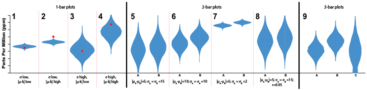
The study was divided into three major sections based on the number of distributions that were shown: 1) four tasks involving one-distribution displays, 2) four tasks involving two-distribution displays, and 3) one task involving a three-distribution display. Sample displays for each of these three sections are illustrated below using violin plots.
The tasks that subjects were asked to perform differed in each of the three sections. Let’s examine each section in turn.
One-Distribution Displays
While viewing each single-distribution display, subjects were asked to perform three tasks: 1) identify the mean, 2) estimate what proportion of values were located above a particular point, and 3) estimate what proportion of values fell within a specified range (always multiples of 10, such as from 20 to 50).
As you can probably imagine, when asked to identify the mean, subjects could easily do this when viewing the error bar and violin plot displays. With HOPs, subjects performed less well when the values were distributed across a large spread, as you would expect, but almost as well when the values were distributed across a small spread. This makes sense. In HOPs, when the line that marks the value hops around within a narrow region, it is easy to estimate a position near the center of that region. This was the only task that subjects were asked to perform that was typical of actual tasks that are done with distributions in the real world and wasn’t devised to match the abilities of HOPs.
When subjects were asked to estimate the proportion of values that fell above a particular point or within a particular range, they performed better when using HOPs, which isn’t surprising when you consider the study’s design. The number of values that were shown using HOPs was always relatively close to 100. HOPs supported these specific tasks by inviting subjects to count the number of times that the line appeared above the specified threshold or within the specified range. On the other hand, the error bar display provided no information about the shape of the distribution, so it could not support this task at all. The violin plot provided information about the shape of the distribution, but it is difficult to estimate the percentage of values that fall above a particular position or within a particular range based on the varying width of the blue shaded area. These are not tasks that we would perform using violin plots. Using HOPs to perform these tasks took some time and effort, but it provided the easiest way to answer the questions. It would be ludicrous to conclude from this, however, that HOPs would ever provide the best way to examine distributions. If we ever needed to perform these particular tasks, we would use a different form of display. For example, a histogram with binned intervals of 10 (0-9, 10-19, etc.) would make it easy to determine the proportion of values in a specified range. Nevertheless, this isn’t a task that we would ordinarily rely on our visual system to handle, but would rely on the computer to respond to a specific query. Queries, which can be be generated in various ways, provide precise and efficient answers. For example, “What percentage of values fall above the threshold of 76?” Expressed in computer terms, we would request a count of the rows where the value of some measure is greater than 76. Virtually all analytical tools support queries such as this, and good visualization tools allow graphs to be brushed to select particular ranges of values to retrieve the precise number or percentage of values associated with those ranges. In light of these efficient and precise options, who would choose to count items while watching a HOPs animation?
Two-Distribution Displays
In this section of the study, the means of two independent distributions, A and B, were deliberately differed such that B was greater in value on average than A. Subjects were asked to compare the distributions. Typically, when comparing two independent distributions, we would ask questions such as:
- “On average, which is greater, A or B, and by how much?”
- “Which exhibits greater variation, A or B?”
- “How do distributions A and B differ in shape?”
Instead of a question along these lines, however, subjects were asked to determine “how often” B was larger than A out of 100? This is a strange question. Imagine looking at the violin plot below and being asked to determine how often values of B are larger than A.

The question doesn’t make sense, does it? The closest question that makes sense is probably “On average, how much greater are values of B than A?” With two normal distributions, this could be determined by comparing their means. The strange question that subjects were asked was clearly designed to demonstrate a use of HOPs. Subjects were directed to count the number of times, frame by frame, that the value of B was higher than A. Those subjects who viewed HOPs, rather than the error bar or violin plot displays, supposedly succeeded in demonstrating the benefits of HOPs if they could count. But what did the HOPs display actually tell them about the two distributions? Remember, the authors are proposing HOPs as a useful form of display for people who don’t understand how to read conventional distribution displays. Imagine that, by counting, the untrained viewer determines that B is greater than A 62 out of 100 times. Does this mean that B is 62% greater than A? It does not. What that is meaningful has the viewer learned about the two distributions by viewing HOPs? Unfortunately, the authors don’t tell us.
What if, rather than comparing two datasets as separate distributions, we want to compare pairs of values to see how they relate to one another? For instance, imagine that we want to see how women’s salaries relate to their male spouse’s salaries to see if one tends to be higher than the other. We can’t see how two sets of values are paired using error bars or violin plots. Are HOPs appropriate for this? They are not. If we wish to examine relationships between two sets of paired values, we’ve moved from distribution analysis to correlation analysis, so we need different types of graphs, such as scatterplots. Watching HOPs animations to examine correlations would never match the usefulness of a simple scatterplot.
Three-Distribution Displays
In this final section of the study, consisting of distributions A, B, and C, subjects were asked to determine “how often” B was larger than both A and C? Fundamentally, this is the same task as the one in the two-distribution displays section, only complicated a bit by the addition of a third variable. Even if it were appropriate to compare three independent distributions by randomly selecting a sample of 100 values from each, arbitrarily arranging them in groups of three—one value per variable—and counting the number of times B was greater than A and C, this is not a task that we would typically perform by viewing a visualization of any type. Instead, if we were examining the data ourselves, we would simply query the data to determine the number or percentage of instances in which B > A and B > C. Watching a time-consuming animation would be absurd. Or, if we were reporting our findings to untrained users, we would do so with a simple sentence, such as “B is greater than both A and C in 32 out of 100 instances.”
Implications
The flaws in this study should be obvious to anyone with expertise in data visualization, so how is it that this study was performed by academics who specialize in infovis research and how did it pass the peer review process, resulting in publication? In part, I think people are inclined to embrace this study because it exhibits two qualities that are attractive to the infovis research community: 1) it proposes something new (innovation is valued above effectiveness by many in the field), and 2) it features animation, which is fun. Who can resist the natural appeal of “dancing data?” Those of us who rely on data visualization to do real work in the world, however, don’t find it difficult to resist inappropriate animations. Those who approach data visualization merely as the subject matter of research publications that will earn them notoriety and tenure are more susceptible to silly, ineffective visualizations. As long as the research community embraces this nonsense, it will remain of little value to the world. If you’re involved in the research community, this should concern you.
How am I able to find flaws in studies like this when researchers, including professors, miss them? It isn’t because I’m smarter than the average researcher. What sets me apart is my perspective. Unlike most researchers, I’m deeply involved in the actual use of data visualization and have been for many years. Because I work closely with others who use data visualization to solve real-world problems, I’m also painfully aware of the cost—the downright harm—of doing it poorly. These perspectives are foreign to many in the infovis research community. You cannot do good infovis research without first developing some expertise in the actual use of data visualization. This should be obvious, without needing to be said, but sadly, it is not.
Take care,

P.S. I realize that this critique will likely ignite another shit storm of angry responses from the infovis research community. I will be accused of excessive harshness. Rather than responding to the substance of my critique, many will focus on my tone. To the degree that my critiques are sometimes harsh in tone, rest assured that I’ve crafted a tone that I believe is appropriate and necessary. I’m attempting to cut through the complacency of the infovis research community. If you believe that there is a kinder, gentler way to bring poor and potentially harmful research to light, I invite you to make the attempt. If your approach succeeds where mine fails, I will embrace you with gratitude. The best way to address the problem of poor research, of course, is to nip it in the bud before it is published, but that clearly isn’t happening.
11 Comments on “HOPs, Skips, and Jumps to Silly Visualizations”
My eyes hurt.
My boss would laugh in my face if I present him with a dancing line. I can only assume these researchers were big fans of the tag in the early days of HTML.
If you superimpose the HOPs on a piano layout, do they play “Mary Had a Little Lamb”?
I think this is one of those cases where you won’t find much resistance to your critique – this is just silly. About the only thing I’m getting out of the HOPs is a vague idea of correlation between the two variables, based on how close the lines are (assuming they share a scale or the scales are normalized).
Or,
Bear in mind that any appearance of correlation (e.g., the lines tend to jump up together or down together) is meaningless in this study because the pairs of variables are not related. If the pairs of values were related, we might get a sense of correlation from HOPs, but never as informative as a static display designed for viewing correlations, such as a scatterplot.
An effective study would be to add a “View All Datapoints Simultaneously” checkbox to the interactive version, and see how early/often people switch to that mode.
Because who has the time and patience to sit through a slideshow of individual datapoints and try to commit everything to short-term memory before making any decisions?
Why not just see it all plotted at once, do your analysis, and go home early?
You can still beat the traffic if you hurry.
There is so much to say here that I can’t figure out where to start.
I think the most annoying thing for me was the statement “The experiment tasks were about as favorable as possible for the abstract, static representations.”
This is patently false, for all of the reasons you already pointed out. Chief among them, estimating the probability that values from one distribution are higher than values from another is not something you would ever do with a violin plot or error bars, so how is it possible that the experiment tasks were favorable for those representations?
In any case, I guess I don’t understand the problem the researchers are trying to solve. Yes, certain types of inferences are hard to make from certain types of graphics. Solution: use a different graphic more suited to the problem, or use text. If I was absolutely forced to convey P(A>B) to a user using a graphic with no supporting text, maybe HOPs would come in handy, but I cannot imagine any scenario where they would be more useful than just providing this information in text form: A is expected to be larger than B 75% of the time.
You might assume that this study is so obviously absurd that no one would take it seriously. If only that were true. The professor who brought it to my attention did not do so because he thought it was bad, but because he found it interesting and potentially useful. How is it possible that a study this bad could be produced by professors who specialize in data visualization, was approved by peer reviewers for publication, and then went on to capture the interest of other professors who teach data visualization as well? I will be quite interested in seeing if anyone in the infovis research community comes to the defense of this study. What they could possibly say to defend it is a mystery.
Had these researchers asked the question, “Is it possible that an animated display of individual values could help people understand and compare the nature of distributions?” and then went on to design a study that would test this possibility in a meaningful manner, I would have no objection, despite significant and well-founded doubts. That isn’t what happened, however. Instead, these researchers specifically designed a study to promote benefits of their invention that don’t exist. This is bad science. It is irresponsible.
How should a community of scholars respond to work of this type? I think the answer is clear. Let’s see if any of these scholars are willing to do what’s needed.
I rarely saw such of useless method. What surprises me is the fact that the authors seem to understand what distributions are and how error bars or violin plots can be used to interpret distributions. Nonsense – is the least I can say about this study.
For those who want a continuous representation of the probability above/below a particular value don’t forget a cumulative probability chart, e.g. https://en.wikipedia.org/wiki/Empirical_distribution_function. In my opinion these are underused, because that question is relevant for many types of decisions. For example, for time-to-failure, you can easily pick out the time where 50% of the units will have failed by (or more extreme quantiles). While they may be abit more novel, they are quite easy to explain.
That chart would clearly be more appropriate for the questions asked in this cited study, at least for the univariate and bivariate questions. The three variable task is tricky nor matter how you slice it – the question doesn’t explicitly state that the distributions are independent. I can’t think of any relevant situation where I would reasonably ask that question though. (If they are independent, the bivariate comparisons tell you all you need to know.)
I appreciate your approach. Others may not. Direct and honest critique (and not just criticism) is my experience in the real world.
Wow. Comparing random draws (or is it a defined sequence?) from two independent distributions to support a comparison is possibly one of the most naive concepts I have ever come across. Sadly the authors must have at least some basic knowledge of statistical theory to come up with such an idea.