Graph Hall of Shame
I thought that it would be fun to use this blog as a forum for sharing really bad examples of graph design, especially examples found on the Web sites or in the user documentation of business intelligence vendors. This serves two purposes: 1) It illustrates ineffective graph design practices, to help you learn what to avoid, and 2) it hopefully embarrasses the vendor that created the graph enough to pay more attention to what they show their customers as examples of graph-based communication. I’ll share fresh examples from time to time, but please feel free to send me examples that you’ve found as well, which I can then share with the other readers of this blog. You can send examples directly to me at sfew@perceptualedge.com.
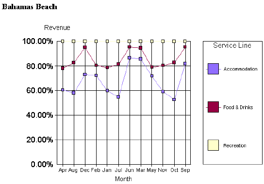
Ill begin with an example found in Business Objects’ user documentation. I found this some time ago, so it is possible that it has since been replaced with a better example. Take a look at it for a moment to determine for yourself what’s wrong with it–what undermines effective communication.

Now that you’ve had a chance to critique it yourself, here’s a list of the problems that I noticed:
- The legend is far too visually prominent. Making it so huge and enclosing it with a border draws readers eyes to it far more than appropriate. The legend is much less important that the data in the plot area of the graph.
- The items in the legend are in an order that is the reverse of the order of the actual lines in the graph. Readers would find it easier to associate the labels in the legend with the corresponding lines if they were in the same order.
- The grid lines compete with the data lines, making it difficult to focus on and compare the patterns formed by the lines. These grid lines are probably not necessary at all–the vertical lines certainly are not–and if the horizontal lines are useful to support a higher level of precision when reading the values, they should be kept very light, just visible enough to do the job without distracting from the data.
- The labels that identify the values along the quantitative scale (0.00%, etc.) are much too visually prominent. What are they so big and bold, especially compared to the other labels and titles in the graph? They are not more important than the other labels and should therefore look the same.
- The numbers along the quantitative scale display a meaningless level of precision. The two decimal places of precision, zeros in every case, tell us nothing and imply a level of precision in interpreting the graph that a graph cannot support.
- The color of the recreation line is barely visible against the white background of the graph.
- The big squares that mark the individual values along each line clutter the graph somewhat. Individual data points are probably not needed on these lines, but if they are needed to help readers compare values for a given month between the three lines, they can do this job with less visual prominence, such as by using small black or gray dots.
- Last, but not least, the sequence of months along the X-axis is a rather creative way to display time. I can’t think of any situation in which an alphabetical arrangement of months would make sense.
I could say more, but these are the primary problems. Shame on Business Objects for encouraging their customers to display data in this manner. User documentation of this quality hurts more than it helps.


One Comment on “Graph Hall of Shame”
Totally missed the alpa sort on the months. I was disturbed by Recreation at 100%, what is the point of that series. Do the two other series add, and if they meet target people are allowed to recreate?
An area or pie chart might work better.