The Crystal Xcelsius Challenge – A showcase for data visualization “Happy Meals”
As the end of 2006 approaches, I’ve been thinking back over the year, trying to summarize the essential progress of business intelligence (BI), especially in the realm of data visualization. Unfortunately, with the exception of a few software companies that have introduced products or upgrades that actually work and add value, 2006 has added little to support the chief goal of BI, which is to help people make sense of business data and to communicate their findings to others. Most BI software vendors are serving up data visualization in the form of “Happy Meals” that are no more nourishing to businesses than the fast food that has lured the appetites and expanded the waistlines of most Americans.
This morning I received an email from the CFO of a large bank. In it he mentioned that Business Objects, a vendor whose products his company uses, recently conducted a data visualization contest involving solutions developed with Crystal Xcelsius. He informed me that the requirements of the Crystal Xcelsius Challenge were described as follows:
The participant must create an original interactive data presentation or business dashboard (“Dashboard”) using any Crystal Xcelsius™ product (i.e. CX Now!, Crystal Xcelsius Standard, Professional, or Workgroup). The Dashboard must attempt to serve some kind of business function.
Even though this CFO is a customer of Business Objects, after reviewing the winning solutions, he was gravely disappointed in the results of this contest: “It appears that Xcelsius picked winners on the basis of how many Xcelsius widgets they showed, and not the best examples of visualization.”
After reviewing the winning solutions myself, I agree with his summation. These solutions illustrate the theme that has dominated most BI data visualization 2006: anemically presented data, tainted with distracting visual nonsense. I’ve decided to use the contest’s winning solution to point out practices that we must avoid if we care about improving business intelligence in the coming year.
The winning solution was submitted by Peggy Tien of Vancouver, Canada. Peggy is without a doubt a talented software engineer and an expert in the use of Crystal Xcelsius. Based on what’s important to Business Objects in this contest, given that its sole intention was to market Crystal Xcelsius, Peggy deserves the $10,000 prize that she received. Her solution features the visual artifice that makes Xcelsius the darling of those who prefer high-tech kitsch to useful information. If submissions had been judged on their ability to make sense of and communicate business information effectively, however, Peggy’s solution would have fallen short in several ways. I believe that this is largely a failure, not of Peggy, but of the product and the way that Business Objects markets it.
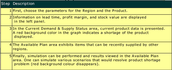
Here’s a screen shot of the winning solution:

You can see and interact with a live version of this solution on Business Objects’ Web site.
I would like to do for Peggy and for those who wish to learn from her solution, what the folks at Business Objects have not done, at least so far. I would like to use it to teach principles of effective information design by critiquing its effectiveness and suggesting how it could be improved. Let me begin with the purpose of the solution, which is stated on Business Objects’ Web site:
The Supply Chain Plan Dashboard is designed to assist management in simulating various ways to balance inventory supply and demand. Supply sources include forecast and sales order, while demand sources include purchase orders and inventory stock. The dashboard alerts managers of supply shortage quantities and dates. Managers can then use the dashboard interface to formulate inventory supply-demand adjustment plan. The dashboard also displays information on supply availability from other warehouses, helping managers to effectively carry out inventory transfers between associated companies.
And before launching into my own critique, here are the comments of the judges:
This is a unique and outstanding example of a forward-looking dashboard. It is a powerful tool that gives the user the ability both to monitor current supply/demand status AND to develop an adjustment plan that will address shortages – in real-time. This dashboard does an excellent job of aesthetically displaying a large number of critical KPI’s and alerts. It is well laid-out, and effectively uses color to differentiate and group KPI’s. This unique dashboard is an example of data visualization that could only be created with Crystal Xcelsius.
While it is not true that this solution could have only been created using Crystal Xcelsius, it is true that many of the problems that it exhibits were encouraged by the product and the way it is marketed.
First of all, contrary to the title that appears at the top of the display, this is not a dashboard. It was not designed to support effective monitoring of supply chain information. A dashboard is a visual display of the most important information, related to a particular objective or set of objectives, which has been specifically designed to enable people to monitor what’s currently going on at a glance. One could never assemble the big picture of what’s going on regarding supply and demand from this application. It is too fragmented into little pieces of information to ever get an overview, which is what’s required when you wish to monitor something. This is also not an analytical application in a general sense. Once again, the information is too fragmented into isolated pieces to get the overview that is needed in the beginning of the analysis process, and it lacks the full range of views and comparisons that are needed for data analysis. At best, this is an application for examining, in a narrow and prescribed manner, the supply versus the demand for a particular product in a particular region, complemented by the ability to view the results of specific “what-if” manipulations of the data in an effort to improve supply. There is nothing wrong with this scope, if this is all you need to do, but people who manage supply chains usually need more.
Beyond the misapplication of the term “dashboard” to this display, which is hardly Peggy’s fault, but more a result of the sloppy way that vendors apply this term to almost any screen-based display, the other problems that caught my attention fall into four categories: (1) inadequate or inappropriate data representation, (2) ineffective visual design, (3) inadequate instructions, and (4) ineffective interface design.
Inadequate or Inappropriate Data Representation
- The colored background colors (gray or red) in the bar graphs indicate good or bad, but not how good or bad. Reference or background fill colors could have been used to indicate the good and bad ranges so that you can see how far into a given range the measure extends.
- In the bar graphs, the only way that it makes sense to include actual orders and forecasted orders together in a stacked bar is to place the forecast on top of the actual orders. The orders are real values that can be counted on, and therefore deserve the dominant position, starting from the bottom and extending from a value of zero. The forecast is a guess and should therefore extend the actual order total to provide a picture of what the total demand is assuming that the forecast will come true. Also, because the forecast segment of the bar is less certain, it should be assigned a color that is less intense than the color used for the orders segment of the bars, but the opposite was done in these graphs.
- The three gauges on the left lack quantitative scales, so all you know is the actual value (displayed as text) and the qualitative range (bad, satisfactory, and good). Without a scale, we cannot tell where the ranges start and end.
- The gauges lack points of comparison. We know that a measure is good or bad, but don’t know on what basis this judgment was determined. Good or bad compared to what? Measures almost always need to be compared to something to provide the context necessary to give them meaning.
Ineffective Visual Design
- The circular shape of the three gauges wastes a great deal of space that could have been used for additional information.
- The grid lines in the bar graphs are too salient and distracting. Also, because the grid lines do not extend all the way to the quantitative scale on the left axis, they are nearly impossible to associate with the scale.
- Colors have been inconsistently used to represent qualitative meanings. In some cases “good” is represented by black (the thermometers on the right), sometimes gray (the background color in the bar graphs), and sometimes green (the gauges). Using different colors to mean the same thing is confusing. Also, the same color green that was used to indicate bad performance in the gauges was used to represent the Detroit region in the line graph, suggesting that the Detroit data in the line graph is good, which is not necessarily the case.
- The transparency of the pull-down menu makes the text hard to read. When you are selecting a region or product from a pull-down list, you don’t need to see what’s behind the menu.
- The legend for the lower bar graph is closer to the table below it than it is to the graph, which leads one to assume that it pertains to the table.
- The colors that were used to distinctly encode forecast, order, stock, and purchase in the bar graphs were only partially associated with the tabular entries below the second bar graph. The color that was used to encode the amount of products in stock in the bar graphs was assigned to the “Stock” row of the table as well, but none of the other rows were assigned colors that match those in the graphs.
- The heavy button-like borders around each value in the table make the table stand out far more than it should. Assuming that borders around each value are needed at all, they should be made barely visible.
- The horizontal gradients of color on the bars makes them hard to read and visually confusing, compared to a single, undifferentiated color.
- The 3-D effects that have been applied to many objects are distracting and add no value whatsoever. They arbitrarily cause objects that are 3D to pop out visually.
- Because so much color and so many different colors have been used throughout the display, the power of color to highlight particular parts of the display, such as data that most needs attention, has been undermined.
- Days 1 through 10 are a time-series scale that is shared by both bar graphs and the line graph. These graphs are meant to be compared, but the values associated with the days in the line graph are not aligned with the corresponding bars in the bar graphs, which makes comparisons difficult.
Inadequate Instructions
- It was a good design decision to place all the instructions for using the application in a separate help window (shown below), which can be accessed by clicking a help button. This kept the display from becoming cluttered with text. Unfortunately, however, the instructions that have been provided are inadequate. For instance, they don’t tell us how to change values in the Adjustment Plan section of the display, which is needed, because it is not at all obvious how to do this. They also fail to tell us the meanings of the values that are associated with the two shortage level thermometers. Until the plan has been adjusted, the values that appear in the “Current Demand and Supply” and “Adjustment Plan” bar graphs are the same, so why do the shortage levels differ? It took some investigating to figure out that the top thermometer displays the shortage for today, but the bottom thermometer shows the projected shortage for the next 10 days.
Ineffective Interaction Design
- The means that was provided to adjust values in the plan is no intuitive and works poorly. Adjustments must be made by pointing to a value in the table below the graph, holding down the left mouse button, and then moving the mouse up or down. While you do this, a two-headed arrow moves up and down on the screen, but disappears behind other objects, such as bars in the bar graphs. It would work much better to allow the bars in the graph to be sized directly by clicking and dragging them up or down. Values can also be changed by typing them directly into the table, but I wasn’t aware of this until a colleague informed me that by double-clicking on a value in the table (which isn’t mentioned in the instructions), I could then change it.
- When adjusting the plan, supplies of products that are available in other regions can be seen in the line graph, but there is no way to transfer stock from one of these regions to the region that needs it. A what-if scenario can be displayed by increasing the amount of stock in the region that is being examined to meet demand, but this does not have an affect on any of the regions from which the stock would need to be taken.
Business Objects is by no means the worst provider of data visualization today, but because it is a big and vocal company, it is positioned near the center of my radar screen. Just as the American government, which is hardly the worst government in the world, is so large and powerful that it affects the world on a large scale when it does something stupid, immoral, or destructive, Business Objects, as one of the largest BI vendors in the world, has a responsibility that comes with its influence to do what’s right, lest the world suffers. Wouldn’t it be great if Business Objects and all the other BI vendors started taking data visualization—the most powerful means available to fulfill the promise of business intelligence—seriously? Instead, they flood the market with superficial fluff, projecting the belief that their customers don’t know any better? And wouldn’t it be great if those business people who purchase BI products started demonstrating that they do in fact know better by demanding products that actually work? This is my hope for 2007. At the end of the day, the only measure of success for any BI application is that it works and works well. It should help people understand their data thoroughly with the least amount of effort, thus paving the way to intelligent decisions.
5 Comments on “The Crystal Xcelsius Challenge – A showcase for data visualization “Happy Meals””
Hi Stephen,
I really enjoy your posts, and learned a great deal from the two TDWI courses I attended last year in Las Vegas. And I definitely agree with your assessment of the winning entry in the Crystal Xcelsius competition. However, I am not sure I agree with your rather harsh criticism of the Crystal Xcelsius product. Granted, it is “flashy” (pun intended) and can be abused by people who get too enamored with its array of visual options, but I would argue that it can be used to create dashboards that users do find valuable and informative. In our organization, we have created a few dashboards using Xcelsius that are very popular with their intended audience, simply because they convey important information in a simple and user-friendly way. Now, it is quite possible that they don’t follow all data visualization best practices, but if the information is effectively conveyed (as judged by the recipients of that information), isn’t that of utmost importance?
I’d love to hear your assessment of the second place winner in the contest. Personally, I find it to be a very effective dashboard, and certainly better than the first-place winner. I find its design very clean, and it manages to present a wealth of information in a very accessible and consistent manner. There is very little visual clutter, colors are used consistently, and I love the way the legend and metric definitions are made available to the users (they are there for first-time users, but don’t get in the way for users already familiar with them). So, as a neophyte in the data visualization space, I would be interested to hear what you find both effective and ineffective in this dashboard, since I know that users in our organization would be thrilled to get a dashboard like this. For us, the real challenge would be effectively collecting all of the underlying data, but visually it would meet many of our users’ needs.
Looking forward to your response.
-Mike
Hi Mike,
What is the “harsh criticism” of Crystal Xcelsius with which you disagree? I haven’t commented one way or another about the product’s ability to create effective dashboards. I’ve criticized the fact that it emphasizes features and functionality that subvert effective dashboard communication, and I’ve criticized dashboard designs that Business Objects features as fine examples of Xcelsius’ use.
I don’t own a copy of Crystal Xcelsius, so I have never had an opportunity myself to see if it can be used to create effective dashboards. I have worked with clients, however, who were not able, even with great effort, to remove some of the features of the software that undermined its ability to communicate.
As a designer, I don’t judge a dashboard’s worth solely on the fact that the people who use it find it “valuable and informative.” I try to base my evaluations of effectiveness on empirical evidence, derived from research. Recipients of information often miss-judge the effectiveness of its communication. For instance, if they have been led to believe that a flashy gauge is the right way to display information on a dashboard, they might base their judgments primarily on that. Perhaps the dashboard that they consider valuable and effective could be 10 times as valuable and effective if it were better designed.
Rather than taking the time to critique another entry in the Crystal Xcelsius dashboard competition, it would be much more relevant and helpful to you if I could take a look at and comment on one of your dashboards. I would be happy to do so if you would post one on my Discussion Forum (http://www.perceptualedge.com/discussion.htm), where others can see it and comment on it as well.
Take care,
Steve
Hi Steve,
Point taken. To people not aware that such a thing as filet mignon exists, a Happy Meal may seem like the pinnacle of culinary achievement. This is even more so the case for people, like those in our organization, who have for years had to subsist on the BI equivalent of the globs of grey mystery meat so often encountered in college cafeterias. A Happy Meal, by comparison, while certainly still devoid of much nutritional value, does at least look like real food. I suppose our job is to keep exposing ourselves to more refined dining, so that we eventually arrive at the nourishment we crave and deserve.
And now I think I’ve mined that metaphor enough.
:-)
I would love for you to take a look at one of our dashboards. Which Discussion Forum folder would you recommend I use for uploading it?
Take care,
-Mike
Mike,
Excellent use of a metaphor! I especially love your reference to “mystery meat.” Please post one of your dashboards in the “Dashboard Design” section of the Discussion Forum and we’ll continue our conversation there.
Steve
Hi Steve,
I have finally gotten around to posting one of our dashboards to the Discussion Forum. I had to insert test data and remove some branding, so that I don’t breach any confidentiality clauses, which is why it’s taken me a while to post it. I am very interested to hear what you have to say.
Take care,
-Mike