| |
|

|
Thanks for taking the time to read my thoughts about Visual Business
Intelligence. This blog provides me (and others on occasion) with a venue for ideas and opinions
that are either too urgent to wait for a full-blown article or too
limited in length, scope, or development to require the larger venue.
For a selection of articles, white papers, and books, please visit
my library.

|
| |
May 26th, 2010
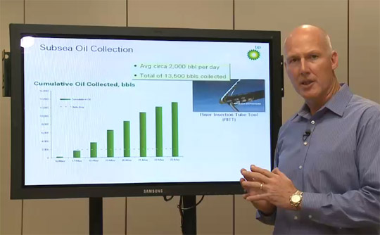
A colleague sent me a link to Rachel Maddow’s website today where she features a graph that was used by BP senior vice president Kent Wells to show how the company’s efforts to collect the oil that’s spewing into the ocean at a rate of several thousands of barrels per day is improving. He talks about adjustments that they’ve made to the siphon, then says “Here you can see how we’ve continued to ramp up.” But is this really what’s happening?
Although the graph doesn’t outright lie, BP is relying on the viewer’s assumption that a series of bars that increases in height represents an increase in performance. In this case it does not, however, because the bars display the cumulative amount of oil collected per day, not the daily amount. In my graph below, which shows daily oil collection, the story is obviously quite different.
While the amount of collection increased in the beginning, it has decreased or held steady for the last four days and is now well below the average amount of daily collection for this period as a whole. Things are definitely not getting better. How do you spin bad news like this? One way is to create a misleading graph, but cover your ass by doing it in a way that isn’t an outright lie.
Take care,

April 29th, 2010
Oracle Corporation takes its name from the treasured advice-givers of ancient Greece. Its name is ironic at times, however, when its advice is far from sage. When it comes to data visualization, and dashboard design in particular, Oracle gives some downright awful advice.
I received an email from one of my readers who uses Oracle’s OBIEE tool to develop applications for his customers. He attached the following graph as an example of what Oracle teaches people when they attend the online course “Oracle BI Enterprise Edition – Build Good Dashboards”:
Based on this graph, I’m guessing that Oracle now outsources the development of its courses to the primate house of the local zoo. Although I haven’t seen the course myself, I’m told that this graph is typical. If this is what a leading Business Intelligence software vendor considers an effective way to display data, it’s no wonder that people are frustrated with the industry.
Almost every aspect of this graph fails miserably.
- It has been complicated by a 3-D rendering of the plot area and the bars (or tubes in this case), which does nothing but make it harder to interpret the values. Notice that the quantitative scale for “Dollars” and “Year Ago Dollars” on the left axis is aligned with the front of the graph, but the scale for “Forecasted Dollars” and “Forecasted units” on the right is aligned with the back of the graph.
- I assume that the quantitative scale on the left is for dollars and the one on the right is for units. If this is the case, however, the title that appears on the right-“Forecasted Dollars, Forecasted Units”-is incorrect.
- A dual-scaled graph—one quantitative scale on the left for dollars and one on the right for units—should usually be avoided, especially on dashboards, because it can be confusing and misleading. For example, notice that the forecasted units line intersects the dollars’ bars, which would naturally incline anyone viewing the graph to compare their magnitudes, yet this would be entirely meaningless, because magnitude comparisons can’t be made between them when they have entirely different scales and units of measure.
- Forecasted units would not be useful on this graph without including actual units, which has apparently been forgotten.
- Lines representing “Forecasted Dollars” and “Forecasted Units” have been used to connect values per region, which makes no sense. The patterns formed by the lines are completely arbitrary and could be changed by sorting the regions in a different order.
- The lines have large, clutter-inducing data points along them.
- The lines appear to have some sort of drop shadow or lighting effect, which makes it look as if there are four lines rather than two.
- “Dollars” for the current year and “Year Ago Dollars” are meant to be compared, not summed. By using stacked bars rather than placing separate bars side by side for the current year’s dollars and the previous year’s dollars, the comparison is difficult to make. The bars as a whole, consisting of both years stacked on one another, represent a sum that is useless in this situation.
- Given the fact that the X-axis has the title “Region”, there is no reason to clutter the graph by including “REGION” in each of the labels.
- The prominent vertical grid lines that separate the regions are unnecessary, resulting in clutter.
- The tick marks along both vertical axes are unnecessary, because gridlines appear in the graph at the same positions.
- The minor tick marks on the right-hand vertical axes are darker than the major tick marks.
- The positions of the two Y-axis titles are inconsistent, resulting in a sloppy appearance.
It is as if the person who created this “Good Dashboards” example of a graph did everything possible to make it as ineffective as possible.
How can a vendor that claims to understand data and presumes to teach people best practices in its use know so little? Oracle, you should be embarrassed.
Take care,

April 12th, 2010
I was invited to speak at a recent TEDx event in Berkeley, but I withdrew late in the game when the TED folks asked me to sign a contract that would have given them the right to edit my talk however they wished without my permission. This is something that I never allow, because I’ve learned the hard way that even people with good intentions can screw things up by making bad edits. I’m writing today, not to talk about the rights of content creators to their work, but about the theme of this TEDx event, which struck me as misguided. I and the other speakers were asked to tie our talks to the theme “Doing the Unprecedented.” When I received this request from the event coordinator (TED calls them “curators”), I told her that I would tie my talk to this theme by making the case that doing the unprecedented is highly overrated.
 Most of what we can do to make the world a better place involves, not doing the unprecedented, but doing what matters and what works, whether unprecedented or not. This might not be as exciting as the unprecedented, but it’s desperately needed. I believe that too many opportunities are wasted because we glorify the unprecedented for its own sake.
In the United States over 150,000 people die each year due to post-surgical complications. That’s three times the number of traffic fatalities. What makes this even more shocking, however, is the fact that half of these post-surgical deaths could have been prevented, not by doing the unprecedented, but by doing what medical professionals already know, but often fail to do.
Many of these surgical failures are caused by the complexity of the work. When tasks are complex and you’re working under stress amidst distractions, it’s hard to remember everything that should be done. A movement is now underway to solve this problem, which involves nothing unprecedented, but something that another highly skilled group of professionals—pilots—have been doing for many years. Surgical teams are beginning to use checklists.
Atul Gawande, who led the effort to create this surgical safety checklist for the World Health Organization, writes convincingly about the need for checklists in all professions that deal with complexity in his new book The Checklist Manifesto: How to Get Things Right.
In the field of data visualization, failures are more common today than successes, not due to complexity, but to the fact that few people have been trained in the simple principles and practices of graph design. As a result, they rely on software tools to do the work for them and most of those tools lead them astray, encouraging them to produce silly, useless displays like this.
This is a travesty, because we are living at a time when we could be making tremendous use of data to inform better decisions, and most of the rules for doing this well have been known for years.
Here’s an example of one of the earliest quantitative graphs, hand drawn by William Playfair in 1786. In his time, Playfair did the unprecedented by inventing or greatly improving many of the quantitative graphs that we use today.
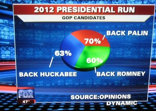
Back in 1983, Edward Tufte published his first book, The Visual Display of Quantitative Information, in response to the problem of ineffectively designed graphs. And yet, despite Tufte’s efforts, plus my own and the work of several others since, it appears that graphical communication skills in general might actually be declining. Problems like this silly pie chart on Fox News, which adds up to 193%, are far too common.
 When did we lose sight of the fact that data displays are about data, expressed clearly, accurately, simply, and meaningfully? When did Business Intelligence (BI) take a wrong turn down the path to business stupidity? In our efforts to do the unprecedented, to make ourselves look impressive by decorating our data in impoverishing ways, we’ve adopted practices that make us dumb. Most of the principles for doing this right have been known for a long time. Let’s save the unprecedented for situations that demand it. For most data sense-making and presentation, let’s do what’s needed and what works.
Take care,

March 29th, 2010
It is not difficult to present data in clear, accurate, and meaningful ways. The skills that are required to do this can be easily learned. They involve simple principles, most of which have been taught for many years. So why are most data displays so impoverished?
One reason is that we live in a time when people use their computers as a replacement for skills. If you rely on Excel or almost any other software tool that creates charts to do the work for you, then your data displays will fail miserably. Effective data visualization practices are only built into a few products that are available today. Most software vendors have decided that they can satisfy us with razzle dazzle—pie charts that spin and bars shaped like pyramids—and so far we haven’t discouraged them by refusing to buy their silly products.
We are stuck in a vicious cycle of data impoverishment. Vendors show us bad examples of data visualization and we emulate them in our work. When vendors then look at what their customers are doing, they see examples that lead them to give us more of the same. Only a few vendors care enough for their customers to avoid the silly stuff that undermines our efforts.
This morning, I was faced with a fresh reminder of the current state of data impoverishment. A reader invited me to visit Microstrategy’s website to see the finalists of its customer dashboard competition. What I found was depressing. I couldn’t find a single example of a dashboard that could be used to monitor information effectively. At best they could be used to look up a few facts when what’s actually needed is a rich set of comparisons. The problems that I found are too many to delineate, but all the dashboards suffer from a common flaw: they say too little and what they do say they say poorly.
To give you a sense of what I found, here are three of the winning entries:
The U.S. Postal Service is currently struggling to adapt to changes in the way that people communicate. If they find this dashboard helpful, it’s no wonder they’re struggling.
This entire dashboard displays four measures, and none in a manner that’s particularly useful. The slight exception is that you can choose one of the four measures, such as Occupancy, which is currently selected above, to view a time-series display. Unfortunately, this combination bar and line graph performs poorly compared to a simple line graph with three lines.
Poor Eli Kiwanuka. It appears that he was photographed in a police lineup. This “Executive Dashboard Summary – Sales” displays the performance of one person only. How is this a summary of sales performance? Rather than a dashboard for monitoring performance, this provides a means to look up a few facts about individual sales people, one at a time, and requires that you wade through a series of poorly-designed, eye-assaulting graphs to painfully piece together a picture of one person’s performance.
I don’t blame Microstrategy’s customers. They’re working within the constraints of the tool and emulating impoverished examples, which is probably all they’ve ever seen. I mostly blame the folks at Microstrategy, who should know better. This competition gave the folks at Microstrategy a perfect opportunity to critique the designs that were submitted and show their customers how much better these dashboards could work if designed more effectively, assuming their software makes this possible. Did they miss this opportunity because they don’t know any better themselves?
Impoverished displays of data are what you get when vendors care a lot about sales but little about the real needs of their customers.
Take care,

March 10th, 2010
In the January 2010 issue of the Visual Business Intelligence Newsletter I redesigned a display of health care costs that appears on GE’s website. I did this using Tableau and provided a link in the article to a live version of the interactive display on the Web. You might have wondered what I did to make that live analytical application publicly available. The answer is that I used something brand new from Tableau called Tableau Public. It was developed as a means for people to share live analytical displays that are of interest to the public via the Web.
A few months ago, when I was approached by UNESCO to help them find a means to share worldwide education data via the Web, I put them in touch with Tableau, and you can now view that information on UNESCO’s website, thanks to Tableau Public. The service is free and includes almost all of Tableau’s usual functionality. You upload your data, build the analytical display or entire application using Tableau Public, and then take the little snippet of HTML code that is generated to embed it right into your website, even though the data and functionality is hosted in the cloud.
I believe in the democratization of important data. I believe in providing people with simple tools for exploring and analyzing data. Tableau Public makes this possible in a way that is more analytically powerful than any free service that’s been offered to date. I appreciate Tableau’s willingness to provide this service, because it not only helps people explore important public data, it does so in a way that demonstrates to those who are stuck with obsolete tools how much more they could do if they had a good visual analysis tool at their fingertips.
For a quick look at Tableau Public, watch the beautiful demonstration video that Tableau has produced, appropriately titled Data In, Brilliance Out.
Take care,

|


