| |
|

|
Thanks for taking the time to read my thoughts about Visual Business
Intelligence. This blog provides me (and others on occasion) with a venue for ideas and opinions
that are either too urgent to wait for a full-blown article or too
limited in length, scope, or development to require the larger venue.
For a selection of articles, white papers, and books, please visit
my library.

|
| |
September 27th, 2010
In February of 2007, I wrote a book review titled “Sticky Stories Told with Numbers” in the Visual Business Intelligence Newsletter of the book Made to Stick by Chip Heath and Dan Heath. I gushed with enthusiasm for this simple, practical guide that teaches us how to get our messages across in ways that result in understanding and action. Given my appreciation for this fine book, I was thrilled when I heard that the brothers Heath had written another, which I finished reading last week. Once again, they’ve given the world a set of clear-headed, easy-to-understand guidelines—this time for effecting change when change is hard—entitled Switch.
 We who spend our lives searching for the stories that live in data to promote evidence-based decision making often watch in horror when we fail to help decision makers understand the stories and care about them. To effect change, we must not only tell these stories in ways that lead to understanding, we must also appeal to people’s hearts in ways that make them care enough to want the change that we’re proposing, and we must prepare a path for change that makes it easier to follow than ignore. Switch explains why change is often hard and describes clear steps for helping people get from where they are to where they ought to be. This is not a book about manipulating people to serve your own ends. It’s about facing the truth that even when change is good for us, getting from here to there is often a struggle that requires a helpful nudge in the right direction. As information stewards, this ability to nudge people in helpful ways must be part of our skill set.
I won’t say more about Switch, because I don’t want you to think that my brief description is sufficient for your needs. Get a copy for yourself. You won’t regret it.
Take care,

September 20th, 2010
This blog entry was written by Bryan Pierce of Perceptual Edge.
The United States Patent and Trademark Office (USPTO) recently posted an online dashboard to allow the public to monitor data related to the issuance of new patents. At Perceptual Edge, we strongly support efforts to make government data more accessible and understandable. Unfortunately, in its current form, the Patents Dashboard fails to do this.
When I first viewed the Patents Dashboard, the first thing that struck me was its size. As you can see, the dashboard is about seven screen-lengths long!
(To view the full-sized dashboard, click the image. If the newly loaded image is still small, click it to make it full-sized.)
One of the principles of good dashboard design is that you should try to put all of the information that people might want to connect and compare onto a single screen. If people have to scroll to see everything or navigate between different screens, it makes it almost impossible to make comparisons and see relationships between the variables.
There are occasional cases when a dashboard must be split between more than one screen because there is so much information that must be viewed that it cannot fit on a single screen, even when viewed at a high level of aggregation. This would be a rare case and it’s definitely not the case here. Although the dashboard takes up 7 screen-lengths, there are only 17 quantitative measures that are being displayed here. This low data density is caused by three main factors. First, most of the data is being displayed using circular gauges which take up a lot of space but only tell us a single number (for instance, we can see that First Office Action Pendency is 26.2, but we don’t know whether that’s good or bad, how good or bad it is, or how it compares with a target, last year’s value, or some other comparative measure). Second, there are large sections of text that are used to explain what each of the variables mean and how to interpret them. Generally information like this should be kept off the dashboard by putting it in a help screen or by using tooltips that appear when people hover their mouse over a particular metric. However, because many of the people who use this dashboard will be first-time users (as opposed to a more typical corporate dashboard that might be used by the same person each day), having descriptions on this dashboard isn’t necessarily a problem, they just need to be handled better. Third, this dashboard takes up so much space because the gauges are repeated. Each gauge appears once at the top of the dashboard and then again in the detailed section. This might be necessary when the dashboard is seven screen-lengths long, but if the dashboard had been created using the kind of space-saving display mechanisms that good dashboard design requires, it wouldn’t have been necessary.
Below is a redesign of the Patents Dashboard that I mocked up using space-saving means of display like bullet graphs and sparklines. I encourage you to click the image to view it at full size as the image below is too small to be seen clearly:
As you can see, by using bullet graphs and sparklines, rather than circular gauges, I was able to fit all of the metrics from the original dashboard onto a single screen and I still have about 25% of the screen left over for additional content. I also included a couple of line graphs to facilitate easy comparisons between the number of patent applications that are received and the number that are processed. In an attempt to make the information easier to digest, I’ve arranged the metrics into logical groupings so that people can easily see the different types of data and make meaningful comparisons between related variables.
Rather than displaying descriptions next to each of the metrics, I’ve designed it so that people can simply click on a metric and read its description in the box at the bottom of the screen. In my mock up, the “Traditional Total Pendency” metric has been clicked, so it’s highlighted with a light gray border and its description appears in the bottom box. This design makes it easy for people to get descriptions right on the dashboard, but it doesn’t clutter it by displaying all of the descriptions all the time.
There’s one additional thing I want to point out. It is common to see a large title, a logo, and decorative graphics at the top of dashboards. In the USPTO example, the top 1/3 of the first page is filled with these things. The top portion of the dashboard, especially the top-left, is the most visually weighty real estate on the computer screen. It should be filled with important data, not a silly image of a person looking at bar graphs through binoculars.
If you’re creating a dashboard for external users and need to include branding, consider placing it in the bottom-right corner. This is the least prominent portion of the dashboard, so it’s perfect for non-data content, such as logos, which must be included, but shouldn’t dominate.
I built this redesign based on the assumption that the metrics the USPTO chose for their dashboard are useful to people who work with patents. Given that I don’t work in the field, I chose not to create additional metrics to fill in the empty space. However, the USPTO could surely find a good use for the free space, either by including other useful metrics, or by including other graphs to give more context to the existing metrics.
My simple redesign took a seven screen-length dashboard and collapsed it to ¾ of a screen (assuming a screen resolution of 1024 x 768), while adding additional information. I was able to do this because I used display mechanisms that were designed with the tight space requirements of a dashboard in mind. Because the design uses sparklines instead of full line graphs for the time-series information, we can’t make magnitude comparisons or determine individual values within the lines, but we can see the pattern of change through time and spot exceptions, and we can do so for every variable, not just the nine that included time-series information in the original. Using the dashboard we can quickly get an overview of the data and spot metrics with interesting values, patterns, trends, or exceptions. Once we find something interesting, we could then drill into the metric to see a different screen with more detailed graphs. The purpose of a well-designed dashboard is not to try to display all the details that might eventually be needed; it’s to display the most important information at a level that people can quickly comprehend, so they know where to begin if they need to dig in for more information.
-Bryan
September 9th, 2010
I delivered a keynote presentation at Tableau’s Customer Conference last week. Several people at the conference expressed appreciation for the insights contained in one of my slides in particular, so I thought I’d share it here in my blog.
Here’s what I said while showing this slide:
The industry that has claimed responsibility for helping organizations get real value from information goes by the name “business intelligence.” This term was originally coined by Hans Peter Luhn, an IBM researcher, way back in 1958. Luhn defined business intelligence as “the ability to apprehend the interrelationships of presented facts in such a way as to guide action towards a desired goal.” The term didn’t catch on, however, until sometime after Howard Dresner, best known for his work at Gartner, used it again to breathe new life into to the data warehousing industry. Dresner defined the term as “concepts and methods to improve business decision making using fact-based support systems.”
Contained in these early definitions was the seed of an inspiring vision that caused people like me to imagine a better world, but the business intelligence industry has done little to help us achieve the vision of the people who coined the term. When Thornton May was interviewing people for his book “The New Know”, he asked a prominent venture capitalist known for his 360-degree view of the technology industry what he thought of when he heard the phrase business intelligence. His response was “big software, little analysis.” Sadly, his response rings true.
In the 1990s, the data warehousing industry, which had become lackluster due to its many failures and the inability of thought leaders and vendors to tell us anything new and worthwhile, promoted the term business intelligence (BI) as its new rallying cry. It was used as a marketing campaign to rekindle interest in old technologies, but did little to change the course of events. The industry continued to focus on building the infrastructure of data rather than the tools and methods that are needed to actually use data. Until this day the BI industry still focuses on collecting, cleaning, transforming, integrating, storing, and reporting data, but the activities that actually make sense of information and use it to support better decisions have remained behind a wall that they’ve failed to scale and have never seriously tried to scale. For information to be useful, we must explore it, analyze it, communicate it, monitor it, and use it to predict the future, but the BI industry’s attempts to support these activities with few exceptions have been tragically comical. The technology-centric, engineering-oriented perspective and skill set that has allowed the industry to build an information infrastructure is not what’s needed to support data sensemaking. To use the data that we’ve amassed, a human-centric, design-oriented perspective and skill set is needed.
All of the traditional BI software vendors and most of the industry’s thought leaders are stuck on the left side of the wall. The software vendors that are providing effective data sensemaking solutions—those that make it possible to work in the realm of analytics on the right side of the wall—have come from outside the traditional BI marketplace. Vendors like Tableau, TIBCO Spotfire, Panopticon, Advisor Solutions, and SAS tend to either be spin-offs of university research or companies that have ventured into the BI marketplace from a long history of work in statistics. Traditional BI software vendors and the scores of recent start-ups that emulate them can choose to climb the wall, but it won’t be easy. They’ll need to rebuild their approach from the ground up. Unfortunately, most of them don’t even realize that their attempts to provide data sensemaking solutions are embarrassingly uninformed and ineffective. Until they see the wall, they’ll never learn to scale it.
Take care,

June 17th, 2010
The BI industry has always failed to understand and support its real customers. With few exceptions, BI product vendors and consultancies continue to be acquainted primarily with IT. This is a comfortable, compatible relationship, for BI and IT both tend to see the world from an engineering-oriented, techno-centric perspective. But the BI industry’s real customers are the folks who actually use BI tools to transform data into the meaningful information they need to make better decisions. Although some of these folks work in IT, most do not. Most are not software engineers. Most are not technologists. Most are people who have a job to do that requires an awareness of what’s going on and how they might influence it, which is primarily gleaned from data. To do this, they need tools that enlighten.
In the past, when the BI industry focused exclusively on building an infrastructure for decision support by developing technologies that acquire, improve, store, and dispense massive amounts of data at high speeds, it was perhaps legitimate to engage primarily with IT. Today, however, the BI industry can no longer sit comfortably in locked rooms filled with servers, discussing bits and bytes with their IT comrades. Most organizations that have purchased BI solutions now know that they need more than BI infrastructure—they need to make sense of all that data they’re collecting, most of which today serves as a massive paper weight. Unfortunately, the BI vendors that helped build the infrastructure can’t use the same perspective, knowledge, and skills that made them successful in the past to produce data sensemaking (analytics) and communication tools. They must now shift from an engineering-oriented, techno-centric mindset to one that is design-oriented and human-centric. They must venture into unfamiliar territory. If they don’t, they’ll be left behind. Unfortunately, most of the major BI players haven’t realized this yet. Before they can begin to make the shift, they must first wake up.
I was prompted to write these words when I read a recent blog post by Boris Evelson of Forrester Research entitled “BI vs. Analytics.” Despite my impassioned disagreement with Evelson several months ago when he attempted to list the features of “advanced data visualization solutions” without first developing an understanding of data visualization, I found myself shouting “Amen” when I read the first two sentences of his recent blog entry:
In my definition—and believe it, I am fighting and defending it every day—analytics has always been, and will always be part of BI.
Indeed it has, at least by definition. Unfortunately, only in recent years have a few vendors managed to make analytics a part of BI in terms of actual analytical functionality. As I continued to read Evelson’s blog, however, I soon stumbled over the following statement: “Today most of the top BI vendors do have…advanced analytics…functionality, so it’s really a commodity now.” Apparently Evelson and I still see things quite differently. Analytics are now being claimed but not actually supported by most BI vendors. What most of them call analytics is so far from actual data sensemaking, it would be amusing if it weren’t so tragic. Analytics is not and never will be a commodity (that is, a good “which is supplied without qualitative differentiation across a market,” according to Wikipedia).
Evelson is not unique as a BI industry thought leader who fails to understand analytics. Few BI industry analysts and thought leaders have ever actually done the work of a data analyst. They’ve written ETL code, they’ve planned and managed BI implementations, they’ve developed reports, they’ve developed BI methodologies and strategies, and they’ve learned the intricacies of BI technologies, but they’ve never actually dipped below the surface of data sensemaking. What I’m saying is that most of BI’s prominent voices have at best a vague understanding of analytics, so they’re not the people you ought to be listening to for insight and advice in this particular realm. Only a few new experts with actual experience in analytics have raised their voices within BI circles in recent years—people like Tom Davenport and Jeanne Harris, the authors of Competing on Analytics and Analytics at Work. Their efforts are complementing statisticians and information visualization experts to raise the banner of BI’s ultimate purpose: data sensemaking. These are the voices that must be raised to a higher volume than those of the past if BI hopes to fulfill its original promise and ultimate goal—helping organizations function more intelligently by basing their decisions on evidence contained in data. The opportunity is now; the door is open. Not everyone in the BI industry, however, will walk through it.
Take care,

May 27th, 2010
This blog entry was written by Bryan Pierce of Perceptual Edge.
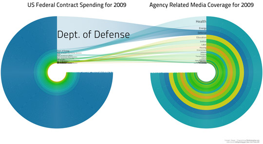
Last week Stephen published an article entitled, “Our Irresistible Fascination with All Things Circular,” which describes how people’s seemingly innate love for circles has led to the creation of many dysfunctional graphs, such as pie charts. Today, another example of a poorly designed circular graph came to our attention. A couple months ago, Sunlight Labs hosted a contest called “Design for America,” which asked designers to create displays of government information for the purpose of making “government data more accessible and comprehensible to the American public.” A couple days ago, they announced the winners. In the data visualization category there are plenty of examples of what not to do, the worst of which appears below.
 This display is supposed to be used to compare the 2009 US Federal Contract Spending for several sectors to the amount of Media Coverage that those sectors received during the year. As you can see, the designers seem to have fallen into the same sort of circle-lust that Stephen wrote about last week. In this case, the circular shape seems to be entirely arbitrary, because the quantitative data is encoded only by the thickness of the rings. These circles serve the same purpose as stacked-bar graphs; they’ve just been stretched out and distorted into a circular shape.
Ignoring the uselessness of the circular design for a moment, what does this visualization tell us? The only thing it tells me is that Defense spending was vastly under-reported in the media during 2009 while Health and Energy spending were comparatively over-reported. Without a lot of effort, I can’t make meaningful comparisons between the information in the other sectors, because they’re too small and hard to see, and I can’t even make comparisons between the three largest sectors with much accuracy. It’s also difficult to read the names of the smaller sectors because they overlap.
Although it might not be as sexy, two horizontal bar graphs next to one another would work better: one for Federal Contract Spending and one for Media Coverage. The Federal Contract Spending graph could be sorted from highest to lowest and the Media Coverage graph could present the bars in the same order. This would make it very easy to compare a sector’s spending and media coverage (because they’d be aligned in a row), it would make exceptions jump out (because there’d be a difference in the length of the bar in the Media Coverage graph compared to its neighboring bars), and it would be easy to read the names of all the sectors. It would still be hard to decode the contract spending in some of the smaller sectors accurately (because their bars would be so much smaller than the Dept. of Defense bar), but at least all of the bars would share a labeled quantitative scale, which would make the task easier.
Another useful alternative, which would put even more focus onto the relationship between Federal Contract Spending and Media Coverage, while making the exceptions jump out, would be a scatterplot that displayed Federal Contract Spending on the x-axis and Media Coverage on the y-axis.
It is unfortunate that most of the winners of Design for America contest don’t represent useful designs. The fact that the circular graph above was a winner either means that the judges of the contest had a terrible selection of designs to choose from, or that the judges don’t understand data visualization. This is sad, not just because people are being given $5,000 prizes for impoverished displays, but because this information is important and it could benefit people if it was presented in a useful way.
-Bryan
|


