

Dental work by road workers with jackhammers — Dashboard design gone awry
May 10th, 2007Alright, I’m not really going to write about the having your dental work done by road workers with construction equipment, but I am going to write about something that is just as painful and absurd: information displays that are designed by software engineers who know nothing about design.
A few days ago a press release was published by the George S. May International Company to announce its dashboard solutions for “small to mid-sized” companies. Here’s a quote from the press release:
We have found that two major obstacles stand in the way of business owners managing their companies more effectively. One is the difficulty in understanding the data they have. The second is difficulty in determining the cause-and-effect relationships among the different data. Management Dashboards helps business owners overcome these obstacles.
While this accurately describes two common problems in business today, I don’t agree that the dashboards that George S. May offers do much to solve the problem. Like most dashboard providers, this company’s solutions communicate information poorly. Effective dashboards result from a combination of good technology and good design. These dashboards look like they’ve been designed by technologists who sit in their dimly lit cubicles all day banging out code, isolated from the world of people. Dashboards are a medium of communication. To work effectively, they must be designed to present the information that people need to do their jobs in a way that is clear, accurate, and efficient.
It makes me sad and even a little angry when software and service companies advertise information solutions that work this poorly, because it isn’t that difficult to learn how to do this right. To illustrate this point, I asked Bryan Pierce, the Operations Manager at Perceptual Edge who has been working with me since last December, to critique one of the dashboards that are featured by George S. May. Before coming to Perceptual Edge, Bryan had no experience with data visualization, and because his work doesn’t require him to be an expert in this field, what he has learned he has picked up mostly indirectly, by reviewing my articles, books, and blogs. In a short time, he has developed the skills that a company such as George S. May could use to produce solutions that really work. The rest of this blog entry was written by Bryan to illustrate how easily the visual design skills that are needed to dramatically improve dashboards can be learned.
Take care,

My name is Bryan Pierce. I am not a rocket scientist or a brain surgeon, nor do I need to be to understand and apply the principles of good information dashboard design. For the last six months, I have worked with Stephen Few at Perceptual Edge, handling the day-to-day operations. Using the skills I have picked up in that time, I am critiquing and providing recommendations for the improvement of a dashboard I recently found online, which was created by the George S. May International Company (http://www.gsmdashboards.com/):
Prior to working with Stephen, I had no exposure to information dashboards; I wasn’t even familiar with the term. Just after Stephen offered me this job, I decided to read Information Dashboard Design so that I’d have a better understanding of Stephen’s work. Over the past few months, I’ve also read most of his articles and blog posts that address the subject. With the exception of a few conversations we’ve had on the subject, everything I know about effective dashboard design can be learned from Information Dashboard Design or http://www.perceptualedge.com/.
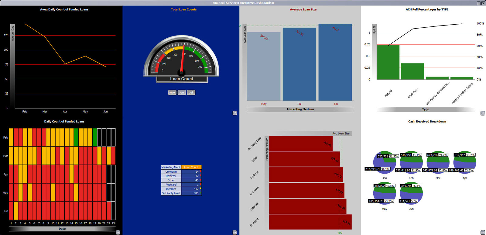
My discussion of this dashboard’s problems is broken into sections. First, I’ll discuss the overall problems, and then I’ll point out some of the problems that are specific to individual components.
Overall Problems:
- Layout: Each component on the dashboard fits into an equally sized “box,” which scales when the window is resized. All of the components resize along with their containing boxes, except the table, which does not scale. Depending on your resolution, this can cause the dashboard to be unbalanced, as in the screenshot above, where some of the items are unnecessarily large, while the table is almost illegibly small. Besides poor scaling, the dashboard’s layout is hindered by the fact that it is based on a grid. As mentioned before, each component fits into an equally sized box, even though all components probably shouldn’t be equally sized. For instance, the heatmap (bottom left) has a much higher data density than the upper bar graph and should probably be allowed more space, yet the dashboard’s grid system gives them the same amount of “real estate.” More thought should have been given to the size and placement of each of these components, based on the nature of the data and its intended use.
- Fill Color: Fill color is used to separate the dashboard into four sections. This makes it unnecessarily difficult for your eyes to track between the differently colored columns. In this case, white space alone would have probably been enough to delineate the sections (with a proper layout); if not, very thin, light gray lines could have been used. In the instances where it is necessary to use fill color to separate sections, a very light color is all that is needed.
- Contrast: The contrast of the graphs compared to the background colors varies significantly. For instance, the heatmap and the gauge use bright colors on a dark background, so they are the most visually salient objects on the entire dashboard. But, are they really that much more important than everything else? Now look at the table and the upper bar graph. They both use blues that are very similar to the background color. As such, they fall away into the background. While a good design can use differences in contrast to direct our eyes, in this case, I think these differences are arbitrary.
- Lack of Context: Many of the graphs are hard to decipher due to insufficient explanatory text. For instance, the “Average Loan Size” bar graph would be easier to understand if it said what units it was being measured in (e.g. U.S. dollars, thousands of U.S. Dollars, etc.). In some cases, such as in the pie charts, the missing information can be obtained from a pop-up legend, by clicking the small eyeball icon to the bottom-right of the charts. However, many of these graphs could have easily been put in context through clearer titles and labels, making the pop-up legend unnecessary. Also, even with the assistance of the legend, some of the graphs are still indecipherable. For instance, notice that both the gauge and the table display the “loan count,” but represent drastically different values. In context, it’s likely that both of these values would make sense. Unfortunately, that context has not been provided.
- Vertically-Oriented and Angled Text: The line graph, the two bar graphs, and the Pareto chart (top right) use vertically-oriented text for their axis titles. The bar graphs and the Pareto chart also use angled text for some of their labels. Vertically-oriented or angled text is harder to read than horizontally-oriented text and should not be used if it can be avoided. On this dashboard, the vertical axis titles could easily be moved to the top of the axis and horizontally-oriented, while the labels could all be oriented horizontally without moving them at all (although some of the labels in the Pareto chart would need to be split onto two lines).
- Unnecessary Precision: Graphs are used to show the shape of data, to compare magnitudes, spot exceptions, etc. If exact values are necessary, a table works best. As such, it’s usually not necessary to show actual values of bars; a scale along the axis will likely provide sufficient precision. In this dashboard, the numbers have been written directly on the bars and pie slices, and in many cases they have been written to two decimal places of precision. This clutters the graphs and distracts us from the shape of the data. On the rare occasions when the exact values and the shape or magnitude of the values are both necessary, a table and graph should be used in conjunction. It’s less distracting and more efficient to look up values on a table that is below or next to the graph than it is when they’re integrated.
- Use of Color Gradients: It’s a rare occasion when the use of a gradient in a dashboard actually serves to enhance its usability. Most often, color gradients are used in a misguided attempt to make a dashboard more visually interesting. At best, this is useless decoration; at its worst (such as when a gradient is used in the plot area of a graph), it can actually cause optical illusions that can adversely affect perception of the data. In this dashboard, gradients are used to decorate many of the graph and axis titles. This does nothing to enhance communication and only serves to give these titles unnecessary visual salience.
The Heatmap:
- A heatmap is a poor choice for the display of time-series data. In addition to the actual values, which a heatmap can only display in a very rudimentary manner, based on color, it’s often useful to see the shape of change through time. If a line graph were used instead of a heatmap, it would be much more enlightening. For instance, in June, the heatmap shows us that for all but one day, the amount of loans funded was considered “Poor.” If a line had been used, we could see whether the amount of funded loans is trending upwards, downwards, or remaining flat, whether the loan amount is fluctuating significantly between days or remaining fairly steady, etc. Reference lines could be used to signify the division between “Good,” “Fair,” and “Poor” performance.
- The horizontal axis of the heatmap is inadequately labeled and very confusing. The axis label says that each number represents the “Date,” but last time I checked, February had more than 19 days. After working at it, I was able to decipher the meaning of the days. Each number represents a business day for a given month in the year 2005. In addition to ignoring the weekends, the heatmap also ignores certain holidays. For instance, February only had 19 work days if you exclude President’s Day. As you can see, the problem with this is that nobody thinks in terms of work days. You don’t think, “Today is the 13th work day of the month.” You think “Today is the 17th day of the month.” The heatmap’s design would have been much more effective if every day of the month was included and non-business days were simply left blank or “grayed out” in some manner.
- Color is used poorly in the heatmap. The use of similar intensity reds and greens together makes the heatmap useless to the 10% of men and 1% of women who are colorblind. Additionally, by only encoding three different values (“Good,” “Fair,” and “Poor”) we lose out on some of the depth the heatmap could have provided. For instance, currently, a single loan could mean the difference between a day being considered Fair or Good. If a divergent color scale were used—that is, one that uses different intensities of two different colors, to encode the data—the heatmap would provide much more insight. For instance, red could be used for poor loan days and blue could be used for good loan days. Days with extremely high or low loan volumes would show up as bright red or blue, average days would appear gray, and everything else would fall somewhere in between. While we still wouldn’t know exact values (color doesn’t work for this), we would have a better idea of just how “good,” “poor,” or even “fair,” each day was.
The Gauge:
- The primary problem with the gauge in the second column is, well, that it’s a gauge. Gauges are “all the rage” on information dashboards; unfortunately, they take the dashboard metaphor too far. One of the strengths of gauges on real automobile dashboards is that they are an easy way for a mechanical device to show change through motion. For the needle to change, its base only needs to rotate, instead of physically moving from one place to another. However, computerized dashboards need not share the same physical restraints that real world gauges do. On a computer screen, the circular shape of the gauge only wastes space and makes it unnecessarily difficult to read. Additionally, it’s rare that the data on a dashboard is updated so frequently that motion will actually be used to show change. This dashboard is no exception. The “real-time” gauge represents the “loan count” for a given month. You would want to know this number, but would you really watch the gauge to see how fast it changed, the way you look at the speedometer in your car? No. The information contained in the gauge could be displayed more efficiently in a variety of ways that would also save room. One of the best ways to display this information is through the use of a bullet graph, which Stephen developed specifically as an effective, compact replacement for gauges.
The Upper Bar Graph:
- Can you name the two months that follow May? June and July, right? When you think of them, you never think “July and June,” because that is not their order in the year. Anytime time-series data is shown on a graph, it should always be sorted from earliest to latest and never any other way. Unfortunately, in an attempt to rank the months by “Average Loan Size,” the creators of this dashboard put July before June, as seen in the upper bar graph. They shouldn’t have.
The Pareto Chart:
- The graph in the top right corner is called a Pareto chart. In this type of graph, the bars indicate the magnitude of individual items, while the line indicates the cumulative totals of those items from left to right. For instance, the line starts at the top of the first bar and then as we move to the second bar, the line displays the combined total of the first and second bars. Once we reach the right-most bar, the line equals the total of all items. The problem here is not the Pareto chart itself, but the scale on the left. The scale on the right expresses each bar’s ACH Pull as a percentage of the whole (which is why the line ends at 100% on this scale), but it is not clear what the left scale represents. Also, the unequal precision used on the left scale, with numbers containing anywhere from 0 to 2 decimal places, makes it more difficult to read than necessary.
The Pie Charts:
- Pie charts should never be used. Research has found that people have a much harder time accurately judging 2-D areas, such as slices of a pie, than they have comparing lengths, such as the lengths of bars. These pie charts also exhibit another problem that most other pie charts do not. Because, both dollar values and percentages are provided on the pies, it’s natural to assume that comparisons can be made between the slices of two different pies. However, this can only be done with the percentages, not with the dollar values. For instance, look at the blue portion of the pies that represent February and March. Although February’s blue slice is larger and represents a larger percentage of that month’s total, the dollar value that it represents is significantly less than the dollar value for March. This problem and the problem of pie charts in general could be avoided if this was redesigned as a bar chart. Each pie could be replaced with a pair of bars, and all of the bars could be placed on a single axis. The vertical axis scale could be in dollars. This design would be more compact than six pie charts, and it would make comparisons between the magnitudes of two bars in a single month or between two bars in different months accurate and efficient. If the exact percentages were necessary—which they probably wouldn’t be, given the higher accuracy of magnitude comparisons with bar graphs—they could be included in a small table below the graph.
There are other tweaks and polishes that could be made to the dashboard; I have only discussed the most egregious problems. So, why do so many companies make dashboards that have so many design problems? I don’t know. Maybe they are unaware of the problems or perhaps they just don’t care. I can tell you, however, that it’s not difficult to learn the principles of good dashboard design. I have picked them up through a few hours of reading. Once they’re explained to you, they make sense and eventually seem intuitive. It only takes a little effort to learn how to create dashboards that are as effective as they should be.


