| |
|

|
Thanks for taking the time to read my thoughts about Visual Business
Intelligence. This blog provides me (and others on occasion) with a venue for ideas and opinions
that are either too urgent to wait for a full-blown article or too
limited in length, scope, or development to require the larger venue.
For a selection of articles, white papers, and books, please visit
my library.

|
| |
December 10th, 2006
Looking for relationships in quantitative data is fun. Contrary to the reputation of quantitative analysis as deadly boring to all but the pocket protector gang, most people find it engaging when the process is made simple, the quantitative relationships are brought to life visually, and the information is interesting. When Martin Wattenberg, an exceptional talent in the field of information visualization, developed a little Web application called NameVoyager to promote his wife Laura’s book The Baby Name Wizard, he had no idea how popular it would become among a broad range of people, not just those trying to choose a name for their babies. All sorts of people found their way to NameVoyager and had loads of fun with it. Initially, most people looked up their own names to see how they had changed in popularity from the 1880s until today, but most moved on to explore and make discoveries about the changing popularity of name after name, examining the historical ups and downs in their popularity, and even testing sets of names to see if their popularity was correlated in some way. People would stand around computers in groups calling out “look up Sally now” and the like. People were sending emails to one another excitedly telling them to examine such and such to see the interesting historical trends. Although most people might not have called what they were doing “quantitative analysis,” in this case exploring and making sense of time-series sets of values that measured the popularity of names, this is precisely what they were doing, and having fun in the process.
The guys at www.swivel.com—data nerds by their own admission—recognized this fact and have created a playground for the public to have fun examining historical quantitative relationships. I’m inclined to appreciate and support any effort that invites people to think quantitatively and analytically. I like the intentions of the folks at Swivel, but have concerns about their execution.
Most of my current work in data visualization is a response to the sad fact that it is the rare businessperson who knows how to communicate quantitative data graphically. They need to be taught the necessary skills, and so I write books and teach workshops to address this need. My concern with Swivel is that this site makes it easy for people to explore and make discoveries about data, but they don’t teach them the skills that are required to do it meaningfully, nor have they built best practices into their graphical playground to prevent people from reaching wrong and potentially absurd conclusions. How long will it be before USA Today begins to feature such amazing discoveries as the negative correlation between wine consumption and violent crime and promote it as a causal relationship, using the graph from Swivel to validate its claim.
Swivel was recently released in preview mode and I’ve had but little time to explore it. It didn’t take long, however, to discover several problems. The first time that I read about Swivel and followed a link to the site, the following graph was being featured:
My eyes were immediately drawn to the intersection of lines around the year 1995 and to the peak in the one line around the year 2002. As soon as I tried to interpret the data, however, my efforts were frustrated because my poor eyes could not match up the colors in the legend to the colors of the lines, even though I was wearing my brand new reading glasses and had expanded the graph to maximum size. Many of the lines appeared to have the same or nearly the same colors.
I started searching for a way to identify the individual lines. I tried pointing to and clicking individual lines to no avail. I soon discovered, however, that I could click a label in the legend to make something happen, but my hope that the corresponding line would be highlighted in some way was dashed when the graph was replaced with one that included only the line that I selected in the legend. I had no way to identify individual lines in the context of the whole.
I gave up on understanding which line was which and decided to see if I could discern anything else meaningful from the graph. I noticed that the percentage scale on the Y-axis included negative percentages, which caused me to wonder exactly what the scale represented. According to the Y-axis title, I was looking at “relative values.” Relative to what? I had to go exploring again for an explanation. Eventually I discovered that I could choose to edit the graph, which took me to a different view where I could select from three quantitative scales: absolute values, relative to average values, and relative to range values. “Relative to average” was selected, so I surmised that the average value was calculated as the mean of all values across the entire range of time (1970-2004).
I could now make some sense of what I was seeing, but I couldn’t quite shake the concern that my understanding of how the average was calculated might be wrong or that it might have been calculated incorrectly. For one thing, I didn’t know if the average was calculated for each line independently, based only on its values, or on all the data in the graph. My suspicion about the accuracy of the calculation was aroused by the fact that this graph was composed of unequal intervals of time. Upon examining the data table, I found values for the following years: 1970, 1980, 1985, 1990, 1991, 1992,…2004. Intervals varied from 10 years to one year, but nothing in the graph informed me of this fact, which must be taken into account when examining the data and in calculated averages across this period of time.
I went exploring again, shifted back into edit mode, and this time changed the quantitative scale to “relative to range.” When I viewed the results of this change in a new version of the graph, once more the Y-axis title proclaimed “Relative Values.” Given the fact that there are two types of relative scales available, this wasn’t very informative and was in fact potentially misleading. I noticed that in this new version of the graph, several but not all “ways of dying” began with their lines at 100% in 1970 (see below).
 I guessed that “relative to range” must mean relative to the highest and lowest value across the entire range of time, either for each line independently or for the full set of lines, but if this were true, wouldn’t at least one line dip to a value of 0% at some point? It would be nice if I didn’t have to guess at the meaning of the scales. One fundamental rule that I teach regarding quantitative communication is that you should include an explanation of everything that isn’t obvious.
I began to wonder about the one remaining type of quantitative scale: absolute values. I was curious about what would happen if the sets of values that were being compared in the graph didn’t share the same quantitative scale, for example, per capita income in dollars and infant mortality in number of deaths. How would unlike scales be handled in a single graph? So I went searching for a graph that might illustrate this situation, and found the following simple example that compares two variables: per capita sales of wine (in dollars, I assume) and incidences of violent crime (see below).
 It took me a while to realize that the line for “Per Capita Beverage Wine” wasn’t omitted, as I first assumed, but was rendered almost invisible because it was stuck at a value of zero across the entire graph. Because the quantitative scale is expressed in thousands, per capita wine sales don’t even register. Despite the appearance of this graph, wine sales actually did vary significantly between 1970 and 2004, but there is no way to show this when the quantitative scale is set to accommodate the much greater values associated with violent crime. The rule that was broken this time is that you don’t combine data with unlike quantitative scales into a single graph with a single scale. Instead, to compare them you create multiple graphs, one for each quantitative scale, and place them one on top of the other so that the same points in time align and patterns of change through time can be easily compared.
I’ll end my critique of the site here, which has perhaps already gone on too long for a blog, but I want to finish with an expression of hope for Swivel. I think these guys are trying to do something worthwhile. I applaud their effort. I can’t imagine the work that has gone into the development of this site. Rather than discourage their efforts, I want to encourage them to make the site more effective. The problems that it exhibits must be solved in two ways:
- By providing instruction to those who use the site in how to explore and interpret data meaningfully.
- By incorporating best practices into the site, drawing on the knowledge of experts in the field of information visualization.
I noticed that one of the three advisors to the Swivel team is a professor in the Computer Science Department at the University of California, Berkeley. I know of at least three experts in information visualization at this university: Maneesh Agrawala (also in the Computer Science Department), Marti Hearst (School of Information), and myself (Haas School of Business). The Swivel team should reach out to experts in this field, either at Berkeley where they’ve already established a relationship, or elsewhere. I believe this venture is too great an opportunity to squander through lack of critical expertise. This information visualization site will succeed only if it is rooted in the best practices of information visualization. Without this expertise, it will quickly degenerate into the ridiculous.
Take care,

December 5th, 2006
Not long ago I mentioned the software company Visual Engineering (makers of VisualAcuity) as one of the few companies that supports the use of Tufte’s sparklines and my bullet graphs on dashboards. As of a few days ago, the folks at Visual Engineering are featuring a sample Sales Management Dashboard on their Web site that was designed to look exactly like the sales dashboard in my book Information Dashboard Design. I supplied them with the data in Excel and they built a working dashboard that not only looks like mine (almost down to the pixel level), but also includes useful details-on-demand functionality to demonstrate more comprehensively how a good dashboard should operate. Some details can be accessed by hovering over specific data points in graphs (for example, the bar on a bullet graph), which causes a small pop-up window to appear with details as text, and a lower level of detail can be easily accessed through drill-down functionality when you spot something in the dashboard’s big picture that needs closer examination.
I can’t comment on the merits of VisualAcuity for dashboard development as a whole, because I’ve never used it, but I can state with confidence that it gives you the visual means to create dashboards that communicate clearly and efficiently, and it provides effective functionality for accessing details when and only when you need them, so they don’t needlessly clutter the dashboard otherwise.
As I’ve stated previously, the software vendors that have demonstrated their ability to design dashboards that support the visual design principles that I teach are Visual Engineering, BonaVista Systems, Corda Technology, and SAS Institute.
Take care,

November 26th, 2006
I recently read a press release from Business Objects that presents the company’s ongoing mission in a way that I find discouraging, although typical of BI software vendors. The article, entitled “Business Objects Designs the Future of Business Intelligence with Business Objects Labs” (November 7, 2006) announced a new research team that will provide “early access to next-generation Business Objects innovations.” This seems useful on the surface, but the focus of this research and what it says about Business Objects’ perceived mission concerns me.
According to the press release, this new team consists entirely of engineers. I have great respect for the work of good software engineers, but I have little confidence in software that is the product of an engineering effort alone. What appears to be lacking is the participation of designers. Software companies that are run by engineers tend to produce software that is technically impressive and jam-packed with features, but poorly designed and barely usable. It is the job of good engineers to make software do what the design specification says it should do, in the way the specification says it should do it. It is the job of good designers to precede the work of engineers, determining what the software should do, based on what’s actually needed, and how it should do it, based on what actually works.
Customers should express to software vendors what they need to accomplish, but should not dictate precisely how the software should be designed to accomplish their objectives. People who use software to do something are rarely experts in interface design, usability, human cognition, and other areas of knowledge that must guide software design, any more than they are experts in the programming techniques that are used by engineers to develop the software. Software vendors should take as much responsibility for good design as they do for good engineering. Should, but this is rare.
Design makes the difference between the elegance and simplicity of an iPod and the clumsiness and incomprehensibility of most television remote controls. Based on the pure joy of a technical challenge, engineers will work around the clock for weeks to develop the means to render pie chart three dimensionally with photo-realistic reflections of light and shadow. Designers, however, will prevent this waste of time knowing that a third dimension of depth in a pie chart is meaningless and reflections of light, which we would find annoying in the real world, are distracting and can undermine our perception of the data.
This new team at Business Objects is “focused on leveraging emerging technologies to deliver innovations that continue to simplify and extend the value of BI to more people.” Once again, on the surface this sounds great, but existing BI software already exhibits excessive interest in cramming in more and more features and chasing new ideas without taking the time figure out what really matters and to then develop software that really works. I’m concerned that what Business Objects and other major BI vendors refer to as BI 2.0 is just the latest marketing hype for more of the same. The people who rely on business intelligence software would benefit much more if vendors placed less emphasis on breadth of functionality and more on depth of effectiveness.
Take care,
November 22nd, 2006
Those of you who are familiar with my work know that I am an avid critic of business intelligence vendors that don’t understand data analysis and presentation, especially the variety that involves visual representations of information. I harangue and cajole in an effort to embarrass vendors into taking this critical aspect of business intelligence seriously. In several articles and blog posts, I’ve argued that business intelligence vendors should be familiar with the important work that has been and continues to be done by the information visualization research community and should incorporate this work into their products. Today, I’m going to focus my critical lens on the information visualization research community.
My work involves wearing several hats, all in the service of better business intelligence. One of those hats is that of a mediator between business intelligence software vendors and the information visualization research community. I try to help the vendors become familiar with the best research findings, so they can use them to improve their software, and I try to help the research community understand the needs of business people whose work involves making sense of information and presenting their findings to decision makers. I would also like to help the research community focus more of its work on real needs and on software that effectively addresses these needs.
I recently attended the InfoVis 2006 conference in Baltimore (produced by IEEE). This conference is the leading international venue where those involved in information visualization research can present their work. I attended the 2005 conference as well, which was my first time. The quality of my experience on both occasions was mixed.
I saw several presentations of excellent research that were built on a solid understanding of visual perception and cognition and followed a robust methodology. I also saw several that fell short on one or both counts. The failures surprised me, because most of these projects are conducted at major universities, where I would expect a thorough understanding of the field and careful research practices to be the norm.
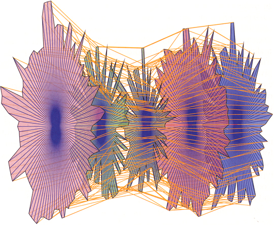
Even when the research was done well, it wasn’t always worthwhile, for it often lacked potential application. I’ll admit that I’m strongly biased in this regard. I spend my days helping real people (mostly businesspeople) solve real problems in the real world. I believe that research projects should begin as a response to something that is really needed, a problem that requires a solution. Displaying treemaps with Voronoi tessellation in place of the usual rectangles (see below) might pose an interesting problem for software engineers, but is this a good enough reason to expend months of research and university funds, culminating in an event where several hundred people sit in a room and use their combined and significant brainpower to ogle the academic equivalent of a Hooters waitress? Cute, cool displays, in and of themselves, will not make the world a better place. In this yound and exciting field, there are plenty of projects that could.
 I believe that every research project—certainly those that are awarded a spot in the InfoVis conference agenda—should be required to include the following two sections in the presentation:
- Why? Describe the problem that the project attempted to solve, not only abstractly, but also in concrete terms involving examples from the real world.
- Why still? Survey the other known attempts to solve this problem and describe what they lack that created the need for a better solution.
Beyond establishing why the project matters, presentations should also validate the merits of the solution in the form of tests on real people doing real work. For example, most of us who have used parallel coordinates to explore and analyze multivariate data would agree that meaningful patterns can be obscured in a clutter of lines, especially with large data sets. This is a real problem that can undermine the effectiveness of parallel coordinates displays. A real solution must surpass the transformation of parallel coordinates into 3-D star glyphs (see below), which are completely unreadable for what should have been obvious reasons. Supposedly, with this imaginative solution, problems with normal parallel coordinates can be “easily solved,” but nowhere in the presentation or paper was any empirical evidence for this claim provided.
 If you’re going to claim the efficacy of your solution, especially if it seems perceptually incomprehensible, you had better be prepared to counter necessary objections with solid evidence. I say “necessary” objections, because research should be subjected to courteous but uncompromising peer review, and the assembled knowledge at InfoVis provides a venue for this that gets far too little expression. Every presentation should include:
- How do we know this works? Report of your empirical findings, resulting from tests of appropriate subjects performing real-world tasks.
We are privileged to be part of an exciting but still newly developing field. We must diligently critique the work and challenge one another to continuously improve. A panel at this year’s conference discussed the question: “Is information visualization science?” I believe the best work in the field is science, as it should be, but still too much of the work undermines our ability to speak of the field as a whole as science. This will change as the field matures. The question that I ask, however, is how quickly will it change? There’s a world out there that needs what we can discover and develop. Let’s focus today on what matters and what works.
Take care,
Comments Off on InfoVis 2006—achievements and disappointments
October 4th, 2006
Most dashboard products feature a lot of silly display widgets but lack the basic flexibility required to design dashboards that communicate effectively. They equip you with gauges that make you feel like you’re behind the controls of an antique steam locomotive or playing a video game, but cannot position and size charts as needed or even do things as simple as position the title of a graph’s Y-axis where you want it. So far, I have found very few dashboard products that have the flexibility that is required to support the visual design principles that I teach, but today I can gladly add one more to the list. Corda Technologies offers a dashboard product called CenterView, which is much like other popular products in that it exhibits a wide range of silly widgets and ineffective features, such as 3-D charts, but the silly stuff can be ignored or turned off, and their development environment provides the power and flexibility to produce well designed dashboards.
How do I know this? No, I haven’t spent the last few days learning the product to see what it can do. The folks at Corda did this for me. After a recent product briefing, I invited them to demonstrate the effectiveness of CenterView by doing their best to duplicate one of my own dashboard designs that is featured in my book Information Dashboard Design. I gave them an Excel spreadsheet that contained the data along with a picture of the dashboard, and then waited with great anticipation to see what they could do. I am pleased to announce that they were able to produce a dashboard that is virtually identical to mine, including bullet graphs and sparklines. You are welcome to view their successful dashboard design for yourself.
Corda now joins the select group of vendors who can produce dashboards that communicate effectively, including SAS, BonaVista Systems (makers of an Excel add-in called MicroCharts), and Visual Engineering (makers of VisualAcuity). If there are any other vendors out there who would like to join these ranks, I’d be happy to give you the same challenge that I gave Corda, and more than happy to welcome another vendor to this elite group if you succeed.
Take care,
|
