| |
|

|
Thanks for taking the time to read my thoughts about Visual Business
Intelligence. This blog provides me (and others on occasion) with a venue for ideas and opinions
that are either too urgent to wait for a full-blown article or too
limited in length, scope, or development to require the larger venue.
For a selection of articles, white papers, and books, please visit
my library.

|
| |
January 24th, 2007
Previously in this blog, on two separate occasions I commented on new web-based services—both available to the public—for exploring and sharing data visually: Swivel and Data360. I welcomed the worthwhile intention of both—to provide a public forum for sharing and discussing insights discovered in data—but I found the visualization capabilities of both rudimentary and in the case of Swivel especially, in some ways ineffectively designed. I believe in the inherent value of information and fully support efforts to make it available in ways that challenge people to think and hone their analytical skills. Upon discovering these fledgling services, I found myself longing for another—one that provided exceptionally well designed visualization tools, which could give this worthwhile venture a better platform for meaningful and eye-opening discoveries and collaboration. Knowing that work in this area was already being done by some of the brightest lights in the information visualization community at IBM Research’s Visual Communication Lab, I hoped that they would step into the breach. Yesterday, my hope was realized in the form of a new service called Many Eyes.
Here’s an excerpt from the site, which describes its objective:
Many Eyes is a bet on the power of human visual intelligence to find patterns. Our goal is to “democratize” visualization and to enable a new social kind of data analysis…
All of us at the Visual Communication Lab are passionate about the potential of data visualization to spark insight. It is that magical moment we live for: an unwieldy, unyielding data set is transformed into an image on the screen, and suddenly the user can perceive an unexpected pattern. As visualization designers we have witnessed and experienced many of those wondrous sparks. But in recent years, we have become acutely aware that the visualizations and the sparks they generate, take on new value in a social setting. Visualization is a catalyst for discussion and collective insight about data.
We all deal with data that we’d like to understand better. It may be as straightforward as a sales spreadsheet or fantasy football stats chart, or as vague as a cluttered email inbox. But a remarkable amount of it has social meaning beyond our selves. When we share it and discuss it, we understand it in new ways.
The same beauty and passion with which the team at the Visual Communication Lab has expressed their intentions can be seen in the service that they provide, and especially in its visualization tools. Martin Wattenberg and Fernanda Viégas are the two members of this team whose work I already know and respect. I would expect nothing less from them than the fine collaborative visualization environment that they and their colleagues have created.
As a brand new site, still in its alpha phase, Many Eyes does not already offer everything one might desire when exploring and sharing information visually, but what they do offer is finely crafted, and it extends to a surprisingly large number of visualization types, considering that this is a first release. Even geo-spatial (geographical map based) and treemap displays are included. The charts are things of beauty that don’t resort to the superfluous decoration (3-D bars and pies, garish colors, silly lighting effects, etc.) that is common today in most commercial visualization tools.
Here’s a simple line graph that I created to compare U.S. consumption of apples and oranges (yes, I’m comparing apples and oranges) as it has changed from 1970 until 2003:
Notice how your eyes are drawn to the data and how easily you can follow and compare the ups and downs of apple and orange consumption across the years. This is the product of expert design. If you wish to see precise values without going back to the data set, just hover with the mouse over any point along a line and the value appears, but only when you want it, so it doesn’t clutter the graph when you don’t.
To give you an example of the more sophisticated visualizations that Many Eyes offers, here’s a treemap, which compares highway vs. city mileage of vehicles, organized by class and manufacturer:
I’ll resist the temptation to show more examples, because you’ll have a lot more fun if you go to the site and explore it directly.
Given their commitment to support data exploration as a social event, they have incorporated means for people to share their thoughts verbally as well, by people to post comments and questions in the collaborative spirit of discussion boards and wikis.
Many Eyes doesn’t already do everything you might find useful while exploring data and it certainly isn’t a replacement for robust commercial visual analysis software, but even as a free web service, it already gives you better visualization functionality than most business intelligence software products. In the few minutes that I’ve had so far to explore the site, I listed a few things that I would like to see added or improved, such as the ability to sort categorical items in a graph by value (for example, in a bar graph that shows the consumption of all fruits in 2003, sort the bars by the amount of consumption rather than alphabetically) and the ability to compare data distributions using a box plot. I sent my list to Martin Wattenberg and received a quick reply that both of these features are already on the list for a future release. (Keep in mind that the site was just released in its alpha state.) I suspect that Martin and his colleagues didn’t wait until everything they had planned to include was in the site before previewing it, because the earlier release of Swivel and Data360 made them anxious to show their hand as soon as possible.
The value and extraordinary power of information visualization for analysis is quickly gaining recognition. It’s an exciting field, which is far too often undermined by poorly designed visualizations, which is shown so vividly in most of the dashboards that vendors advertise. A finely crafted visualization service, such as Many Eyes, is a “site” for many sore eyes, thanks to the dedication and skill of the folks at IBM’s Visual Communication Lab.
Take care,

January 8th, 2007
Most of my rants about the poor state of data visualization are aimed at business intelligence software vendors that dabble in the field without understanding it, resulting in poorly designed and ineffective software. Every once in awhile, however, circumstances prompt me to redirect my aim toward the academic visualization community. Even though academic researchers are responsible for most of the breakthroughs in the field of visualization, they are sometimes responsible for downright clueless visual communication and for colossal wastes of time and effort.
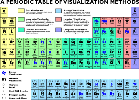
In the last two days I’ve noticed several blog entries about something called “A Periodic Table of Visualization Methods.” This is the work of two fellows at the Institute of Corporate Communication, University of Lugano, Switzerland. It was recently published in the paper “Towards a Periodic Table of Visualization Methods for Management.” Coming from an institute that focuses on communication, it is especially alarming that this presentation of visualization methods communicates so poorly.
Before commenting further, let me show you the table.
The periodic table of elements, unlike this table that was modeled after it, is quite effective in design. It works because its organization reflects the meaningful attribute of each element’s atomic number (the number of protons in the element’s atomic nucleus). The two-character abbreviations that it uses to label each element work because they are the standard abbreviations that are used by scientists. This new periodic table of visualization methods, however, exhibits no such organizing principle. What is the point of doing an entire research project to force a list of visualization methods into a paradigm that doesn’t fit it? Apart from breaking the visualization methods into general categories (information visualization, concept visualization, etc.), this table exhibits no useful organization.
It also fails in its printed form to use the most obvious means of presenting methods of visualization: images that illustrate the methods. The web version provides access to images by hovering the mouse over an entry in the table. This is an effective way to give people access to details on demand, which are needed infrequently, but the images work even better than the names to identify the visualization methods, and therefore ought to be visible at all times. A simple table with one row per visualization method, organized into categories (information visualization, concept visualization, etc.), would present this information more clearly, especially if it included the following:
- Column 1: A full name for each method, without the two-character abbreviations that nobody knows and nobody will ever be inclined to use
- Column 2: A simple image to illustrate the method
- Column 3: A description of the method, including what it is used for and what differentiates it (which is missing entirely in the display above)
If there are particular attributes that ought to be identified for each method, such as whether it supports overview, detail and overview, or detail views of information, then a column could be included for each, perhaps with a simple check to indicate if it applies. If included, these designations ought to be clearly defined and separated into unambiguous values. I only got as far as looking at the second entry–Table–which was designated as a means to present overview information only, before giving up on this particular distinction as useless. Tables can be used to display overview (summary) information, detail information, or a combination of overview and detail information. I also found the distinction between “divergent thinking” (“adding complexity”) and “convergent thinking” (“reducing complexity”) confusing. I believe that good visualizations neither add to nor reduce complexity, but accurately and as simply as possible represent the level of complexity that exists in the data.
I am sorry to single out the authors of this particular research paper, because the problems found in their paper are not uncommon. I welcome their efforts to create a better or more comprehensive taxonomy of visualizations. What I’m saying is that researchers in the field of information visualization ought to present their work in a manner that exhibits practices of effective visual communication, which are well established in the field. You don’t get a pass just because you assume your audience consists of other academics in the field. Even academics understand information better when it is presented clearly.
P.S. Anyone looking for an encyclopedic reference for data visualization should consider Information Graphics: A Comprehensive Illustrated Reference, by Robert L. Harris.
January 7th, 2007
When the Readers’ Choice Award in the data visualization category given by Intelligent Enterprise magazine—one of the few periodicals focused on business intelligence—goes to IBM Visualization Data Explorer, we should question the merits of these awards. Don’t get me wrong; IBM Research does some exceptional work in the field of data visualization, but IBM Visualization Data Explorer is not business software, at least not in the same sense as data visualization products such as Tableau, Spotfire, and Advizor Solutions. It is a programmer’s tool for developing sophisticated visualizations and analytical applications, which is used predominantly by scientists. Here’s an example of the type of visualizations that are typical of its use:
Most business people would take one look at the product’s user interface (see below) and run like hell back to the safe haven of Excel.
IBM Visualization Data Explorer is probably a very good product, and it could certainly be used by a programmer to develop an application that business people could use to analyze business data, but it is useless and potentially misleading to compare products of this type to visual analysis applications that are designed to be used by business people.
If you go to IBM’s Web site to learn about IBM Visualization Data Explorer, you will quickly discover the truth for yourself. Of the many examples of visualizations that have been produced by the product, only a handful fall into the general business category, and even those don’t fit what we usually think of as business intelligence. Here’s an example to illustrate my point:
Although a stock analyst could probably learn, after a great deal of practice, to interpret this graph, you would want to keep it far away from the faint of heart.
Frankly, most of the business examples that can be found on IBM’s Web site are not well designed. This next example uses a rainbow color scale (a bad practice for a continuous range of values), the heights of states, and the heights of bars on a 3-D map to encode stock information, which could be displayed in a much more comprehensible manner using a tool like Tableau.
If you’re in the habit of selecting software based on readers choice awards, you’re in for a big surprise if you use this year’s winner in Intelligent Enterprise’s data visualization category as your guide. Something really screwy happened to produce this result. Perhaps someone tampered with the electronic ballot box.

Comments Off on Intelligent Enterprise Readers’ Choice Awards feature an odd data visualization winner
January 1st, 2007
Not long ago I wrote about a new Web site called Swivel, which serves as a venue for posting, exchanging, and exploring data. Although I was critical of its data visualization implementation and concerned that it might encourage people to make absurd and misleading comparisons between variables, I was encouraged that such a venue for data had been created and hopeful that it would improve over time. Shortly after writing about it, I received an email from the creator of another Web site with similar intentions named Data360. Its creator, Tom Paper, invited me to take a look at Data360 and comment on it. In his email, Tom described his site as a place where “people can find, present and share data. We’ve been calling it a ‘collaborative trend tracking website’ and a ‘data dashboard for a democratic society.'”
Tom pointed out ways that, despite many similarities, Data360 differs from Swivel:
Both products do similar things, although I would say that where Swivel is more playful, Data360 is more serious. Our view is that it’s too easy for charts to lie; a well-done chart tells a story and is the result of intelligent and, sometimes, creative analysis.
Data360’s target audience is businesses, academics, non-profits and governmental organizations (”BANG”), while Swivel’s appears to be more individuals (”Youtube for Data”).
On the surface, at least, Tom’s description of how the two sites differ seems fair. The folks at Swivel probably characterize their intentions differently, but even if they are trying to do precisely what Tom has described, the playful vs. serious goals of these sites are both worthwhile, as long as they serve these audiences well and discourage them from adding to the confusion and misrepresentation of the facts that already plagues the Web.
Both sites must improve the design and functionality of their graphs to provide an engaging venue for data presentation and exploration. Data360 suffers from fewer and less glaring problems than those that I found at Swivel, but this is partly due to the fact that its graphs do less. I want to encourage those of you who take data visualization seriously and have useful insights to get in touch with Data360 and Swivel to offer your suggestions and encouragement. With the right improvements, both sites could enrich the world by providing useful venues for presenting and exploration important data.
December 28th, 2006
As the end of 2006 approaches, I’ve been thinking back over the year, trying to summarize the essential progress of business intelligence (BI), especially in the realm of data visualization. Unfortunately, with the exception of a few software companies that have introduced products or upgrades that actually work and add value, 2006 has added little to support the chief goal of BI, which is to help people make sense of business data and to communicate their findings to others. Most BI software vendors are serving up data visualization in the form of “Happy Meals” that are no more nourishing to businesses than the fast food that has lured the appetites and expanded the waistlines of most Americans.
This morning I received an email from the CFO of a large bank. In it he mentioned that Business Objects, a vendor whose products his company uses, recently conducted a data visualization contest involving solutions developed with Crystal Xcelsius. He informed me that the requirements of the Crystal Xcelsius Challenge were described as follows:
The participant must create an original interactive data presentation or business dashboard (“Dashboard”) using any Crystal Xcelsius™ product (i.e. CX Now!, Crystal Xcelsius Standard, Professional, or Workgroup). The Dashboard must attempt to serve some kind of business function.
Even though this CFO is a customer of Business Objects, after reviewing the winning solutions, he was gravely disappointed in the results of this contest: “It appears that Xcelsius picked winners on the basis of how many Xcelsius widgets they showed, and not the best examples of visualization.”
After reviewing the winning solutions myself, I agree with his summation. These solutions illustrate the theme that has dominated most BI data visualization 2006: anemically presented data, tainted with distracting visual nonsense. I’ve decided to use the contest’s winning solution to point out practices that we must avoid if we care about improving business intelligence in the coming year.
The winning solution was submitted by Peggy Tien of Vancouver, Canada. Peggy is without a doubt a talented software engineer and an expert in the use of Crystal Xcelsius. Based on what’s important to Business Objects in this contest, given that its sole intention was to market Crystal Xcelsius, Peggy deserves the $10,000 prize that she received. Her solution features the visual artifice that makes Xcelsius the darling of those who prefer high-tech kitsch to useful information. If submissions had been judged on their ability to make sense of and communicate business information effectively, however, Peggy’s solution would have fallen short in several ways. I believe that this is largely a failure, not of Peggy, but of the product and the way that Business Objects markets it.
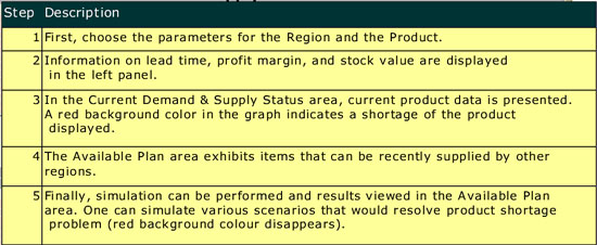
Here’s a screen shot of the winning solution:
You can see and interact with a live version of this solution on Business Objects’ Web site.
I would like to do for Peggy and for those who wish to learn from her solution, what the folks at Business Objects have not done, at least so far. I would like to use it to teach principles of effective information design by critiquing its effectiveness and suggesting how it could be improved. Let me begin with the purpose of the solution, which is stated on Business Objects’ Web site:
The Supply Chain Plan Dashboard is designed to assist management in simulating various ways to balance inventory supply and demand. Supply sources include forecast and sales order, while demand sources include purchase orders and inventory stock. The dashboard alerts managers of supply shortage quantities and dates. Managers can then use the dashboard interface to formulate inventory supply-demand adjustment plan. The dashboard also displays information on supply availability from other warehouses, helping managers to effectively carry out inventory transfers between associated companies.
And before launching into my own critique, here are the comments of the judges:
This is a unique and outstanding example of a forward-looking dashboard. It is a powerful tool that gives the user the ability both to monitor current supply/demand status AND to develop an adjustment plan that will address shortages – in real-time. This dashboard does an excellent job of aesthetically displaying a large number of critical KPI’s and alerts. It is well laid-out, and effectively uses color to differentiate and group KPI’s. This unique dashboard is an example of data visualization that could only be created with Crystal Xcelsius.
While it is not true that this solution could have only been created using Crystal Xcelsius, it is true that many of the problems that it exhibits were encouraged by the product and the way it is marketed.
First of all, contrary to the title that appears at the top of the display, this is not a dashboard. It was not designed to support effective monitoring of supply chain information. A dashboard is a visual display of the most important information, related to a particular objective or set of objectives, which has been specifically designed to enable people to monitor what’s currently going on at a glance. One could never assemble the big picture of what’s going on regarding supply and demand from this application. It is too fragmented into little pieces of information to ever get an overview, which is what’s required when you wish to monitor something. This is also not an analytical application in a general sense. Once again, the information is too fragmented into isolated pieces to get the overview that is needed in the beginning of the analysis process, and it lacks the full range of views and comparisons that are needed for data analysis. At best, this is an application for examining, in a narrow and prescribed manner, the supply versus the demand for a particular product in a particular region, complemented by the ability to view the results of specific “what-if” manipulations of the data in an effort to improve supply. There is nothing wrong with this scope, if this is all you need to do, but people who manage supply chains usually need more.
Beyond the misapplication of the term “dashboard” to this display, which is hardly Peggy’s fault, but more a result of the sloppy way that vendors apply this term to almost any screen-based display, the other problems that caught my attention fall into four categories: (1) inadequate or inappropriate data representation, (2) ineffective visual design, (3) inadequate instructions, and (4) ineffective interface design.
Inadequate or Inappropriate Data Representation
- The colored background colors (gray or red) in the bar graphs indicate good or bad, but not how good or bad. Reference or background fill colors could have been used to indicate the good and bad ranges so that you can see how far into a given range the measure extends.
- In the bar graphs, the only way that it makes sense to include actual orders and forecasted orders together in a stacked bar is to place the forecast on top of the actual orders. The orders are real values that can be counted on, and therefore deserve the dominant position, starting from the bottom and extending from a value of zero. The forecast is a guess and should therefore extend the actual order total to provide a picture of what the total demand is assuming that the forecast will come true. Also, because the forecast segment of the bar is less certain, it should be assigned a color that is less intense than the color used for the orders segment of the bars, but the opposite was done in these graphs.
- The three gauges on the left lack quantitative scales, so all you know is the actual value (displayed as text) and the qualitative range (bad, satisfactory, and good). Without a scale, we cannot tell where the ranges start and end.
- The gauges lack points of comparison. We know that a measure is good or bad, but don’t know on what basis this judgment was determined. Good or bad compared to what? Measures almost always need to be compared to something to provide the context necessary to give them meaning.
Ineffective Visual Design
- The circular shape of the three gauges wastes a great deal of space that could have been used for additional information.
- The grid lines in the bar graphs are too salient and distracting. Also, because the grid lines do not extend all the way to the quantitative scale on the left axis, they are nearly impossible to associate with the scale.
- Colors have been inconsistently used to represent qualitative meanings. In some cases “good” is represented by black (the thermometers on the right), sometimes gray (the background color in the bar graphs), and sometimes green (the gauges). Using different colors to mean the same thing is confusing. Also, the same color green that was used to indicate bad performance in the gauges was used to represent the Detroit region in the line graph, suggesting that the Detroit data in the line graph is good, which is not necessarily the case.
- The transparency of the pull-down menu makes the text hard to read. When you are selecting a region or product from a pull-down list, you don’t need to see what’s behind the menu.
- The legend for the lower bar graph is closer to the table below it than it is to the graph, which leads one to assume that it pertains to the table.
- The colors that were used to distinctly encode forecast, order, stock, and purchase in the bar graphs were only partially associated with the tabular entries below the second bar graph. The color that was used to encode the amount of products in stock in the bar graphs was assigned to the “Stock” row of the table as well, but none of the other rows were assigned colors that match those in the graphs.
- The heavy button-like borders around each value in the table make the table stand out far more than it should. Assuming that borders around each value are needed at all, they should be made barely visible.
- The horizontal gradients of color on the bars makes them hard to read and visually confusing, compared to a single, undifferentiated color.
- The 3-D effects that have been applied to many objects are distracting and add no value whatsoever. They arbitrarily cause objects that are 3D to pop out visually.
- Because so much color and so many different colors have been used throughout the display, the power of color to highlight particular parts of the display, such as data that most needs attention, has been undermined.
- Days 1 through 10 are a time-series scale that is shared by both bar graphs and the line graph. These graphs are meant to be compared, but the values associated with the days in the line graph are not aligned with the corresponding bars in the bar graphs, which makes comparisons difficult.
Inadequate Instructions
- It was a good design decision to place all the instructions for using the application in a separate help window (shown below), which can be accessed by clicking a help button. This kept the display from becoming cluttered with text. Unfortunately, however, the instructions that have been provided are inadequate. For instance, they don’t tell us how to change values in the Adjustment Plan section of the display, which is needed, because it is not at all obvious how to do this. They also fail to tell us the meanings of the values that are associated with the two shortage level thermometers. Until the plan has been adjusted, the values that appear in the “Current Demand and Supply” and “Adjustment Plan” bar graphs are the same, so why do the shortage levels differ? It took some investigating to figure out that the top thermometer displays the shortage for today, but the bottom thermometer shows the projected shortage for the next 10 days.
Ineffective Interaction Design
- The means that was provided to adjust values in the plan is no intuitive and works poorly. Adjustments must be made by pointing to a value in the table below the graph, holding down the left mouse button, and then moving the mouse up or down. While you do this, a two-headed arrow moves up and down on the screen, but disappears behind other objects, such as bars in the bar graphs. It would work much better to allow the bars in the graph to be sized directly by clicking and dragging them up or down. Values can also be changed by typing them directly into the table, but I wasn’t aware of this until a colleague informed me that by double-clicking on a value in the table (which isn’t mentioned in the instructions), I could then change it.
- When adjusting the plan, supplies of products that are available in other regions can be seen in the line graph, but there is no way to transfer stock from one of these regions to the region that needs it. A what-if scenario can be displayed by increasing the amount of stock in the region that is being examined to meet demand, but this does not have an affect on any of the regions from which the stock would need to be taken.
Business Objects is by no means the worst provider of data visualization today, but because it is a big and vocal company, it is positioned near the center of my radar screen. Just as the American government, which is hardly the worst government in the world, is so large and powerful that it affects the world on a large scale when it does something stupid, immoral, or destructive, Business Objects, as one of the largest BI vendors in the world, has a responsibility that comes with its influence to do what’s right, lest the world suffers. Wouldn’t it be great if Business Objects and all the other BI vendors started taking data visualization—the most powerful means available to fulfill the promise of business intelligence—seriously? Instead, they flood the market with superficial fluff, projecting the belief that their customers don’t know any better? And wouldn’t it be great if those business people who purchase BI products started demonstrating that they do in fact know better by demanding products that actually work? This is my hope for 2007. At the end of the day, the only measure of success for any BI application is that it works and works well. It should help people understand their data thoroughly with the least amount of effort, thus paving the way to intelligent decisions.
|