| |
|

|
Thanks for taking the time to read my thoughts about Visual Business
Intelligence. This blog provides me (and others on occasion) with a venue for ideas and opinions
that are either too urgent to wait for a full-blown article or too
limited in length, scope, or development to require the larger venue.
For a selection of articles, white papers, and books, please visit
my library.

|
| |
February 27th, 2007
When I first discovered Swivel.com, I was encouraged that a website was providing a venue for the presenting, discussing, and collaborating around important data, despite its problems. When the folks there responded positively to my recommendations, I was hopeful that the site might evolve into something useful. One of the latest features, which they proudly refer to as the ability to “bling your graph,” however, has put an end to these hopes. What a shame.
Here’s their explanation of the new feature:
In this world of customization, individualization, tricking trucks, pimping rides, and extreme makeovers, we here at Swivel wanted to allow users to further express themselves in their graphs…What does it mean to bling a graph? It means you can add a photo as the background image of your graph. Just click on the Bling button.
 Swivel has joined the swelling ranks of those who believe that important information can be enhanced by sprucing it up with gratuitous decoration. This might be appropriate for advertising, but it is the death of data. Blinging your graph is to graphical presentation what a lobotomy is to brain function. At least they’ve given this feature a name that accurately describes its purpose. If you want your data to impress those who prefer superficial sparkle to the substance of important information communicated clearly, Swivel is the site for you. There are so many ways that the ability to share data and worthwhile findings could be improved on Swivel. What a travesty that a feature that is not only useless but also undermines the purpose of the site occupied their attention and efforts. If you want to make sense of data and share what you’ve discovered with others, you would do better to try out Many Eyes.
February 21st, 2007
I discovered today, thanks to the blogger at Serious about Consulting, that Business Objects is working on a new product called BI Desktop. In a recent conversation with the folks at Business Objects Labs, I was encouraged when they said that they are taking data visualization seriously and are working on some new products that are bound to please. The blogger said that, although he suspected that I would be unimpressed with the desktop widgets that make up BI Desktop, he liked them. He referred to them as “neat stuff to play with.” He was right—I don’t like them, although I would agree that if you want to play, they might keep you entertained for a few minutes. I would love to see a well designed data visualization product from Business Objects, but in its current form, BI Desktop won’t be the one.
I don’t have anything against the concept of simple display widgets that remain on your screen to keep you informed about some important performance measure. I do object, however, to any form of display that doesn’t communicate effectively and doesn’t fit an actual business need.
What kind of business intelligence information deserves to sit on your desktop at all times in the form of an individual display widget? The only kind that qualifies displays a measure that meets the following criteria:
- The information changes frequently throughout the day.
- You must monitor it throughout the day.
- It is displayed in a manner that enables you to assess performance.
- It tells you enough about what’s going on to know if you must take action.
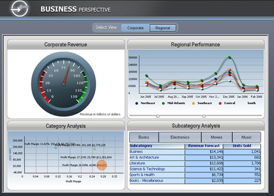
Let’s take a look at the sample widgets that Business Objects Labs have put on display:
Now let’s evaluate each of the three widgets, based on the criteria above.
Total Inventory Cost
This widget is a typical gauge, such as those provided in many dashboard products. It suffers from all of the problems that are typical of these gauges: it takes up far more space than necessary to say far too little. It informs us of two facts: the cost of total inventory is $1,410,049 and this is satisfactory (based on the fact that the needle is pointing to the yellow range). Here are a few things that it doesn’t tell us, however:
- What dollar amount of inventory would be considered good or bad? Because the gauge provides no quantitative scale, we simply can’t tell.
- What is the cost of total inventory being compared to as a measure of performance? Is there a target? If so, what is it?
- If you happen to be color blind, which 10% of males and 1% of females are, you probably can’t tell whether it is to the left or right that you ideally want the needle to point.
One of the biggest problems with this example, however, is that total inventory cost is not something that changes so rapidly that you need a widget to keep track of it by constantly sitting on your screen. This is a measure that you might look at once a day at most.
Inventory Breakdown
Pie charts don’t communicate a breakdown of inventory into its parts nearly as effectively as bar charts. It is much harder to compare the sizes of pie slices than the lengths or heights of bars. You might object to this statement, however, by pointing out that the percentage of each slice is revealed as text, to which I would respond, “If you need the numbers to be printed on the slices to understand the chart, what good is the image?”—a table of numbers would work better. Despite the generic problems that pie charts suffer, this pie chart in particular is absurd. What’s missing from the picture? The labels that are needed to tell us what is being measured, what each slice represents. Also, this pie chart fails to display performance information. Assuming that the sizes of the slices are changing throughout the day and that we actually know what they represent, how would we ever know if we should take action? Nothing tells us when particular conditions are good or bad, such as what the targets are for the various measures.
Revenues by Quarter
Once again, here’s a widget that would sit on our screen taking up space all day long to tell us something that we would likely only need to see once in the day. Of the five quarters, only the current quarter could possibly change during the day. The little bit that it might change in a day, however, isn’t worth monitoring. And where is the target or some other point of comparison that gives us some clue as to how revenues are performing. At least with this particular widget, we can compare the current quarter to past quarters, which is useful, but not enough. Unless we’re near the end of the quarter, comparing the current quarter’s revenues to prior quarters doesn’t really tell us how well we’re doing.
My Conclusion
The criticism that I’ve aimed at Business Objects in the past, remains valid for this future product as well. They are either developing or purchasing visualization products (for example, Crystal Xcelsius, which was developed by Infommersion) that are poorly designed. These problems in design would never occur if they stepped back from what they’re doing and asked the questions “What do our customers really need?” and “What functionality and design would effectively address this need?” When a data visualization product is needed, it cannot be developed without a firm understanding of visualization: what works, what doesn’t, and why. To date, Business Objects, much like most other BI vendors, has not demonstrated even a fundamental understanding of data visualization.
Take care,

February 7th, 2007
Bissantz and Company, one of two German software vendors that makes an Excel add-in for producing sparklines (BonaVista Systems is the other), has added a new feature to their product that you should avoid. In addition to looking at a simple sparkline to see how a series of values has changed through time, you can now listen to that same information encoded as sound. Here is their explanation for the new feature:
A time-series is a pattern. It climbs upward and descends, patterns are stable or swinging, they change slowly or abruptly. The pattern is more important than the actual values…Time-series patterns are similar to sound patterns. A sound pattern climbs or descends just like values do. You can hear what you see and see what you hear. If you simultaneously hear and see the same your understanding is faster. [Emphasis mine]
Everything was fine until the last sentence. Sound patterns are indeed like time-series patterns. In fact, sound patterns are not just like time-series patterns, they are time-series patterns. They consist of values (frequencies) that unfold serially through time. The claim, however, that the addition of an audio encoding to a visual encoding of time-series information speeds up the process of understanding is not correct. It actually slows down the process. I can see the time-series pattern in an instant, because my brain processes the image in a parallel manner, but sounds are processed serially, which takes time. Audio encoding might be useful for people who are visually impaired, but for the rest of us it is not a good replacement nor even a good addition to a graphical encoding.
February 6th, 2007
MicroStrategy recently announced the release of version 8.1, which supposedly features the “state of the art in business dashboards.” Much like most of the other big business intelligence software vendors, however, MicroStrategy seems to think that the essence of data visualization is flash and dazzle. Here’s how they describe it:
With advanced visualizations that produce ad agency-quality graphics, our pioneering dashboard technology offers a variety of visualizations that let you bring your data to life with beautiful clarity. (Emphasis mine)
Ad agency quality graphics is not the goal that vendors ought seek in an effort to differentiate their dashboards. How about setting themselves apart by being able to honestly say: “Our team of visual communication experts have worked hard to apply the best of information visualization research to the unique requirements and opportunities of dashboards.” So far, I haven’t seen a dashboard product that can make this claim. Too bad. What we’re getting instead is a silly competition among the vendors to out-perform each others with features that don’t matter, because they not only don’t improve a dashboard’s ability to communicate information effectively, they actually obscure the data. “Beautiful clarity” is something I can get excited about, but the sample dashboard below is neither beautiful nor clear:
Even the most basic visual design principles have been ignored, or more likely are not even known, by the person who created this sample dashboard. On a properly designed dashboard, this same information could be displayed in a quarter of the space much more meaningfully and with greater clarity. Why are so many BI software vendors copying one another rather than actually taking the time to learn something about data visualization? Effective data visualization is not achieved by using cute gauges and drop shadows, yet the first section of product features page, titled “Beautiful,” begins with the statement:
MicroStrategy 8.1 dashboards are beautiful — with new graph effects, bevels, gradients, semi-transparency, 3D, Bezier curves, drop shadows, and more — all supported by the new High Fidelity Graphing Engine…
Anyone who understands data visualization, especially as it applies to dashboards, would recognize this as a very dangerous list of data-obscuring nonsense.
Stand up to your vendors and remind them of their obligation to become experts in data visualization if they intend to develop and sell data visualization products. Enough already! My eyes are beginning to hurt.
Take care,
January 25th, 2007
Yesterday, I blogged about the new collaborative data visualization site called Many Eyes. I am only one among many who have contributed comments to the websphere in the last few days about Many Eyes. In scanning through some of the comments by others, I found an article by Shane Schick, who, although well intentioned, doesn’t seem to understand data visualization. Here’s an excerpt from Shane’s article titled “I’ll believe it when I see it”:
I’m more of a pie chart guy than a bar chart guy. With bar charts you have to read along the bottom to see what the categories are and then back to the bars themselves to determine how much larger one thing is than another. With a pie chart it’s all laid out for you, and it takes only a glance to assess the proportion. To me, pie carts are just easier on the eyes. That won’t necessarily be the case for Many Eyes.
Not being a data visualization expert, Shane’s comments about pie charts vs. bar charts are actually more accurate if you attach what he said about pie charts to bar charts, and vice versa. Unlike pie charts, which typically use a legend to label the slices, bars on a bar chart are labeled directly, just below the bars. You can read a bar’s label without moving your eyes, but with most pie charts your eyes must bounce back and forth again and again between the slices and the legend. Also, visual perception is notoriously bad at comparing 2-D areas, such as pie slices, whereas our greatest perceptual precision is achieved by comparing the lengths of objects that share a common baseline and orientation, such as the bars in a bar chart, or in comparing the 2-D position of objects along a common dimension, such as the ends of bars. Finally, most pie charts are actually harder, not easier on the eyes, because they consist of several colors (one per slice), which are usually (although not necessarily) bright, garish, and therefore jarring to the eyes. When a bar chart is used to display the same information that could also be displayed in a pie chart, all the bars share a single color (unless you unnecessarily make each bar a different color, which is gratuitous nonsense). A considerable body of research has confirmed the superiority of bar charts in supporting all but a few rarely used operations of graph interpretation that can also be performed with pies.
It’s important to mention that pie charts are used for only one type of quantitative comparison, whereas bar charts support many purposes that require the comparison of magnitudes (that is, the relative sizes of the values). Pie charts are used exclusively for part-to-whole comparisons. In fact, the one advantage that a pie chart has compared to bar charts is that when you look at one, you know you are seeing a comparison of the parts of some whole, such as regional sales (the slices), which add up to total sales (the whole pie). Because bar charts can be used to display many types of quantitative relationships, when you look at one that is used to display a part-to-whole relationship, this fact isn’t as obvious, despite a quantitative scale that’s expressed as percentages. All that this means, however, is that you must state this fact, such as in the title “Regional Breakdown of Total Sales.” In other words, even if Shane’s preference for pie charts were backed by the evidence of what actually works best, he would still need bar charts for a host of purposes that pie charts cannot support.
At one point in his article, Shane complains: “If you’re the lone pie chart person among a group of histogram people, how well are you going to be able to articulate a vision?” The truth is, when it comes to presenting data, you can’t be either a pie chart person or a histogram person. To articulate your vision effectively, you must know how to match the data and your message to the appropriate means of display. Pie charts, which exclusively display part-to-whole relationships, and histograms (a specialized version of a bar chart), which exclusively display frequency distributions, don’t align themselves with distinct teams that are trying to reach the same goal. To articulate your vision, you must speak the language—in this case the language of graphs.
Take care,
|