| |
|

|
Thanks for taking the time to read my thoughts about Visual Business
Intelligence. This blog provides me (and others on occasion) with a venue for ideas and opinions
that are either too urgent to wait for a full-blown article or too
limited in length, scope, or development to require the larger venue.
For a selection of articles, white papers, and books, please visit
my library.

|
| |
August 24th, 2006
I was recently approached by folks at the German software company Bissantz and Company because they were interested in implementing the bullet graph that I designed as an alternative to most dashboard gauges. They also wanted to let me know that they already had an Excel add-in for producing Tufte’s sparklines, which I think are especially useful for displaying trend information in a small amount of space on dashboards. In talking with them, I learned that they have a data analysis product named DeltaMaster that has been around for years, but I had never seen. This morning I was briefed on DeltaMaster by means of a Web-based demonstration and I’m writing to report my impressions.
The people who developed DeltaMaster, especially the company’s founder, Dr. Nicolas Bissantz, come from the world of data mining and statistics. Based on a few emails that we’ve exchanged, Bissantz comes across as a man of vision, inspiration, and take-no-prisoners action. He sees the efforts of people like himself and me as new “guerilla style information…culture” as we fight to usher in the next generation of business intelligence. His enthusiasm is contagious–almost overwhelmingly so. In their effort to meet the needs of business people, the folks at Bissantz and Company have worked hard to deliver the powerful tools of statistics and data mining in friendly packages.
Despite the powerful algorithms that work beneath the surface, the interface speaks the language of business and presents functionality in terms of what it is used to accomplish. I was impressed by two aspects of DeltaMaster:
1) The built-in support for effective analytical navigation (overview, then details, with quick access to filtering and drilling).
2) The prebuilt analysis methods designed to pursue particular analytical goals that are important to business analysts in a way that hides the complexities and intimating math usually associated with statistics and data mining.
Rather than learning the meaning and use of pareto charts, parallel coordinates, etc., DeltaMaster’s prebuilt analysis methods are described using terms such as “Characteristics Comparison,” “Component Comparison,” “Concentration Comparison,” “Correlation Comparison,” “Deviation Comparison”, “Frequency Comparison,” and so on. I like this approach, which focuses on the actual analytical task, rather than the name of the chart or the statistical method that is being used. When one of these analysis methods is selected and data are applied to it, the results are displayed in a table, graph, or in most cases combinations of the two, based on best practices that are built into these methods.
DeltaMaster lacks some of the functionality that I find useful in visual analysis tools, such as small multiples (a series of small graphs that can be used to make comparisons without resorting to 3-D graphs, which are difficult to read) and brushing (the ability to display multiple graphs within eyespan, each showing the same data from a different perspective, and then select a subset of the data in one graph and have that same subset automatically highlighted in all the other graphs), and its interface can be improved somewhat, but what it does it seems to do well enough to deserve your attention.
My exposure to DeltaMaster has been brief and superficial. I can hardly endorse it based on such little information. It might have problems and limitations that undermine its effectiveness. Perhaps I’ll have a chance to delve into it deeper in time. In the meantime, however, if you’re in the market for a data analysis tool, you might want to take a look at DeltaMaster.
Take care,

Comments Off on DeltaMaster: German engineering for BI
August 7th, 2006
People use the term “dashboard” to mean many things, but in my mind one of the defining characteristics is that a dashboard is used to monitor what’s going on. Whether in real time or once a day, a dashboard presents the most important information that someone must monitor to do a job, making it apparent when something requires attention. When monitoring in real-time is required and responses must be made immediately, a dashboard must provide something called “situation awareness.” For instance, pilots and air traffic controllers use systems that are designed to support situation awareness. Similarly, the manager of a manufacturing operation or someone who supervises a team of people who do telephone sales must maintain situation awareness. To support situation awareness effectively, dashboards must be designed in particular ways. Research into situation awareness has produced a large body of findings that can be drawn upon for this purpose. A book by Mica R. Endsley, Betty Bolte, and Debra G. Jones entitled Designing for Situation Awareness: An Approach to User-Centered Design (published by Taylor & Francis in 2003) beautifully distills the findings of this research into a clear set of 50 principles that can be used to guide this work.
I wish I had known about this book before I wrote Information Dashboard Design: The Effective Visual Communication of Data, because I could have been more explicit in some of my recommendations and provided more evidence to support many of my claims. Fortunately, nothing that I learned from this book conflicts with the dashboard design principles that I teach, but for situation awareness, this book takes us further into the specific requirements of systems that keep people aware of what’s going on from moment to moment. Most of the examples that are used to illustrate the principles relate to systems for pilots and air traffic controllers, but they apply just as well to any situation that requires ongoing awareness for immediate response when a need arises.
To give the flavor of the book, here’s the opening paragraph:
While a clear understanding of one’s situation is undoubtedly the critical trigger that allows the knowledge, skills, and creativity of the human mind to be successfully brought to bear in shaping our environment, very often people must work uphill, against systems and technologies that block rather than enhance their ability to ascertain the information they need. Knowledge in a vacuum is meaningless. Its use in overcoming human problems and achieving human goals requires the successful application of that knowledge in ways that are contextually appropriate. Yet, across a wide variety of engineered systems, people face an ever-widening information gap — the gulf between the data that is available and the information that they really need to know.
Central to the book is the understanding that situation awareness consists of three separate levels:
Level 1 – perception of the elements in the environment
Level 2 – comprehension of the current situation, and
Level 3 – projection of future status
The authors address each of these levels, sharing insights gained from research for how we can design computer systems to awareness, understanding, and response.
Although written by sophisticated researchers, this book is readable and practical. I recommend it to anyone who wants to design a dashboard for real-time monitoring that really works.
Take care,

Comments Off on Designing dashboards for “situation awareness”
July 31st, 2006
Recently, my friend Ron Powell, Editorial Director of the Business Intelligence Network, pointed out that I seemed to be giving a great deal of critical attention to Business Objects in this blog. As the person ultimately responsible for the Business Intelligence Network’s content, he was probing for the cause of this attention, wondering if I had a personal bias against Business Objects. Journalistic integrity is critical to our work, so I appreciate his concern. After we spoke, I looked back over my blog entries and found that to date I have spoken critically of vendors or publications in 50% of my entries and 33% of these critical entries were aimed at Business Objects (three in total). Although these statistics aren’t evidence of a crusade, I can understand why personal bias seemed like a possibility. Let me explain how I decide what to write about and why Business Objects has been featured so often.
First of all, I don’t believe Business Objects does data visualization worse than other mainstream business intelligence vendors. Most large business intelligence vendors don’t understand data visualization. They focus primarily on useless and distracting visual fluff rather than meaningful substance. Their understanding of data visualization is superficial, with shallow roots the reach down into the rocky soil of misguided customer demand (which they themselves have helped to create), rather than the rich soil of empirical research into what really works. This is currently true of the largest BI-specific vendors–Business Objects, Cognos, and Hyperion–and is also true of Microsoft, the maker of Excel, the tool used for business intelligence more than any other.
I use this blog to discuss what’s on my mind regarding data visualization as it applies to business intelligence. What’s on my mind can be triggered by many things, but it is usually prompted by something I’ve read. Consequently, vendors that issue frequent press releases or frequently distribute marketing materials get my attention more often than others. It is my experience that no large business intelligence vendor issues press releases and distributes marketing literature on the topic of data visualization more frequently than Business Objects. As an analyst and journalist who specializes in data visualization, I listen when vendors speak about it or make claims about what they bring to it. When I feel strongly about these statements, either positively or negatively, I respond. My responses are especially impassioned when vendors make statements or claims that I believe are either misleading (including outright false) or espouse a position that undermines the effectiveness of business intelligence as an industry, data visualization as a discipline, or the customers we are supposed to serve.
I recently began to use this blog to show examples of poorly designed graphs. I inaugurated this “Graph Hall of Shame” with an example taken from Business Objects’ user documentation. Why? Because of all the examples in my private collection of bad graphs from BI vendors, I felt that this one was especially bad in ways that I could easily explain, which made it a good place to begin. To be fair to Business Objects, however, you should know that I only possess copies of user documentation from two large business intelligence vendors: The only other user documentation at my disposal is Brio’s from before the time Brio was acquired by Hyperion. In other words, I have a larger collection of Business Objects examples to choose from than any other vendor, which is part of the reason why these examples show up in my work more often than others. This isn’t fair, so I’ll make an effort to keep this abundance of Business Objects examples from resulting in an undeserved frequency of nomination to the Graph Hall of Shame.
Something has come to my attention recently regarding Business Objects, however, that requires a response.A few days ago, an article by Stephen Swoyer appeared in Enterprise Strategiesk, which reported fresh claims by Business Objects about its data visualization strategy. Swoyer states: “Late last year, Business Objects SA got itself a data visualization strategy, courtesy of the former Infommersion…Xcelsius [Infommersion’s product] brought a candy-apple sheen to Business Objects’ analytic brawn.” What is Business Objects now planning to add to this data visualization strategy?
Over time, says BO director of marketing James Thomas, Business Objects hopes to do for Xcelsius what the former Crystal Decisions Inc. did for Crystal: bundle it with third-party applications and IDEs, open it up to developers, ISVs, and OEMs, and facilitate invocation of Xcelsius’ data visualization capabilities from custom-built or third-party applications.
This is not a data visualization strategy; this is a sales strategy. A data visualization strategy focuses on improving the usefulness and effectiveness of data visualization and applying it in new ways to address real problems. Plans to bundle Xcelsius with third-party applications, etc., is part of a sales strategy. Unless Xcelsius is much different from what Business Objects features on its Web site and other marketing venues, it does not represent the direction that data visualization ought to be going. Embedding Xcelsius in every nook and cranny will do more harm than good. Remaining neutral, Swoyer diplomatically raises an important question about Xcelsius: “Candy Apple Sheen or Candy Apple Substance?” I find it difficult to see past the blinding candy apple sheen. Here’s a typical example.
 We find it annoying in the physical world when glaring light reflects off the surface of an object, making it difficult to see, so why would we want to reproduce this effect in a display of business information? There is probably some useful functionality hiding beneath Xcelsius’ video game look and feel, but the dominance of distracting visual fluff and game-like sound effects severely undermines its integrity and proclaims that Business Objects doesn’t understand or seriously care about data visualization. Business Objects does care about sales, however, and knows that many people find the video game qualities of Xcelsius entertaining. Few of our customers are experts in data visualization. They haven’t done empirical research to determine what works and what doesn’t, nor have they read the research findings of others. Vendors selling data visualization software are supposed to be the experts, working to give people what they need . It pains me to see the potential of data visualization reduced to this level. Business Objects is certainly not alone in this; just louder than most vendors in marketing this snake oil.
I express strong opinions in this blog, sometimes in provocative ways, but I base them on evidence and reason. This is my job. I welcome discussion about these opinions with business intelligence vendors, espeically if they find fault with my evidence or reasoning. Respond to this blog or contact me directly. Show me that you care. If you wish to give the world useful tools, let’s work together to make them as good as possible. I would much rather write about the good work of business intelligence vendors and use this blog to put people in touch with tools that can improve their lives.
Take care,

Comments Off on Business Objects’ data visualization strategy
July 19th, 2006
You’ve been having so much fun with the last graph that I nominated for the Graph Hall of Shame, I couldn’t wait to announce the next nominee. This example comes from iDashboards. What you see below is an excerpt from a larger dashboard. Take a moment to examine it and make a list of its problems. Include anything that gets in the way of clear and efficient communication. Keep in mind that this is from a dashboard, and that one of its goals therefore is rapid communication.
Click to enlarge

Where to begin? Here’s my list of problems.
- The quantitative scale does not begin at zero. Not all quantitative scales must include zero, but when bars are used to encode the values, zero must be there. One of the ways that a bar encodes a value is by its height (or length, in the case of horizontal bars). If bars begin at some value other than zero, their heights do not accurately encode the values they represent. Also, without zero, comparing the heights of various bars does not accurately represent the differences in value between them. For example, it appears that the bar above the label “Maine” is about 150% the height of the bar to its right, but it is actually only about 107% the smaller bar’s value. I realize that the zigzag shape at the base of each bar is meant to indicate that the scale has been truncated, but what’s the point of using bars to graphically represent the data if you can’t compare them to one another? Without this ability, a table of the same data would work much better.
- You probably noticed in my point above that I didn’t refer by name to the bar next to the one labeled “Maine”. This is because it isn’t labeled. Only every other bar is labeled. You can get by with not labeling every month or year in a time-series graph, because we all know which month follows April or which year follows 2002, but we don’t all know which state follows Maine alphabetically, at least not without difficulty.
- Even by labeling only every other state, the state names could not be placed side by side without orienting them sideways. Unfortunately, this makes it difficult to know to which bar a particular label refers. For instance, does the “Maine” label actually refer to the bar above it or to the smaller bar to the right? This depends on whether the labels are centered below the bars or right justfied such that they end under the corresponding bar.
- If the purpose of this graph is to compare the average salaries of the various states to one another, ranking them by size (such as from largest to smallest) would have made this much easier to see. Alphabetical order is only useful for looking up individual items, which is something that tables support nicely, but graphs should be used to feature patterns in the data.
- On a dashboard, which is used to monitor what’s going on, do we really need to see the average salary for every single state? Probably not. It would probably be more appropriate to only show those states with the highest salaries or a combination of the top and bottom states (such as the top five and bottom five).
More problems could be added to the list, but I’ll leave it to you to point out the additional flaws.
Take care,

Comments Off on Graph Hall of Shame – Nominee #2
July 14th, 2006
I thought that it would be fun to use this blog as a forum for sharing really bad examples of graph design, especially examples found on the Web sites or in the user documentation of business intelligence vendors. This serves two purposes: 1) It illustrates ineffective graph design practices, to help you learn what to avoid, and 2) it hopefully embarrasses the vendor that created the graph enough to pay more attention to what they show their customers as examples of graph-based communication. I’ll share fresh examples from time to time, but please feel free to send me examples that you’ve found as well, which I can then share with the other readers of this blog. You can send examples directly to me at sfew@perceptualedge.com.
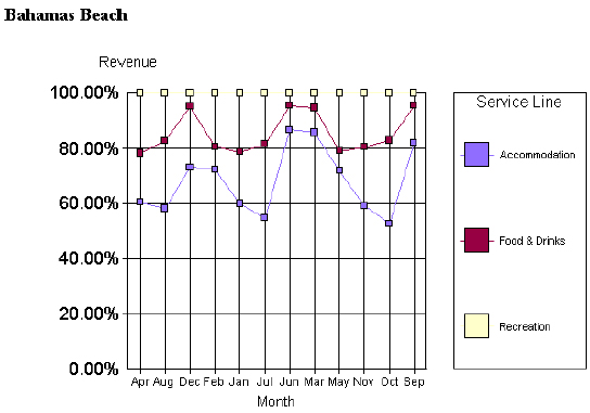
Ill begin with an example found in Business Objects’ user documentation. I found this some time ago, so it is possible that it has since been replaced with a better example. Take a look at it for a moment to determine for yourself what’s wrong with it–what undermines effective communication.

Now that you’ve had a chance to critique it yourself, here’s a list of the problems that I noticed:
- The legend is far too visually prominent. Making it so huge and enclosing it with a border draws readers eyes to it far more than appropriate. The legend is much less important that the data in the plot area of the graph.
- The items in the legend are in an order that is the reverse of the order of the actual lines in the graph. Readers would find it easier to associate the labels in the legend with the corresponding lines if they were in the same order.
- The grid lines compete with the data lines, making it difficult to focus on and compare the patterns formed by the lines. These grid lines are probably not necessary at all–the vertical lines certainly are not–and if the horizontal lines are useful to support a higher level of precision when reading the values, they should be kept very light, just visible enough to do the job without distracting from the data.
- The labels that identify the values along the quantitative scale (0.00%, etc.) are much too visually prominent. What are they so big and bold, especially compared to the other labels and titles in the graph? They are not more important than the other labels and should therefore look the same.
- The numbers along the quantitative scale display a meaningless level of precision. The two decimal places of precision, zeros in every case, tell us nothing and imply a level of precision in interpreting the graph that a graph cannot support.
- The color of the recreation line is barely visible against the white background of the graph.
- The big squares that mark the individual values along each line clutter the graph somewhat. Individual data points are probably not needed on these lines, but if they are needed to help readers compare values for a given month between the three lines, they can do this job with less visual prominence, such as by using small black or gray dots.
- Last, but not least, the sequence of months along the X-axis is a rather creative way to display time. I can’t think of any situation in which an alphabetical arrangement of months would make sense.
I could say more, but these are the primary problems. Shame on Business Objects for encouraging their customers to display data in this manner. User documentation of this quality hurts more than it helps.

|


