| |
|

|
Thanks for taking the time to read my thoughts about Visual Business
Intelligence. This blog provides me (and others on occasion) with a venue for ideas and opinions
that are either too urgent to wait for a full-blown article or too
limited in length, scope, or development to require the larger venue.
For a selection of articles, white papers, and books, please visit
my library.

|
| |
February 8th, 2006
One of the most prevalent problems with dashboard software is inflexible layout. Most products force you to divide the dashboard screen into a rigid grid of rectangular panels into which tables, graphs, and other display widgets are placed. It is difficult to produce a well-designed dashboard when working under these constraints. To arrange a large collection of disparate data in a small amount of space in a way that communicates effectively, you need complete flexibility to position display objects wherever necessary, size them however necessary, and to strip them down to their bare essentials. Most products fail to support this level of flexibility.
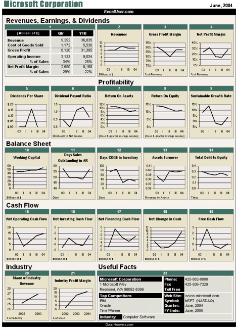
I was recently introduced to the work of an Excel expert extraordinaire, Charles Kyd, who gets Excel to perform layout tricks that leave most dashboard products in the dust. Kyd’s web site, http://www.exceluser.com/, offers a cornucopia of Excel resources, including an E-Book, Dashboard Reporting with Excel. In it Kyd presents a step-by-step approach to building dashboards in Excel that makes use of some features that I never knew existed, such as the Camera Tool. It is this feature in particular that frees you from the rigid row and column structure of Excel and allows you to place and size display objects, including tables, with complete flexibility.
Kyd doesn’t claim to be a data visualization expert, but he manages to avoid most of the common pitfalls of visual dashboard design that most software vendors flaunt, such as those ridiculous dashboard gauges that clutter and eat up the screen with low-density information. His visual designs could be improved somewhat, but they are far better than what you’ll find on the web sites of most dashboard vendors and are definitely on the right track for effective communication. Dashboard Reporting with Excel sells for $24.95, and you can download it immediately from http://www.exceluser.com/. Here’s a sample of one of his dashboards:
 Not bad for a dashboard that requires nothing but that spreadsheet software that is already running on your computer. I hope that the inventiveness and good sense of people like Charles Kyd provide the swift kick that dashboard vendors need to focus on functionality that delivers real business solutions, rather than the entertaining but information poor dashboards that currently dominate the market.

January 20th, 2006
I just returned from a long walk near my home in the hills of Berkeley. During the walk I listened to a podcast of an NPR program about research into the causes and treatments of particular neurodevelopmental disorders, such as autism. One of the researchers from the M.I.N.D. Institute at the University of California in Davis mentioned that it is currently difficult to identify specific genes that are closely related to autism, because autism isn’t really a single disorder, but rather several disorders that exhibit similar behaviors. If you’re trying to detect high incidences of particular genetic markers that are related to a particular disorder, such as autism, you must define the disorder narrowly enough to find a link to a single genetic cause or predisposition. For instance, in searching for the cause of cancer, you would need to narrow the disease to a particular type of cancer, because the different types—of which there are several—have very different causes. This researcher’s comments started me thinking about the importance of good data segmentation, of breaking business dimensions down into meaningful subtypes to enrich the data for insightful analysis. This point alone warrants a great deal of consideration, but the point I want to make in this blog entry is that a great many of the breakthroughs that we experience when analyzing business data are inspired indirectly from thinking and learning about other things.
Innovations are born at the intersection of disparate disciplines and ideas. Our minds have an uncanny ability to make connections between things that weren’t obviously related until those things encountered one another in our minds. As business professionals, we constantly run the risk of becoming myopic, too focused on one narrow field of responsibility to notice interesting connections and new ways of looking at what we do and the data we seek to understand. Just as bringing a group of people together from various parts of the company to tackle and solve problems gives birth to more intelligent solutions, so too does bringing the broad interests of our own lives, our own multidimensional selves, to the workplace.
Keep your mind sharp through involvement in a range of interests and interactions and bring them all with you to the office and conference room. The most creative and productive people I know are usually those who fill their lives with broad pursuits, fill their minds with far-ranging collections of knowledge, and fill their communities with people of all kinds.

Comments Off on Bring your multidimensional self to the office (or “Multidimensional data can only be understood by multidimensional people”)
January 14th, 2006
I currently teach a workshop called “Information Visualization for Discovery and Analysis”. In this workshop I present several general practices for analyzing quantitative business data using interactive visual techniques, as well as many specific visual representations of data and visual analysis techniques that are designed to solve particular business analysis problems. For instance, I describe several ways to display and interact with time-series data to solve particular problems, including one that I’ll describe here as a example. My purpose here is to illustrate the kind of examples that I plan to include in my next book and to invite you to share your own visual analysis designs and techniques for making sense of quantitative business data. If you submit a technique that is new to me and I decide to include it in my book, I will gladly give you the credit for passing on the idea and will send you a complimentary copy of the book once it’s published. Much of what I know I’ve learned from people like you who work regularly in the trenches to solve real-world business problems. Please submit your ideas via the Discussion Board (see the discussion forum on “Visual data analysis techniques”) on my web site at www.PerceptualEdge.com.
On occasion it is useful to compare rates of change between two or more sets of time-series data. For instance, you might want to determine if your domestic or international sales are increasing the fastest. Line graphs do a great job of showing the ups,downs, and overall trends of values as they change through time. Here an example of how your domestic and international sales might look during the last six months.
 It is natural when looking at a time-series graph such as this to assume that the orange line is increasing at a faster rate than the green line, but in fact that are increasing at precisely the same rate. A 10% increase beginning at $10,000 equals $1,000, while a 10% increase beginning at $100,000 equals $10,000, and on a standard quantitative scale the slope of a line that increases by $1,000 is much less than one that increases by $10,000. This does not hold true, however, for logarithmic scales. The same data appears in the graph below, this time using a logarithmic scale. Equal rates of change when using a logarithmic scale appear as equal slopes, no matter how much the actual values are or the differences between them.
Therefore, if you want to compare rates of change rather than actual amounts of change, using a logarithmic scale makes the comparison easy.

January 5th, 2006
Last night while on my way to visit friends, I happened to look up and notice the moon. Nothing about the moon last night was particularly spectacular or eye catching; in fact, it was a little sliver of a thing, but still beautiful and awe-inspiring, as it always is. I didn’t just see it there in the sky; I actually paid attention to it for a moment and realized that I hadn’t noticed it for awhile. If I had walked up to you this morning and asked what the moon looked like last night and whether it were waxing or waning, would you have known the answer? Most days I wouldn’t have a clue, and this saddens me.
I am a busy guy, like most of us are these days, with much to distract me from noticing the state of the moon, but I like to think of myself as someone who notices what’s going on in the world around him, someone who is conscious of the context of life, someone who notices things like the moon. At times of reflection like this, I am troubled by the way I have allowed my work and the other interests that fill my time to narrow my awareness, to make me one of those myopic guys who sees only what’s in front of his face and rarely turns his head to discover what he’s missing.
This disturbs me because I am convinced that my life, my work, and my brain are at their best when my vision is most panoramic and my feet tread diverse paths. Most innovation comes from the intersection of ideas; that place where disciplines and worldviews rub up against one another. Too much immersion in a single activity, topic, or way of thinking gradually produces stagnation. We need to lift our heads and look around often to remain vital and to remember who we are, what we’re doing, what it’s all about, and why it matters.
The moon is out there and it is beautiful to behold. I am a better person and I do better work when I notice it. Businesses are smarter and give more to the world when they do this as well. It is easy to get lost when you forget to look around.
I am inclined to end this blog entry right here, happy to have blessed the world with my philosophical musings, but I’m betting that you would like me to tie this a little more firmly to data visualization, or at least to business intelligence in general. Let’s see…how can I link this to BI? Ah hah, I just thought of something I’ve been itching to say for a while now.
Three months ago Business Objects purchased a relatively small company named Infommersion, whose software features visual representations of data, especially in the form of dashboard-like displays. Prior to this purchase, the visual capabilities of Business Objects’ software were rather sad. I suspect that they heard enough complaints about this from customers that they finally decided to address the problem by acquiring software that already handled data visualization more satisfactorily. Unfortunately, Business Objects didn’t lift its head high enough to get a good look around.
Rather than walking up the hill a ways to get the lay of the land and understand the real potential of dashboards and what’s really needed to deliver that potential, they grabbed for the obvious but ultimately unsatisfying appeal of flash and dazzle. The software that they purchased, now called Crystal Xcelsius, looks great—at least superficially—but it is just a slicker version of the same misguided design that most dashboard software features. Dashboards are only as valuable as they are able to deliver—clearly, accurately, and efficiently—the important information that people must monitor to do their jobs.
Dashboard vendors should be spending their time figuring out the best ways to support this need, rooted firmly in an understanding of visual perception (how people see) and human intelligence (how people think). Instead, most of them are spending their time creating the cutest, most photo-realistic gauges, meters, and traffic lights imaginable. This considerable effort does little to improve a dashboard’s ability to communicate, and in most cases actually achieves the opposite effect. Dashboards are not video games, they are computer-based displays for vital business communication. To build products that enable the development of effective dashboards, software vendors must lift their heads above the fray of feature-function competition and look past the tempting candy (the empty calories of superficial glitz) that is dangling right there in front of their eyes. They must step back and look around long enough to remember what business intelligence is all about, and then take the time to design software that really works and really matters.
That’s enough preaching for today.

Comments Off on When did you last look up and notice the moon? (or “When will Business Objects raise its head and look around?”)
January 1st, 2006
The ground in my Berkeley neighborhood is saturated. A series of winter storms have drenched us with rain to the point where the earth has closed its mouth, refusing to drink any more. Our streets have become rivers and lakes. As I contemplate what to say in this, my first-ever blog entry, the current saturated state of the earth seems a fitting metaphor for our information-soaked world. I can’t help but wonder, “Does the world need yet another blog, the rambling musings of another “thought leader”, to add to the already dense infosphere?” As I await your answer, over time revealed through your visits to this site, I’ll do my best to make it worth your while by letting the emergence of worthwhile ideas determine when I make new entries to vie for your attention, rather than some arbitrary schedule of demand.
Although I’ve been involved in every aspect of business intelligence and data warehousing over the years, my primary interest today involves the use of visual representations of data to make sense of (analyze) and communicate information. This domain, whether you call it data visualization, information visualization, visual analytics, or the new name that I’m beginning to float—BizViz—lives at the heart of business intelligence. The Gartner Group, which coined the term business intelligence, defines it as:
An interactive process for exploring and analyzing structured and domain-specific information to discern trends or patterns, thereby deriving insights and drawing conclusions. The business intelligence process includes communicating findings and effecting change.
(Source: A glossary on the web site www.gartner.com)
If this is indeed the essence of business intelligence, then no tools and techniques contribute more directly and completely to this endeavor than the visualization tools and techniques that make visible in an unparalleled way the meaningful trends and patterns in information that must be discerned to make intelligence business decisions.
As business intelligence professionals, let’s not lose sight of our mission, which is not to throw more on the growing heap of data that already overwhelms decisions makers today, but to help people make sense of information that matters and to deliver the meaning that they find to decision makers as clearly and accurately as possible. Only then can businesses function intelligently. This is a worthwhile challenge that cannot be resolved by simply throwing more technology at it. To produce business intelligence, we need to bring a great deal of our own intelligence to this process and keep our eyes on what really matters and what really works.
I believe that many of the best business intelligence solutions involve tools and techniques that present to our eyes—our most powerful sensors by far—meaningful patterns and trends that live in data in an easily recognizable and informative way. Most of the musings in this blog of mine will invite you to think with me about these matters and will hopefully help us all to open our eyes.
And now, in a blatant attempt to begin this blog on a provocative note, I’ll throw out a statement that is bound to rouse a response: “Most business intelligence software vendors don’t understand data visualization.” Even their basic charting functionality is embarrassing. There are a few notable exceptions, but most vendors haven’t a clue. As a result, they focus on cuteness rather than effectiveness, on visualizations that have more in common with video games than the tried and true designs that have been demonstrated to work. They ought to be experts in this field, because it is critical to effective business intelligence. They’ll only become experts when their customers stop asking to be entertained with flash and dazzle and begin to demand effective visual analysis and communication functionality that is firmly rooted in an understanding of how people see and think. This is where you come in if you’re one of their customers. Take the time to learn what works and then demand it. I’ll do what I can to help.

Comments Off on Let’s open our eyes–the importance of data visualization to BI
|


