Oracle/PeopleSoft Enterprise Service Dashboard — A disservice to people who desperately need better
Thanks to a press release from Oracle last week, I found the two dashboard screen shots that appear below in a Product Sheet that describes the features of Oracle’s new PeopleSoft Enterprise Service Dashboard software. These examples feature a dashboard that is designed for monitoring call center activity—or at least this is their intent. I’m frustrated that software vendors continue to produce such anemic and poorly designed dashboard examples. Whether the software is capable of doing better, I don’t know, but these screen shots demonstrate no understanding whatsoever of effective dashboard design. Oracle should be embarrassed.

Due to a busy schedule, I asked Bryan Pierce, who works with me, to critique these examples. Until a few months ago when he began to work at Perceptual Edge, Bryan had no experience with graphical communication and had never seen a business intelligence dashboard. Today, he spends his days managing the day-to-day operations of Perceptual Edge (website, bookkeeping, etc.), but has been picking up data visualization skills on the side, mostly by reading my books and articles. I’m pointing this out because it’s worthwhile to note that it doesn’t take years of experience to develop the skills of graphical communication. Bryan’s critique begins below my signature, which I’m confident that you’ll find useful. Oracle could learn a thing or two from Bryan.

This review is based on the two images that were included in Oracle’s product data sheet. Unfortunately, due of their low-resolution, some of the text was illegible, so I wasn’t able to conduct as thorough of a review as I would have liked. Below is a list of the problems that I found.
Overall:
- All of the graphs use 3D to encode 2-D data. The third dimension adds no value but does succeed in making the values harder to decode.
- Neither display is sufficiently data-rich. In creating a dashboard, it’s important to put all of information that people might want to compare together on a single screen. Even when people probably won’t compare values, it’s easier and more efficient for them to work with a well-designed single page than it is to work with multiple data-sparse screens. The size of the graphs alone—giant pies and single bars that take up a quarter of the screen—indicates that much more information could have be included on the display. It’s likely that, given a proper layout, multiple screens would not even have been necessary.
- The borders between graphs are unnecessarily salient, which makes it more difficult to track between them to make comparisons.
- All of the tick marks used are redundant; they are not necessary when gridlines are used.
Main Screen (first image):
- Very little of the information is encoded visually, undermining much of the strength of a dashboard. The only information that is encoded visually is the information contained in the pie chart and the bar & line graph. The multiple tables require us to read the information (slow serial processing) instead of allowing us to see the information like graphs do (fast parallel processing).
- The bar and line graph appears to display call volume (bars) and call capacity (line) as it changes through the day (although, due to the low resolution, I can’t be sure of this). By using bars and a line together, it creates the potential for confusion when they cross. For instance, look at the 5th bar from the left. If its magnitude was slightly higher, the top-left side of the bar would be above the line, but the top-right side would not. It could difficult to quickly determine whether the bar or the line represented a greater value, in some cases. The 3-D effect only adds to the problem. If only bars or only lines were used, this wouldn’t be a problem. If bars and lines are used, this problem could be alleviated by adding small data points to the line to assist in comparisons.
- The pie chart appears to display a breakdown of calls by the originating region (US – Midwest, United Kingdom, etc.). Pie charts don’t work well because people have a difficult time accurately comparing area. When a third dimension of depth is added, this becomes even more difficult because the slices at the top of the pie are shrunken slightly while the bottom slices are slightly enlarged to provide the 3-D perspective. 2-D bar charts work much better than pie charts because, instead of relying on our poor ability to compare areas, they are based upon our ability to compare lengths, which we do quite well.
- The gradients used in the background of the graphs are more visually salient than a solid light color would be and in some cases, they can misleadingly alter our perception of the data.
- The background images are distracting and make it more difficult to read the data.
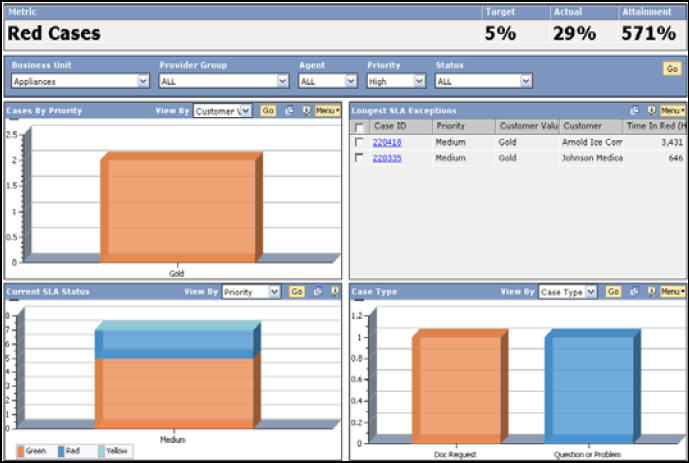
Drill-Down Screen (second image):
- Notice the legend below the bottom-left bar graph. On many dashboards the colors green, red, and yellow are commonly used for encoding data. Red is usually used to represent “bad,” yellow “borderline” or “satisfactory,” and green “good.” The problem with this color-coding is that the 10% of men and 1% of women who are color-blind might not be able to tell the good from the bad. In this case, it appears that Oracle might have tried to avoid this by using red, blue, and light green (which could potentially be differentiated by the color-blind because the light green has a lower intensity than the red). Unfortunately, look at the labels on the legend. The red box is labeled “Green,” the blue box is labeled “Red,” and the light green box is labeled “Yellow.” This creates a big problem for the display. Studies have found that when the word for a color is different from the color of the word (for instance “green” is written in red text) it is significantly slower and more difficult to read. How many times would you need to go back to the legend before you would easily remember that the blue bar means “red?” This cross-coding is a significant problem for everyone, whether color-blind or not.
- The red and blue colors used to encode the bars mean different things in different graphs. When the same color is used in multiple graphs, people naturally tend to assume that there is meaning behind this; in this case, they would attempt to find meaning where there is none. When multiple colors are used, care should be taken to prevent people from looking for connections that don’t exist. There is an exception to this rule: If everything is the same color. All of the bars could be the same color without any confusion. When everything is encoded with the same color, instead of just certain things, people aren’t inclined to see false relationships.
- There is little point in encoding a single value as a bar. It takes at least as much time to decode as it would to just read the number (because you must refer to the scale). Once multiple bars are added, bar charts begin to shine because the approximate value of every bar can be understood by one or two quick glances at the scale and you can quickly make some comparisons between the bars without referring to the scale at all.
- The bars on this screen all use transparency, which is another gratuitous effect that serves no positive purpose.
- The gridlines are probably unnecessary in all of these graphs. If they are required, they should be lightened so that they are just light enough to be visible and no more.
Below, I have included an image of a call center dashboard that Steve created for his book Information Dashboard Design. Notice how much more information is provided on the screen: It’s not cluttered, but it is much more data-dense than the previous examples. Notice how much cleaner it looks; color is not being used gratuitously and there are no special effects to distract from the data.

4 Comments on “Oracle/PeopleSoft Enterprise Service Dashboard — A disservice to people who desperately need better”
Stephen – your post is spot on and Brian’s work is excellent. I am curious to know what program you use to put together your chart templates. One other thing I have to offer, and this goes beyond your point that Oracle’s dashboard is suboptimal, is that Oracle is focused on lagging indicators for a call center. They should be focused on leading indicators like Net Promoter Scores (NPS) (see my summary at http://websterpacific.files.wordpress.com/2007/02/the-ultimate-question.pdf)
This whole field I find fascinating, because collecting and presenting data about things that matter most is where there is huge leverage today. However, why people buy, why people are loyal, are challenging things to measure.
Best regards,
Tom
Stephen – totally agree with your observations. With the data granularity ever increasing, it becomes more and more critical to communicate those things that are truly important.
MicroStrategy seems to be missing from your portfolio of dashboard critiques. Do you have an opinion of their dashboards?
Jacob
Jacob,
I’ve seen screen prints of some of MicroStrategy’s dashboards on their website, which exhibit both good and bad design characteristics. I was encouraged to see that they now support both sparklines and bullet graphs.
The best way for any vendor to demonstrate the ability of their product to produce effective designs is to reproduce one of my sample dashboards. I would be happy to provide MicroStrategy with the data that they could use to reproduce the sample Sales Dashboard that appears in my book. If they are successful, I will happily acknowledge their product as one that can be used to produce effective, well-designed dashboards. What this task would demonstrate to me primarily is their ability to position and size display objects on the screen wherever necessary. Most dashboard products are limited by a rigid grid layout, which prevents them from doing this.
[…] Don’t let fear kill your dashboard project. Yes by all means look at the dashboard solutions you already have in house. But if they are dismal (as Stephen Few enjoys pointing out) don’t be afraid to go your own way. […]