Business Objects’ Bullet Graphs: A Good Idea, Implemented Poorly
A few days ago the following screenshot on Business Objects’ website was brought to my attention:

I was pleased to see sparklines and bullet graphs in this example, because they can work quite effectively on dashboards, but I was bothered by several problems with the implementation. Being short of time, I asked Bryan Pierce, who works with me, to critique the dashboard, which he has done below.
Take care,

This screenshot is intended to demonstrate a new add-on for BusinessObjects XI called BI Annotator. It was the dashboard used to exhibit the add-on, however, and not the add-on itself, which caught my eye. Specifically, the column labeled “Current Performance.” Although this dashboard has multiple problems, such as column headers that are not aligned to match their data, the primary problem involves the implementation of the bullet graphs (that is, the linear bar-like graphs in the “Current Performance” column). Bullet graphs were invented by Stephen as a compact, data-rich, and efficient alternative to gauges on a dashboard. Below is an example of a bullet graph with labeled parts.

When Stephen created bullet graphs he gave an open invitation to software vendors to implement them and has since freely provided a design specification to anyone who is interested. As you can see, Business Objects has attempted to do this, but with limited success. They realized that bullet graphs can serve a useful purpose, but they haven’t taken the time to understand why they work and to design them according to that understanding.
The first problem with the bullet graphs in this example is that they lack a quantitative scale. Without a labeled scale you cannot make quantitative judgments about the bars. You can make qualitative judgments of “Bad,” “Fair,” and “Good,” based on the color-coding of the bars, the circle icons to the right of the bullet graphs, and background color in the bullet graphs, but to determine a quantitative value you must rely on the percentage column to the right, which tells you nothing about the values associated with the ranges of bad, fair, and good.
On a closer comparison of the percentages to the bar lengths, one might assume that Business Objects intentionally left off the quantitative scale to hide another problem: The bars do not have a zero baseline. It appears that the quantitative scale starts at approximately 80%. This creates two problems. First, it exaggerates the actual differences between the bar lengths. This problem can be seen by comparing the first two bars, Bluetooth and Core CDMA. Although the Core CDMA bar appears to be about twice the length of the Bluetooth bar, it represents a value that is only 11% greater. Second, what happens if a value is less than 80%? You might assume that the non-zero baseline would automatically be set to just below the lowest value of the bars, but, as a quick glance at the PTOM bullet graph will tell you, that assumption would be wrong. The PTOM graph represents a value of 0% and therefore has no bar at all. This value is 90 percentage points less than the next lowest value, but the difference in bar length is only about 1/5th of the difference in bar length between the second lowest value and the highest value (a value difference of 46%). Because Business Objects used a non-zero baseline and then implemented it sloppily, the differences in length between the bars are not only exaggerated, they are also inconsistent.
My next problem with the bullet graphs involves the use of color. As mentioned before, notice how the qualitative values of “Bad,” “Fair,” and “Good” have been tri-encoded on the bullet graphs. These values are encoded as the colors of the bars and circle icons (red for “Bad,” yellow for “Fair,” and green for “Good”), as well as in the intensity of the background color (dark gray, medium gray, and light gray for the respective qualitative values). One problem with this approach is that 10% of men and 1% of women are color blind, and most of them cannot distinguish green from red. Second, color coding has been overused, undermining its ability to function effectively. Often, when people over use color in a dashboard, they do so with the best of intentions. They believe that by color-coding everything, they will make the display easier to comprehend as a whole. Unfortunately, however, when everything stands out, nothing does. Because of this, bright, intense colors should be reserved only for highlighting objects that demand our attention. Everything else should be muted. Grays and soft colors like those found in nature work well. Below is a series of bullet graphs that Stephen designed for use as a section of a larger call center dashboard, which provide an example of appropriate color use.
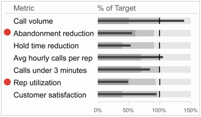
The different shades of gray in the background of the bullet graphs provide subtle qualitative encoding while color is used only for those measures that demand attention. It’s easier to look at these gray graphs than the brightly colored graphs in the Business Objects example and the items of most importance jump out more quickly and clearly. It also functions well for those who are color blind.
Another feature that Business Objects’ bullet graphs lack is an adequately labeled comparative measure. A comparative measure gives the bullet graph meaningful context. For instance, sales of $24.3 million are not very meaningful until you know how that compares to some other measure such as the target, last year’s sales, or average sales. In this case, we might assume that the little white bar located between the medium gray and light gray background areas is the comparative measure because it appears to be located at about the 100% mark (although again, this must be approximated because there is no quantitative scale). If we assume that this is the case, then we’re still left without appropriate context because the comparative measure is not defined. If it represents a target, 100% might be good, but if it represents last year’s performance, 100% might not be good: 100% of last year’s performance isn’t so good if you were expecting 10% growth. The comparative measures need to be adequately labeled and they should be slightly more prominent, so that they’re easier to spot. Additionally, they shouldn’t be built into the background, because there are bound to be cases where the breakpoint between “Fair” and “Good” and the target are different. Or at least, there should be.
But, maybe that’s the point. Perhaps, Business Objects is just trying to be “good enough” to turn a profit, instead of making an effort to excel. So often, software vendors choose the easy route, giving people more of the visual fluff they’re so used to, instead of creating products that actually function well, based on a keen understanding of what works and why.
12 Comments on “Business Objects’ Bullet Graphs: A Good Idea, Implemented Poorly”
Interesting post, I like the example ‘series of bullet graphs that Stephen designed for use as a section of a larger call center dashboard’. Is there any chance you could post the full dashboard? I would really like to see what the complete dashboard looks like. Thanks in advance.
Martin,
You might find the white paper that I wrote for Inova Solutions useful. It focuses on the way dashboards should be designed to support real-time situation awareness, using the needs of a call center as an example. It includes a full call center dashboard near the end of the paper.
ok, I scoured the BObj website but can’t find this… can you tell me which product it is in?
Tim,
The screenshot of BI Annotator was taken from the following address: http://labs.businessobjects.com/bi_annotator/default.asp.
-Bryan
Great post, got some useful info out of it. Any comments on the spark lines. Is it better to include it or just include a trend indicator (up/down arrow)
Sparklines can work wonderfully on a dashboard, because they display rich information simply and in a small amount of space. If people only need to know if something is going up or down and absolutely nothing more, then a simple up or down trend arrow could suffice. One of the problems associated with trend arrows, however, is that often it isn’t obvious what the up or down arrow means. If a revenue trend arrow points up, what exactly does this mean? Up since last year? Up since last month? Up since yesterday?
A sparkline, on the other hand, clarifies the meaning by actually showing the trend across some period of time. A revenue sparkline that mostly heads downward but shoots up at the end clearly indicates that revenue has mostly trended downwards, but turned upwards in the last day, week, or month, depending on the intervals of time represented. In other words, a sparkline can function as an enriched trend arrow, conveying a great deal more information without unnecessary complication.
It looks like the product producing the charts isn’t in fact Annotator. Annotator is apparently just a way to add dimensions to a Universe from a flatfile, as opposed to a database table.
The charts were being produced by another BO Labs product called Masher. All of the BO Labs products are can be viewed here: http://labs.businessobjects.com/ The link to Masher itself is here: http://labs.businessobjects.com/mashup/default.asp
Masher looks like an interesting product. According to BO, it, “makes it uniquely easy to create and use external graphics resources within Web business intelligence documents. Web Intelligence enables mash up by allowing report designers to insert pre-built pieces of DHTML and JavaScript into their reports.” They show Google Maps and other custom visualizations being implemented via Masher (most of the samples demonstrated on the site are classic examples of chart junk, though there doesn’t appear to be anything that would prevent one from producing a well-designed visualization template, like a sparkline).
Hi Stephen
I saw your seminar in Sydney last Friday – what an eye opener. Do you know if Excelcius will incorporate your bullet graph ?
I’m mildly disappointed in the screenshot, as the numbers are difficult to see. Upon some serious squinting, I can see that the baseline isn’t zero. I even went to their website to see if they had a better image there, but they did not. It’s not surprising, however, that such a bad screenshot would be used by a company to hide the fact that they didn’t do a very good job.
I see the point re. the critique of the Business Objects implementation of the sparklines and bullet graphs.
I am a big fan of the design and layout concepts, but I have not been able to find something similar anywhere, excepts BonaVista’s MicroCharts, which is an Excel based solution (quite nice actually).
Does anyone have any good ideas for where to look?
I like bullet graphs quite a bit, though I tend to have one gripe with them– When presenting a few together, it’s challenging to convey that one target is a “no-more than” target (say, for “hold time” in a customer service queue) and another is a “greater than is good” (say, for revenue target on a sales dashboard).
So, when looking at two bullet charts together, both of which are just shy of their targets– one might be a really good thing (“we’ve almost hit our sales numbers!”) and another might be a pretty bad thing (“our hold times are pretty long”).
I’m aware that you can reverse the gradient to indicate the difference, but it doesn’t seem quite as “at a glance” useful as I’d like it to be.
Am I over-thinking it? Could a bit of color (green-to-red) be useful?
Tony,
I agree that this is a problem, but it is not particular to bullet graphs. It exists with any series of graphical quantitative displays, when each attempts to compare an individual measure to its own particular target, but the targets don’t work consistently in that the goal in some cases is to meet or exceed the target and in other cases to come in under the target. All forms of gauges and meters face the same challenge: to provide a clear visual cue about how the target works.
Replacing the different intensities of a single hue with the colors green, yellow, and red does seem to highlight the fact that some targets work differently than others stand out a bit more, but at what cost? Even if we disregard the fact that most people who are colorblind cannot distinguish green and red, we are still left with an over use of color that makes the dashboard cluttered and visually overwhelming, as well as a dramatically weakened ability to use color to draw viewers’ eyes to particular areas that need attention.
One way to solve the problem with bullet graphs that you might consider involves reversing the scale to run from right to left. Using expenses as an example, the scale could run from 0 at the right of the bullet graph with increasing numbers running leftwards. The bar that encodes the expense measure would then run from the right edge of the bullet graph leftwards. The fact that the bar runs from right to left would provide a strong visual cue that the target works differently.
I’ll post a new blog to address this issue and provide some examples.
Thanks for the thoughtful comments.
Steve