Journalistic Graphics with Integrity
My friend and colleague Katherine Rowell of HealthDataViz sent me a link this morning to an article in the New York Times titled “The Experts Were Wrong About the Best Places for Better and Cheaper Health Care,” by Kevin Quealy and Margot Sanger-Katz (December 15, 2015). It caught her attention, in part because it involves healthcare, which is the focus of her work, but also because she thought the graphs that appear in the article were well done. After skimming the article, I agreed with her assessment if the graphs. I wasn’t surprised, for the New York Times produces some of the best journalistic graphics in the world. They don’t always get it right, in my opinion, but they usually do.
I thought I’d bring this article to your attention to illustrate how graphics can be used to complement a news story without the eye-candy that is often introduced by unskilled infographic designers. I also thought I’d invite you to use this as an opportunity to hone your own skills in critiquing the effectiveness of graphs. Based on my cursory review, only one potential problem caught my attention. Perhaps you’ll find it as well. If you look closely, you might come up with additional ways in which the graphs could have been improved to tell their stories more effectively. I won’t identify the problem that I noticed until later, in a couple days or so. In the meantime, review the article on your own and then post comments here to show your appreciation for particular aspects of the graphs or to suggest ways in which they could have been improved.
Take care,

14 Comments on “Journalistic Graphics with Integrity”
The main issue I noticed was the use of ranking to determine positions in the scatter plot. Basically where the axes cross is the median, but does this mean for places at that point medicare and private insurance costs are “equivalent” (i.e. not high or low)? The actual costs might communicate more clearly.
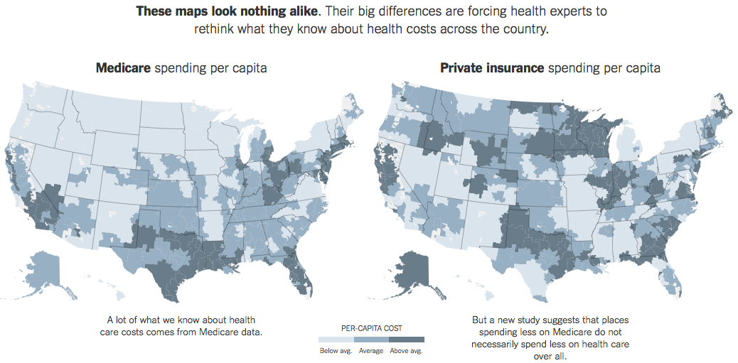
As for the heatmap above, the goal is to highlight the differences, but glancing back and forth between the two maps seems hard to do. One improvement I would consider is to use some form of variance plotted on a single heatmap. Conventional wisdom (according to the article) suggests the map would be mostly a single, solid color – whereas this new study suggests that many areas would be much lighter or darker, making the differences much more obvious.
Andrew,
The first potential problem that you identified is the one that caught my attention: the use of ranking positions rather than per capita healthcare expenses along the axes of the scatterplot’s quantitative scale. This results in the slight misinformation that you identified as well as an inability to see of the two variables are correlated. Using the ranking positions along the scales caused the values to be evenly distributed across the plot area, suggesting that no correlation exists. Most readers of the graph would not understand that this is merely a result of scaling by rankings.
The two choropleth maps are indeed difficult to compare. This could be remedied by using a single map to directly show the differences between the two variables, but I would be inclined to do this as a third maps, leaving the two existing maps as the first view, followed by the variance map to make their differences easier to see.
I hope to hear from others as well, so let’s keep this going.
There’s a certain wow effect that I must point out. I’m familiar with search boxes and other controls that change the graphical images on a web page. This page is different. When I enter a county name, it not only changes graphs, but also the article itself.
When I enter Denver, the article says: “Consider Denver. Spending on Medicare patients is about average in this area. When it comes to private health insurance, spending is also about average. Denver is one of the few places where spending for both programs is very similar – in most, there is some degree of mismatch.”
When I enter Ogden, Utah: “Consider Ogden, Utah. Spending on Medicare patients is relatively low in this area. When it comes to private health insurance, spending is about average.”
The first astonishment becames weaker, when I soon realize this is merely a useless trick. If you have exact numbers in the database, you should communicate them graphically, not by using text. A scatter plot is a good choice, but (as stated above) the actual costs per capita would communicate more clearly.
By the way, this would be a good instance to harness a Gapminder style scatter plot (by Hans Rosling). Even without time axis, that would enable reasonable interaction, such as tool tips and selecting a county from an alphabetical list.
On the other hand, I also tend to think that it was a journalistic choice to keep the focus on the text and not on interactive graphics, which justifies the current format of the article in general.
I have more fundamental concerns. I have not extensively read the article so perhaps some of this is answered somewhere, but I have not seen it yet. What does per capita mean? Is it per insured patient or per population? This raises questions about the age distribution of the population. Medicare populations differ greatly as does the average age of the Medicare population itself. Since well over half of Medicare spending comes during the last two years of life, these results will be very sensitive to the fraction of the population that is quite old.
Also, as I read the article, I was quite interested in the data on prices paid by insurers – I have longed for such data for a long time but not seen this. It appears that this new data source is not publicly available either. And, some limitations in coverage (only some insurers are represented). The authors claim that the results have somewhat been checked against a similar database that exists in Colorado. I looked at that data and it is not compelling. Only a couple of treatments are covered. And, if you look at hip replacements in Denver (one of the few choices available – and one that is fairly common), the prices vary but the two largest differences are for two hospitals where the Colorado data source explicitly states are not really comparable. So, the widely varying private insurance prices does not seem so supported to me. And, my impression (from medical providers) has been that private insurer prices do not vary that much within a geographic area – my training as an economist makes me very suspicious of claims that the variation is large (I’m not talking about list prices here, but the insurer payments).
Having studied health care prices for some time, I have to say that the displays leave me with more questions than answers. That is not a bad thing, but the displays are not leading me to ask those questions – it is my own knowledge of the subject matter. Shouldn’t a good display lead the viewer to ask meaningful questions?
Dale,
Thanks for the thoughtful analysis. You bring a perspective to this that most of us are not qualified by our experience and training to bring. You are clearly not the intended audience for this article, but it might have been useful if the authors had consulted someone like you while doing their research.
Their decision in using rank comparison is not unusual and not necessarily bad. Before I would do any assumption related to rank comparison they used, would be good to know the real values of both Medicare and Private Insurance. Their decision of using rank comparison instead of real values comparison might be sustained by a previous study of the distribution of real values. A rank comparison makes very much sense when the two distributions are quite different: skewed in different directions, unusual long tails and so on. I can only guess this was the reason of using it.
One extra good thing I remarked in their design is the use of three sequential colors instead of a continuous range of colors. A small sequence of colors is my preferred choice whenever I need to use colors to encode quantitative variables in an ascending order.
I agree with Stephen about the need of a third map showing the differences. I would probably use a divergent sequence of colors to encode the correlation between Medicare and Private Insurance. Probably, to be consistent with the other charts, I would encode rank differences.
Overall I consider the visualizations well done and the Web techniques very well chosen (zoom in-out the page, you will see the charts and annotations will keep their clarity, unlike any other image based graph).
Dan,
Please elaborate on your opinion that using rankings rather than actual values in the scatterplot would be appropriate if the distributions were skewed in different directions.
Dale,
Your comments prompted me to review some of the referenced underlying data sources for the NY Times article. According to the research study that served as the primary source of the NY Times article, it appears that “per capita” equates to insured persons (“beneficiary” is the term used in the research) rather than a regional population. Additionally, in the research article, their scatter plot of Medicare spending rank vs. private insurance spending rank contains a footnote that “overall spending does not include drug spending.” Indeed, drug costs & spending are another matter entirely. Drug companies can & do change their costs at any time, most often increasing brand drugs every month.
I agree that pricing remains elusive. Even in my area, where there are two competing health systems, costs for a given procedure can vary greatly. The area hospitals do publish costs for some of their common procedures, but one needs to keep in mind that neither hospital may be cheaper, overall; it will depend on the medical procedure. Also, the fact that the hospitals negotiate rates with the insurers doesn’t help to understand costs, at least for the consumer.
In general, I think the NY Times article does shed light on a concept that one might merely assume that there would be a positive correlation between Medicare and private insurance spending. Consequently, the article achieves at least one goal of prompting the reader to look beyond assumptions and to not rely on one source of data as being comprehensive.
From the standpoint of data viz, I think I would have liked to see the scatter plot based on actual dollars rather than rank.
I’ve been looking into it further and my questions are multiplying. So, is the per insured individual a different value for the Medicare and non-Medicare populations? I would imagine it is – but this only exacerbates the issues with the age distribution of the population.
I actually tried to gain access to the data – after all, the consortium states that their mission is to foster independent research. Their response: “at this time HCCI does not license its claims database either to commercial entities or to university researchers for one-off projects.”
Table 5 of the original source paper shows large variations of prices within the 25 largest metropolitan areas. I was struck by the absence of Boston and San Francisco (and the presence of Camden) so I emailed the principal author and was told that the 25 largest was determined by the number of insured individuals in the database. Since the database consists of 4 large insurers, and is notably without Blue Cross Blue Shield, this would explain the absence of Boston. But since Kaiser is included, I find it strange that San Francisco is not present in the list. Hence my desire to gain access to the raw data.
They also say that the results are consistent with other data sources, such as the Colorado All-payers database. But that database only provides data for 2 birth conditions and two joint replacements. And, it shows a different amount of variation than the Blue Cross Blue Shield Axis data (the latter should show less variation than the former since it is but one insurer in the Colorado state data). Definitions for the prices in these databases are not provided.
I am not done (only starting, really), but I don’t think that visualization can be detached from other questions of data integrity and research standards. Replicating any of these studies is nearly impossible. The visualizations focus attention on salient characteristics, but are they the right characteristics?
It is not like the stakes are small – the health care sector is more than 17% of the US economy. The insurance industry has a lot at stake and the gist of these studies is to focus attention on health care providers – widely varying prices which would seems to suggest great rooms for cost reductions. However, given that large insurers negotiate contracts with all these providers, they are well aware of the discounted price they get from each. I am left puzzling why they are willing to pay 3x as much for the same treatment within the same metropolitan area. I think this is a basic question that needs to be answered. And, a good visualization should either provide answers or point to the important questions.
Finally (and I realize this is becoming a rant, not a blog post), I think it is time for policy makers to say that anybody that provides studies to support a policy position either provide their raw data or realize that their study will be heavily discounted. We are well beyond the point at which it is enough to trust people because they either (a) work for a not for profit organization, (b) have a PhD, (c) wrote a complex paper which only the highly educated can hope to understand, or (d) had the paper peer reviewed. In this era of data-informed decision making, it is time that the standards of data analysis be raised – visualization being one of the more important parts, but only part, of this picture (unintended pun).
Dale,
What you’ve written is not at all a rant. You’re asking important questions and making important observations. In other words, you’re doing what data analysts are supposed to do. You are clearly familiar with the health insurance domain, so your points are not random but are focused on things that matter. Thanks for providing such useful feedback.
Daniel Zvinca, who posted comments above, and I have discussed the use of rankings rather than actual values in the scatterplot via email. Dan pointed out that more than the scatterplot was based on rankings. For instance, it is likely that the values encoding on the maps are rank-based as well (e.g., below average = the bottom 33%, average = the middle 33%, and above average = the top 33%). Also, the strip plots that allow you to compare medicare spending to private health insurance spending for particular cities appears to be based on a ranked arrangement of values along the scales rather than the actual values. Now that I realize how much of the data was presented based on ranking rather than actual values, my overall impression of the charts is less positive. I appreciate the fact that the charts are simple in design, but ranked scales can be quite misleading in a news story such as this. Two adjacent values on a ranked scale can be quite different in their actual values, but this information is lost. In the scatterplot, two data points that are next to one another in a particular quadrant might be much different in their actual values than two items that appear in completely different quadrants.
Stephen,
It’s because Bostock has left New York Times in 2015 ;-)
Otherwise we would have some interactive mouse over charts bringing some light to the real values…
I’m in agreement with Dale’s points above. My first question, without even reading the article, was – aren’t the populations of medicare and non-medicare patients very different in different geographic areas? Just looking at the medicare picture and places with lots of old folks of course have high spending – western PA, NJ, Detroit, FL…
Doesn’t doing this comparison “per-capita” actually *create* the effect they claim to measure? I would expect that the more people on medicare in a given region, the less on private insurance. So the data really could just be an artifact of population distribution?
Ah I just saw Peter’s comment above about per-capita. That’s worse if they use per-capita without defining it, in common parlance per-capita means “for each person”… but if the data doesn’t actually measure “for each person”, but “for each person with X attribute”…?