What Qualifies as Engagement?
When vague or ambiguous terms are used without defining them, confusion results. The term Big Data is a prolific example. An entire industry has been built up around a term that no two people define the same. In this particular case, the confusion is useful to vendors and consultants who want to sell you so-called Big Data products and services. In the field of data visualization, the term engagement is being tossed about more and more, without a clear definition. Research papers are being written that make claims about engagement without declaring what they mean by the term. This creates a minefield of confusion.
This issue came up in a recent conversation in my discussion forum between Enrico Bertini and me. Enrico was using the term engagement to describe attributes of data visualizations that are eye-catching. I responded to Enrico that engagement, in my opinion, involves something more than merely catching the eye. When people use the term engagement when discussing data visualization, they tend to always use it in a positive manner. It is assumed that engagement is useful. This, however, is not a good assumption. We can certainly become engaged in activities that are less than useful—harmful even.
Measuring the degree to which someone becomes engaged in viewing or in some way using a visualization can be useful, but only if we clearly define what we mean by the term and choose a metric that indeed measures it, which is rarely done. Using eye-tracking technology to measure the amount of time someone looks at something in particular is a common way that engagement is measured in research studies, and in these studies it is always assumed but rarely explained why engagement defined and measured in this manner is beneficial. Someone might look at a particular visualization or a particular component of a visualization because it’s visually unusual or eye-catching, but not in a manner that is informative. It is also possible that someone may look at something for a long time because they are struggling to make sense of it, which is likely a problem. The struggle would only be useful if it results in understanding something that couldn’t be understood more easily had the data been displayed in another way.
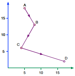
Let me illustrate with a specific example. Recently, Steve Haroz, Robert Kosara, and Steven L. Franconeri wrote a research paper titled “The Connected Scatterplot for Presenting Paired Time Series.” The purpose of the study was to test the potential usefulness of an unusual version of a scatterplot that a few graphical journalists have produced in recent years. When we want to examine how two quantitative variables changed through time—variables that don’t share a common quantitative scale (e.g., monthly sales revenues in dollars versus the number of items sold)—we would ideally use two line graphs, one positioned above the other, or if our audience is not confused by dual-axis graphs, we could use a single line graph with a scale on the left for one variable and a scale on the right for the other. The same values can be displayed in a scatterplot, however, with a single data point for each time period, which encodes the two variables based on the position along the X axis for one variable and along the Y axis for the other. To show the chronological sequence, the dots are connected with a line and labeled sequentially. Here’s a simple example from the paper:
And here’s the same data shown as a dual-axis line chart:
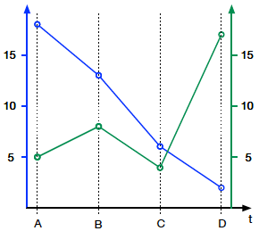
In this particular case, a dual-axis graph wouldn’t actually be needed because both variables share the same quantitative scale, but you can imagine that they don’t.
Although it seems obvious that, even with an extremely simple data set such as this, the connected scatterplot is more difficult to read than the dual-axis line chart, it certainly didn’t hurt to do an experiment to confirm this. In fact, these researchers confirmed that connected scatterplots are difficult to read and produce more errors in understanding. What’s interesting, however, is that the researchers made the following statement in the last sentence of the paper’s conclusions section:
All these findings suggest that the technique, despite its lack of familiarity, has merit for presenting and communicating data.
If you carefully read the paper, however, the results did not indicate that these graphs provide any actual benefits. So, what is it to which these researchers are referring as merit? Here’s the answer:
The prioritized viewing of CSs [connected scatterplots] – at least as compared to DALCs [dual-axis line charts] – makes them good candidates when the goal is to draw a viewer’s attention.
Later in the same paragraph, however, they make the following admission:
But it is not yet clear whether the preferential viewing arises from the technique per se, or its lack of familiarity.
What do they actually mean by “prioritized viewing” and “preferential viewing,” terms that suggest usefulness? Test subjects were shown screens consisting of six blurred thumbnail versions of charts—three connected scatterplots and three dual-axis line charts. The researchers told subjects that they were “studying the types of information that most interested them.” They were further told that they had five minutes and that, during that time, they could click on any thumbnail chart to view a larger, nonblurred version of it. Using eye-tracking technology to monitor the subjects, the authors found that, during the first half of the five-minute period, subjects spent more time on average looking at the connected scatterplots. This is what led the authors to recommend connected scatterplots’ “use for engagement and communication.” I don’t consider this a meaningful assessment of engagement, and certainly not of engagement that is useful, given the fact that subjects found these graphs difficult to understand.
We should be more clear and precise in our use of terms when they constitute the object of research or are promoted as beneficial. The degree to which and manner in which someone becomes engaged in viewing and interacting with a visualization is worth consideration, but only if we define engagement clearly. To me, engagement suggests more than attracting attention. It suggests sustained attention. For engagement to qualify as useful, it must involve productive thinking. For example, here’s a definition that might work in the context of data visualization:
Useful engagement with visualized data involves a sustained period of attention on the data or in interaction with the data that increases understanding.
If we measure this and seek to achieve this in our work, we’ll be doing something worthwhile.
Take care,

27 Comments on “What Qualifies as Engagement?”
Steve
I wholeheartedly agree with your point. Perhaps you won’t like this example – I’m sure someone will not. But Donald Trump can be said to “engage” voters in precisely the same ambiguous manner. It is measured by how much attention the media and television viewers give to his outbursts. In that sense, voters are “more engaged” by Trump than any of the other candidates. However, I think it would be much harder to meet the bar of demonstrating that they are “productively” engaged.
Regarding the specific example of dual scale line charts versus scatterplots:
The dual line/scale chart is clearly easier to decipher. The scatterplot does show a feature that may not be evident from the dual line plot – especially if there are a relatively large number of data points. The scatter reveals whether the two series are moving in the same direction or are inversely related. With a larger number of data points, this may not be evident from the line plot. Here is an example based on gasoline and electricity prices in the UK over a 25 year period:
http://myweb.loras.edu/dl526303/ImageComparison.html
I think, in general, more complex plots like the scatter are not a useful for an audience less familiar with the context and/or data analysis. But they can be worth it if more subtle patterns are worth exploring.
Hi Stephen –
1. Engagement
There are many definitions of engagement, and I like yours: Sustained attention that leads to understanding.
But it’s not the definition that we tested in our paper, and I think that the paper was fairly clear on that. We sought to verify the intuitions of journalists, who claimed that connected scatterplots would draw readers into a story by putting their eyes on the graph. So that’s what we measured, with a full understanding of alternative definitions.
So when you say, “What do they actually mean by ‘prioritized viewing’ and ‘preferential viewing,’ terms that suggest usefulness?”, I’d say that we meant what we said on page 8 and elsewhere, that connected scatterplots might “…draw in potential readers to more closely examine the chart”, and that’s what our experiment simulated. To a journalist, that’s useful. I would invite everyone to read the text of the engagement study (page 8), and the associated guideline at the end, to see that we tried to be careful about our definition, and what we could and could not claim from the results. The paper & summary is here: http://steveharoz.com/research/connected_scatterplot/
This definition is worth studying. In your ‘engagement’ exchange with Enrico Bertini on the ‘memorability’ thread, Enrico pointed out that a major bottleneck for this goal for journalists (and others) is the need to put eyes on a graph, and you countered that it isn’t the right bottleneck (or at least, shouldn’t be) for the vast majority of visualization instances that occur in day-to-day business settings. If that were true, I still wouldn’t see why studies of what works in journalism should be trumped by studies of what works in business settings. The business setting may be (to invent some numbers) 500,000 presenters, but each person presents to 15 viewers. The relevant journalist community (e.g., Amanda Cox at the NYT) may only be 15 presenters, but they each present to 500,000 viewers. As that’s several million affected people either way, I’d say that puts the two applications roughly on par. And I don’t think that you’d argue that what journalists present is less important.
There is an opportunity here for your definition of engagement to affect the visualization community, if it could be more concrete. Could you point out a set of real-world examples — perhaps from your existing books and articles — of effective vs. ineffective visualizations in terms of their potential for engagement as ‘sustained attention for understanding’ *per se*, minimizing other differences in the clarity, accuracy, and truthfulness of the visualizations? Such examples could inspire the research community to operationalize engagement along that lines that you envision.
2. Are connected scatterplots useful?
They may draw the eyes of readers a bit more, but what if they can’t understand the plots when they get there? We found that there are indeed some typical errors: Being confused when the temporal sequence moves right to left, or if the data makes a ‘loop’, and not spontaneously reporting the presence of correlations. But these errors are correctable with some simple design guidelines (summarized on the site linked above): use prominent arrows to indicate timeflow direction, explain loops with annotations, point out important correlations. You don’t need to be a professional designer to follow those guidelines, they are no more complex than the advice that you give on other graph types in your (excellent) books. And the number of errors was surprisingly low overall (except the failure to report correlation, which was a huge effect)
Is this effort worth it? For better ‘engagement’, probably for journalism, and the case is open for business settings. But for better understanding, we are doing further work to find out. Because once a viewer understands how to read a connected scatterplot, it has potential advantages in seeing and understanding cyclical patterns over time (see ‘steam indicator’ and ‘Beveridge Curve’ examples on first page of our paper). It has potential advantages in seeing changes in relationships between variables, because the plot explicitly codes relationships as points (it is a scatterplot after all), and codes relationship changes over time as orientations among the connecting lines. In the connected scatterplot that Dale linked above, deviations from the 45deg identity line indicate deviations from strong positive correlations. Such advantages might be useful under the right design conditions (the definition of ‘identity line’ depends on the units and scaling of each axis, readability depends on the number of points plotted, etc).
There is again an opportunity for you (and others on this board) to inspire how this research advances. We’ve been searching for real-world examples of where connected scatterplots might better present relationships between variables over time. Journalists think that they are better in many cases. Here’s a simple example that I think is better than two line graphs (http://53eig.ht/1i1jDon). And here is an example that allows the viewer to relations among three variables that would be difficult to understand as three line graphs (http://nyti.ms/1PaXxuh). Both of those have easy extrapolations to business settings. So, if you can think of similar examples – or think that none exist – from your own experience, we’re all ears!
– Steve
Steve Franconeri
Professor of Psychology, Northwestern University
Director, Cognitive Science Program
Steve Franconeri,
Let me begin by thanking you for responding. I appreciate the rare occasion when someone whose work I’ve critiqued responds personally, and does so thoughtfully, as you have.
I’m suggesting that engagement, when it’s defined as you have (i.e., a greater amount of viewing time during the first 2.5 minutes of selecting among blurred thumbnail versions of charts) is of no use in and of itself. I’m also suggesting that, even if it were useful to define engagement in this manner, you haven’t actually demonstrated that general readers will choose connected scatterplots over line graphs. Instead, you’ve shown that a small, non-randomized group of undergraduate students spent a little more time viewing connected scatterplots than line graphs under a particular set of experimental conditions. More than anything else, your findings suggest that connected scatterplots exhibit the problems that your intuitions likely alerted you to in advance. Despite these findings, however, you are encouraging people to explore these charts and are planning to pursue them in further studies yourself. I find your level of commitment to connected scatterplots puzzling. It also illustrates a common difference between academics and the world of actual practice, where problems can actually cause harm.
The work of journalists is incredibly important. When I point out that journalists constitute a tiny fraction of the total number of data visualizations and practitioners, I’m not devaluing journalism. In part, I’m arguing that data visualization practices that are uniquely useful to journalists ought not to be the practices that get most of the attention in research, nor are they practices that should be broadly promoted.
Even when we focus on the needs of journalists, we should still emphasize the importance of clarity. Keep in mind that journalists do not create visualizations for other journalists (or shouldn’t), but for members of the general public. The amount of attention that is given to making graphics eye-catching is overblown and is actually dangerous when pursued by unskilled designers. Even skilled designers, such as Amanda Cox of the New York Times, sometimes create visual puzzles that catch the eye but yield minor rewards in understanding. Her theme river display of movie revenues, which earned her an award at Malofiej a few years ago, is a well-known example of this. The current emphasis among journalists on making visualizations eye-catching is based on the assumption that people must be entertained by visual effects before they are willing to read a news story. This assumption is demeaning to the general public and is probably not true for most readers.
Before we can discuss the utility of testing engagement as I’ve defined it, we must agree that it is the information in charts that people should find engaging. Based on my definition of engagement, any chart that displays interesting and useful information in a way that people can understand is automatically engaging. Engagement cannot be measured by how long someone looks at a chart, as you did in your study. It is the degree and quality of understanding that results that we should measure. Your study found that understanding was hindered by connected scatterplots, yet you recommended them nonetheless.
You have suggested that the problems that undermined the usefulness of connected scatterplots could be overcome by following your guidelines. You provided the following guidelines, which I’ve paraphrased:
Do you really believe that, by following these guidelines, connected scatterplots work as well or better than simple line graphs? I don’t, and unfortunately, you didn’t test your guidelines to confirm that they solve the problems.
For connected scatterplots to be proven useful, we would need to identify specific ways in which they can do as well or better what familiar graphs are already known to do effectively. Every feature of connected scatterplots that you’ve identified as useful can be displayed more effectively using a line graph. This is easy to demonstrate.
You suggested that we take a look at two specific examples of connected scatterplots that, in your opinion, are superior to line graphs. The NY Times example that displays the relationship between three national currencies is not actually a scatterplot. I don’t know how to read it. Do you? The fact that values seem to appear outside of the plot area is confusing. The example that you cited regarding M. Night Shyamalan movies doesn’t reveal anything that couldn’t be shown more effectively using a dot plot with time along the X axis. I wouldn’t connect the dots with a line graph in this case because the movies were not made a regular intervals of time, so connecting the values with lines would be misleading, erroneously suggesting a continuum of values as they change through time. If you provide me with the dates of the movies, I’ll gladly create a dot plot to illustrate a more understandable chart.
What you’ve identified as particularly informative shapes in connected scatterplots are loops and Ls (i.e., right angles). The patterns that these shapes represent can be seen as well or better in regular line graphs. To illustrate, I created a simple example below. The connected scatterplot contains loops and Ls. You can see for yourself that the patterns of change encoded as loops and Ls are easier to understand when they’re shown in line graphs.
Here’s the connected scatterplot:
And here’s the line graph version of the same data:
Something that you didn’t mention in your paper is that patterns are created by intersecting lines that powerfully catch the eye in connected scatterplots, which are sometimes meaningless. Here’s a pattern that caught my eye in the connected scatterplot above:
Without seeing the extension of every line to its data point, the pattern doesn’t mean anything. Here’s the complete pattern that must be seen for understanding to emerge:
What I’m pointing out is that connected scatterplots have problems that go beyond those that you’ve identified.
If you believe that I have stacked the deck against connected scatterplots in some way with my example, I will gladly redesign any example that you wish. All that I need from you is the data set. Please provide a complete data set with values for regular intervals of time, however, unlike many of the journalistic examples that display only selected values and leave most of the data hidden.
Besides unwarranted claims about the benefits of connected scatterplots, what concerns me most about your study is your attention to low-priority issues. The world isn’t begging for a better way to show how simple sets of values change through time in relation to one another. Standard line graphs usually do this incredibly well. There are many issues that matter so much more, which deserve your attention. You and your co-authors possess abilities that can be put to better use than by doing additional studies about connected scatterplots. Your work is potentially more important than your choices of research topics suggest.
To summarize, I’m concerned that you are wasting your time and talents, which could be put to better use, and that your unwarranted claims about connected scatterplots might encourage people to display data in ways that are ineffective. If you don’t know what’s most needed in the real world of data visualization practice, I invite you to interact more closely with people like me who are well acquainted with the needs that exist and the problems that are crying out for solutions.
[SF: Comments below in italics and enclosed in brackets followed by the initials “SCF” were written by me, Stephen Few, in response to Steve Franconeri’s comments. I’ve incorporated them into the body of Steve’s comments to make the connections between his comments and my responses easy to follow.]
Hi Stephen –
Thanks for this thorough reply, and for taking the time to generate an example dataset.
1. Engagement.
I’ll keep this part short. Your original post argued that we didn’t define engagement clearly; my post above argues that it did. Your original and new post argue that our definition of engagement isn’t the ‘right’ one, and I don’t think we’ll solve that here. We drew our definition from the “real world of data visualization practice” that you value — through interviews with real journalists. You have a broader point about there being too much research using this definition and not enough under your definition, and we could discuss that (I know your arguments surrounding chartjunk; it exists, but this ain’t it), but I’ll focus on the next topic, and this will already be a long reply.
[SCF: Actually, you did not define the term “engagement” in your paper. I had to piece together what you meant by the term from the design of your experiment and from your comments about the opinions of journalists. I’m not sure why you brought up chartjunk. It doesn’t apply to your paper.]
2.1 Are connected scatterplots worth studying
“…You are encouraging people to explore these charts and are planning to pursue them in further studies yourself. I find your level of commitment to connected scatterplots puzzling… your attention to low-priority issues… The world isn’t begging for a better way to show how simple sets of values change through time in relation to one another. Standard line graphs usually do this incredibly well.”
I challenge you to a race, using your examples from above.
I’ll use the connected scatterplot, and you’ll use the two line graphs.
The figures below show what I see when I look at the CS plots.
Ready?
— Point out the years with the strongest positive and negative correlations between the two time series sets. (I see 3 positive, which are ‘forward-slash’ lines, and 1 negative ‘backslash’ line)
— Point out the years where one variable changes but the other does not. (I see 3 of each type, easily identified as vertical and horizontal lines)
— Point out ranges of time-delayed correlation. (I see three loops on the CS, looks like there might be an interesting trend where units sold is related to sales in later years?)
[SCF: A race between you and me wouldn’t prove anything useful, would it? What you and I can do as individuals has little bearing on the world at large.]
While I’m sure that you could construct new graphs for each of these decisions (e.g. various differencing operations), connected scatterplots might serve these decisions pretty well. That’s what we’re exploring.
(I note that the examples above represent ideas generated in collaboration with Steve Haroz, Robert Kosara, and especially Matt Hong, an undergraduate here at Northwestern.)
[SCF: What you’ve already found is that connected scatterplots do not work particularly well. You’re ongoing commitment to them is puzzling.]
Now let’s look at the Shyamalan data from 538. You assert that the connected scatterplot is an inferior format — let’s test that. Compare the two versions below: the original CS, and the way I’d imagine that you’d remake it (the data are here if you’d like to revise that, e.g. if you think a dot plot would help).
I invite the viewer to first browse the double row chart to see how it feels, then the CS. To me, the CS leads to more conclusions about relations, and is definitely more engaging to read. I can see that from SixthSense through Signs, there are fluctuations in revenue, but not ratings, but then there’s a big drop in both, and then both stay low for the remaining films. For the double row chart, those conclusions take far more visual work. To me, the CS is not only more engaging under the ‘journalist’ definition (no contest), it is more engaging in its service of understanding, under your definition.
[SCF: Rather than assuming that you know how I would design this, if you would provide me with the years of the movies, as I previously requested, I’ll show you what I have in mind. Without the years, I cannot represent time. Your paper claims to study connected scatterplots that feature paired time series, so time is essential.]
None of the examples above should convince you that CS’s are definitively better for any given dataset or task.
Of the bulleted guidelines from our paper that you list above, 5/6 are weaknesses of the CS or ways to mitigate weaknesses. We don’t claim that the CS is better, or that non-professionals should use it, only that it is surprisingly comprehensible among a set of barely-trained Northwestern undergrads. If you read the text underneath the ‘Use for engagement and communication’ headlines, you’ll see a more precise point (Yes, the 5-word headline does not express the advice as precisely as we’d like).
[SCF: You didn’t actually respond to me. In your paper you stated that the problems associated with connected scatterplots could be overcome by following your guidelines. I listed the only guidelines that I found in your paper. I pointed out that you have not backed up your claim that these guidelines mitigate the problems. The appropriate response is for you to acknowledge that, contrary to your claim, you do not know if these problems can be mitigated. Contrary to your claim above, you did not demonstrate that connected scatterplots were comprehensible among Northwestern undergrads. In fact, you demonstrated that the undergrads who participated in your study experienced several problems comprehending them.]
But the examples above make clear to me that the CS merits further consideration, so that we can identify if and when it would be the better choice. After a bit of work, guidelines might become sufficiently precise to allow even non-professionals to use it.
[SCF: Your examples do not make this clear to me and give me no reason to believe that further work will make connected scatterplots useful for professional or non-professionals.]
2.2 Connected scatterplots are a fascinating case study for perceiving and understanding relations.
While I now have one foot firmly in the data visualization world, my home department is psychology. My lab studies resource limitations in
visual processing, particularly for relational processing. Here’s why CSs are interesting from that perspective.
[SCF: There is a potential finding regarding visual processing that came to my mind while reviewing your paper, but it suggests a problem related to connected scatterplots, not a benefit. It might be worth pursuing, because I’m not aware of anyone identifying this particular perceptual limitation in the past. I suspect that we cannot decode the vertical and horizontal positions of a data point simultaneously when they encode the values of two separate variables (e.g., units sold and profits earned). It seems likely that we can only decode one value at a time and then afterwards concatenate them into a multivariate description (e.g., fewer units sold and more profits earned). In other words, encoding two values as a single data point does not speed perception of those values when horizontal position encodes one and vertical position encodes the other.]
Take a look at the displays below, and try to find the two outlier relations in each. In the luminance and position cases, it’s hard. For intersections (bullet graphs, which you’ve advocated for) and orientations, the same relations are easy to process, because they are coded by single features.
[SCF: As the inventor of the bullet graph, I can state with some authority that it does not apply to this discussion, because all of the values that are displayed by a bullet graph must share a common unit of measure and scale. In fact, none of your examples above apply to this discussion.]
So when I ask you to compare relations across two time series sets, as in your two line graphs, it’s tough because you have to compare two orientations. It’s even tough if I progressively segment and overlap the orientations that need to be compared.
[SCF: Actually, the comparison of corresponding slopes is easy and quick. You might respond that similar slopes along two lines cannot be compared with precision, but this doesn’t matter because the two variables don’t share a common scale, so it isn’t useful to compare their slopes precisely, but only in a rough sense.]
Finally, see how the CS (at bottom) turns these double relations into single orientation encodings (with orientation representing the relative contribution of each axis to change in the dataset). Segment length is related to the total change. I’ve marked three pairs in red so facilitate comparison of the formats.
[SCF: Your statement is not accurate. Segment length in a connected scatterplot is not a measure of total change. The changes of two variables with different units of measure cannot be summed to form a total.]
The CS encoding may allow easier perception — and I think also understanding — of relations between relations, which are tough for people. That makes CSs interesting and worthwhile to study from the psychology perspective as well.
[SCF: This is a stretch given the fact that your own experiment demonstrated the opposite.]
3. Future work
“I invite you to interact more closely with people like me who are well acquainted with the needs that exist and the problems that are crying out for solutions”
Invitation accepted.
Let’s chat (here, in another thread, or offline).
[SCF: I’m happy to chat with you.]
-Steve (Franconeri)
Steve Franconeri asked for real-world examples of where connected scatterplots might better present relationships between variables over time.
Here’s an interesting link to a YouTube film https://www.youtube.com/watch?v=iAs3cm_PSg4, where professor Thomas Homer-Dixon gives a psychological explanation on human conflicts (title = Catastrophic dehumanization: the psychological dynamics of severe conflict).
In the very core of the theory, there’s a three-dimensional scatterplot (cube) that contains so-called catastrophe response surface. Along the theory, the cube is defined by the variables identity, justice, and structural constraint. Societies are points in the surface moving in time. There’s a nonlinear part in the surface representing collapse. During the lecture, Mr. Homer-Dixon gives five two-dimensional slices of the cube describing different chains of events (societies moving on a surface).
Now, I know perfectly well that this is not an example Steve Franconeri was looking for. Nevertheless, this is an example of a well-defined connected scatterplot that cannot be replaced by line graphs.
Janne,
Your YouTube example is not a time series, so it doesn’t relate to a connected scatterplot of paired time series. The question remains whether the three-dimensional scatterplot is the best way to display the three-variable relationship that Homer-Dixon described in his lecture, but that’s a different topic.
Steve,
The easiest way to compare rates of change associated with two variables that don’t share the same unit of measure and quantitative scale is to express the rate of change directly, thereby using the same scale for both variables, which allows you to place variables in a single line graph with two lines. Journalists sometimes use this means of display, which works quite well. This is a much better alternative to a connected scatterplot.
[Once again, I (Stephen Few) have entered my responses to Steve Franconeri comments below, in brackets and italics, followed by my initials “SCF”.]
I’ll respond to the other points, but first we need to collect a little data. [SCF: The points that I made above that you have not responded to do not require more data.]
[SCF: A race between you and me wouldn’t prove anything useful, would it? What you and I can do as individuals has little bearing on the world at large.]
I will assume that you are kidding. Clearly, what that means is that the typical viewer would be faster.
So let’s ask the viewers that are reading this thread. Folks, please post a comment stating whether you found the CS format, or the double line-graph format, faster/easier for the tasks that I specified. Please look at my 6-panels first so that you know what visual features to look for in the CS (e.g., diagonals and vert/horz lines). On Stephen’s double line graphs (or the new overlapping one that he just posted), you are looking at relative slope values for each month individually.
Keep in mind that I’m not arguing that the CS is definitively better in any given case, I’m only arguing that it’s potentially useful enough (or perhaps better) for some cases that it’s worth thinking about and studying a bit more. Stephen is arguing that it is never useful and merits no further study (and strong claims are admirable in certain ways). [SCF: Actually, I am arguing that your study indicated that connected scatterplots cause problems in comprehension and that you have provided no reason to believe that they provide any benefits. The possibility certainly exists that, through additional study, you might find that there is something in particular that a connected scatterplot does well. The point is that you are fishing without any reason to believe that there are fish to be caught. You’re certainly welcome to do that, but there is an entire ocean of fish to be caught if you cast your line in the right place.]
[SCF: Rather than assuming that you know how I would design this, if you would provide me with the years of the movies, as I previously requested, I’ll show you what I have in mind…]
Sure thing, took me 90 seconds to look up the dates.
I’ve updated the excel file. Looking forward to seeing your redesign.
Would be happy to see others readers’ redesigns as well.
https://dl.dropboxusercontent.com/u/47794/CS_SFew/538_Shyamalan.xlsx
I hadn’t included the years because the 538 version expressed time ordinally, showing the decline of a career across movies, not years. That’s fine in CS, and I think it was a good design choice. [SF: That might be fine in a connected scatterplot, but it falls outside of your study’s scope. As the title of your study indicates, it was designed specifically to examine connected scatterplots that display paired time series.] [SCF: What you’re saying, Steve, is that this does not actually qualify as an example of a connected scatterplot that contains paired time series. As such, it isn’t relevant to our discussion, unless you want to open it to the consideration of connected scatterplots with paired ordinal values.]
So in summary, I ask the readers of the thread to weigh in on two items:
1. Which format would win the ‘race’, as described above?
2. When Stephen posts his redesign of the 538 Shyamalan chart, which do you like better, in terms of both engagement and understanding?
After we have some data from those questions, I can provide the rest of a reply.
-Steve (Franconeri)
[SCF: That might be fine in a connected scatterplot, but it falls outside of your study’s scope. As the title of your study indicates, it was designed specifically to examine connected scatterplots that display paired time series…. What you’re saying, Steve, is that this does not actually qualify as an example of a connected scatterplot that contains paired time series. As such, it isn’t relevant to our discussion, unless you want to open it to the consideration of connected scatterplots with paired ordinal values.]
Please just forget I said that – I did not anticipate that it would become a distraction into irrelevant definitional issues.
We await your redesign of the 538 graphic.
– SLF
Steve,
What you said isn’t a distraction, it is a pertinent fact. The connected scatterplot about Shyamalan’s movies that originally appeared in 538 does not relate to your paper because it is not a time-series display. Are you expanding to topic to include connected scatterplots that don’t involve time series? If so, then this is a different matter. I’m still willing to design alternatives to the original display, but they won’t related directly to the topic of this discussion. Because my blog does not make it easy for people to attach figures, I’ll open a thread in my discussion forum for this and include a link to it from here. As I’m sure you know, there are many ways that this data set could be displayed, depending on the story that the journalist was trying to tell. To eliminate ambiguity about the story, please describe the story that you would like me to tell with my redesign. Letting you do this will eliminate my ability to choose a particular story that is easier to tell graphically than the story that you or the journalist had in mind.
Steve –
It’s time series data. The movies happen over time.
That’s why there is a directional timeline connecting them.
Sixth Sense is first. After Earth is last. In time.
We refer to this exact example in our paper, see Table 1, it’s not ‘out of scope’.
If you insist, omit the names of the movies and just use the dates, then it’s purely time in the strict sense that you are referring to.
Please do provide of copy of your redesign here on this thread, as we’ll all be curious to compare it to 538’s version.
– SLF
Steve,
We don’t call this a time series. Everything happens in time, but that doesn’t make everything a time series. As you pointed out previously, this is an ordinal series of values, not a time series. A time series consists of a set pf values for a range of equally-sized intervals of time. Regardless, I’ve offered to design an alternative to the connected scatterplot if you clarify the story that ought to be told. You invited others to create their own solutions as well, which is why I will do this in my discussion forum where figures may be easily included. I’ll include a copy of 538’s original graphic as well.
I completely agree with Stephen Few here. I posted an example much earlier in this thread where I believe the scatterplot does a better job of revealing correlation patterns than the paired time series. But I have to admit that the example is somewhat specialized – precisely because the time series is relatively monotonic (in terms of the x and y variables following mostly monotonic time trends). If the time trends are more complex, the scatterplot becomes strained and I believe there are always better displays to use.
Hi Stephen –
Here is the story that I see in the CS version:
– For the first three movies, there’s variability in revenue, but the ratings are all high.
– Unbreakable has particularly low revenue compared to these other highly rated movies.
– Then there is a drop for two consecutive movies in both measures
– Then the final four movies are uniformly low in both revenue and ratings.
– The Last Airbender has particularly high revenue compared to these lowest rated movies
– Overall there is a strong correlation between revenue and ratings.
– Overall, there is a drop in both values over time.
Of course, each time I say ‘movies’ above, I mean in the temporally ordered sense – you can just assume that each movie appears exactly every two years.
Looking forward to seeing your redesign, this will be an interesting comparison.
-Steve
Hi Steven, Did you open up a forum link? I did not find it or see a recent discussion on the forum.
I would like to say that the Shyamalan CS vs vertical charts is a bit of a straw man argument. He draws a red line on the CS showing the trend but doesn’t draw trend lines on the other two bar charts and placed them vertically. Then he “invite[s] the viewer to first browse the double row chart to see how it *feels*”. Red is a very strong color. I have muted that color some on my graphs. Placing the bars horizontally and adding red lines to them does show the trends very easily. Shyamalan is declining.
https://public.tableau.com/profile/publish/ConnectedScatterplots/Trends
Secondly, I think a connected scatterplot will have an increased tendency is obscure the narrative if used with more data. See my example of vehicle miles traveled and unemployment.
https://public.tableau.com/profile/krislikesmath#!/vizhome/ConnectedScatterplots/BigCS_VMTM12
Steve Franconeri,
I should have perhaps been clearer in my request. By asking for “the story,” given your work with Robert Kosara, who has focused a great deal of graphical storytelling during the last few years, I assumed that you would know what I was requesting. By story, we are usually referring to a narrative that has a particular message to communicate. What you provided was a recitation of the facts, without an emphasis on anything in particular.
Something that caught my attention about your list of the facts is that they contain a few errors.
Because you didn’t provide a story, I reviewed the article on FiveThirtyEight in which the connected scatterplot originally appeared to see what they were trying to say. Here ‘s the basic storyline:
In the original article, nothing was mentioned about a correlation between ratings and revenues. Nevertheless, I’ll design a graphical display that reveals each of the facts that you listed, excluding the errors, but I’ll try to emphasize the points that were part of the original FiveThirtyEight article’s storyline.
Kris,
I haven’t started a thread in my discussion forum yet, but plan to do so sometime today.
Hi Kris –
I like your double column redesign – it’s better than the one I threw together too quickly.
You are absolutely right that a fair comparison should equate annotation/baselining (e.g. the red line) across the two examples.
Your double column chart shows a clear story of decrease over time in both measures, which correspond to the last two ‘story points’ I mentioned above. But do you think that the double-column shows the first five points in *more* clearly? Do you find those relationships difficult to extract on the 538 version? I’m honestly curious, perhaps I’ve been staring at the 538 graphic for too long! I find #3 (“Then there is a drop for two consecutive movies in *both* measures”) to be particularly easier to see on the CS plot.
For your second point, we discuss the too-many-points problem in our paper.
-Steve (Franconeri)
@Steve:
The story you see in the CS version: Can you honestly say that you don’t see any of those story points when looking at the simple bar-chart version you presented above?
Because all of those points are obvious to me when looking at the bar charts. Glancing down the series of bars, I can clearly see that the first three pairs are relatively large (Unbreakable having less revenue), both series of bars shrink after that, The Last Airbender had considerably higher revenue among the last four, etc. The only thing I don’t see is how you can claim that any of those story points are evident in the connected scatterplot, but are obscured in the bar chart. Regardless of your opinions on CS plots, to suggest that these conclusions require more visual work is essentially lying to everyone here, including yourself.
As far as the CS plot being more engaging (no contest, as you put it): Meh. Personally, I find that I have to spend more time looking at the CS plot to figure it out. I don’t consider that more engaging, I consider that time wasted. And as far as getting my attention easier, that’s a hard one to measure; you asked us to look at both of them. If you hadn’t, I probably wouldn’t have looked at either of them, which I assume might be the case for most people.
And none of this comes from an opinion against CS plots. I seem to recall seeing some CS plots years ago that I actually found compelling (of course I wish now that I remembered where I saw them). But to be fair I’m not positive that they wouldn’t have been better displayed as line charts. To be perfectly honest, I really do think there may be merits to CS plots (with or without consistent time intervals), but I’m just not seeing any good examples here.
I have now created a new thread in my discussion forum for alternate versions of the chart that displays the ratings and revenues of M. Night Shyamalan’s films. Please take a look, share your opinions, and if you’d like, share your own graphical versions of the story.
Hi all –
Thanks to both Kris and Stephen for taking the time to construct redesigns, and to Dale, Janne, and Andrew for providing their thoughts. I have become accustomed to viewing CS graphs, and it’s possible that I prefer them for viewing some patterns even when others don’t, so it’s helpful to hear the opinions of folks who haven’t recently stared at them as long. I like both redesigns, and they may help inspire the control conditions for a bit more research on the CS format. I’ll monitor the discussion board to see what else readers come up with.
Stephen, there are several comments above that I haven’t answered, revolving around what we did/didn’t claim/show in our paper. It seems that the message that we tried to express differs from the one that you read, and it can be tough to separate the content of a paper from the context of one’s experience and point of view, for both the writer and the reader. Further discussion of that topic is destined to devolve into exhaustive searching and comparison of quotes from the paper, which I don’t suspect is a good use of time for either of us.
So Stephen, thanks again for taking the time to read our paper, for posting your thoughts on it, and for weighing in on best directions for future work. While I’m not convinced that all work on the CS format should cease, you’d certainly given me new ideas to think about, and this was a otherwise helpful brainstorming & feedback session. I look forward to corresponding with you offline to hear about your ideas for fertile topics for data visualization research.
– Steve (Franconeri)
(This will be my final message in this thread, I’ll leave the last word for Stephen)
Thanks Steve. I appreciate your willingness to engage in this discussion here on my site and I’m pleased that you found it useful, as did I.
I have to say that any correlation pattern over 8 movies I find unconvincing. I would much rather see more movies – perhaps the trend for different directors over time. If someone has access to the Rotten tomatoes data for a large number of movies, I have a lot of other data for the movies. It is simply too easy to see an apparent trend that is simply noise – unless it is compared to something meaningful. The “story” should come after the analysis, not before. This “story” looks like it was written before the analysis and then 8 data points are revealed that are consistent with that “story.”
Dale,
If you read the original article as it appears on FiveThirtyEight, I don’t think you’ll conclude that they first came up with a story and then selected data to fit it. In fact, they made no claims about correlations, which, as you rightly point out, would be difficult to make based on this limited data set. Their only speculation involved a possible explanation for falling ratings and revenues beginning with The Village.
Re: December 28th, 2015 at 11:07 am posting
Re: “Folks, please post a comment stating whether you found the CS format, or the double line-graph format, faster/easier for the tasks that I specified” – Steve Franconeri.
I’m not certain that faster/easier is the question to be answered. We present/display to promote understanding/comprehension of the story that’s IN the data. For me, SCF’s double line graph CAN BE understood and that relatively quickly.
That said, if we want to show correlation between volume and profit, use a scatter plot. Then, add a $/unit chart to show how we have fared with our per unit profitability over time. Simple and of genuine interest to a business owner.
Now that this discussion is winding down, I’d like to make a parting observation. When I first saw the research paper “The Connected Scatterplot for Presenting Paired Time Series,” I immediately asked, “Why study this?” I asked this question for a simple reason: line graphs almost always do a great job of presenting paired time series in a way that clearly displays patterns of change and supports easy comparisons. This study of connected scatterplots was not undertaken in response to a problem. Line graphs work well because they display change through time in a way that is incredible easy for our brains to perceive and understand. It is natural for us to perceive the progress of time as a line that extends horizontally from left to right and to perceive quantitative values as vertical (i.e., higher and lower) positions along the line. It is not natural for us to perceive change through time of two time series as various 2-D positions in relation to scales along X and Y axes, even when those positions are connected with a line to show the sequence.
Think about the charts that do a good job of representing quantitative information. Every effective chart that we use was initially created in response to a specific need, not as a result of a research project to find value in a chart that doesn’t seem to have any. For example, when Ben Shneiderman invented the treemap several years ago, he wasn’t just playing around, he was trying to solve a specific problem: how can we compare parts of a whole when there are far too many parts to display using existing visualizations, such as a bar graph. We need innovation in the field of data visualization. We have much to learn. There are many ways in which our charts and techniques for interacting with them can be improved. Those of us who are intimately involved in data visualization are painfully aware of a long list of needs that deserve attention. The research community exists to address these needs. This will only happen, however, if researchers know what’s going on and commit themselves to solving real problems. Is it possible that Steve Haroz, Robert Kosara, and Steven Franconeri could find that connected scatterplots for presenting paired time series are useful for something in particular that existing charts can’t do as well? Certainly, it is possible. Is it likely? I doubt it.
The authors of this research might argue that they were indeed responding to a real need—the need of graphical journalists to engage their readers. Remember that this discussion began with my concern about the term “engagement” and the way that it is often thrown around without a clear definition and as inherently useful. Engagement in and of itself is not necessarily useful. It all depends on the object and quality of the engagement. Drawing attention to a visualization that communicates ineffectively is not a legitimate goal of journalism—or shouldn’t be.
Many times over the years I have heard people in the information visualization research community express their desire for a closer connection with visualization practitioners and a better understanding of their needs. Disappointingly, however, I have rarely seen more than a superficial effort to build this connection. For this connection to be forged, the incentives of academic research must change and researchers must begin to seek feedback from the world of practitioners rather than building defenses against it. Researchers should also declare their findings with more care if they want their work to be trusted.