Zen and the Art of Presentation
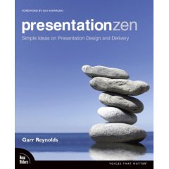
Garr Reynolds gets it! His new book Presentation Zen demonstrates this fact beautifully. He and I both strive to improve communication, largely through simplicity of design. He once promoted my work in his blog at presentationzen.com (the most visited website on presentation design) and now I have the opportunity to return the favor, without reservation, by recommending his book.
What I strive to do for quantitative data presentation, Reynolds does for presentation in general, especially oral presentations to groups that are accompanied by slides (PowerPoint and Keynote). Presentation Zen is not a PowerPoint manual in the manner of most software books. It isn’t procedural, filled with step-by-step instructions for using features and functions. Rather, it teaches an approach to presentation that is rooted in science, informed by an entire philosophy, and overflowing with common sense that is all too uncommon in presentations today. I want to give you a tiny taste of the wisdom and practical advice that awaits you in this book; just enough to send you to the bookstore with conviction and haste.
As the title suggests, Reynolds finds inspiration for the principles that he advocates in the teachings of Zen:
The principles I am most mindful of through every step in the presentation process are restraint, simplicity, and naturalness. Restraint in preparation. Simplicity in design. Naturalness in delivery. All of which, in the end, lead to greater clarity for us and for our audience.
Before you can appreciate the wisdom of Reynold’s advice, you must recognize the sad state of most presentations today.
The first step to creating and designing great presentations is to be mindful of the current state of what passes for “normal” PowerPoint presentations and that what is “normal” today is out of sync and off-kilter with how people actually learn and communicate.
Why is this true?
Presentations are generally ineffective, not because presenters lack intelligence or creativity, but because they have learned bad habits and lack awareness and knowledge about what makes for a great presentation (and what does not).
Many organizations bemoan the routine “death by PowerPoint,” but strive to combat it without understanding the true nature of the problem. It can’t be solved through templates and one-size-fits-all rules like “No more than 20 slides in total and five bullet points per slide.” Reynolds understands the problem at its core and resists simplistic formulas.
The number of slides is not the point. If your presentation is successful, the audience will have no idea how many slides you used.
He further recognizes that effective presentations today are different from those of the past.
People who possess loads of information in a particular field have historically been in hot demand and able to charge high fees for access to their stuffed, fact-filled brains. This was so because the facts used to be difficult to access. Not any more. In an era where information about seemingly anything is only a mouse click away, just possessing information alone is hardly the differentiator it used to be. What is more important today than ever before is the ability to synthesize the facts and give them context and perspective…What we want from people who stand before us and give a talk is to give us that which data and information alone cannot: meaning.
Have I convinced you yet that Presentation Zen deserves a place in your library? I consider my skills as a teacher and speaker pretty high up on the scale, but I learned some lessons from this book that I’m dying to incorporate into my course slides and the next keynote I’m scheduled to deliver. Even if you’re good at this, I’m betting this book will make you better. If you struggle with this stuff and know you need help, let Garr Reynolds ease the load. Buy this book.
Take care,


3 Comments on “Zen and the Art of Presentation”
Stephen – Another great recommendation. I admit in my 15+ years of marketing analytics & BI, I’ve made many of the mistakes. What I learned, I learned the hard way.
Since learning more about good data visualization and design largely from your resources and my colleagues at Tableau Software, creating dozens of flashy PowerPoint slides is no longer the first thing I do for storytelling and communication (for that matter, neither are Excel spreadsheets for my analysis efforts).
This book sounds like a great addition to my bookshelf – thanks.
Thanks for this terrific recommendation. I got the book and it has completely transformed the way I view slides and their role. Born again! I already re-created from scratch a talk of mine on “Explanatory vs. Predictive Statistical Modeling” following the insights from Reynold’s book. I tested it out last week and the result was terrific!
Two comments that I’d like to make:
1) In terms of class slides (I teach mostly MBA students), it is unclear that the same extent of “kill words, use visuals” works. Students won’t typically read separate handouts (or anything other than what goes on in class!) and expect class slides to support their later learning to some degree.
2) The book’s recommendations and examples of slides were great. But what I was missing dearly was some guidance on how to create speaker notes and then how to disguise them during the talk. With so many classes and talks that we academics give, it’s hard to memorize everything (which would be the ideal).
Bought it, read it, love it. It’s now going around the office as “required” reading!