| |
|

|
Thanks for taking the time to read my thoughts about Visual Business
Intelligence. This blog provides me (and others on occasion) with a venue for ideas and opinions
that are either too urgent to wait for a full-blown article or too
limited in length, scope, or development to require the larger venue.
For a selection of articles, white papers, and books, please visit
my library.

|
| |
July 14th, 2008
Seth Godin invited a reaction last week when he ventured into unfamiliar territory by publishing a blog post entitled “The three laws of great graphs.”
- One story
- No bar charts
- Motion
He was apparently engaging in a bit of hyperbole—a statement that is intentionally exaggerated for the purpose of making a point—when he listed as one of his rules: “No bar charts.” When Jesus made use of hyperbole to warn that great wealth can lead to corruption—”It is easier for a camel to pass through the eye of a needle than for a rich man to enter into the kingdom of heaven”—I suspect most listeners understood that he was using an exaggerated analogy to make his point. Godin’s spare but sweeping statement, “No bar charts,” however, runs the risk of being taken literally by many who struggle with data presentation, and have an undiscerning appetite for simplistic rules.
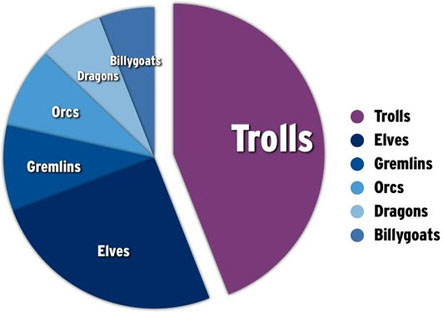
In a follow-up blog entry on the following day, Godin responded to the outcry of those he calls “data presentation purists” by explaining what he supposedly really meant: “bar charts are dramatically overrated.” I agree that bar graphs are often used when a different type of graph would do the job much better, but they are not overrated. In fact, for general presentation purposes, bar graphs along with line graphs are the two most valuable graphical tools for telling quantitative stories. Godin got it quite wrong when he wrote: “The correct use of a bar chart is to show how several items change over a period of time.” The story of change over time is actually told much more effectively with a line graph. Bar graphs work better than anything else for simple magnitude comparisons. In regards to this, Godin also veered from good advice when he argued that one should use “a simple pie chart when comparing two or three items at the same scale.” In fact, pie charts do one thing and one thing only—they compare parts of a whole (things that add up to 100% of something). They should never be used for other magnitude comparisons.
The example that Godin used to illustrate the superiority of pie charts actually tells a story that could be better told using a simple bar graph, even though it might indeed display parts of a whole (whether it does or not isn’t clear without context).
One of the first things that I noticed when I saw this chart is that it includes elements that aren’t needed to tell the story. Notice that the slices are directly labeled in the pie chart itself, which makes it entirely unnecessary to include a legend. Doing so works against Godin’s objective of keeping the story simple, because it draws people’s attention to items that add no meaning to the chart, thus wasting their time.
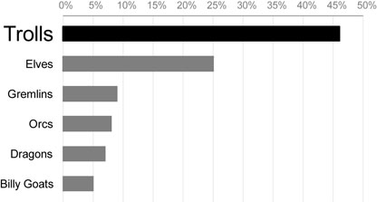
According to Godin, the message of the chart is, “Trolls are where we should focus our energy.” Apparently, however, the other creatures shown in Godin’s pie chart must also be important to the story, or else why not lump them together into a single slice labeled “All Other Creatures”? Based on this assumption, a bar graph would make it much easier to compare the values associated with the various creatures, and could be designed in a way that still clearly emphasized the greater importance of trolls to the story, as illustrated below:
There’s no need to address the other issues raised by Godin’s argument, because Jon Peltier has already done so with great dispatch in his blog. I would like to address Godin’s final rule, “Motion,” which he elaborates by saying, “You should animate your charts.” While there are times when it is useful to animate a chart in some manner, more often than not it adds nothing to and at times even obscures the story. Here are Godin’s specific instructions:
It’s simple: create two slides. The first one shows where the data used to be, the second one, on the same axes, shows where it is or where it’s going. Motion.
Establish the first slide. Make your point about your source and its validity. Then press the advance button. Boom.
Boom? While I appreciate Godin’s intention, there are usually better ways to show change in a presentation. In many instances, it is better to show change in a single line graph, which allows people to see the full course of change from one point in time to the last as a single, simple picture. When the story is better told using a different type of chart, such as a bar graph (or, God forbid, a pie chart), it almost always works better to begin by displaying a single graph that displays the state of things at one point in time and then cause a second graph that displays the state of things at the other point in time to appear beside or below the first. Doing it this way makes it possible for people to compare the two states, such as the past and today, which is almost impossible to do when they can only see one graph at a time.
 I’m not trying to pick a fight with Seth Godin. He’s an excellent speaker with areas of expertise that differ from mine. When he gives advice about graphs, however, he wanders into my backyard, and I can’t help but point out the flaws when he gets it wrong. Perhaps I’m just one of those “data presentation purists” who believes that the rules ought to actually work, confirmed by thoughtful research.
Take care,

July 2nd, 2008
The field of information visualization is still relatively young. The milestones that mark its history can be listed and briefly described with the exhalation of a single deep breath. Only a few information visualization events today can be anticipated with guarantees of significance, including:
- IEEE’s annual InfoVis Conference, which always provides glimpses of a few new and promising innovations
- Edward Tufte’s seminar, if you’ve never been before, which will encourage you to strive for excellence
- A presentation by Hans Rosling, which will inspire you to use visualization to solve the world’s problems
- A new major release of software from Tableau or Spotfire, which will convince you that visualization can reach a broad audience when properly designed and commercially packaged
I hope that my workshops fall into this category as well, with the guarantee that you will walk away having learned many useful, simple, and practical skills.
At least one more event belongs on this list: the publication of a new book by Colin Ware. When Colin told me late last year via email that he had a new book on the way entitled Visual Thinking for Design, I began counting the days. As far as I know, Colin is the world’s leading authority on visual perception in terms of how our knowledge of its mechanics, strengths, and limitations can be applied to information visualization. Much of what I know about visual perception, I learned directly from his work. I’ve been relying on his book Information Visualization: Perception for Design for years, quoting it often in my own work. Based on its exceptional quality—not only its excellent content, but also Colin’s ability to express it clearly—I knew that the release of his new book would constitute a major information visualization event. I finally got my hands on a copy a couple of weeks ago. My high expectations were not disappointed. In fact, they were exceeded.
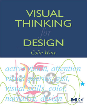  Visual Thinking for Design is intentionally less comprehensive than Information Visualization: Perception for Design, for it is more focused on visual perception as a process that can be tapped to help us think more effectively. This new book is also accessible to a broader audience of readers. Anyone interested in how visualizations should be designed—both the pictures and interactions with them—to help people discover and understand the meanings that live in data, will find this book comprehensible and a delight to read.
Colin begins by introducing the term “active vision.”
Active vision means that we should think about graphic designs as cognitive tools, enhancing and extending our brains. Although we can, to some extent, form mental images in our heads, we do much better when those images are out in the world, on paper or a computer screen. (Preface, p. ix)
He goes on to explain why this way of understanding visual perception is important.
The active vision revolution is all about understanding perception as a dynamic process. Scientists used to think that we had rich images of the world in our heads built up from the information coming in through the eyes. Now we know that we only have the illusion of seeing the world in detail. In fact the brain grabs just those fragments that are needed to execute the current mental activity. The brain directs the eyes to move, tunes up part of itself to receive input, and extracts exactly what is needed for our current thinking activity, whether that is reading a map, making a peanut butter and jelly sandwich, or looking at a poster. Our impression of a rich detailed world comes from the fact that we have the capability to extract anything we want at any moment through a movement of the eye that is literally faster than thought. This is automatic and so quick that we are unaware of doing it, giving us the illusion that we see stable detailed reality everywhere. The process of visual thinking is a kind of dance with the environment with some information stored internally and some externally and it is by understanding this dance that we can understand how graphic designs gain their meaning. (Preface, pp. ix and x)
With these words, Colin begins his own elegant dance of explanation, taking the reader step by step through the process of visual perception, pointing out in practical terms along the way how this knowledge can be applied to information visualization and also other thinking processes, such as scribbling on a napkin to explore ideas.
It is always tempting, when reviewing a book this good, to say too much out of sheer excitement. I’m not going to give into this temptation, because I don’t want to spoil any of the fun that you’ll have reading this book from beginning to end with little advance knowledge beyond the fact that it is an extraordinary work. Everyone interested in information visualization should read this book. Not just read it, but mark it up with lines, comments, and even diagrams in the margins, and then keep it close at hand for easy reference and review.
Take care,
June 16th, 2008
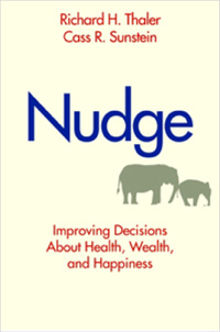 Richard H. Thaler and Cass R. Sunstein, both of the University of Chicago, have written a thought-provoking book full of practical suggestions for improving the decision-making process, titled Nudge: Improving Decisions About Health, Wealth, and Happiness. Based on the title, you might assume that this is a self-help book. It is not. It is treatise on the importance of building into products and services “nudges” that help people make decisions that best serve their needs. Products and services require people to make decisions and—intentionally or not—the way the experience is designed pushes (or “nudges”) people in a particular direction. Where products are placed on store shelves and where foods are placed in a school cafeteria line are examples of “choice architecture” that make it easier for people to choose some things over others. Thaler and Sunstein explain the omnipresence of choice architecture and how it works, then go on to argue that, because it exists, whether planned or not, we ought to design choice architectures that make it as easy as possible to make choices that meet people’s needs. They are not saying that any choices should necessarily be removed or that someone’s idea of a good choice should be forced on anyone, but merely that the providers of products and services ought to consider the needs of their customers and make it as easy as possible to make good choices.
One of the prime examples of choice architecture is the existence of defaults in software and other systems. Given the fact that many people will never bother to consider their options, why not make the default choice one that is most likely to work well for them. Many and perhaps most software vendors put little thought into the defaults that they build into their products. A software engineer’s notion of how something should work is insufficient consideration of the matter.
Many of the most visible problems that people face today, such as rising foreclosures and poor health coverage, are in part the results of poor choice architecture. Often they’re the results of choice architectures that were designed to benefit some people at the expense of others, such as disreputable mortgage brokers and health insurers trying to maximize their own interests alone.
Thaler and Sunstein don’t raise awareness of the problem and stop—they go on to propose many practical solutions to important issues, including environmental protection, prescription drug coverage, financial debt, and even marriage rights.
All of us who have opportunities to nudge people in the direction of good choices have a responsibility to do so. To some degree, every one of us is a choice architect—some with influence over many lives and others with influence over a smaller population of family, friends, and co-workers . We can nudge in ways that do not limit freedom of choice. To nudge wisely, we must understand the real needs of people, not just their superficial or momentary preferences, which they often live to regret.
Comments Off on Nudge Me Tender, Nudge Me True
June 6th, 2008
The June/July 2008 issue of Scientific American Mind includes an article entitled “Your Inner Spam Filter” by Andrew W. McCollough and Edward K. Vogel of the University of Oregon. In it they explain that superior abstract reasoning appears to be related to better use of working memory and that the difference between those who reason effectively and those who don’t might be due to differences in the brain’s ability to filter out information that is not relevant to the task. Research has demonstrated for years that working memory is limited to about four chunks of information at a time. You might be surprised by how little we can hold in working memory, the area in our brains where information is temporarily stored while we’re thinking about something. Better use of working memory’s limited capacity results in better abstract reasoning—the kind of reasoning that handles data analysis. So, the analytical process is improved by the brain’s ability to filter out irrelevant information, a function that works a bit like working memory’s spam filter.
Data analysis software, in an effort to support the process, should eliminate all non-essential content, thereby reducing the need for an analyst’s brain to filter it out. By doing so, good software will help to level the playing field between analysts whose internal spam filters vary in quality. The current trend in data presentation and analysis software to display information using flashy visual effects, such as 3-D charts with lighting effects to make them look photo-realistic, rather than displaying the data alone in simple, clear, and meaningful ways, is working against the needs of analysts. As Edward Tufte wisely wrote in back 1983, “Above all else show the data.”
Take care,
June 5th, 2008
Trevor Lott of www.DealerDiagnostics.com, a service that provides performance reports for auto dealerships, wrote to me recently. Here’s what he said:
I’ve been a fan of your work for several years and have always been impressed with your willingness to share, be it innovations, ideas or feedback. It’s only fitting that I had you in the back of my mind when I was testing the Google Charts API a few weeks ago to explore the potential of the web service to create bullet graphs. I’m happy to report that it’s possible but wanted to take it one step further: to promote bullet graphs and help to increase their accessibility. To that end, I wrote up a quick guide to creating bullet graphs using the Google Charts API. Please consider it a small tribute for what you’ve given to me and the data visualization community over the years.
I appreciate Trevor’s kind tribute—especially the fact that he delivered it in the form of a practical solution to a real need. If you’re interested in producing bullet graphs using Google Charts API, take advantage of Trevor’s fine work, which he’s provided as a simple series of clearly explained steps. You’ll find it in Trevor’s blog.
Take care,
|