| |
|

|
Thanks for taking the time to read my thoughts about Visual Business
Intelligence. This blog provides me (and others on occasion) with a venue for ideas and opinions
that are either too urgent to wait for a full-blown article or too
limited in length, scope, or development to require the larger venue.
For a selection of articles, white papers, and books, please visit
my library.

|
| |
April 14th, 2008
I try to maintain a comprehensive library of books and articles about data visualization, so when I recently read that Springer published a new book entitled Handbook of Data Visualization, filled with chapters from respected experts in the field, I set out to get a copy. Ordinarily, I purchase books for my data visualization library—that is, I pay for them, rather than requesting complimentary desk copies, which are often offered to educators. This book’s $319 price tag, however, discouraged my normal practice. I decided this was an exceptional situation, so I tried to take advantage of my faculty position at the University of California, Berkeley. In response, I was told that I could get a copy to examine, but would have to return it if I decided against using it as a textbook for one of my courses. Once my hands touch a book, they don’t let go, so I tried a different approach. I offered to review the book in my blog, which earned me a copy, and today I am fulfilling my promise.
Last week, I spent many hours in airports and on planes (I was a victim of American Airlines’ inspections, which grounded thousands of flights), which gave me time to peruse all 920 pages of this book and read several chapters in detail. This book is indeed filled with data visualization expertise, but it isn’t clear for whom it was written. Contrary to the title, this is not what I would call a handbook. This is a collection of sophisticated academic articles that cover broad territory, but do not provide an overview and introduction to data visualization that the term handbook suggests. Unlike Readings in Information Visualization: Using Vision to Think by Card, Mackinlay, and Shneiderman (1999), Handbook of Data Visualization lacks informative and digestible introductions to the topics that it addresses. Despite my expertise in quantitative data visualization, I couldn’t follow much of the content, for it assumes an advanced level of mathematics and statistics well beyond my own. The fact that I couldn’t understand much of it certainly doesn’t make this a bad book; it simply suggests that non-statisticians should probably avoid it. Which brings me back to my earlier question: for whom was this book written? The obvious answer—for statisticians with expertise in data visualization—becomes less obvious in light of the price. I don’t know many statisticians who are able, or if able, are willing to plunk down $319 for a collection of articles, no matter how good they are.
I couldn’t help but wonder what could have possibly caused Springer to set the price so high. I assumed that its three editors—Chen, Hardle, and Unwin—would receive royalties from Springer for their work, but I doubted that contributors of individual chapters would be paid for their efforts. My curiosity led me to ask a friend who contributed a chapter along with three of his colleagues if he was compensated. He replied that his compensation was a single copy of the book, which he and his three co-writers were obliged to share. He was frustrated that the book’s high price would keep his work from being purchased, except by university libraries. Besides royalties to the writers, the only other significant expense a publisher usually faces is the cost of printing and binding, for they rarely spend much money to promote books. This book is hardbound, which costs more to produce than a paperback, but I estimate based on my own experience that printing and binding should cost less than $10 a copy, even if printed in relatively small quantities.
For $319, one would expect a book about data visualization to feature beautifully rendered color figures throughout, but it exhibits only one-color printing (black and shades of gray), except for a small insert of multi-colored pages in the middle. I believe that every book about data visualization should be printed in color, yet I’ve seen many examples of an author’s fine work that were undermined by a publisher’s decision to save money on production costs by going with cheap paper and a one-color printing process.
Another aspect of this book’s design that I found annoying and completely out of character with the concerns of data visualization was the placement of figures. In the chapter “Good Graphics?” by Antony Unwin, he wisely recommends:
Keeping graphics and text on the same page or on facing pages is valuable for practical reasons. It is inconvenient to have to turn pages back and forth because graphics and the text relating to them are on different pages.
Amen to that. Unfortunately, even the very page on which this statement appears and almost every other page in the chapter ignores this advice. I’m confident that Unwin cannot be faulted for this flaw in design, and that fault lies with the publisher, which took the easy, inexpensive path, despite the inconvenience to readers. I have had to fight hard to control the design of my books and articles, sometimes to the annoyance of publishers, in an effort to avoid problems like this. This shouldn’t be necessary. Publishers should be experts in these matters and respect their customers enough to do what’s required to make books work, even when it takes more time and costs a bit more.
I cannot recommend this book to most of my readers, who usually favor advice that is accessible to non-statisticians and can be more broadly applied. I am confident, however, that this book would be useful to statisticians who already know quite a lot about data visualization, if they could only afford to buy it. The failures of this book rarely stem from its authors, but instead from Springer’s near-sighted and dysfunctional publishing model.
Take care,

March 24th, 2008
Several months ago I received an email from a fellow named Michael Alexander who wanted my opinion of his technique for producing bullet graphs in Excel. We interacted a bit, and before long Michael mentioned that he was writing his second book for Wiley’s “…for Dummies” series, titled Excel 2007 Dashboards & Reports for Dummies. He asked if I might be willing to write a foreword for the book. I was very honored by his request and indicated my willingness, assuming that I liked what I saw when given the chance to review an advanced copy of the book. Deadlines got in the way of pursuing this plan, which I regret, because I have just read the book and love it.
Michael has managed to do something that’s rare. He has eloquently interwoven the conceptual and technical areas of knowledge that are needed to build effective dashboards in Excel. Technicians often can’t get their heads out of the bits and bytes, and those of a more conceptual ilk often lack technical expertise. Michael has his feet planted firmly in both of these worlds. Technicians often don’t know how to write, but Michael is a refreshing exception to this stereotype as well. This book reads like a conversation.
Unlike most software manuals, this book is rooted in a clear understanding of information—how people use it, why they use it, what really matters to them when they use it, and how to use it effectively. This includes an understanding of data presentation. Michael supports the mission of data visualization evangelists such as Tufte and myself by preaching the gospel of simplicity. He issues clear warnings against the graphical excesses that Excel 2007 encourages. Why? Because it drowns out the clear voice that information needs to tell its story.
This book is finely structured. In roughly 300 pages, it covers all the important aspects of dashboard design in Excel, clearly and without distraction. It is comprehensive, yet simple. Anyone who wishes to develop dashboards in Excel should be able to find everything they need in its pages.
Michael—I’m sorry there was no time to review your book in advance and write a foreword. I would have been honored to recommend it, as I am wholeheartedly doing now.
Take care,
March 20th, 2008
Garr Reynolds gets it! His new book Presentation Zen demonstrates this fact beautifully. He and I both strive to improve communication, largely through simplicity of design. He once promoted my work in his blog at presentationzen.com (the most visited website on presentation design) and now I have the opportunity to return the favor, without reservation, by recommending his book.
 
What I strive to do for quantitative data presentation, Reynolds does for presentation in general, especially oral presentations to groups that are accompanied by slides (PowerPoint and Keynote). Presentation Zen is not a PowerPoint manual in the manner of most software books. It isn’t procedural, filled with step-by-step instructions for using features and functions. Rather, it teaches an approach to presentation that is rooted in science, informed by an entire philosophy, and overflowing with common sense that is all too uncommon in presentations today. I want to give you a tiny taste of the wisdom and practical advice that awaits you in this book; just enough to send you to the bookstore with conviction and haste.
As the title suggests, Reynolds finds inspiration for the principles that he advocates in the teachings of Zen:
The principles I am most mindful of through every step in the presentation process are restraint, simplicity, and naturalness. Restraint in preparation. Simplicity in design. Naturalness in delivery. All of which, in the end, lead to greater clarity for us and for our audience.
Before you can appreciate the wisdom of Reynold’s advice, you must recognize the sad state of most presentations today.
The first step to creating and designing great presentations is to be mindful of the current state of what passes for “normal” PowerPoint presentations and that what is “normal” today is out of sync and off-kilter with how people actually learn and communicate.
Why is this true?
Presentations are generally ineffective, not because presenters lack intelligence or creativity, but because they have learned bad habits and lack awareness and knowledge about what makes for a great presentation (and what does not).
Many organizations bemoan the routine “death by PowerPoint,” but strive to combat it without understanding the true nature of the problem. It can’t be solved through templates and one-size-fits-all rules like “No more than 20 slides in total and five bullet points per slide.” Reynolds understands the problem at its core and resists simplistic formulas.
The number of slides is not the point. If your presentation is successful, the audience will have no idea how many slides you used.
He further recognizes that effective presentations today are different from those of the past.
People who possess loads of information in a particular field have historically been in hot demand and able to charge high fees for access to their stuffed, fact-filled brains. This was so because the facts used to be difficult to access. Not any more. In an era where information about seemingly anything is only a mouse click away, just possessing information alone is hardly the differentiator it used to be. What is more important today than ever before is the ability to synthesize the facts and give them context and perspective…What we want from people who stand before us and give a talk is to give us that which data and information alone cannot: meaning.
Have I convinced you yet that Presentation Zen deserves a place in your library? I consider my skills as a teacher and speaker pretty high up on the scale, but I learned some lessons from this book that I’m dying to incorporate into my course slides and the next keynote I’m scheduled to deliver. Even if you’re good at this, I’m betting this book will make you better. If you struggle with this stuff and know you need help, let Garr Reynolds ease the load. Buy this book.
Take care,
February 6th, 2008
The history of obstetrics is interesting. (Yeah, I know this is a strange opening sentence for a blog about visual business intelligence, but bear with me.) Its history even includes a bit of unexpected intrigue, such as the early history of forceps. Because forceps delivery was so wildly successful for complicated births, the London-based Frenchman who invented the procedure and his family of physicians refused to reveal the technique for three generations, hiding it even from the mothers giving birth through use of a drape, until they passed it on to a physician in Amsterdam who kept it to himself for 60 more years. A particular event in obstetrical history actually has something to teach us about the importance of performance measure, which we can apply to business. It involves something called the Apgar score, which I learned about by reading Atul Gawande’s wonderful book about healthcare, Better: A Surgeon’s Notes of Performance (Metropolitan Books, New York, NY, 2007). You’ll get a flavor of Gawande’s writing in a couple of quotes from the book below.
 
During the 20 years or so leading up to the 1950s, great progress was made through tighter medical standards and the introduction of antibiotics, especially penicillin, in improving the odds of the mother surviving the delivery. Up until the mid-1930s, childbirth was the single most dangerous event in a woman’s life. By the 1950s, the risk of death decreased from one of every 150 births resulting in the death of the mother, to only one in 2,000. Despite this dramatic improvement, babies still weren’t faring much better than before. One in 30 still died at birth.
Virginia Apgar, the first woman to be admitted into surgical residency at Columbia University College of Physicians and Surgeons, became an anesthesiologist during this period. She developed particular concern for the fate of newborns, which at the time were left to die if they were “malformed or too small or just blue and not breathing,” because doctors assumed that nothing could be done to save them. Apgar wasn’t an obstetrician, but she was so convinced that deliveries could be done better, she took it upon herself to challenge the system. She did so by devising a score, which is still routinely used in hospitals today, and is called the Apgar score.
Nurses use the Apgar score to rate the condition of newborns on a scale of zero to 10.
An infant got two points if it was pink all over; two for crying, two for taking good, vigorous breaths, two for moving all four limbs, and two if its heart rate was over a hundred. Ten points meant a child born in perfect condition. Four points or less meant a blue, limp baby.
Apgar published her procedure in 1953, the year preceding my own birth. It probably saved my life, for I was so anxious to get going, I tried to breathe before emerging from the birth canal into the world of air. The Apgar score was immediately adopted, resulting in a dramatic turnaround.
The score turned an intangible and impressionistic clinical concept—the condition of new babies—into numbers that people could collect and compare. Using it required more careful observation and documentation of the true condition of every baby. Moreover, even if only because doctors are competitive, it drove them to want to produce better scores—and therefore better outcomes—for the newborns they delivered.
Babies were examined and their condition scored immediately upon delivery and then again after five minutes. Because of this process, it soon became apparent that babies with low initial scores could be revived to score in the acceptable range within five minutes, with the right care.
Part of the reason the Apgar score worked so well is because it was easy to calculate and understand. This is true of business performance measures as well. Measures that people can’t understand or are too hard to figure, rarely catch on. The very existence of a measure—a number—makes performance tangible, something people can think about in concrete terms and invent responses to improve. As long as performance remains nebulous and abstract, it won’t change for the better. People need a measure to wrap their heads around. When the Apgar score was first introduced, no one could imagine the difference it would make. I doubt that Apgar herself foresaw the way that her score would incite doctors and nurses to compete with themselves and one another. When people have a way to evaluate their performance, they are naturally inclined to do better and better.
In my work, I help people examine, make sense of, and then present quantitative data to others, including key performance indicators (KPIs), through the use of visual representations. Visualization makes data accessible in a way that brings meaningful patterns, trends, and exceptions to light. Data visualization isn’t helpful, however, unless you have the right numbers—numbers that actually measure what needs to be measured and do so in a way that can be understood.
If you’re struggling to identify the right measures and express them meaningfully, you might consider turning to some of the folks who specialize in this work. Here are two you might want to consider:
Take care,
February 4th, 2008
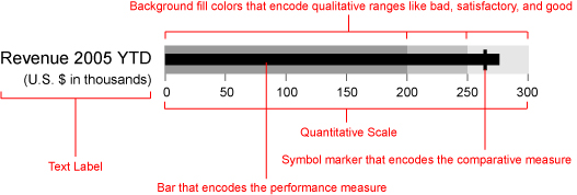
When I designed the bullet graph back in 2005, I did it to solve a particular problem related to dashboard displays. The graphical widgets that software vendors were providing to display single measures, such as year-to-date sales revenue, consisted mostly of circular gauges and meters, which suffered from several problems. Most of them conveyed too little information, did so unclearly, and wasted a great deal of space on the screen. The bullet graph was my alternative, which was designed to convey a rich story clearly in little space.
Since their introduction, a number of dashboard vendors now support bullet graphs, either as a predesigned display widget or as a display that can be easily constructed using their design tools. Now that bullet graphs are being used a great deal, they are being put to the test, and best practices are being developed to use them effectively.
One challenge that is faced by any graphical display of a single measure compared to another, such as a target, is the fact that the target usually functions as a point that the measure should reach or exceed, such as a sales target, but sometimes it functions as a point that the measure should stay below, such as an expense target. Here is a series of bullet graphs, which are designed in the typical manner:

Two of the measures—expenses and defects—work the opposite of the others in that the goal is to remain below the target. The background fill colors on these bullet graphs, which vary from dark gray to indicate “poor performance” through to the lightest gray to indicate “good performance,” are arranged from poor on the left to good on the right for revenue, average order size, and new customers, but in reverse for expenses and defects. The reversed sequence serves as a visual cue that expenses and defects should remain below the target. This cue, however, is not strong. It would be useful if something that stood out more signaled this difference.
We might be tempted to replace the varying intensities of a single color—in this case varying intensities of gray—with distinct hues, to make the reversal of the qualitative scale more apparent, such as by using the traditional traffic light colors that are so popular on dashboards.

This does cause expenses and defects to more clearly stand out as different from the other measures, but at what cost? Even if we ignore the fact that most people who are colorblind (10% of males and 1% of females) cannot distinguish green and red, we are still left with an overuse of color that makes the dashboard appear cluttered and visually overwhelming, as well as a dramatically weakened ability to use color to draw viewers’ eyes to particular areas that need attention. Is there a better way to make certain bullet graphs look different without introducing other more troubling problems?
Here’s a suggestion: not only reverse the sequence of the qualitative scale, but also the direction of the quantitative scale. Using expenses as an example, the quantitative scale could run from 0 at the right of the bullet graph with values increasing leftwards. The bar that encodes the expense measure would then also run from the right edge of the bullet graph leftwards. The bar running from right to left serves as a stronger visual cue that the target works differently, as you can see below:

Although it is not conventional for a quantitative scale to run from right to left, except in the case of negative values, this is easy to read and the unconventionality actually causes it to pop out more clearly. In fact, expenses and manufacturing defects are measures that we can easily think of as negative values (for example, expenses reduce profit and defects reduce manufacturing productivity).
I would like to encourage all the vendors out there that support bullet graphs to support this functionality and for those who use them to take advantage of it.
Take care,
|