| |
|

|
Thanks for taking the time to read my thoughts about Visual Business
Intelligence. This blog provides me (and others on occasion) with a venue for ideas and opinions
that are either too urgent to wait for a full-blown article or too
limited in length, scope, or development to require the larger venue.
For a selection of articles, white papers, and books, please visit
my library.

|
| |
January 15th, 2008
As a specialist in data visualization, essentially I strive to help people think and communicate more effectively. Consequently, I am always on the lookout for new insights into how we think and how thinking can be improved. For example, my library of books about critical thinking is quite large and always growing. In the last month or so, I have read two wonderful books about thinking and the brain that have now taken prominent positions in my library: The Accidental Mind, by David J. Linden, and Don’t Believe Everything You Think, by Thomas Kida.
The Accidental Mind
Brain research is one of the most exciting fields today. What we know about the brain is increasing at a rapid rate, partly due to technologies such as fMRI’s (Functional Magnetic Resonance Imaging), which now make it possible to observe what goes on in our heads to a far greater degree than ever before. I purchased a copy of this book, in part because I wanted to better understand how neurons chemically and electrically form thoughts and store memories. As a Professor of Neuroscience at the Johns Hopkins University School of Medicine, Linden is qualified to explain this, and he is able to do so in a way that doesn’t require a medical degree to understand.
The other thing that drew me to this book is Linden’s willingness to talk about the human brain without hiding its flaws. The text that appears on the inside of the book’s jacket introduces his perspective provocatively:
You’ve probably seen it before: a human brain dramatically lit from the side, the camera circling it like a helicopter shot of Stonehenge and a modulated baritone voice exalting the brain’s elegant design in reverent tones.
To which this book says: Pure nonsense. In a work at once deeply learned and wonderfully accessible, the neuroscientist David Linden counters the widespread assumption that the brain is a paragon of design—and in its place gives us a compelling explanation of how the brain’s serendipitous evolution has resulted in nothing short of our humanity. A guide to the strange and often illogical world of neural function, The Accidental Mind shows how the brain is not an optimized, general-purpose problem-solving machine, but rather a weird agglomeration of ad-hoc solutions that have been piled on through millions of years of evolutionary history…With forays into evolutionary biology, this analysis of mental function answers some of our most common questions about how we’ve come to be who we are.
As a meta-thinker—someone who thinks about thinking—I am all too familiar with the foibles of the human brain. Contrary to what’s commonly assumed, the brain is hardly the product of intelligent design. It would be extraordinarily difficult for anyone who is familiar with the brain to fail to see it as a strong argument for Darwinian evolution.
Although Linden does not deal with data visualization, what he reveals about visual perception, learning, and memory provides important background that is useful to anyone who wishes to develop expertise in this field.
Don’t Believe Everything You Think
The subtitle to Kida’s book is “The 6 Basic Mistakes We Make in Thinking.” Although I did not learn a great deal from this book that I have not already read elsewhere, I found it exceptionally worthwhile because it brings together the most common mistakes in thinking that are usually segregated into resources from different fields of study, such as critical thinking, psychology, and neuroscience. Kida is a skeptic, without apology, as am I. Despite the bad rap that skeptics often receive, as Kida says,
A skeptic is just a person who wants to see and evaluate the evidence before believing. In its truest sense, a skeptic is someone who keeps an open mind, but requires rigorous investigation before choosing to believe something.
In this book, he winnows the common problems that get in the way of clear thinking to six:
- We prefer stories to statistics.
- We seek to confirm.
- We rarely appreciate the role of chance and coincidence in life.
- We can misperceive our world.
- We oversimplify.
- We have faulty memories.
He explores each of these problems in detail, blending findings of science and anecdotes from personal experience together in a highly readable way to help us recognize these problems when they occur, understand what causes them, and work around them to produce the clear thinking that can result in better decisions. Unlike many treatises on critical thinking, this book is infused with compassion. It acknowleges that we all make these mistakes, and that we don’t make them because we’re stupid. Rather, we make them because we’re human. Kida doesn’t berates us for making these natural mistakes, but rather leads us gently to practical solutions.
I highly recommend these books:
The Accidental Mind: How Brain Evolution Has Given Us Love, Memory, Dreams, and God, David J. Linden, The Belknap Press of Harvard University Press, Cambridge, Massachusetts, 2007.
Don’t Believe Everything You Think: The 6 Basic Mistakes We Make in Thinking, Thomas Kida, Prometheus Books, Amherst, New York, 2006.
Take care,

January 10th, 2008
This entry was written by Bryan Pierce of Perceptual Edge.
Recently, I found a glowing press release from a business intelligence vendor named Blink Logic, which announced that their software is now being used by a large financial services company. After reading the press release, I went to their website where I found the following image:
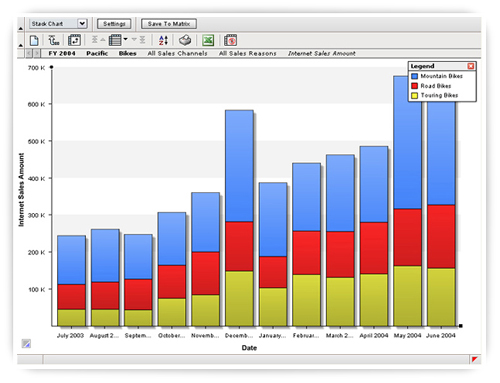
This is a stacked bar graph that is being used to display how Internet Sales have changed from month to month. Each stacked bar combines sales for Mountain Bikes, Road Bikes, and Touring Bikes. Although this might not be the best graph for the job (notice how difficult it is to compare the heights of the red or blue bars), depending on what their client needs to focus on, this graph type might be sufficient.
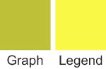
What bothered me and prompted me to write about this graph appears in the legend in the upper right corner.

In the graph, the colors of the three bar segments are blue, red, and green. In the legend, they’re blue, red, and yellow. Here are swatches of the two colors side by side.
In looking around their website, I found a few other examples of the same problem.
If you look at the original bars closely you can see that the fill color in each of the bars varies slightly. In conjunction with the shadow on the right side of each bar, it’s probably safe to assume that Blink Logic is trying to simulate lighting effects on the bars and as a side effect, the yellow color, which was selected to represent Touring Bikes, is being rendered as green (that is, yellow supposedly darkened by shadows).
Problems of this sort are fairly common by-products of lighting effects. Because of the gratuitous use of lighting effects, for example, I’ve seen pie charts that looked like they contained more slices than they actually did and line graphs where the colors of two or more of the lines were indistinguishable. Even when lighting effects don’t distort the image, they can still slow us down, because they complicate the display, making our eyes try to find and compare gradients of color instead of uniform patches.
The essential point I’m attempting to make is not just about lighting effects, but about all of the glitzy effects and cool features that vendors incorporate into their products and promote to the world. Before a new effect or feature is added, a vendor needs to weigh its true costs versus its benefits. Is it detrimental to the whole? If you add another variable to a bar graph, you complicate it, making it harder to focus on the other data. Often, this is okay, because the benefit of the additional data outweighs the cost of the additional complexity. But what benefit do visual frills add? When you add a color gradient, shadows, or a 3-D effect to your bar graph, you might make it “prettier,” but is it really worth sacrificing understanding in the process?
-Bryan Pierce
December 12th, 2007
Every once in a while I encounter someone’s work whose sanity of argument, integrity of passion, and elegance of expression convinces me in an instant that I have found a comrade. Recently reading the new book Geekonomics by David Rice was such an encounter.
 
Rice is a prophet, and like most true prophets, what he is saying is something you won’t like hearing. Geekonomics warns against the dangers of software. That’s right—software—which we rely upon every day to a rapidly increasing degree. Rice is no crackpot or self-proclaimed guru looking to make a quick buck with this book. His warnings are akin to those of Alan Cooper in The Inmates are Running the Asylum and my own as well. While Cooper and I rail against software’s inexcusable dysfunctionality, however, Rice points out very real dangers that threaten the world. Most software is bad, not just because it is much harder to use and far less effective than it ought to be; it is also insecure, which invites danger. The more we rely on software, the more vulnerable we are to the whims of those who would do harm.
Earlier this year, the country of Estonia, “the most wired nation in Europe,” was crippled for more than two weeks by cyber attacks that were launched by Russian hackers. These attacks so overwhelmed Estonia that its leaders had no choice but to sever the country’s connection to the Internet, and “with it the country’s economic and communications lifeline to the rest of the world” (from the preface of Geekonomics, David Rice, published by Addison-Wesley, 2007). Why was Estonia attacked? “The Russian government objected to Estonia’s removal of a Soviet-era war memorial from the center of its capital, Tallinn, to a military cemetery.” By becoming well wired, Estonia had inadvertently become highly vulnerable to attack. Why? Because it relied on an infrastructure—software—that was insecure.
Geekonomics does not address data visualization in particular, which is the focus of this blog, this entire website, and my work. Rather, it explains the fundamental reasons why software of all types usually fails to deliver what we need, especially security, and the threat that this failure invites. The dangers that Rice describes are on the scale of global warming. Did this statement get your attention? Good, because it’s true, and the magnitude and imminence of this problem deserves your attention. Just like the threat of global warming, we dare not ignore the threat of insecure software, because software has become the infrastructure of the modern world.
Rather than saying more about this book, I’ll let it speak for itself by including a couple of quotes, which should whet your appetite. I’ll begin with Rice’s synopsis of the book’s arguments.
There are three primary themes in Geekonomics:
- First, software is becoming the foundation of modern civilization; software constitutes or will control the products, services, and infrastructure people will rely on for a wide variety of daily activities from the vital to the trivial.
- Second, software is not sufficiently engineered at this time to fulfill the role of “foundation.” The information infrastructure is the only part of national infrastructure that is destructively tested while in use; that is, software is shipped containing both known and unknown weaknesses that software buyers are made aware of and must fix only after installation…The consequences are already becoming apparent and augur ill for us all.
- Third, important economic, legal, and regulatory incentives that could improve software quality, reliability, and security are not only missing, but the market incentives that do exist are perverted, ineffectual, or distorted. Change the incentives and the story and effects of insecure software change also.
Rather than fixing the problems in their software, most vendors spend their time cramming new features as quickly as possible into each release—new features that are rarely used.
So why, then, would software vendors provide an increasing and ever more fantastic array of features in applications when it is clear that users do not use newer features, and additional features tend to promote the very unreliability that keeps users from enjoying new features in the first place?
Compared to sufficient testing and proper security development practices, features are much less expensive to implement and provide an easier method for users to differentiate products even if newer features are not employed in practice. From a business perspective, even if features are irrelevant to a purchaser from a functionality perspective, features are not irrelevant to the software vendors where it counts most: the point of sale.
For the copious time and effort consumers spend comparing one list of features against another, the software vendor understands that the number of features matters more than anything of true consequence, whether quality, reliability, and/or security.
Geekonomics is not only an important book, it is also a good book. Rice is smart and thoughtful, and he knows how to write. If you rely on software (and who doesn’t?), you should read this book. If you produce software, you should read this book. You might not like what you read, but you need to hear it, and we all need to do something about it.
Take care,
December 11th, 2007
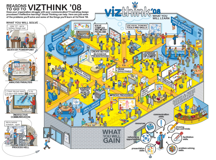
Yesterday, I decided to pull out of the VizThink 2008 conference, for reasons that I will explain. Because I have been advertising my involvement in the conference on this site and previously suggested that you consider attending it in this blog, I want to explain why I’ve changed my mind about participating.
When I was first approached by the VizThink team and asked to speak at their inaugural conference, back when only two or three others were on the list of speakers, I was excited about the conference’s potential. As a specialist in data visualization, I recognized the value of bringing together experts from all visual thinking disciplines. There is much that we can learn from one another. As the list of speakers continued to grow, however, my hopes began to wane and my concerns mounted. Don’t get me wrong! The speakers are experts in their fields. My concern is that as a whole they don’t accurately represent the spectrum of visual thinking, and that the list of topics is heavily skewed, primarily toward the use of drawings to record ideas (such as during a brainstorming meeting) or in printed form to explain something, such as a concept or process.
Until yesterday, out of 38 speakers and 32 breakout sessions, I was the only representative of “information visualization”—and now there are none. This mix misrepresents visual thinking as primarily related to various forms and uses of drawings. As such, it fails to feature what I believe is the most exciting way in which visual thinking is supported by technology today: information visualization—”the use of computer-supported interactive visual representations of abstract data to amplify cognition” (Card, Mackinlay, and Shneiderman, Information Visualization: Using Vision to Think, 1999). I don’t mean to disparage the use of drawings to help people think about ideas and communicate them to others, including those that take the form of comics (10% of the sessions feature this aspect). I just think that this emphasis on drawings gives a lopsided impression of visual thinking, which is not the impression that an inaugural conference on the exciting and important topic of visual thinking should promote.
Besides this imbalance, one other concern also discouraged my participation. I suspect that many of the visualizations that will be featured at the conference fall into the realm of what I consider ineffective. Drawings are fun and entertaining, and when appropriately used and properly designed, they can support thinking in meaningful ways. When they are used gratuitously or improperly designed, however, they can undermine thinking. I believe that this conference should be about effective visual thinking. To meet this standard, this conference should promote the use of visualization only when visuals are the best way to get the message across, and it should feature visual designs that are firmly rooted in an understanding of visual perception and cognition. If the poster below, which was designed and is being used to promote VizThink 2008, represents the view of visual thinking that will be featured, I am inclined to question its merits.

Click to enlarge.
I don’t believe that this an effective way to help people consider the content and decide if they should attend the conference. This poster strikes me as no more effective for visual thinking than a set of PowerPoint slides filled with bullet points is effective for communication. When I see a picture like this, I’m discouraged from looking at it by the visual clutter. I have to work much too hard to glean what’s meaningful from the chaos of visual content. To the degree that VizThink 2008 ends up teaching people to use visualization in this way, it will do a poor job, both of serving their needs and of representing the potential of visual thinking.
I realize that by expressing this opinion, I am opening a can of worms and inviting debate. I’m doing so intentionally, because discussion could be helpful. I know that my concerns are shared by others who have nevertheless chosen to speak at the conference, hoping to nudge it in the right direction. Again, let me clarify that I am not questioning the potential benefits of visualization media of many types as aids to thinking. What I’m arguing is that we need to approach visual thinking critically, test our methods for effectiveness carefully and responsibly, and make sure that they conform to what we already know about visual perception and cognition based on years of established research.
Visual thinking is an important topic that has much to offer the world. For this reason, I wish VizThink well and hope that, given time, it evolves into a conference that provides a balanced view of visual thinking, promotes only those practices that are effective, and builds a strong multidisciplinary community of practitioners. If and when it does, perhaps I will be invited again to participate and will be able to accept the invitation with enthusiasm and without compromise.
Take care,
November 26th, 2007
A few days ago in this blog I responded to critiques of my InfoVis 2007 capstone presentation that were published in other blogs by Mike Danziger and Joe Parry, who both attended the conference. Mike Danziger has graciously and thoughtfully continued this discussion in his own blog. Mike expressed his concern that readers not see his critique as a personal attack on me. Let me make it clear before responding to the Mike’s points that I don’t consider Mike’s critique a personal attack in the least. As I said previously, I appreciate Mike’s comments and am grateful for them because they open the door to useful discussion. I’d like to focus on a few points that Mike made in his recent response.
Mike states that the primary disconnection between his perspective and mine involves different uses of a few terms:
What makes these statements problematic to me, and what was part of what I was trying to get at in my original critique, are Steve’s definitions of terms like “useful,” “(in)effective,” and “[user] needs,” with regard to information visualization. If I were to try to identify, right off the bat, the fundamental disconnect between the two “camps” that Steve and I represent, it would be that we don’t necessarily agree on what these terms mean.
I believe that something is “useful” (that is, it matters) and “effective” (that is, it works) to the degree that it satisfies worthwhile “needs” of those who use it. If a person watches a television program solely to be entertained and that person has what he or she considers an entertaining experience, it is effective. Whether it is useful or not is a different matter, although I’ll readily admit that there are occasions in my own life when I simply want to laugh and little else. The point is, I judge usefulness and effectiveness based on a defined set of objectives related to the needs of particular people. When I critique a particular visualization or approach to visualization, I do so in the context of a particular set of objectives. I do have a bias, however, which I’ll admit without apology. By definition, I believe that information visualization must “inform” people—that is, it must impart information resulting in understanding. In some cases, other objectives may also be relevant, but they are in conflict with the primary objective of informing if they undermine this experience.
I believe that Mike has set up an artificial dichotomy between vaguely defined classes of visualization.
My contention is that this sort of traditional, “scientific” understanding of information visualization, while certainly valuable in some domains (such as business intelligence), is too restrictive when considering its broader, more popular uses. For one thing, there is the obvious point that “popular visualization” does not necessarily share the same critical goals. Many of the infovis examples that Steve criticized from the Smashing Magazine article exemplify this, in that they present information that is not necessarily “mission critical” in the same way BI information might be – people are not necessarily viewing these visualizations because they need to make critical decisions based on the meaning of the data they present. Rather, they are perhaps more “casual” forms of information visualization in which directness and efficiency of transmission are not the primary goal, which then complicates our conception of “usefulness” or “effectiveness.”
What exactly is “popular visualization”? Mike suggests that it involves a use of infovis that supports objectives that are not “mission critical.” Actually, very few uses of infovis in the domain of business intelligence are mission critical. I believe, however, that even when not “mission critical,” information visualization should still be informative. Whether something is mission critical or not has no bearing on whether the information should be presented in an understandable way.
Anyone who creates an information visualization has the right to define its specific objectives, as long as informing is one of them. That visualization should be judged both on the merits of the objectives—a value judgment—and its ability to satisfy those objectives—a pragmatic judgment, which is determined by comparing the outcomes to those objectives. When I critique an information visualization, I attempt to judge it in this way. For instance, are the objectives of the ambient orb useful, and if so, is it effective? The objectives might be useful for some people, but the ambient orb certainly doesn’t satisfy them effectively compared to other means. Are the objectives of Many-Eyes useful and effective—in this case I believe the answer is a resounding yes, despite the fact that it should and no doubt will continue to improve in many ways.
Mike’s notion of popular visualization requires that it concern itself with “engagement design.”
While it’s true that infovis, as a field, grew out of a “strict” scientific tradition (ie. computer science) that informs its theories and methodologies, it is going to have to broaden its understanding of the ways in which “normal” people interact with information if it wants to present itself as accessible to the masses. I think the field will need to start thinking more in terms of “engagement design” rather than the highly quantified metrics of efficiency, time on task, etc., that have traditionally characterized user studies in HCI and interface design.
Information visualization, as I understand and practice it, grew out of many disciplines—not just computer science. I wholeheartedly agree that, despite the many disciplines that inform it, it must “broaden its understanding of the ways in which ‘normal’ people interact with information.” I also believe that it must deepen its understanding. To work effectively, infovis must engage those who interact with it. What isn’t clear to me, however, is what Mike means by engagement. Engaged in what and for what purpose? In much of my work, I advocate the importance of people becoming engaged with information visualization in a way that allows them to become immersed in the process of exploring and making sense of the information, without being distracted or disrupted by the mechanics of using the software. I have the impression, however, that Mike is using the term engagement differently, suggesting that people should become drawn into the visualization by any means possible, not necessarily in a way that engages them in meaningfully exploring and making sense of information.
Mike concludes by expressing a sentiment that I appreciate:
I’m not arguing that its design principles should replace the ones that Steve talks about, but I’m completely certain that the two perspectives are not mutually exclusive; the reality, I think, is that both could benefit from a more robust understanding of one another.
I agree and am finding this discussion helpful. I suspect that much of the apparent conflict between our perspectives is semantic, but semantic conflict is often the hardest to uncover, understand, and reconcile. Let’s keep working at it. For those of you who are following this discussion and wish to contribute, I invite you to do so in the spirit of working together to improve what we do. This is not a battle with good guys and bad guys. This is how people who share a common passion strive to further the cause.
Take care,
|