| |
|

|
Thanks for taking the time to read my thoughts about Visual Business
Intelligence. This blog provides me (and others on occasion) with a venue for ideas and opinions
that are either too urgent to wait for a full-blown article or too
limited in length, scope, or development to require the larger venue.
For a selection of articles, white papers, and books, please visit
my library.

|
| |
November 19th, 2007
Several people who attended the InfoVis 2007 conference and heard my capstone presentation, “InfoVis as Seen by the World Out There: 2007 in Review,” have written about it in blogs. I’m grateful for each of these responses, even when they disagree with me. One of my intentions in the capstone presentation was to stimulate discussion. In the last few days, Mike Danziger and Joe Parry in particular have opened the door to discussion in their blogs, which I would like to advance by responding. Mike and Joe both commented thoughtfully. It is clear that they both care a great deal about information visualization. Their combined comments took issue with four aspects of my position or means of expressing it. I hope that in responding to their comments, I’ll be able to engage Mike, Joe, and others in a way that will help the information visualization community reflect on and advance its important work.
Issue #1: Few dismisses popular examples of visualization without trying to understand what’s useful about them.
… he was dismissing without trying to understand what is useful about them (in addition to his criticism of Swivel, he wrote off the Ambient Orb, and the list of infovis examples recently published by Smashing Magazine).
…the fact that (some) people find it [the Ambient Orb] compelling suggests that there is something engaging about its presentation. Rather than writing it off as useless, why not try to figure out how to incorporate its engaging qualities in to more “sophisticated” visualization systems?
(Mike Danziger)
What is perhaps not obvious, based on my capstone presentation alone, is the fact that I spend a fair amount of time trying to understand what draws people to ineffective visualizations—those that fail to serve the needs of the audience while managing to appeal to that audience on some level. Regarding the Ambient Orb in particular, I’m not sure that many people really find it engaging, and I doubt that those who do are engaged by “its presentation,” which is rather meager. I suspect that they see the Ambient Orb as a novelty item, much like that painting of dogs playing poker. I believe that the article by Smashing Magazine created a buzz in the blogosphere because it introduced a community of techies to something that was new to them. For that I’m grateful; I just wish the article had been more discriminating in what it included and more knowledgeable about infovis. I believe that the early popularity of Swivel, and the fact that it has since been overshadowed by Many-Eyes in popularity, makes the case that people will become more excited by better visualizations when given the choice. Many-Eyes has managed to make the process of data exploration and analysis interesting and fun, without resorting to features that undermine the effectiveness of the activity.
I hope that I’m never guilty of writing off meaningful aspects of visualization as useless, simply because they don’t match my own preferences—aesthetic or otherwise. If you ever catch me doing so, I want you to call me on it. Just make sure that what you point out as useful in a visualization is actually useful and not just appealing to your own preferences.
Issue #2: Few underestimates the power of playfulness in reaching out to an audience.
I also think he underestimates the power of playfulness and fun in reaching out to an audience – come on – Swivel’s option to “bling your graph” is just funny!
(Joe Parry)
Actually, I believe that my work demonstrates how much I appreciate the power of playfulness in reaching out to an audience. My capstone presentation was certainly an example of this. The difference between my use of playfulness and examples like Swivel’s “bling your graph” is that I try very hard to use playfulness to engage people in thinking meaningfully about the message that I’m trying to communicate and to remember that message. If putting photos in the background of a graph (Swivel’s “bling your graph” feature) were “just funny,” I wouldn’t object. The problem is, this feature actually undermines the graph’s ability to present information and suggests that presentations can be improved by means of gratuitous decoration. Joe—you seem to make this distinction yourself when you thanked “Nathan” for his critique of “Graphwise.com,” (much more scathing than my own review of it, by the way), which pointed out how the picture in the background of a graph that was featured at Graphwise undermined its effectiveness.
Issue #3: Few is more concerned with telling people the “right” way than understanding their needs.
Few’s conception of popular infovis design is particularly hard-line – more about telling the masses how to display information the “right” way, rather than thinking about how non-experts might interact with information differently and with different needs.
Everything about his presentation revolved around showing “outsiders” why their intuition about infovis is wrong. If our goal is to produce infovis that makes sense to these non-experts, I don’t think this mentality is constructive.
(Mike Danziger)
I can understand why my approach to information visualization might seem “hard-line” and focused on telling people the “right way.” This perception is accurate, but incomplete. When a great deal of evidence indicates that certain visualization practices work better than others, I believe that it’s helpful to teach people to follow the best practices and avoid those that fail. Thousands of people who have attended my courses, heard my presentations, or read my work, are grateful for this information, because it helps them to do their jobs better. They have better things to do with their time than make mistakes that could easily be avoided once they’re known.
As I see it, doing things the right way and caring about the needs of people are not separate concerns, but one and the same. I define the “right way” as the way that best satisfies the needs of people—the way that works. I’m a pragmatist. What I don’t do is define the “right way” as the way that people desire things to be done. Our desires, our notions of how things should be done, often conflict with the way that really works. Who among us has not suffered countless times from decisions, based on desires, which end up biting us in the butts?
What is definitely not true of my work is that it is not sensitive to or informed by the needs of “non-experts.” In fact, it was an awareness of the needs of non-experts that gave rise to my work. Unlike many folks in the information visualization research community, I live and work among “non-experts” everyday. Non-experts take my courses and read my books because they are looking for help. They realize that they were never taught how to present data effectively or to use graphical representations to make sense of data. When I show examples of all-too-familiar but ineffective graph design practices, they laugh and admit—”Yes, I do that all the time.” They’re not offended, because I’m not presenting the examples to offend them. We laugh together about the mistakes that have become commonplace, and then have fun together learning ways to present and reason about data more effectively.
Issue #4: Few’s approach hurts our efforts to popularize information visualization.
I think that attitude does a disservice to the goal of popularizing information visualization. (Mike Danziger)
I understand why he is so passionate about designing clear visuals, but sometimes that passion can err on the abrasive side.
(Joe Parry)
This is difficult to hear. I certainly hope this isn’t true. If I did nothing but expose and oppose visualizations that are in my opinion ineffective, playing no role but that of a gadfly, I might be guilty of serving information visualization poorly and certainly only partially. This is hardly the case, however. I promote effective information visualizations just as passionately as I oppose those that illegitimately claim the title.
The real “disservice to the goal of popularizing information visualization” is the existence of (1) ineffective or irrelevant infovis projects and products that represent our work poorly, and (2) the unfortunate inability of many experts in the field to present their work to those who need it in a way that they can relate to, care about, and understand. These problems are what I’m trying in my own small way to fix. I hope that my efforts rarely “err on the abrasive side” or are guilty of unfair or unsubstantial criticism.
Take care,

November 14th, 2007
I have reviewed every release of Tableau, beginning with version 1.0 and continuing now with the latest release, version 3.5. After recently being briefed on version 3.5 by the folks at Tableau, I concluded the meeting with the following statement: “You guys continue to amaze me with how many important features you’re able to address in each release, thoroughly and without compromising quality.” The team at Tableau succeeds better than any other software design and development team I know in identifying the most important next steps in the product’s evolution and proceeding through those steps expertly and thoughtfully. They don’t just tick items off a features list that was composed from customer requests. Rather, they understand the needs of their customers well enough to discriminate between features that really matter and those that would take the product in an unproductive direction. The features that they decide to include are not turned over to developers to code as quickly as possible with little direction; they first go through a rigorous design process to make sure that they are implemented in the most effective way possible.
I’m not going to review all of the new features of this release and none of them in detail, but want to briefly mention and describe those that I find most interesting.
Improved Visual Design
The visual appearance of Tableau was already quite good, but with this release they have managed to make them even better by following some of the visual design principles that I advocate (and Tufte advocated long before I did). It’s amazing how much of a difference it makes to reduce everything that isn’t data to a minimum and to make other simple changes such as orienting labels horizontally whenever possible.
Field Labels
Prior to this release, labels were not included in the display for fields of data that appeared in the columns (as opposed to the rows). In the example below, the label “Product Type / Product” would not have appeared in the body of the display as you see here. If you were the analyst who created the display, you knew these field labels because they appeared elsewhere on the screen, but if you passed the display on to someone else as an image, those field labels would not have been included. This improvement, along with others the folks at Tableau have been focusing on make it much easier to pass the results of your analysis on to others without having to spend time to polish the display.

Legend Highlighting
Sometimes you want to quickly focus your attention on a subset of data that appears on the screen without filtering out everything else. The new legend highlighting feature makes this possible in an incredibly simple manner. The graph below is certainly not one that you would want to present to others for the purpose of making fine comparisons between these 13 products, but it is one that you might use during the process of data analysis to get the big picture of what’s going on.
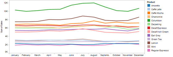
As it is, however, if you wished to compare the performance of particular products through the year, this display is too cluttered and the process of associating the labels that appear in the legend to the appropriate lines in the graph is time-consuming. For instance, if you wanted to closely compare the two decaf products without being distracted by the other eleven, you could filter out the other eleven. This works great, but what if you wanted to focus on the two decaf products without losing a sense of how they compare to the whole, the complete set of 13 products? Now, through legend highlighting, you can accomplish this by dimming out all lines in the graph except the decaf products, which allows you to focus on specific data without losing a sense of how it relates to the whole. Here’s how this would look:

Sometimes data displays that are used for analysis or reporting involve multiple files, such as several data sources and sometimes even images that are incorporated into the display (for example, a map). In previous versions, if you wished to make the display available to others, the process of packaging all of the files that were needed was painful and time-consuming. In Tableau Desktop 3.5, even if the display will be viewed by others in a Web browser or you’re sending it as an email attachment, you can save it as a Packaged Workbook file, so that what gets passed on contains everything that’s needed.
Tableau Reader
Organizations that are looking for ways to make information available to whomever needs it, along with most of the features that Tableau provides for interacting with data (sorting, filtering, etc.) will welcome Tableau Reader as manna from heaven. Just like the Adobe Acrobat reader that made it easier to share documents as PDFs, the Tableau Reader is a free product that can be downloaded in seconds. In other words, if you have a copy of Tableau Desktop 3.5, which you use for a particular data analysis task that you’d like to pass on to others to perform, you now have the means to do so, for free. The reader cannot be used to access and interact with data other than what the workbook was designed to access and do, but most people don’t need to create analyses from scratch, they simply need to interact with a defined set of data in predictable ways, which they can do with Tableau Reader. You might wonder why Tableau is willing to make something this valuable available without charge. They know that as more and more people are exposed to the value of their tools, demand for Tableau Desktop and Tableau Server will drive greater overall revenues in the long run.
Web Server and Client
Speaking of Tableau Server, a web server version of the product, along with a web browser client, was released earlier this year without a lot of fanfare, but it deserves it. It was only a matter of time before customer demand for a Web version of the product could not be ignored. Similar to Tableau Reader, which allows you to distribute all the functionality that many people need for free, Tableau Server allows you to make a greater degree of functionality available to people across the organization for a fraction of the cost of buying individual copies of the desktop product. Many business intelligence vendors that have introduced new web versions of their existing desktop products, came out with web versions that had but a fraction of the desktop product’s functionality and worked so differently from the desktop product that people had to learn how to use them from scratch, The functionality and look-and-feel of Tableau’s web product, however, are surprisingly close to its desktop sibling. Some of this similarity was achieved by subtle improvements to Tableau Desktop 3.5 that were designed to make the desktop interface more closely match that of the new web client.
Tableau Server 1.5 was released along with Tableau Desktop 3.5, which includes refinements to the server product. One that I particularly like is the ability to search for Tableau workbooks that are stored on the web server in a variety of flexible and powerful ways. If you’ve ever used a web server business intelligence product, you know how quickly the list of available reports can grow unwieldy, making it almost impossible to find what you need. With Tableau Server 1.5, however, you can search for particular workbooks much like you would search for content on the World Wide Web using a powerful search engine such as Google, but with the addition of filters that help you rapidly and meaningfully pare down the list of matches.
Those of you who regularly read this blog know that I can come down hard on products that work poorly. On the other hand, as this brief review of Tableau Desktop 3.5 and a few other reviews over the years have shown, I can be positively effusive when software warrants praise. In truth, I much prefer bringing good products to your attention than warning you about those that are bad, but I get so few opportunities to do so. Thankfully, the few vendors that know what they’re doing and care about their customers, such as Tableau, give me a break every once in awhile from wielding the gavel of shame.
Take care,

November 12th, 2007
Around a year ago Swivel.com was the first “social visualization” (a.k.a. collaborative visualization) site to capture attention in the blogosphere. At about the same time, I learned about a similar site, Data360.com, which is not as well known. Not long afterwards, Many-Eyes.com emerged to set the standard for rich and meaningful collaborations between people about data, graphically represented. Until Swivel and Data360 set themselves apart by addressing a particular audience and set of needs better than Many-Eyes, their worth remains questionable. Why bother with all three sites when one is superior by far? In the world of technology, however, every good idea must be beat to death by countless competing attempts to address the same need, very few of which actually take the time to understand the need or develop the expertise to respond to it effectively. Graphwise.com, a new social visualization site now in beta, is a case in point.
I realize that a little competition is good for the marketplace to the degree that it applies pressure on companies to do their best and to price their products and services reasonably. When the marketplace is flooded with competitors who focus on seizing an opportunity without understanding it, however, the marketplace becomes unnecessarily complicated. In the book The Paradox of Choice, Barry Schwartz convincingly argues that, while having a few things to choose from fosters freedom and is thus useful, there is a threshold beyond which choices becomes counter-productive and a burden. In the developed world, and certainly in the United States, we have become buried under of over-abundance of choices, forced to waste our time choosing for an endless array of competing alternatives, unless we take dramatic steps to simplify our lives. We don’t need more choices; we need fewer but better choices.
Now that I’ve gotten that off my chest, back to Graphwise.com. What is it that this new site is offering us? After searching through their entire site, here are the only answers to this question that I could find:
GraphWise aims to provide the public with the tabular data available on the Internet, provided by commercial sources, and uploaded by users. By registering, you’ll be able to save the data you find and the graphs you customize for later use. In the near future, you’ll be able to publish data to our search engine for public use.
GraphWise is primarily a search engine. That is, it searches the web and detects data tables in all sorts of web pages and data files. It is hoped that GraphWise will help you find the data you need more quickly, because it is visual. GraphWise does the searching through millions of rows and columns so you don’t have to. Then it “slices and dices” the data it finds to create meaningful plots of that information.
On the surface, Graphwise appears to be much like the other social visualization sites, differing perhaps in one respect: they automatically search the Web looking for data tables to store on their site and make available in the form of graphs. The benefit they offer? To “help you find the data you need more quickly, because it is visual” and to relieve you of work by automatically slicing and dicing the data “to create meaningful plots of that information.” If they are actually able to do this, they might have something useful to offer. The problem is, I don’t think they can. And even if they’re able to do this, the graphing functionality that they offer to help us explore and make sense of data is god-awful.
As a data visualization expert, no one needs to convince me that visual representations of data are powerful and useful, but they are not powerful and useful for every possible task. How does a collection of thousands or even millions of graphs make it easier for people to “find the data they need more quickly”? I’m unable to imagine any way that it can. The only way that Graphwise appears to support searching for particular data is in the same way that every other site does: by means of text searches for key words.
Is it really possible to automatically search the Web for data and turn it into meaningful graphs, without human intervention? Perhaps at some point in the future, but I don’t think we’re there yet. At most, they can make a few guesses about what they find, such as by looking for labels that look like dates and then providing a line graph to display it as a time series.
Below I’ve selected a sample table that Graphwise apparently found on the Web. Here’s the view that it provided in a list of several tables that was presented when I searched on the keyword “fuel”:
<
This preview of the table is a bit confusing. The data for year 1990 is being displayed as column labels, every column has the same overall label of “Oil Space Heating,” and the years are in a random order. The suggested graphs appearing on the right exhibit a rather unintelligent “slicing and dicing” of the data to find meaningful ways to visualize it.
By clicking the “…view…” link below the table, a more meaningfully structured table appeared in a popup window:

Based on this arrangement of the data, a relatively intelligent parsing program should be able to discern that I have time-series data ranging from 1980 through 1997, with several missing years.
I clicked on the first suggested graph, and what then appeared was a plot area that kept bouncing back and forth between the following two pie charts, which I couldn’t figure out how to stop:

The chart on the left displays a part-to-whole relationship that breaks 1992 into two slices: “Liquefied petroleum gas1” and “Compressed natural gas.” Now I’m really confused, because none of this data can be found in the table pictured above that this graph was supposedly based on. The chart on the right makes more sense, in that the data that it displays actually exists in the table, but a part-to-whole relationship that includes four U.S. geographical regions along with the entire U.S.A. puts us back in the realm of nonsense. So much for “meaningful plots.” According to the site:
Today, GraphWise has over 2 million tables and 150 million graphs. We plan to reach the one billion graph mark in the coming months.
Here again we have a dramatic example of how more is not better.
Rather than relying on the dysfunctional smarts of Graphwise to find and display data for me, I decided to upload some data of my own to see if I could do something meaningful with it. I found a good data set at Many-Eyes, downloaded it, and then uploaded it to Graphwise. Here’s a portion of the data, shown in the table that Graphwise created:

As you can see, it includes various measures related to counties in the state of Virginia. In Graphwise, once you’ve uploaded a data set, instructions on the screen tell you to “Click on the plot icons in the results to build a graph.” I couldn’t find any plot icons, but after looking around for several minutes, somehow I managed (and I honestly don’t know how) to get the following graph to appear:

This graph combines measures of population, per capita income, and medium household income per county using grouped bars. What you see here is Graphwise’s default formatting of a bar graph. What this graph makes it easiest to do is compare the magnitude of a particular county’s population, per capita income, and medium household income, which doesn’t really make any sense. Ignoring this point for the moment, I decided to try to improve the horrible formatting defaults. Here are the options that I had to work with:

As you can see, the options that are provided don’t really address formatting, except that I can turn off the 3D rendering of the bars. Frustrated that I couldn’t improve the formatting in the many ways that I wished, I decided to do the one thing that I could: remove the 3D.

I got more than I bargained for. The background was automatically turned black, and although the third dimension of depth was removed from the bars, the silly lighting effects were not. As you can see, this isn’t much better. It is not a pleasant picture that would incline one to study the data.
I noticed that “themes” could be applied to the graph, so I decided to explore this feature. Here’s a sampling of a few of the many themes that Graphwise offers:

In order, from left to right and top to bottom, these styles are named 1) black, white, and red, 2) arctic cool, 3) Easter egg, and, believe it or not, and 4) clean. As you can see, the themes provide a bevy of really bad ways to design a graph. Just for fun, I decided to go all out and take advantage of the one other visual design option that Graphwise offers: the ability to put an image in the background of the graph, which they call a watermark. From the many pictures of animals, buildings, furniture, etc., I decided to dress up the arctic cool version of my graph by appropriately pairing it with a penguin.

I particularly like how I was able to make the penguin’s beak reach for the high value of 100,000. This might look cool (arctic cool, even) , but it is an example of dysfunctionality at its worst.
Surely I was missing much of what I could do to create a meaningful graph, but I couldn’t find any instructions on the site to point me in the right direction. Perhaps the site provides examples to demonstrate the merits of their graphs. I took a quick tour of the graphs that were featured on the site, and here’s an example of what I found:

Here’s the description that accompanied this graph:
After 2000 legal immigrants to the United States number approximately 1,000,000 legal immigrants/year of which about 600,000 are Change of Status immigrants who already are in the U.S. Legal immigrants to the United States now are at their highest level ever at over 35,000,000 legal immigrants. Here the list shows average number of legal immigrants/year immigrating from 2000 to 2004, the number of foreigh [sic] born immigrants from 2000 census, Year 2004 foreign born and 2010 projection using an average of number of immigrants/ year.
The quality of the description seems well-matched to the graph. This is what they chose to feature?! I’m particularly amused by the fact that one of the countries—Ireland—is represented differently than the others for some unknown reason, which you can barely make out as a thin pink line. Notice how the year 2010 percentages (the right-most group of bars) are all pancaked at the bottom of the scale that extends to 1,900,000. Also notice how there is no visual delineation between the five sets of bars along the X-axis.
So the question remains, “Why do we need another social visualization site when Many-Eyes.com is already doing it so well?” There is perhaps room for other such site to address a different audience or unique set of needs, but Graphwise doesn’t seem to do this. What I see here is the efforts of another group of people to exploit an opportunity without understanding that opportunity and without expertise in the technologies that can be used to address it. Using Graphwise would be an unwise choice. I recommend that you avoid it—at least for now.
Take care,
November 5th, 2007
I just returned a few days ago from InfoVis 2007, the premier annual conference of the information visualization research community. After attending the conference last year, I gave it a mixed review in this blog. Despite many worthwhile research projects that were presented, many struck me as poorly designed and of no obvious benefit to the real world. I care a great deal about this community and the work that we’re doing, because I care a great deal about those people and causes in the world that stand to benefit from this work. Consequently, I prod and provoke when it seems necessary to wake infovis researchers up to the great opportunities that they’re missing and the cost of such failures to the world.
From the opening keynote presentation by Matt Ericson, Graphics Editor at the New York Times, this year’s conference had a different tone than last year’s—one that warmed my heart and made me hopeful. Matt set a tone for the conference of “infovis for the masses” by showing how effectively well-designed visuals—even in static form on the printed page—can tell important news stories clearly and compellingly. When asked many weeks ago to deliver the capstone presentation at this year’s conference, and while preparing for it, I had no idea that anyone had a particular theme in mind for the conference. Matt’s opening keynote, several presentations during the conference, and my capstone presentation at the end, wove a common theme throughout that infovis research must become more relevant and useful to the world out there. I doubt that the sentiment was unanimous, but I could see on faces throughout the auditorium a glow of assent and inspiration as I addressed my infovis colleagues and wished them a fulfilling and productive year to come. They knew that by “productive” I meant that they contribute something positive, meaningful, and useful to the world—especially to those who are working to make it better.
I was very pleased to find that more of the work presented by the research community at this year’s conference seemed to be applicable to real problems that are experienced by more than a few and that the overall quality of the research seemed to be a bit better. This was encouraging, but we are still far from where we could be. The goal remains a dot on the distant horizon. I was poignantly reminded of this by several first-time attendees with whom I spoke during the conference. Many were from industry (both software vendors and end users of infovis), including a few who attended because of hearing about the conference from me on this blog. They expressed unanimous concern for how disconnected most of what they saw at the conference was from the uses of infovis that would benefit them. I was happy to tell them that things seem to be getting better, but frustrated that they couldn’t take more with them from this year’s conference but a sliver of hope for the future.
During a tutorial that I taught entitled “Bridging the Chasm between Infovis Research and the World Out There” on the day following the capstone, I was pleased that several people voiced a similar concern that it is not easy for infovis researchers to stay in touch with problems in the real world that infovis could potentially solve, nor is it easy for people outside the infovis community to find out what infovis already has to offer. We talked about creating a clearinghouse of ideas that could bring together people who wish to make their needs known and those who wish to make their infovis work known. In the coming months, I hope to explore this topic and solicit your ideas for making it happen and help in doing the work.
One observation that I made during many of the sessions was that most infovis researchers don’t do a very good job of presenting their work. I don’t expect everyone who does research to be an orator, but a greater effort to achieve one particular end that I’ll address here would be useful: know the venue. You’ve all heard the dictum “know your audience,” which is vital, but it is also helpful to know the strengths and weaknesses of the venue in which you’re presenting.
Some venues work well for presenting the details and others don’t. For example, long mathematical formulas and computer algorithms are appropriate when they appear in papers, allowing readers to study them for however long it takes to make sense of them. They are not, however, appropriate for live presentations. Even if we have the background to make sense of them (and I for one don’t), we don’t have the time to do so while a speaker is talking and the slides are visible for only a brief time.
Another consideration is that PowerPoint or Keynote slides, when filled with text, even in the form of short bullet points, don’t communicate effectively. Check the research, such as that done by multimedia learning expert Richard E. Mayer of the University of California, Berkeley. The redundancy of written words on the screen and roughly the same words coming out of your mouth does not increase understanding—plus, it’s downright boring. Not only is it not beneficial, it can be harmful. If you don’t speak the words that appear on the screen word for word in the same sequence, but instead paraphrase, which we usually do, people will spend a great deal of effort trying to match what you’re saying with the words on the screen. This distracts them from making sense of what you’re saying. Ideally, you want people to think about the information you’re presenting in a way that extends beyond the words themselves into the realm of concepts and connections. This isn’t possible if all of their attention is occupied trying to match your spoken and written commentary. The best combination of spoken word and projected slides during a presentation is either to visually illustrate what you’re stating verbally or to use the spoken word to explain what you are showing in the projected image. This is a complementary use of verbal and visual expression that your audience can perceive simultaneously. Those of us in the infovis community ought to know better than most how to use visualizations to communicate information, even on a PowerPoint slide. For tips on how to do this more effectively, I recommend Cliff Atkinson’s book Beyond Bullet Points.
I had a brilliant professor as an undergraduate named Dr. Wa (Walter) Gong. He ran a natural science program that was part of the general education curriculum. Every student who went through the program was taught and then required to document every lecture using what Dr. Gong called the “Four-Fold Method of Learning.” This method involved identifying and recording the following aspects of a lecture:
- Purpose (what the lecture was trying to accomplish)
- Thesis (the main points only, consisting of two or three at most)
- Validations (the facts that were given to back up the theses)
- Values (how the information could tie into someone’s values, whether or not they fit your personal values)
I did very well in this program, partly because I had already developed a similar method of thinking about and recording information. I believe that everyone who learned this method benefited greatly.
This same method for organizing and recording the contents of a lecture, book, or any form of presentation can be used when preparing a presentation as well. It would be useful for every presenter at InfoVis to feature answers to these four questions (“What are my primary assertions?”, etc.) in the presentation. Here is a different way of phrasing these questions that I believe would fit infovis paper presentations quite well:
- What was the purpose of my research? What was I trying to accomplish? (purpose)
- What were the main findings of my research? (thesis)
- What supports the veracity of my findings? (validation)
- Why does this matter? What does this work offer to the world? (values)
If you answer these four questions during the 20 minutes that you’re allowed using words and images to present your points clearly and to bring them to life, you will have given your audience something they actually might remember and care about.
Take care,
September 26th, 2007
A couple of years ago I had an email conversation with a fellow who worked for a dashboard software company about one of his customers. He said that this customer, a CEO, requested a dashboard that consisted of nothing but a single red traffic light if something was wrong, and was otherwise blank. After taking a moment to digest the idea, I responded that I was sure glad I didn’t work for that company. Any CEO who only wants information when something is wrong is missing much of what he needs to know about what’s going on.
I was reminded of this conversation when I ran across an ad for the “Ambient Orb” this week. It is a large sphere that changes colors based on data input, such as the state of the Dow Jones Industrial Average. Here’s what it looks like when it is dressed in radiant blue:
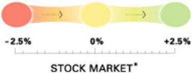
For those of you who prefer the ever popular traffic light colors of red, yellow, and green, it can be programmed to shine in this manner as well, as illustrated by this diverging range of colors for displaying the state of the stock market:
According to the New York Times, “This is ‘ambient information’ — the newest concept in how to monitor everyday data. We’ve been cramming stock tips, horoscopes and news items onto our computers and cellphones — forcing us to peer constantly at little screens. What if we’ve been precisely wrong?” I guess the gist of this statement is that we should be looking at bigger displays, rather than squinting at those tiny screens. “People want information, but they don’t want to invest a lot of time in getting it,” says Ambient president David Rose. “This makes getting information a ‘glanceable’ thing.” And what a wealth of information it is that we can derive from a single color!
I suppose that if you want some ever-present object in your office to alert you to a particular single piece of ultimately summarized information, the ambient orb could do the job. For those who don’t have a moment to spare, you could use it to tell you if its worth your while to actually look at your dashboard today. (In case you don’t know me well enough to know for sure, be assured that I am dripping with sarcasm right now.) Just as the dashboard can serve as a high-level front-end to a richer, more detailed fount of data, so can the ambient orb serve as the single-value front-end to your dashboard. Think of it as a mood ring on steroids.
Why not place one next to your bed and let it tell you whether its worth getting up in the morning, perhaps based on the weather forecast? I suppose that this is one way to deal with information overload, but are we really so busy and overwhelmed that we would choose to reduce information to this level? I’m planning to save my money ($150, plus shipping) for now, but if someone ever comes up with a lava lamp version, I might be tempted to buy.
Take care,
|