| |
|

|
Thanks for taking the time to read my thoughts about Visual Business
Intelligence. This blog provides me (and others on occasion) with a venue for ideas and opinions
that are either too urgent to wait for a full-blown article or too
limited in length, scope, or development to require the larger venue.
For a selection of articles, white papers, and books, please visit
my library.

|
| |
August 8th, 2011
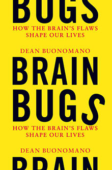
As an avid reader of books and articles about the brain, my interest was piqued while listening to an interview on NPR’s Fresh Air of Dean Buonomano about his new book Brain Bugs: How the Brain’s Flaws Shape Our Lives.
I’ve reviewed other fine books about the brain in the past, such as Brain Rules by John Medina, The Accidental Mind by David J. Linden, and Don’t Believe Everything You Think by Thomas Kida. What’s special about Brain Bugs is Buonomano’s ability to explain how the brain works down to the level of neurons in a way that is both accessible and fascinating. The wild dance of neurons as they interact in great waves of electro-chemical activity came alive for me as I read this book.
Dean Buonomano is a professor in the Departments of Neurobiology and Psychology, and a member of the Brain Research Institute, and the Integrative Center for Learning and Memory at UCLA. He writes with clarity and humor about the inner-workings of the brain. He explains that our neural operating system—”an archaic genetic blueprint that lays out the instructions on how to build a brain”—is in some ways outdated, despite its evolutionary superiority, and that our associative neural architecture not only makes us smart but also makes us susceptible to fear mongering and advertising. Only by putting to work the great strengths of the brain can we painstakingly learn to recognize and overcome its flaws.
Simply put, our brain is inherently well suited for some tasks, but ill suited for others. Unfortunately, the brain’s weaknesses include recognizing which tasks are which, so for the most part we remain ignorantly blissful of the extent to which our lives are governed by the brain’s bugs.
Our brains evolved to optimize our chances of survival and reproduction. “The evolutionary process does not find optimal solutions; it settles for solutions that give one individual any reproductive edge over other individuals.” The world in which most of the brain’s evolution occurred, however, is not the world that we live in today. Some of the ways in which our brains evolved no longer offer advantages.
Today we live in a world that the first Homo Sapiens would not recognize. As a species, we traveled through time from a world without names and numbers to one largely based on names and numbers; from one in which obtaining food was of foremost concern to one in which too much food is a common cause of potentially fatal health problems; from a time in which supernatural beliefs were the only way to “explain” the unknown to one in which the world can largely be explained through science. Yet we are still running essentially the same neural operating system. Although we currently inhabit a time and place we were not programmed to live in, the set of instructions written down in our DNA on how to build a brain are the same as they were 100,000 years ago. Which raises the question, to what extent is the neural operating system established by evolution well tuned for the digital, predator-free, sugar-abundant, special-effects-filled, antibiotic-laden, media-saturated, densely populated world we have managed to build for ourselves?
Evolution works slowly. We can’t wait for corrections to evolve over eons of time. We must learn to recognize the brains limitations and do our best to overcome them. “By exposing the brain’s flaws we are better able to exploit our natural strengths and to recognize our failings so we can focus on how to best remedy them.”
We humans are great at recognizing patterns—something that computers can only do with numbers—but we suck at handling computations. “It is paradoxical that virtually every human brain can master a language, yet struggles to mentally multiply 57 x 73. By virtually any objective measure, the latter task is astronomically easier.” In this age in which quantitative information plays such an important role, statistical naiveté undermines our efforts to survive and progress.
I could go on, but all I’m trying to do here is to pique your interest like mine was when I heard Buonomano on NPR. Everyone involved in analytics must understand a thing or two about the brain—the engine of analytics. For this purpose, I highly recommend this book.
Take care,

July 5th, 2011
Two of my recent blog posts critiqued the data visualizations of David McCandless and found them wanting. In those posts I repeated an argument that I’ve been making for some time now: quantitative data can be displayed in ways that are both beautiful (to produce “awe”) and functional (to produce “ah-ha”), without compromising either. In situations when the attention of people must first be captured before their minds can be informed, this can and should be done in a way that maintains the integrity of the information. The attention-getting component of the story need not be the chart that presents the data, but something complementary, such as a photo, diagram, or some other image—perhaps even words—that appeal to the eye or heart. If a quantitative chart is used to grab attention, it can serve a limited communication function as an introduction to the story or overview of the data, and serve as a launch-pad to other charts that are richer in information. I’d like to illustrate this with a beautiful example.
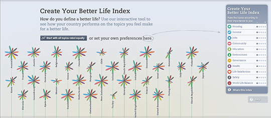
On the website of the Organisation for Economic Co-operation and Development (OECD) you can explore how the 34 member countries compare to one another across 11 measures that contribute to the quality of life using an interactive infographic called the Better Life Index. Here’s what you see upon arrival:
Be sure to view the larger interactive version of this chart to appreciate its elegance and explore its story. It is immediately engaging aesthetically and informatively. The flowers, one for each country, form glyphs: graphical objects that represent multiple data variables. Each petal represents a different quality-of-life measure: the longer the petal the higher the value. Glyphs don’t provide a way to compare the better life profiles of these countries precisely (we’ll get to that later), but they provide an informative overview. It is easy to spot the country that has the shortest petals overall: Turkey. It is easy to find countries that primarily have long petals and thus high values across all measures of a better life. It is easy to spot countries with a significant imbalance of some long and some short petals, such as Spain. Details such as the fact that Austria rates much lower in one area compared to others are also easy to spot. A great deal of information can be gleaned from this overview.
If it stood alone, the ability of this infographic to inform would be limited in a way that I would find annoying, but it doesn’t stand alone. What is that one value in Austria that is much lower than the rest? With some effort we could figure it out from the color legend, but a better way is readily available. While hovering over Austria with my mouse, the following view pops up:
That smaller value is “Income.” With this simple horizontal bar graph, which is readily available in the moment that we need it, we can compare each measure of life in Austria with greater ease and precision by relying on visual perception’s exceptional ability to compare the lengths of objects that share a common baseline. The initial flower chart does not attempt to tell all parts of the story. In fact, each aspect of the story that comes to mind as potentially interesting is supported by a different visualization that is designed to present it clearly and accurately.
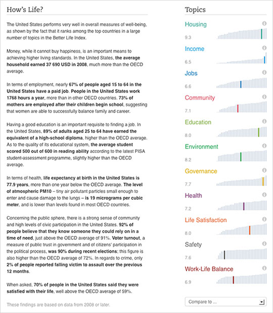
As a citizen of the United States, I was interested in seeing how our quality of life here compares to other OECD countries. By clicking on the flower that represents the United States, I was able to view this information as follows:
On the left, words are used to provide the narrative, while on the right a visual display makes it easy to see how the United States compares to the other countries at a glance. The series of small vertical bars next to each label (Housing, Income, etc.) represents in miniature the values associated with each country ranked from lowest to highest, with the highlighted bar representing the United States. These tiny graphs tell a rich story in little space. Consider Safety for a moment. Not only can we quickly see that the United States is near the bottom with a score of 7.6 out of 10, but that most countries score within a narrow range, with two significant exceptions represented by the lowest bars on the left. Scanning the various measures, I quickly spot that our highest score relative to the other countries is Income (ranked second), but the score of 6.5 is much lower than the highest country. By hovering over the tallest bar a pop-up display tells me that Luxembourg leads the pack with a perfect Income score of 10.
My next question was “How do we compare to Luxembourg overall?” By selecting Luxembourg from the “Compare to…” drop-down list below the charts I was able to make this comparison with ease using the view below with Luxembourg’s bars highlighted but dimmer than those of the United States.
If governance and education in Luxembourg scored more highly, I might be tempted to move.
Much more information about the United States appears on this screen, which I haven’t shown you, including links to related news stories and separate sections of detail about each measure, both in words and charts, those below:
I’ll show just one more aspect of this rich story, then leave it to you to enjoy and learn from it on your own.
One of the key purposes of this infographic is to let us assign weights to the various measures of a better life to fit our own preferences and then see which countries offer the life that we seek. I weighted the measure arbitrarily and was shown the following view:
Weights are assigned by selecting from one to five dots to the right of each measure in the “Create Your Better Life Index.” Based on the weights that I assigned, the flower visualization now shows each country’s correlation to my preferences based on the vertical position of each (higher is better). I can make the comparison even easier by switching the sort order from alphabetically to ranked by score from lowest to highest.
I hope you can see from this brief description that the designers of this infographic achieved a marriage of form and function, beauty and usability, that did not subsume one to the other in an unequal partnership as many infographics do. It was designed and developed by Moritz Stefaner, Jonas Leist and Timm Kekeritz. I don’t know these fellows and know almost nothing about their other work, so I cannot vouch for its merits, but this one example speaks highly of their abilities and their respect for information. If you check on the background of Moritz Stefaner, you’ll find that he has a B.S. in Cognitive Science and an M.A. in Interface Design. His background provides an understanding of the human brain, which clearly directs him to display data in ways that our eyes can perceive and brains can comprehend with ease, speed, and accuracy. The other designers also have backgrounds that make them sensitive to issues of usability. They didn’t just make an infographic that was pretty and provided a little information in a semi-effective way. They could have made the flower petals spin around, but they knew better. Infographics don’t need to shout to get noticed; a welcoming smile and the promise of intelligent conversation is all they need. These guys created a piece of work that is beautiful, engaging, simple, easy to use, easy to understand, accurate, and deeply informative.
Work of this type differs from day-to-day examples of data visualization in two ways:
- It requires a great deal of graphical design expertise
- It requires a great deal of time
The Better Life Index was not produced in an hour or even a day. I’m sure that a great many hours of work went into its design and development. Only special circumstances warrant this amount of work and the resulting expense. When a story is important to a large number of people, it makes sense to invest this level of time and effort. Most uses of data visualization, however, feature information and insights that are important to relatively few people. We can’t afford several days of effort to produce them. We need skills and tools to produce them quickly and easily. We want them to be well designed—pleasing to the eye—but not necessarily beautiful.
Take care,

June 29th, 2011
I was recently asked my opinion of David McCandless’ chart “The Billion Pound-O-Gram,” pictured below.
The person who asked the question was impressed with this chart the first time he saw it. For this reason, he thought that I might find it an effective exception to McCandless’ other work. I do not.
This chart originally appeared in the Guardian on November 7, 2009. It was framed by the following explanation:
Huge sums of money are being bandied about and no-one knows what they are. It’s time to put them into perspective.
289 billion spent on this. 400 billion spent on that. When money reaches this level it literally becomes mind-boggling.
Yet these figures are regularly issued by the government – and the media – as if they are self-evident facts that everyone understands.
Frustrated by this, I created The Billion Pound-O-Gram.
I’ve mixed up of 2008/09 figures from the Treasury and the Guardian. Visualising the numbers like this puts them in visual context, making them easier to relate to.
I was pretty shocked by the size of the UK budget deficit – essentially the country’s overdraft. It’s more than an entire year’s worth of income tax.
A second chart appeared following this explanation to illustrate how the “top five ideas for plugging the deficit” offered by political parties in the UK might reduce it. To sum up, the story is that the UK’s budget deficit is really big, which McCandless tells by comparing it with other amounts of money that are apparently familiar to Guardian readers. The question that concerns us here is, “Does this chart tell the story effectively?” Does it put the budget deficit into perspective in a way that doesn’t boggle the mind as McCandless suggests? This is journalism, so the objective is to inform, to help readers clearly understand the size of the deficit.
By using rectangles of varying sizes arranged as a treemap of sorts, McCandless forces us to perform a perceptual task that we can’t do well (that is, area comparisons). This is a bad choice when he could have used a bar graph instead and allowed us to compare the lengths of bars that share a common baseline, which we can do exceptionally well. Furthermore, his arrangement of the rectangles is arbitrary—not based on category or on the sizes of values—which compounds the difficulty.
To better understand what I’m saying, try to answer the following questions without reading the numbers that appear in the rectangles:
- Which represents a larger amount: Mortgage Lending 2007 or NHS?
- How much greater is Mortgage Lending 2007 than State Pensions?
- Does State Pensions compared with Tesco Revenue look like the difference between 62 and 59, or much greater?
- Which is bigger: Income Support or Police?
You might argue that these comparisons aren’t critical to the story, which is primarily about the budget deficit. If we concern ourselves only with comparing the deficit with other values, nothing about the chart’s design makes this easy, even when items are adjacent to one another. For instance, try answering the following questions:
- How much greater is the deficit than Africa’s entire debt to Western nations, which appears immediately below it? (And don’t cheat by reading the numbers.)
- How much greater is “Bailout: Asset Purchasing and Lending” than the deficit?
- How does Income Tax compare to the deficit?
Without reading the numbers, you’re forced to make wild guesses, which are considerably different from the truth, which could have been presented clearly.
All of these comparisons are incredibly simple to make using the bar graph below. Take a minute to notice how easy it is to see the relationships between these values from largest to smallest and to compare them. Notice especially how easy it is to compare each of the values with the budget deficit, which appears as the vertical black reference line.
In the bar graph, I stuck with the colors that McCandless chose to make it easy to compare his chart with mine, except that I tweaked a few colors a bit to resolve minor problems. In McCandless’ chart, some colors stand out more than others, but they should be equal in salience unless there’s a reason to feature some items over others. Also, for some unknown reason McCandless sometimes altered a single color from rectangle to rectangle, which serves no purposes and creates potential confusion. For example, notice that some of the green rectangles are lighter than others, yet they all represent “Earning.”
I can’t imagine anyone seriously arguing that McCandless’ chart communicates this information as well as the alternative above, but is his chart more engaging? Some folks might find it more engaging purely on the level of entertainment, but not in a way that encourages or supports meaningful consideration of the information, resulting in optimal understanding. Journalism should tell the story truthfully and clearly.
Take care,

June 22nd, 2011
The following ad on Craig’s List illustrates a problem that I’ve been writing about for the last few years: confusion about data visualization and the arts. The title of the position is “Art Director – Data Visualization.” Here’s the ad in full.
Job Description:
We’re looking for an Art Director with 5+ years of relevant design experience and a portfolio that demonstrates conceptual thinking and the ability to deliver unique, creative solutions for complex, data stories. The applicant should push the limits of what creativity and storytelling mean. Their work should not only display analytics and metrics, but also assist users/readers in understanding macro and micro trends in the education arena, both broadly and on a student level. Utilizing information design, data visualization, relationship mapping and statistics, the applicant should apply all of those skills to create compelling infographics and dynamic dashboards to make data more digestible and more human.
Responsibilities of the Art Director:
- The applicant should employ a user-centered design process and be equally comfortable working independently and alongside other design team members and developers.
- S/he creatively conceptualizes ideas that may require extensive research in the field of education (previous experience in education a plus, but not required).
- The applicant needs to demonstrate a solid understanding of where visual design, interaction design, information architecture and technology come together to create smart, compelling and usable experiences across channels and devices.
Requirements of Art Director:
- Candidates must have an outstanding online portfolio.
- Must have a well maintained sketchbook for in-person presentation.
- Passion for design and the evolution of the interactive user experience.
- Solid understanding of design principles and how they apply to the interactive space.
- 5+ years of experience in design and art production. Design for mobile applications is a plus.
- Solid typography, iconography, effective storytelling and an understanding of color theory, as well as meticulous attention to detail.
- Excellent knowledge of prevailing interface design tools, including Photoshop, InDesign, Illustrator, Flash and basic knowledge of HTML/CSS.
- Experience in creating comprehensive wireframes, sketches, UI and final visual design.
- Ability to produce great work in short timeframes, manage time efficiently while multi-tasking across different projects and clients.
- Ability to communicate conceptual ideas and design rationale to other members of the design, development and client teams.
- Comfortable taking specific direction as well as working independently with general guidance.
- Experience working in a corporate environment is essential.
Notice the complete lack of requirements for training or experience in data visualization, data analysis, statistics, cognitive science, human factors, communication, or education. Here we have an organization that deals with education—something vitally important—that has been seduced into thinking that training in graphic arts is what’s required to communicate the important truths that live in their data.
Their ad probably doesn’t require appropriate expertise in part because they seem to lack a clear sense of purpose. It contains key words such as creativity, storytelling, analytics, metrics, infographics, and dashboards, but they seem little more than shallow buzzwords, rather than a clearly understood set of objectives. The clearest they come to declaring a purpose is contained in the last few words of the job description: “to make data more digestible and more human.” Digestible for what purpose? More human in what sense? Who will use the information? What will they do with it? It is only when they know the answers to these questions that they’ll be able to define the job and later measure the results.
I’ve worked with many education-related organizations over the last few years. I have a fairly good sense of the ways that they can better understand and communicate data to support their efforts. It isn’t likely that this ad will find someone who will do the job well. They’re looking for the wrong person because they’re confused. And why are they confused? In part because of the hype that surrounds data visualization today, including that which presents data art as data visualization. Data art (artistic images that are in some way based on data) and data visualization (displays of data that are meant to inform) can both be useful, but for different purposes. The hype and its proponents, including many so-called experts in data visualization, omit this distinction. When organizations that are doing important work, such as preparing students for the world, are influenced in ways that produce job descriptions like this, we can’t ignore the problem.
Take care,

Comments Off on Employment Opportunity: Art Director – Data Visualization
June 21st, 2011
The series of interactive data visualizations that have appeared on GE’s website over the last two years has provided a growing pool of silly examples. They attempt to give the superficial impression that GE cares about data while in fact providing almost useless content. They look fun, but communicate little. As such, they suggest that GE does not in fact care about the information and has little respect for the intelligence and interests of its audience. This is a shame, because the stories contained in these data sets are important.
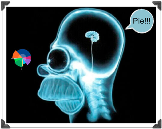
Most of the visualizations were developed by Ben Fry (including the colorful pie that Homer is drooling over above); someone who is able to design effective data visualizations, but shows no signs of this in the work that he’s done for GE. The latest visualization was designed by David McCandless, who has to my knowledge never produced an effective data visualization. In other words, GE has gone from bad to worse.
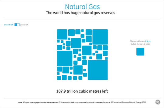
My friend and colleague Stacey Barr, a leading expert in performance measurement, recently sent me a link to GE’s new natural gas visualization, designed by McCandless, along with these words:
I get these emails from Information is Beautiful, and while yes they are beautiful, I often struggle to interpret them. Have you seen them? Would you agree (or do I need remedial training in how to read graphs and diagrams)?
Take a look for yourself to see if you share Stacey’s perspective.
The only things you can’t see here that are available in the original visualization on GE’s website are the names of the countries (one per square) that appear only as you hover over them. What we see here looks like an oddly designed version of a treemap, with only one dimension of data (the relative sizes of the squares, which in this case represent the amounts of natural gas left per country) rather than two dimensions (using varying color intensities as well to display a second set of values). Unlike a true treemap, however, the squares do not fill the space, which raises the question: “What do the white spaces mean?”
If you’re like me, you turned to the legend in the upper left corner to learn the meaning of the white spaces. I interpreted the legend to mean that the blue squares represent amount of natural gas and the white spaces represent years of natural gas left. What followed, of course, was complete confusion. Only after clicking on everything in sight did I eventually discover that what I assumed was a legend is in fact a unique control for switching between quantity and years. The blue and white colors of the control, though they match the colors of the chart, mean nothing. The white spaces in the visualization are also meaningless.
Unless you enjoy hovering over individual squares one at a time and trying to compare their sizes to one another—something the human brain can’t do well—this entire display reveals only a single fact: The world currently uses 2.6 trillion cubic meters of natural gas a year and we only have 187.9 trillion left. Words and numbers tell this story; the graphic is little more than decoration.
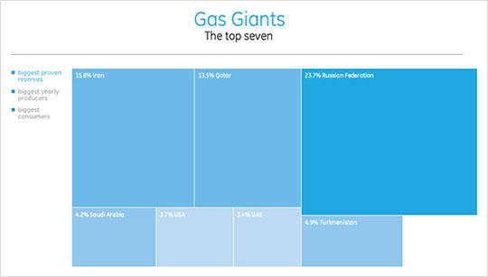
McCandless’ design also provides access to other related views. Here’s the next:
Now, rather than squares with rounded corners and mysterious spaces in between, we have seven rectangles with straight corners, without white space, except for the odd section in the lower right corner. It’s looks as if McCandless’ calculations didn’t work to fill the space, leaving a bit left over.
Why not use a graph that actually makes it possible to interpret and compare the values without reading the text? The same values appear in the bar graph below, which I quickly constructed in Excel, but now we don’t need to read the text to determine or compare the values.
Are McCandless’ big blue rectangles, which vary in overall area (width times height) more beautiful than the smaller blue rectangles in the bar graph that vary in length alone? Actually, they’re not, but even if they were, would the additional beauty justify our reduced ability to read the graphic? Certainly not for anyone who cares about natural gas reserves.
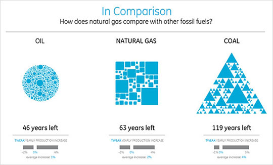
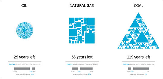
The final view reveals the following:
Before anything else, notice where your eyes are primarily drawn. Most likely to the blue graphics. Unfortunately, these graphics, despite their visual complexity, are almost entirely without meaning and can only be compared in the roughest of ways. The fact that oil, natural gas, and coal have been displayed in different ways (a circle, square, and a triangle) makes comparisons especially difficult.
This visualization includes some interactivity, letting us increase or decrease each source of energy’s annual amount of production to see how it alters the number of years that resource will remain. Here, I’ve increased the production of oil, which decreased the size of the blue circle.
Unfortunately, because the graphics can’t be meaningfully deciphered or compared, the only useful piece of information that we can get from this is the number of years left, which is presented as text.
How would you respond to Stacey’s questions? Are these visualizations of natural gas and other sources of energy easy to interpret? Do they do a good job of telling the story of depleting resources? Do they suggest that GE or David McCandless actually care about this information? Do GE or McCandless respect our intelligence?
I’ll leave the answers to you. You already know what I think.
Take care,

P.S. Why such passion?
Some of my colleagues in the field of data visualization, especially those who work predominantly in academia, don’t fully share my strong reactions to poorly designed data visualizations. I’ve spent some time wondering why I feel more strongly about this than they do, despite the fact that we base our work on the same evidence-based principles. One could argue that I’m by nature more reactive, more apt to raise the banner of battle in the face of harmful practices. There might be some truth in this. Despite my penchant for speaking out against perceived wrong, upon reflection, I’ve come to think that my strong opposition to harmful data visualization practices compared to the greater tolerance of my academic colleagues stems from the different worlds in which we live and work.
Most of my time is spent working with people who use data visualization to support decision making in their organizations. They don’t live in the realm of theory but in a daily struggle to squeeze real value from their data. In many cases, their professional success or failure is measured by the degree to which they are able to find, understand, and then tell the important stories that live in their data. I watch them labor to exhaustion with poor data visualization tools or delight in tools that extend their reach. I applaud their deep desire to solve real problems in the world through the use of data. I empathize when they report the frustration that they feel as they struggle to show their organizations a better way, hindered by horrible examples of data visualization that have captured the imagination and set the expectations of those in charge (for example, a CEO who loves his pie charts and dashboard gauges). In this world, the quality of data visualization—the culture that supports or thwarts it, the skills that extend or limit it, and the tools that support or undermine it—really matters.
Because this is the reality that I see almost everyday, dispassion would be heartless. This isn’t just a job for me; it’s a mission. There are certainly more important matters in the world, but this is one that I can do something about.
P.S.S. A second opinion
My wife, Jayne, is a neuropsychologist. She diagnoses and treats brain disorders and injuries. Other than a shared interest in aspects of the brain, our professional lives don’t overlap. I asked Jayne to read this blog post to see how someone outside the field of data visualization would respond to GE’s natural gas visualizations and my critique of their merits.
As Jayne began to read my review, she soon reached the place where I wrote that I’ve never seen an effective data visualization by McCandless and sighed. Her thoughts were, “Here he goes again,” fearing that my words might set off another firestorm of angry responses. Then she continued reading, and her attitude changed. Here’s what she said about the natural gas visualizations after finishing:
They make no sense whatsoever. I actually found myself getting angry as I reviewed them—primarily because it seems like a deliberate attempt on GE’s part to deceive—to make us think they care about an issue by posting pretty visualizations that, in reality, say nothing. GE and David McCandless should be ashamed! After reviewing these visualizations, it seems clear that GE doesn’t really care about the issue, they just want us to think that they do.
You might be tempted to interpret Jayne’s comments merely as a wife supporting her husband. If you knew her, however, you wouldn’t make this mistake. She would have made no bones about disagreeing with me. You might not share her opinion, but you shouldn’t dismiss it.
She asked me: “How can people defend these visualizations? Why would they do so?” These are questions that I can’t answer. I’m just as puzzled as she is.
|


