| |
|

|
Thanks for taking the time to read my thoughts about Visual Business
Intelligence. This blog provides me (and others on occasion) with a venue for ideas and opinions
that are either too urgent to wait for a full-blown article or too
limited in length, scope, or development to require the larger venue.
For a selection of articles, white papers, and books, please visit
my library.

|
| |
June 16th, 2011
I’ve often said that most large BI vendors support data analytics poorly—especially data visualization. While it’s true that the big guys find it difficult to change course quickly and that most are mired in an old paradigm (technology focused and engineering oriented, rather than design focused and people oriented), which doesn’t support what’s needed for data sensemaking, this doesn’t mean that a big BI company can’t overcome these obstacles and succeed as an analytics vendor. On the other hand, while it’s true that small BI companies are usually more agile, this doesn’t mean that most of them are doing good work. Agility gets you nowhere if you don’t know what you’re doing or where you’re going; it just gets you nowhere faster.
This has been on my mind today, because in the last week I’ve received product briefings from two small data visualization vendors, and these briefings underscored how important it is to start with the right goals, skills, and perspectives if you hope to get somewhere worthwhile. One vendor took advantage of its agility to build something worthwhile; the other wasted the opportunity because it lacked a clear vision and necessary expertise. The two vendors are iQ4bis and Grapheur. (Since this was published, iQ4bis changed its name to Halo Business Intelligence.)
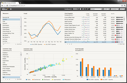
I quickly learned that these two vendors have approached their work from very different perspectives, producing significantly different results. iQ4bis is trying to serve the basic reporting and analysis needs of people whose data is hosted by Microsoft Sharepoint and SQL Server, who are not expert data analysts, and who don’t need to do anything fancy. For this reason, the product is intentionally limited in functionality. Their product is better than most of their competition because they began development with a firm commitment to data visualization best practices. Though fairly basic, what it does it does well. Their commitment to best practices comes through in the design of the charts and user interface (see the sample screen below). Improvements could certainly be made, but fundamentally the product seems quite sound, which cannot be said about many.
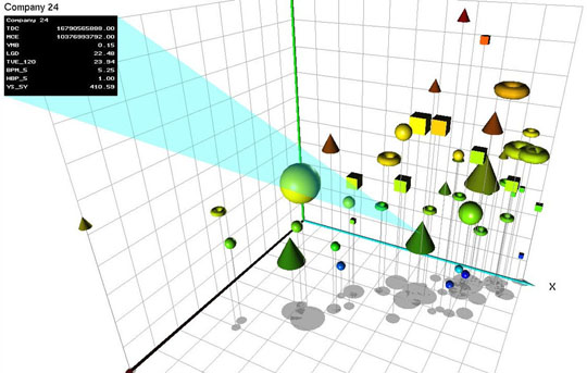
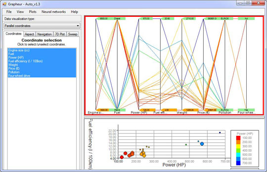
In contrast, Grapheur doesn’t exhibit a clear sense what it’s trying to do or who it’s trying to support. According to the user manual, it’s “intended for business users and decision makers.” During the product briefing, however, when I questioned why the software made it so easy to make bad choices, I was told that only expert analysts would use Grapheur, therefore it wasn’t necessary to prevent people from making mistakes that an expert would know to avoid. Only people who are well trained in visual data analysis would even attempt using this software because it includes several uncommon and complex visualizations, including parallel coordinates, and flirts with statistical functions like K-means clustering. However, even a expert analyst would not be drawn to this software because care wasn’t taken in its design. To illustrate this point, here are two sample screenshots from the product’s website:
3-D bubble charts are exclusively the realm of specialists who are highly trained in the recognition of 3-D patterns, but I doubt that they would find floating donuts all that useful.
To me this looks like something my cat Tuna once spit up, although a bit more colorful. To the uninitiated, some data visualizations can look absurd yet work effectively for those who understand them, but this isn’t the case here. This is meaningless.
The two developers of this software, both computer science professors at the University of Trento in Italy, have also written a book titled Reactive Business Intelligence: From Data to Models to Insight. What is “reactive business intelligence”? They define it as follows:
Reactive Business Intelligence (RBI) is about integrating data mining, modeling and interactive visualization, into an end-to-end discovery and continuous innovation process powered by human and automated learning.
Wow, that sounds impressive. Based on reading the user manual, however, this product doesn’t support true data mining at all and isn’t really designed for statistical modeling. How it enables a “continuous innovation process powered by human and automated learning”, I haven’t a clue.
The brevity of the 59-page user manual suggests that this product is incredibly easy to learn and use. Not so. Let me illustrate. Parallel coordinates are not familiar to most “business users and decision makers.” If you’ve run across them, you know that at first glance they appear intimidating. Using them well requires a great deal of training and experience. You would expect a user manual to take some time to introduce them. Here is the entire parallel coordinates section:
Now select the visualization type parallel coordinates and make sure that the corresponding panel to the right is selected.
In the parallel coordinates visualization, the different columns are represented by equally spaced parallel vertical lines. Each row in the data matrix is represented by a polyline that intersects the vertical line at the specific column values for that row. Each line is color coded according to the cell value in the column that was chosen for color-coding using the global aspect panel.
They don’t even explain what you would use parallel coordinates to do.
One apparent explanation for the misguided nature of this product is the fact that neither of its creators appears to have any experience or training in either business intelligence or information visualization. What is crystal clear is the fact that neither has studied human perception or cognition, which are two prerequisites for the development of useful data visualization software.
Do we need another dysfunctional data visualization product? Hardly. Do we need another confusing industry acronym (RBI)? God forbid.
Some of the best new data visualization products are coming from relatively small, young, and exceedingly agile software vendors that have (1) taken the time to understand what people must do with data to derive value from it, (2) developed a clear set of objectives to address this need, and (3) acquired the design and development skills required to create software that effectively supports these objectives. The fact that a BI vendor is small and agile, however, doesn’t guarantee good data visualization software. Nor does the fact that a BI vendor is huge guarantee bad data visualization software.
Those of us who rely on vendors to provide good tools for data sensemaking don’t care whether they’re big or small; we just want to do our work as well as possible. Vendors that help us do this will gain our trust. Vendors that make hollow claims are already rapidly losing it.
Take care,

June 14th, 2011
I’ve written in the past about the fine data visualization products of Panopticon—one of the few commercial software vendors that understands data visualization. Having not seen the latest releases of their products for a while, I recently contacted the folks at Panopticon to request a product briefing. In addition to learning about the latest features during the briefing, I discovered that Panopticon experienced a tough couple of years since I’d talked with them last, which was a direct result of the recent financial meltdown. Unfortunately, most of Panopticon’s customers were financial corporations, so the meltdown hit them especially hard. I mention this only to help you fully appreciate what they’ve managed to accomplish in the last two years, despite a reduced workforce.
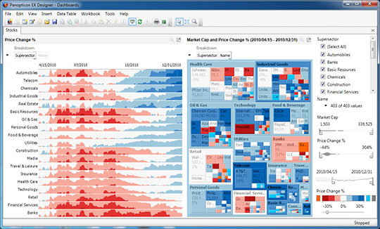
In its early years, Panopticon specialized exclusively in treemap visualizations—beautifully designed and comprehensively functional—which could be updated using real-time streaming data. When I looked at their products a little over two years ago, they had expanded their repertoire of visualizations to include line graphs, bar graphs, and an innovative way to compare a large number of time series on a single screen by merging line graphs and heat maps to form a new visualization called the horizon graph. I wrote about the horizon graph back in June of 2008 in a newsletter article titled “Time On the Horizon.”
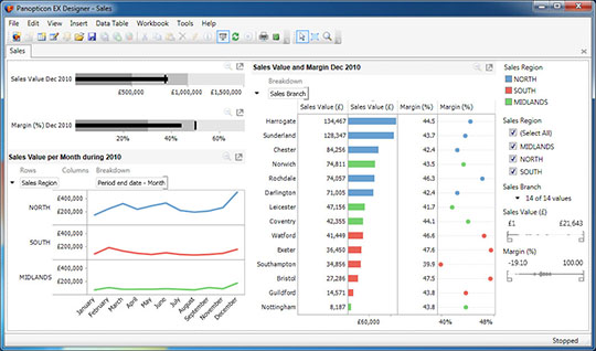
During the past two years they’ve added almost every other type of visualization to their library that’s typically useful for quantitative analysis and performance monitoring, including my bullet graphs and Tufte’s sparklines. Many charts can be combined on a single screen with exceptional layout flexibility, and they can all work together, for instance, through the use of dynamic filters that affect all charts simultaneously. And finally, they’ve added the ability to display small multiples in the form of visual crosstabs. The result is a fine data visualization toolset for building powerful analytical applications and performance monitoring dashboards, developed by a lean team of talented designers and developers who have their priorities straight, rooted firmly in best practices. The toolset still lacks areas of functionality that would be useful, but its moving in the right direction at a rapid pace.
The following example combines a treemap in the middle, which displays market cap and price change information for a large set of stocks by sector, with a horizon graph on the left, which displays nine months worth of daily price change values per sector. Filter controls appear on the right for sectors (a categorical variable filtered using check boxes), market cap and price change percentage (two quantitative variables filtered using slider controls), and date (filtered using a date slider control).
Notice that the slider controls themselves provide information. The quantitative filter controls displays something that looks a bit like a histogram along the scale to show the frequency distribution of values in the data set, and the date filter control includes a sparkline to provide a simple view of how stock price changes went up and down through time.
This next example combines bullet graphs, line graphs, a bar graph, and a dot plot to display sales information by region:
 Panopticon’s products are not designed for exploratory data analysis. Business users wouldn’t explore data with them in an open-ended manner without some up-front development work done first by someone who has developed some skill in using the tool. The creation and layout of visualizations on the screen requires too much interaction with dialog boxes—each filled with many choices—to support the fast and fluid interaction with data that’s needed for exploratory data analysis. Instead, these products are primarily designed as toolsets that developers can easily learn to use for building specialized reporting systems, performance monitoring dashboards, and custom analytical applications. (If you’re unclear about the distinction between exploratory data analysis tools and custom analytical applications, I wrote an article in October of 2009, titled “Fundamental Differences in Analytical Tools” that explained the differences and how each would be used.)
Panopticon’s products don’t do everything, but what they do, they do well, as I hope you can see.
Take care,

May 17th, 2011
This blog entry was written by Bryan Pierce of Perceptual Edge.
In March of this year, Stephen wrote a blog entry titled, “Old BI and the Challenge of Analytics.” In it, he mentioned that he recently had lunch with John Armitage of SAP. John is a designer with years of experience in the field of usability, who follows Stephen’s work and has been tasked with improving the user experience of SAP’s information visualization offerings. Stephen has railed against SAP’s data visualization capabilities for years because they consistently push silly and ineffective graphs instead of implementing visualizations that are designed to communicate. Nonetheless, after their conversation, Stephen left the lunch feeling hopeful that with John’s influence SAP might finally start moving toward greater effectiveness. Stephen’s glimmer of hope was recently rattled, however, when a reader sent him the following slide, which is being used to promote SAP’s newest update to their BI software suite, BusinessObjects 4.0.
 As you can see, SAP’s idea of an “engaging new user experience” includes a 3-D pie chart that looks like an abstract Jello sculpture. Apparently John wasn’t given a chance to preview this slide, nor was he granted any influence over the charting capabilities of BusinessObjects 4.0. To be fair, however, John only recently assumed his new role, so we ought to give him more time before losing hope. We’re rooting for you John. Your job certainly isn’t going to be easy.
-Bryan
April 15th, 2011
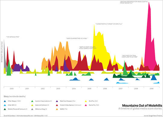
While catching up on the latest data visualization news yesterday, I ran across a blog post by Mario Bonardo of Teradata Corporation. Bonardo’s account of a recent Teradata event in Europe caused me painful dismay. He praised a presentation by infographic artist David McCandless, suggesting that what McCandless does is precisely what needs to be happening in the realm of analytics. Bonardo wrote: “Being asked about the differences between traditional information graphics and his own ones, McCandless said he is aiming to remove as much irrelevant information as possible to get to the core of things, discover new correlations and challenge traditional views.” My dismay does not stem from McCandless’ words, but from his actual practices, which don’t deliver what he claims and certainly don’t point the way to a productive future for analytics. Here are two typical examples of McCandless’ work from his website:
 [Notice how hard you must work to figure out what the various mountain ranges represent. Don’t bother actually trying to determine or compare the values, because it can’t be done.]
[I bet that any one of your reading this can think of a better way to display these values for easier, more accurate comparisons.]
You can also read my critique and redesign of a well-known visualization by McCandless—”Colours in Cultures”—in my March/April/May 2010 Visual Business Intelligence Newsletter article titled “Our Irresistible Fascination with All Things Circular.”
Stripping away the irrelevant—McCandless’ stated goal—can only be done once you’ve found a way to display the relevant. Too many of his visualizations display information in ways that hide much that’s relevant and essential, leaving little of value for the viewer to see. McCandless rarely chooses forms of display that our eyes and brains can perceive with ease and precision. He selects what will appeal superficially to the viewer (lots of circles, swirls, and vibrant colors), not what will most effectively express what’s essential and meaningful. His displays rarely draw viewers into the data in a thoughtful way, but entertain in a way that delivers a simple message, which is often anemic when compared to the richer, subtler, and more complex stories that live in the data.
McCandless is a creator of infographics: combinations of words and graphics that are designed to communicate specific messages. On those rare occasions when his infographics lend themselves to data exploration and analysis, they do so in limited and awkward ways, asking viewers to perform data surgery with blunt instruments. Infographics of this type attempt to tell a story. In McCandless’ case, the stories that they usually tell, if communicated in words alone, would require only a short sentence or two. They make a simple statement in a way that looks lighthearted and fun. As such, they invite viewers to accept the message superficially, not to explore or contemplate deeply. This is not the true realm of analytics.
According to Bonardo, the other members of the panel in which McCandless participated at Teradata’s event made statements in support of his approach, but their comments make me wonder—assuming that Bonardo represents their intentions accurately—if they’re actually familiar with his work.
Stephen Brobst of Teradata said: “Whereas traditional reporting tools were providing answers to pre-defined questions, todays analytical environments offer opportunities to think out of the box and help to find new questions to develop cutting edge business strategies.” Most of today’s so-called analytical environments fail to do this, with only a few exceptions. I’ve seen no evidence that McCandless’ work attempts to address this opportunity at all.
Oliver Ratzenberger of eBay said: “We offer specific visualization classes for our data analysts. We really want them to play with data so that they may actually find new nuggets.” I know this to be true, because I’ve taught information visualization courses privately for teams of analysts at eBay. Trust me when I say that I did not promote the practices of McCandless, which don’t support the rich exploration of data that eBay needs.
Daniel Rodriguez Sierra from Telefonica said: “Human beings are very good at recognizing patterns. The challenge is to display data in a way that it allows human beings to make full use of this natural strength.” How true, but McCandless’ work usually disregards human perceptual and cognitive abilities.
There is a world of difference between the simplistic (that is, overly simplified), artistic infographics of McCandless and the engaging, thoughtful interaction with data that analytics requires. If the business intelligence (BI) industry is now choosing to swap its primitive, dysfunctional charts for the artistic approach of McCandless, we’ll be in for several more years of BI failure. To date, Teradata has partnered with some good data visualization vendors (for example, Tableau) and some embarrassingly bad data visualization vendors (for example, FYI Corporation, which is now defunct, and Bis2). Featuring McCandless’ work does not bode well for the direction Teradata is heading.
In closing these remarks, I want to challenge the merits of the theme that Teradata chose for this event: “Innovate to Differentiate.” Innovation is useful when it leads to a better way of doing things, not just a different way. Innovation in and of itself is highly overrated. There’s been relatively little real innovation in BI for many years. Much of what’s been marketed as innovation is old news repackaged, in the hope that no one will notice. Rather than trying to innovate in the realm of analytics without the required expertise, it’s time for BI companies, consultants, and thought leaders to first learn the basics of data sensemaking and communication—analytics—and only afterwards to try their hands at creating something new.
Take care,

March 30th, 2011
I’ve just returned from a week in Pamplona, Spain. No, I didn’t run with the bulls, but I did something equally exciting: I deliberated with the judges at Malofiej 19, an international competition and summit dedicated to journalistic infographics. I and 9 other judges worked hard for 3½ days to review over 1,000 print entries and 300 online entries, resulting in 7 gold medals, plus around 25 silver and 70 bronze medals for infographic excellence.
(Pictured from left to right: Ryan Sparrow of Ball State University, Stephen Few of Perceptual Edge, Joe Ward of the New York Times, and Matt Perry of the San Diego Union Tribune.)
I learned a great deal during the week and made several new friends. I was deeply impressed with several extraordinary examples of infographics that demonstrated visual eloquence both through superb storytelling and graphical design. Infographics can be extraordinarily powerful when used appropriately (that is, when pictures work better than words) and well designed by combining beauty (appealing and engaging form) and usability (spot on functionality), without compromising either.
This year’s top prizes:
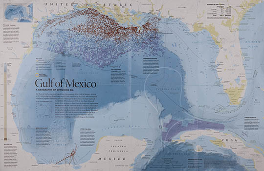
Best of Show (print): National Geographic, for “Gulf of Mexico: A Geography of Offshore Oil,” the story of oil drilling and drilling rights, primarily along the coast of Louisiana.
Best of Show (online): New York Times, for its demonstration of Mariano Rivera’s unique pitching style, titled “How Mariano Rivera Dominates Hitters.” Take the time to watch this amazing combination of narration and motion graphics.
Best Map: National Geographic, for “Rivers of the World,” a gorgeous map of the world’s rivers and lakes.
These infographics are exquisite examples of how well words and pictures can be combined to inform clearly and beautifully to engage and enlighten.
In addition to working as a judge, I also spoke at the summit. The title of my presentation was “Infographics and the Brain: Designing Graphics to Inform.”
Take care,

|


