Thanks for taking the time to read my thoughts about Visual Business Intelligence. This blog provides me (and others on occasion) with a venue for ideas and opinions that are either too urgent to wait for a full-blown article or too limited in length, scope, or development to require the larger venue. For a selection of articles, white papers, and books, please visit my library.


Researchers — Share Your Data!

November 13th, 2017

One of the most popular shows in the early years of television was hosted by Art Linkletter, which included a segment called “Kids say the darndest things.” Linkletter would have conversations with young children who could be counted on to say things that adults found entertaining. I’ve experienced my own version of this in recent years that could be described as “Researchers say the darndest things.” My conversations with the authors of data visualization research studies have often featured shocking statements that would be amusing if they weren’t so potentially harmful.

The most recent example occurred in email correspondence with the lead author of a study titled “Evaluating the Impact of Binning 2D Scalar Fields.” I’m currently working on a newsletter article about binned versus continuous color scales in data visualization, so this paper interested me. After reading the paper, however, I had a few questions, so I contacted the author. One of my requests was, “I would like to see the full data set that you collected during the experiment.” Here’s the response that I received from the paper’s author: “In psychology, we do not share data sets but the full analyses are available in the supplementary materials.” You can imagine my shock and dismay. Researchers say the darndest things!

Withholding the data that was collected in a research study—the data on which the published findings and claims were based—subverts the essential nature and goals of science. Published research studies should be accompanied by the data sets on which their findings were based—always. The data should be made readily available to anyone who is interested, just as “supplemental materials” are often made available.

Only good can result from sharing our research data. If we share our data, our results can be confirmed. If we share our data, errors in our work can be identified and corrected. If we share our data, science can progress.

Empirical research is based on data. We make observations, usually in the form of measurements, which serve as the data sets on which our findings are based. Only by reviewing our data can the validity of empirical research be confirmed or denied by the research community. Only by sharing our data can questions about our findings be pursued by those who are interested. Refusing to share our data is the antithesis of science.

The author’s claim that, “In psychology, we do not share our data” is false. Psychology researchers do not have a “Do not share your data” policy. I’m astounded that the author thought that I’d buy this absurd claim. What is true, however, is that, even though there is no policy that research data should not be shared, it usually isn’t. On many occasions this is not an overt act of omission, but a mere act of laziness. The data files that researchers use are often messy and they don’t want the bother of structuring and labeling those files in a manner that would make them useful if shared. On more than one occasion I have requested data files only to be told that it would take too much time to put them into a form that could be shared. This response always makes me wonder if the messiness of those files might have caused the researchers themselves to make errors during their analysis of the data. When I told a respected psychology researcher friend of mine about the “In psychology, we don’t share our data” response that I received from the study’s author, he told me, “In my experience, extreme protectiveness about data tends to correlate with work that is not stellar in quality.” I suspect that this is true.

If you can’t make your research data available, either on some public medium (e.g., accessible as a download from a web page) or upon request, you’d better have a really good excuse. You could try the old standby “My dog ate it,” but it probably won’t work any better than it did when you were in elementary school. If your excuse is, “After doing my analysis and writing my paper, I somehow misplaced the data,” the powers that be (e.g., your university or the publication that made your study public) should respond by saying, “Do it over.”

If I could set the standards for research, I would require that the data be examined during the peer review process. It isn’t necessary that every reviewer examine the data, but at least one who is qualified to detect errors should. Among other potential problems, calculations performed on the data should be checked and it should be determined if statistics have been properly used. Checking the data should be fundamental to the peer review process. If this were done, some of the poor research that wastes our time each year with shoddy work and false claims would remain unpublished. I realize that this would complicate the process. Well, guess what, good research takes time and effort. Doing it well is hard work.

If you want to keep your data private, then do the world a favor and keep your research private as well. It isn’t valid research unless your findings are subject to review, and your findings cannot be fully reviewed without the data.

Take care,

Design with a Purpose in Mind

October 24th, 2017

The merits of something’s design cannot be determined without first understanding the purpose for which it is used and the nature of those who will use it, including their abilities. When looking at the photo below, you no doubt see two poorly designed chairs. The seats are far too low and the backs are far too tall for comfort. Imagine sitting in one of these ill-proportioned chairs.

If these are chairs, they are poorly designed for all but humans of extremely odd proportions, but they are not chairs. Rather, they are kneelers, used for prayer. Here’s a more ornate example:

And here’s one that looks more like those that are typically found in churches:

Not only are we not able to evaluate the merits of something’s design without first understanding its use and users, we cannot design something ourselves without first understanding these things. This is definitely true of data visualizations. We must always begin the design process with questions such as these:

  • For whom is this data visualization being designed?
  • What is the audience’s experience/expertise in viewing data visualizations?
  • What knowledge should the audience acquire when viewing this data visualization?

The point that I’m making should be obvious to anyone who’s involved in data visualization. Sadly, it is not.

Data visualizations should not be designed on whim. Based on the knowledge derived so far from the science of data visualization, if you understand your purpose and audience completely, you can determine the ideal way to design a data visualization. You can only determine this ideal design, however, to the extent that you know the science of data visualization and have developed the skills necessary to apply it. Our knowledge of data visualization best practices will change and improve as the science advances, and when it does our designs will change as well. In the meantime, we should understand the science and apply the practices that it informs with skill. None of us do this perfectly—we make mistakes—but we should strive to do it better with each new attempt. Data visualization is a craft informed by science, not an art driven by creative whim.

Take care,

Eye-Tracking Nonsense from Tableau

October 9th, 2017

Don’t trust everything you read. Surely you know this already. What you might not know is that you should be especially wary when people call what they’ve written a “research study.” I was prompted to issue this warning by a June 29, 2017 entry in Tableau’s blog titled “Eye-tracking study: 5 key learnings for data designers everywhere”. The “study” was done at Tableau Conference 2016 by the Tableau Research and Design team in “real-time…with conference attendees.” If Tableau wishes to call this research, then I must qualify it as bad research. It produced no reliable or useful findings. Rather than a research study, it would be more appropriate to call this “someone having fun with an eye tracker.” (Note: I’m basing my critique of this study solely on the article that appears in Tableau’s blog. I could not find any other information about it and no contact information was provided in the article. I requested contact information by posting a comment in Tableau’s blog in response to the article, but my request was ignored.)

Research studies have a goal in mind—or at least they should. They attempt to learn something useful. According to the article, the goal of this study was to answer the question, “Can we predict where people look when exposed to a dashboard they’ve never seen before?” Furthermore, “Translated into a customer’s voice: how do I, as a data analyst, design visually compelling dashboards?” What is the point of tracking where people look when looking at so-called dashboards (i.e., in Tableau’s terms, any screen that exhibits multiple charts) that they haven’t seen before and have no actual interest in using? None. This is evidenced by the fact that none of the “5 key learnings” are reliable or useful for designing actual dashboards, unless you define a dashboard as an information display that people who have no obvious interest in the data look at once, for no particular purpose. Only attempts to visually compel people to examine and interact with information in ways that lead to useful understanding—that is, in ways that actually inform—are relevant to information designers. What were participants asked to do with the dashboard? According to the article,

We didn’t give participants a task for this Tableau Labs activity, but that doesn’t mean our participants were not goal-directed. Humans are “meaning-making” animals; we can’t stop ourselves from finding a purpose. Every person looking at one of these dashboards had a task, we just didn’t know what it was. Perhaps it was “look at all the crazy stuff people create with Tableau?!”

Despite the speculations above, we actually have a fairly good idea of the task that participants performed, which was to quickly get familiar with an unknown, never-seen-before display. Where someone’s eyes look when seeing a screen of information for the first time is not where their eyes will look when they looking at that screen to ingest and understand information. This is not how research studies are conducted. I shouldn’t have to say this. This is pseudo-science.

When participants at the conference were asked to look at so-called dashboards for the first time, which were not relevant to them, and to do so for an unknown purpose (or lack thereof), what did eye-tracking discover? Here’s a list of the “5 key learnings”:

  1. “(BIG) Numbers matter”
  2. “Repetition fatigue”
  3. “Humans like humans”
  4. “Guide by contrast”
  5. “Form is part of function”

(BIG) Numbers matter

The observations behind the claim that “BIG Numbers matter” was that people tend to look at huge numbers that stand alone on the screen. Actually, people tend to look at anything that is extraordinarily big, not just numbers. In a sea of small numbers, big numbers stand out. What this tells us is actually expressed separately as key learning number 4: “Guide by contrast.” In other words, things that look different from the norm catch our attention. This is not a key learning. This is well known. Here’s the example that appears in the article:

Big Numbers

Each “key learning” was illustrated in the article by a video. In all of the videos, sections of the screen that appear light and therefore visible, as opposed to darkened sections, were sections that received the attention—the lighter the section the more attention it received. The big numbers in this example appear at the top, but even though they appear in the most visually prominent portion of the screen, apparently, they did not garner more attention than the bar graphs that appear in the section below the numbers. If the attention-grabbing character of big numbers was revealed in this study, this particular screen does not provide clear evidence to illustrate this finding.

In response to this claim, we should be asking the question, “Is it useful to draw people’s attention to big numbers on a dashboard?” Typically, it is not, because a number by itself without context provides little information, certainly not enough to fulfill any actual tasks that people might use dashboards to perform. Nevertheless, the research team advises, “If you have an important number, make it big.” I would advise, if you have an important piece of information, express it in a way that not only catches your audience’s attention but does so in a way that is informative.

Repetition fatigue

Apparently, when people look at a dashboard that they’ve never seen before that isn’t relevant to them, and do so for no particular purpose, if the same type of chart appears multiple times, they get bored after they’ve examined the first chart. If you’re not actually trying to understand and use the information on the dashboard but merely scanning it for visual appeal, then yes, you probably won’t bother examining multiple charts that look the same. This isn’t how actual dashboards function, however. People look at dashboards, no matter how you define the term, to learn something, not just for visual entertainment. When you have a goal in mind when examining a dashboard, the kind of “repetition fatigue” that the researchers warn against probably does not come into play.

We should always select the form of display that best suits the data and its use. We should never arbitrarily switch to a different type of chart out of concern that people won’t look at more than one chart of a particular type. Doing so would render the dashboard less effective.

Here’s the example that appears in the article to feature this claim:

Repetition Fatigue

Even if I cared about this dashboard, I might not bother looking at more than one of these particular charts because, from what I can tell, none of them appear to be informative.

Humans like humans

Yes, people are attracted to people. Faces, in particular, grab our attention. According to the article, “if a human or human-like figure is present, it’ll get attention.” And what is the point of this key learning? Unless the human figure itself communicates data in an effective way, placing one on a dashboard adds no value. Also, if the point is to get someone to look at data when it needs attention, you cannot suddenly place human figures on the dashboard to achieve this effect.

Here’s the example that appears in the article:

People Like Humans

This study did not actually demonstrate this claim. It doesn’t indicate that people’s attention is necessarily drawn to human figures in particular. We know that people’s attention is drawn to faces, but this study might not have indicated anything more than the fact that an illustration of any recognizable physical form in the midst of an information display—something that looks quite different from the rest of the dashboard—catches people’s attention.

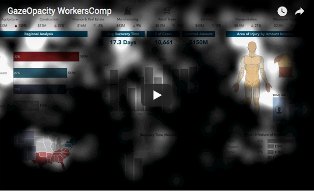
I’ve seen this particular screen of information before. It presents workers’ compensation information. The human figure functions as a heatmap to show where on the body injuries were occurring. The human figure wasn’t there to attract attention, it was there to convey information. It certainly wasn’t there because “humans like humans.”

Guide by contrast

We’ve known for ages that contrast—either the difference between the background and the foreground or making something appear differently than it usually does—grabs attention, if not overdone. This is not a key learning. Here’s how the finding is described in the article:

Areas of high visual contrast acted as guideposts throughout a dashboard. During the early viewing sequence, the eyes tended to jump from one high contrast element to the next. Almost like a kid’s dot-to-dot drawing, you can use high contrast elements to move visual attention around your dashboard. That being said, it’s notable that high contrast must be used judiciously. If used sparingly, high contrast elements will construct a logical path. Used abundantly, high contrast elements could create a messy and visually overwhelming dashboard.

And here’s the example that was shown to illustrate this:

Scanning Seqeuence

Although it wasn’t explained, I assume that this video displays the sequence of focal points that a single participant exhibited. It certainly does not show the particular sequence of glances that was exhibited by all participants. Even if the researchers explained how to interpret this video, it wouldn’t tell us how to use contrast to lead viewers’ eyes through a dashboard in a particular sequence. Discovering how to do this using contrast would indeed by a key learning.

Form is part of function

The researchers complete their list of learnings with a final bit of information that is well known. Yes, the form that we give an information display contributes to its functionality. Here are the insights that the researchers share with us:

All dashboards have a form (triangular, grid, columnar) and the eyes follow this form. This result was both surprising and not surprising at all. Humans are information seekers: when we look at something for the first time, we want to get information from it. So, we look directly at the information (and don’t look at areas with no information). What’s important to note is the design freedom this gives an author. You don’t need to conform to rules like “put anything important in the upper left hand corner.” Instead, you should be aware of the physical form of your dashboard and use your space accordingly.

Knowing that “form is a part of function” actually tells us the opposite of what the researchers claim. It does not grant us “design freedom” and encourage us to ignore well-known principles and practices of design. Quite the opposite. Understanding how form contributes to function directs us to design information displays in particular ways that are most effective. In other words, it constrains our design choices to those that work. Contrary to the researchers’ statement, placing something that’s always important in the upper left-corner of the dashboard, all else begin equal, is a good practice, for this is where people tend to look first. Ironically, if you review the first four eye-tracking videos that appear in the article, they seem to confirm this. Only the video pictured below is an exception, but this is because nothing whatsoever appears to the left of the centered title.

The example that was provided to illustrate this learning does not clarify it in the least.

Form as Function

The researchers were trying to be provocative, suggesting that we should ignore well-established findings of prior research. After all, how could research done in the past by dedicated scientists compete with this amazing eye-tracking study that was done at a Tableau conference?

The true key learning that we should take from this so-called study is what I led off with: “Don’t trust everything you read.” I know some talented researchers who work for Tableau. This study was not done by them. My guess is that it was done by the marketing department.

Take care,

Signature

Data Communicators – People Who Aren’t Interested and Don’t Care Are Not Your Audience

October 3rd, 2017

This week, I am enjoying the pleasure of my friend Alberto Cairo’s company. Alberto traveled to Portland, Oregon to speak for two events and I’m serving as innkeeper and chauffeur while he’s here. Last night an interesting topic arose over dinner. Several interesting topics, actually, but I’d like to share one in particular. Alberto and I both found ourselves bemoaning the assumption of too many data communicators that their audience isn’t interested in the data. This assumption leads to a great deal of poorly designed data displays.

The particular example that prompted our discussion was the assumption that people are unwilling to read brief instructions that explain how to interpret a chart. This assumption leads many data communicators to present data in ways that aren’t particularly informative out of concern that the better form of display would require a bit of instruction. What a travesty!

When we prepare data communications, we should almost always design them for people who are interested in the data. Dumbing the information down or adding entertaining effects that make the data difficult to interpret or comprehend is never justified.

Over the years I have had many debates with people who defend severe compromises in design effectiveness because they believe that their audience must, above and before all, be entertained. There is a place for entertainment. I incorporate a great deal of humor in my classes and lectures. I do so, however, in ways that don’t detract from the learning experience by compromising the content. Humor, used skillfully, can enhance the learning experience. Similarly, data can be displayed in visually engaging ways that enhance the degree to which the data informs, but this requires skill. Merely dressing up the data or adding meaningless and distracting visual effects requires no skill whatsoever, and it results in harm.

Personally, I have never assumed that my audience wasn’t interested in the data that I was presenting to them. I wouldn’t bother presenting data to people who weren’t interested and didn’t care. What would be the point? I match the content of my communications to the needs and interests of the audience. I don’t speak to audiences who lack needs and interests that I’m well-suited to address.

When we present information to people who are interested in it, we can focus on communicating as clearly, accurately, and fully as possible. If you have something to communicate that people care about, you are responsible for doing it well. If your audience isn’t interested in data that you’re communicating, perhaps you have the wrong audience.

Take care,

Signature

Data Is Not Beautiful

August 16th, 2017

Despite the rhetoric of recent years, data is neither beautiful nor ugly. Data is data; it merely describes what is and has no aesthetic dimension. The world that’s revealed in data can be breathtakingly beautiful or soul-crushingly ugly, but data itself is neither.

We can respond to data in ways that create beauty, justice, and wellbeing. We can do this, in part, both through data visualization and data art. Though data visualization and data art are constructed from the same raw materials (i.e., data), their methods differ. What does not differ, however, is their ultimate purpose to present or evoke meaning. When I visualize data, I do it to bring specific meanings to light or to make it possible for others to do that on their own. Similarly, when skilled data artists express data, they do it to evoke a meaningful experience. Even if the data artist’s meaning is less specific than mine as a data visualizer, the artist intends for the viewer to experience meaning and often emotion as well.

I appreciate good data art just as I appreciate good art of all types. What I cannot stomach is meaningless visual drivel that calls itself data art or, even worse, calls itself data visualization. I stridently object to the work of lazy, unskilled creators of meaningless, difficult to read, or misleading data displays. I’m referring to visualizations that fail to display data in ways that promote clear and true understanding. Many data visualizations that are labeled “beautiful” are anything but. Instead, they pander to the base interests of those who seek superficial, effortless pleasure rather than understanding, which always involves effort. There might be occasions when meaningless pleasure is useful, but not when data is being displayed. Data can potentially inform. We should never squander this potential.

Take care,

Signature