Two Highlights of IEEE’s 2015 VisWeek Conference
Each year IEEE’s VisWeek Conference features a few information visualization research papers that catch my interest. This year, two papers in particular stood out as useful and well done:
“Voyager: Exploratory Analysis via Faceted Browsing of Visualization Recommendations,” by Kanit Wongsuphasawat, Dominik Moritz, Anushka Anand, Jock Mackinlay, Bill Howe, and Jeffrey Heer
“Automatic Selection of Partitioning Variables of Small Multiple Displays,” by Anushka Anand and Justin Talbot
My recent book Signal: Understanding What Matters in a World of Noise teaches a comprehensive approach to visual exploratory data analysis (EDA). Its purpose is, in part, to encourage data sensemakers to examine their data both broadly and deeply before beginning to look for signals. The paper “Voyager: Exploratory Analysis via Faceted Browsing of Visualization Recommendations” addresses the observation that most data sensemakers, especially those who have not been trained in statistics, tend to explore data in narrow ways. As a result, they tend to miss many potential discoveries and to understand their data superficially, at best. Voyager is a visual EDA tool that the authors developed to test features that encourage and support broader data exploration. The tool includes a recommendations engine that does a good job of determining useful views of the data from many perspectives (i.e., faceted views), which it then automatically suggests to the user in an organized manner. Unlike misguided attempts to do this by a few commercial products that I’ve seen, I appreciate the fact that the auto-generated views of Voyager are 1) well chosen, rather than just a gallery of possible views, 2) organized in a manner that makes them easy and efficient to navigate, and 3) suggestive without being restrictive. Regarding the third point, the interface allows users to depart from the suggested views to pursue specific questions as they arise, and does so in a manner that isn’t confining. It also allows users to get back to the broader assortment of views with ease. This beautifully supports the perpetual need of data sensemakers to shift between high-level (summary) and low-level (detail) views with ease.
I’m particularly sensitive to the fact that good EDA tools support the user’s thinking process, making suggestions and doing much of the grunt work in a way that never takes control from the user and never subverts the thinking process. Good tools recognize that humans must do the thinking by augmenting the analytical process without becoming overbearing. The authors of this research seem to share my concern, which is no doubt because they actually understand the analytical process based on a great deal of thought and experience.
The second paper, “Automatic Selection of Partitioning Variables for Small Multiple Displays,” is akin to the first in that it identified a real need, addressed it thoughtfully, and supports data sensemakers with useful suggestions.
Small multiples provide a powerful means of displaying data that could not be effectively shown in a single graph. They enable rich comparisons in a way that suits the human brain. The standard approach to splitting data into small multiples is to base each on a single item of a categorical variable. For example, a series of small multiples showing sales data might split the data into a separate view for each product or for each region. What the authors of this paper recognize, however, is that in some data sets there are meaningful subsets of values that could only be seen if each were displayed in a separate view. Consequently, it would be helpful if an analytical tool did a little searching of its own for potentially meaningful patterns and clusters based on all related variables and then suggest small multiples to feature them. Unlike the typical use of small multiples, the division of data into separate views might be based on specific ranges of a quantitative variable rather than items of a categorical variable. This research project attempts to find meaningful clusters and patterns algorithmically that might otherwise remain hidden from view and suggest them.
Let’s consider an example that appears in the paper. Here’s a scatter plot that shows the relationship between admission rates and graduation rates at various U.S. universities:

What’s not obvious when viewing this scatter plot is that there are three groups of universities that exhibit different graduation rate patterns. Although we can’t detect them with our eyes, a good algorithm could detect them for us. These particular groups are related to the ACT scores of students who are admitted to those universities. The different patterns are revealed when the universities are split based on the following ACT score bins: 10-20, 20-30, and 30-36. Here are the results as a series of small multiples based on these bins:
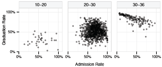
Now we can see that, when segregated into these bins, meaningful patterns emerge. Universities that admit students with the highest ACT scores tend to have high graduation rates, regardless of admission rates, and those with the lowest ACT scores tend to have low graduation rates, regardless of admission rates. Universities that admit students in the 20-30 ACT score range tend to avoid the extremes at both ends of the graduation rate continuum. It isn’t likely that we would have ever found this relationship without the help of the algorithm, because we would probably have never binned ACT scores in this particular way. The authors are proposing a way to enable an analytical tool to find algorithmically what we might not discover on our own during an exploratory journey. It then presents the results to us so we can use our own eyes and brains to confirm the findings and investigate them further. This is a worthwhile use of technology and a well-designed solution.
The authors call the smarts behind this work a “goodness-of-split algorithm” (a clever pun on “goodness of fit”). It ranks potential ways of splitting a scatter plot into small multiples based on four criteria:
- Visually rich
How well the split presents visually rich patterns that can be perceived by the human visual system.
- Informative
How well the split reveals information that cannot be seen in the existing scatter plot.
- Well-supported
How well the split reveals patterns that are meaningful, as opposed to spurious patterns based on random variation.
- Parsimonious
A split that results in the fewest number of small multiples without sacrificing anything useful.
I won’t try to explain how the algorithm works, but you can rest assured that it is based on a deep understanding of statistics and visual perception. If you love elegant algorithms, read the paper for an explanation that will appeal to the computer scientist in you.
Other worthwhile papers were presented this year at VisWeek, but these are the two that piqued my interest most. Unsurprisingly, a few of this year’s papers caught my attention for the wrong reasons. My final newsletter article of this year, which will be published tomorrow, will critique one of those papers as a cautionary tale about research gone awry.
Take care,

One Comment on “Two Highlights of IEEE’s 2015 VisWeek Conference”
I thought “Beyond Weber’s Law: A Second Look at
Ranking Visualizations of Correlation” (http://idl.cs.washington.edu/files/2015-BeyondWebersLaw-InfoVis.pdf) was especially good and is a success story for data sharing. It’s essentially a remake of a paper from last year that I thought was dubious though it did get some attention. I’m still not thrilled with the study set-up (why waste runs with donuts or stacked bars for showing correlation?). However, the new paper took the original data, shared on github, and provided a more in-depth analysis and much better graphics for showing the results.